Appendix
- In order to improve the ease of reading of the World Inequality Report, we have not included all technical details in the main body of the text.
- However, interested readers are warmly invited to visit the Report’s dedicated website (wir2018.wid.world) for methodological details on how estimations were constructed. In our efforts to be as transparent as possible, the website hosts all the methodological documents, country technical papers, raw data sources and computer codes used for the production of the series presented in the World Inequality Report.
- In particular, for detailed technical notes on each of the graphs presented in the report, users should refer to the document: “World Inequality Report 2018 Technical Notes” (WID.world Technical Notes 2017/7). This document at times redirects readers towards other working papers or scientific articles where more exhaustive information can be ascertained.
- The online publication of these documents is essential in our view to increase the level of transparency and reproducibility of global inequality data. We would encourage as many people as possible to view the site, make their own estimations, and discover ways in which our data can be improved and what alternative assumptions would be made in order to do so.
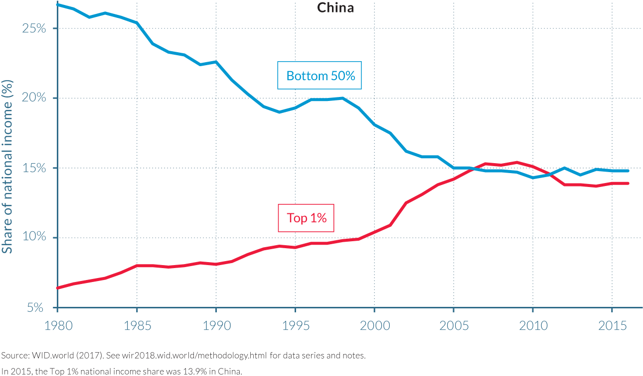
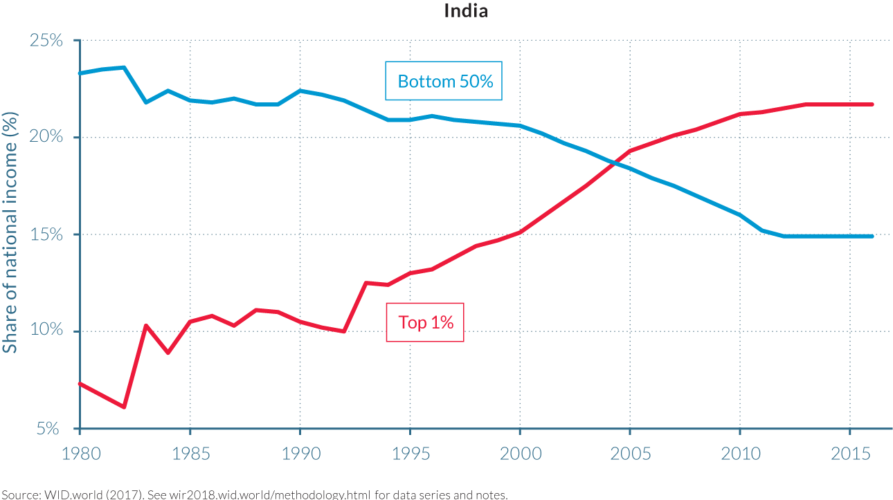
- Below is a limited selection of Appendix graphs, that we refer to earlier in the World Inequality Report. Figures A1 to A3 show alternative methods to represent our main results on global income inequality dynamics. Figure A4 focuses on income inequality dynamics in India and China and provides an example of the types of additional graphs which can be obtained on
wir2018.wid.world.
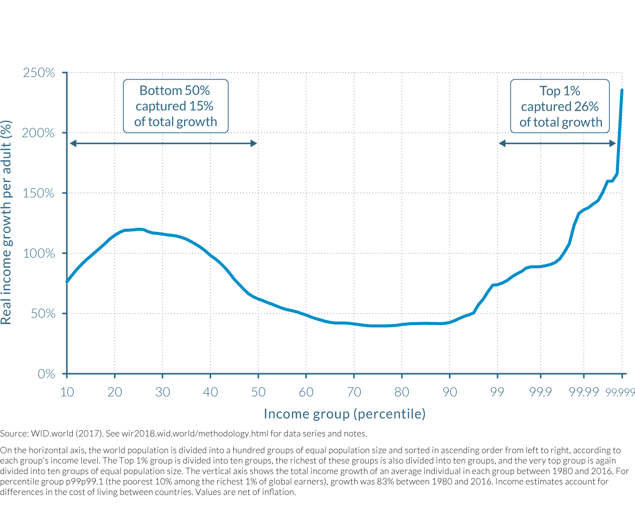
In this representation of global income inequality dynamics discussed in Chapter 2.1, we scale the horizontal axis by population size, meaning that the distance between different points on the x-axis is proportional to the size of the population of the corresponding income group. (See Box 2.1.1)
Total income growth by percentile across all world regions, 1980–2016: Scaled by population
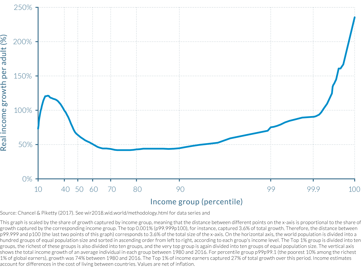
In this representation of global income inequality dynamics discussed in Chapter 2.1, we scale the horizontal axis by the share of growth captured by income group, meaning that the distance between different points on the x-axis is proportional to the share of growth captured by the corresponding income group. (See Box 2.1.1)
In this representation of global income inequality dynamics discussed in Chapter 2.1, we adopt a combination of the scaling methods used in Figure A1 and Figure A2 so as to better visualize global inequality dynamics throughout the entire distribution. (See Box 2.1.1)
This graph shows the evolution of top 1% and bottom 50% income shares in India and China. It is an example of the additional graphs which can be produced online on wid.world and which are discussed in the various methodological documents referred to in the report.