4.1 Global wealth inequality: trends and projections
- Data on global wealth inequality is sparser than data on income inequality, so estimates should be interpreted with care. It is not possible to construct at this stage a consistent global wealth distribution. However, available research on key regions—in particular, China, Europe, and the United States—provide valuable insights into global wealth dynamics.
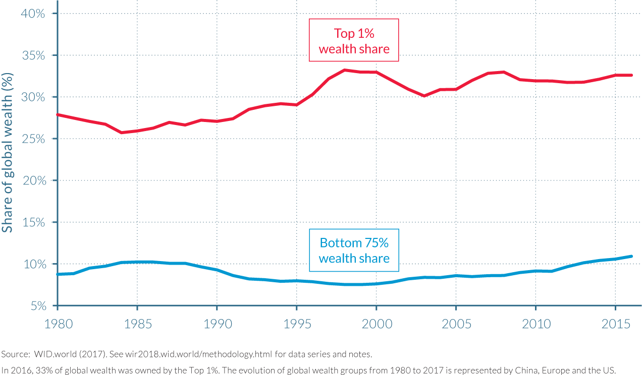
- Evidence points towards a rise in global wealth inequality over the past decades. At the global level—represented by China, Europe, and the United States—the top 1% share of wealth increased from 28% in 1980 to 33% today, while the bottom 75% share hovered around 10%.
- Wealth is substantially more concentrated than income. The top 10% owns more than 70% of the total wealth in China, Europe, and the United States, the bottom 50% owns less than 2%, and the middle 40% (“the global wealth middle class”) owns less than 30%.
- If established trends in wealth inequality were to continue, the top 0.1% alone will own more wealth than the global middle class by 2050.
Global wealth inequality estimates are scarcer than for global income inequality and subject to caution
The available data on wealth inequality is much sparser than for income inequality, especially at the global level. It is therefore more difficult to provide a complete picture of how global wealth inequality has evolved over the past few decades.
We want to be very clear about this: available data sources make it impossible at this stage to properly estimate the level and evolution of the global distribution of wealth. We can to some extent estimate the global distribution of income and its evolution, as we have tried to cautiously show in Part II of this report. The situation is different for wealth. As we have shown in Part III of this report, there are very large areas of the world—particularly in Africa, Latin America, and Asia—where we are not even able to properly measure the aggregate level of national wealth and its decomposition into private and public property, foreign wealth, and natural capital. We first need to make more progress on the measurement of total wealth and its changing structure before we can construct estimates of distribution of private wealth among individuals.
A number of magazines (most notably, Forbes) do publish global rankings of billionaires, and some financial institutions (for instance, Credit Suisse) have combined billionaire data with other data sources to estimate global distributions of wealth. Typically these studies find that top wealth holders have been rising at very high speed in recent decades—substantially faster than the size of the world economy—and below we will agree with this general conclusion. However the methodologies used by Forbes and by these institutions often lack transparency; in particular, they do not release their raw data sources and detailed computer codes. It is impossible therefore to reconstruct their statistical results. This is not merely a technical question; methodological choices can indeed have a large impact on the measured evolution of wealth inequality, and transparency of methods and sources is critical if we want to reach some agreement about inequality facts.
In the context of the WID.world project, we choose to proceed in a gradual manner and to release wealth inequality series solely for the countries for which raw sources allow us to do so in a satisfactory manner. Ideally, one needs to combine household wealth surveys together with wealth rankings and administrative fiscal data (coming from both the income tax, using the capitalization method, and the inheritance tax, using the estate multiplier method) to be able to properly estimate the distribution of wealth and to confront sources in a transparent way. At this stage, these conditions are satisfied only for a handful of countries—most notably, the United States, a number of countries in Europe (in particular, France, the UK, and Spain), and to a lesser extent China (where we have access to household wealth surveys and wealth rankings, but where access to fiscal data is extremely limited). We have also produced estimates of wealth inequality for Russia and the Middle East, but they are more fragile, and we do not use them to produce global wealth estimates in this report.
Our global wealth inequality estimates since 1980 therefore combine data from three large regions: the United States, China, and Europe. Europe itself is represented by three countries (France, Spain, and the United Kingdom), which on the basis of other countries for which we have wealth inequality data (in particular, Sweden and Germany) appear to be broadly representative. Starting from 1987, we can also compare our results with the Forbes billionaire rankings, which provide a better coverage of countries, though only for a tiny, extremely wealthy part of the population, and with little knowledge of how this information was collected.
Available data show that global wealth inequality is extreme and on the rise
At the global level (represented by China, Europe, and the United States), wealth is substantially more concentrated than income: the top 10% owns more than 70% of the total wealth.1 The top 1% wealthiest individuals alone own 33% of total wealth in 2017. This figure is up from 28% in 1980. The bottom 50% of the population, on the other hand, owns almost no wealth over the entire period (less than 2%). Focusing on a somewhat larger group, we see that the bottom 75% saw its share oscillate around 10%. Wealth concentration levels would probably be even higher if Latin America, Africa, and the rest of Asia were included in the analysis, as most people in these regions would be in the poorer parts of the distribution. We leave this to future editions of the World Inequality Report. (Figure 4.1.1)
We compare in Table 4.1.1 the growth rates of the different wealth groups between 1980 and 2017 (all growth rates are expressed in real terms—that is, after deduction of inflation). A number of striking findings emerge. First, one can see that average wealth has grown faster since the 1980s than average income, reflecting the general tendency of wealth/income ratios to rise in most countries, as documented in Part II of this report. Between 1987 and 2017, per-adult average income has increased at 1.3% per year at the world level, while per-adult wealth has increased at 1.9% per year.
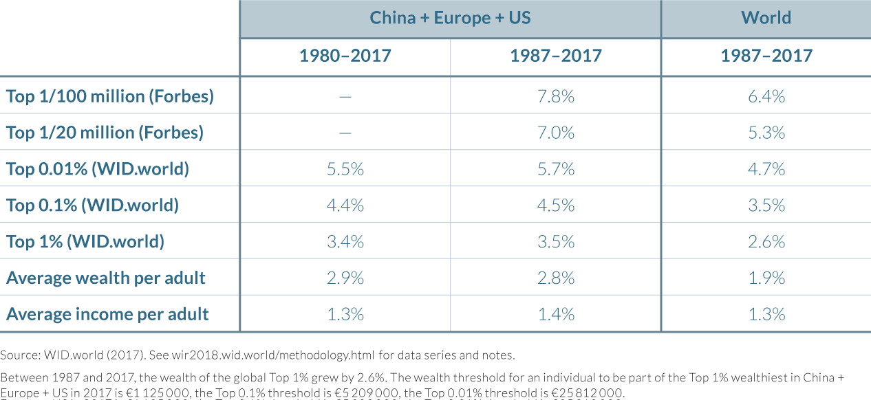
Next, if we now look at the top of world wealth distribution—as measured by the Forbes billionaire rankings—we find that the top wealth holders’ share has increased a lot faster than average wealth holders: 5.3% since 1987 for the top 1/20 million, and 6.4% for the top 1/100 million (see Table 4.1.1). By definition, this is an evolution that cannot continue forever: if top wealth holders were to grow on a permanent basis at a speed that is three to four times faster than average wealth in the world, then billionaires would ultimately come to own 100% of the world’s wealth.
The problem with this billionaire data is twofold: first, as was noted above, it is not entirely clear how it was estimated; next, and most importantly, it is not clear at all whether this pattern of very fast growth holds only for billionaires, or whether it can be extended to multimillionaires. This is crucial because there are many more individuals who own $5 million, $20 million, or $100 million than there are billionaires, and the former command a potentially much larger fraction of world wealth than the latter.
We unfortunately do not know the full answer to this question, but at least our estimates for the US, Europe, and China distribution of wealth provide some interesting insights. We find that the top 1% average wealth in the US, Europe, and China has risen at 3.5% per year between 1987 and 2017 (versus 2.8% for per-adult average wealth and 1.9% for average income). The higher we go in the distribution, the faster the growth: the top 0.1% average wealth has increased by 4.4% per year, and the top 0.01% average wealth has increased by 5.6% per year.
These findings, which were obtained by combining a number of independent data sources (household wealth surveys, income tax data using the income capitalization method, and inheritance tax data using the estate multiplier method, when available), appear to be consistent with the Forbes billionaire data. But they also suggest that one needs to go really very high in the distribution of wealth to see growth rates on the order of 5%–6% per year. If one considers only the top 1% wealth holders as a whole (that is, all individuals with net wealth higher than about €1.1 million in China, Europe, and the United States in 2016), then the growth rate between 1987 and 2017 has been 3.5% per year. This is faster than average wealth growth (2.8% per year), but the gap is not as huge as for billionaires. This suggests at current speed that rising inequality and the divergence of the wealth distribution will take a couple of decades before it takes really extreme proportions. (See below for a discussion of future prospects.) That being said, the direction in which the distribution is going definitely suggests rising concentration of wealth, and there is no evidence that the financial crisis of 2008 had any impact—other than temporary—on this long-run structural trend.
Our results also show that a large share of the growth of global wealth accrued to the top 1% and even narrower wealth groups. As Table 4.1.2 shows, the top 1% captured 37% of per capita wealth growth, more than half of which went to the top 0.1%.

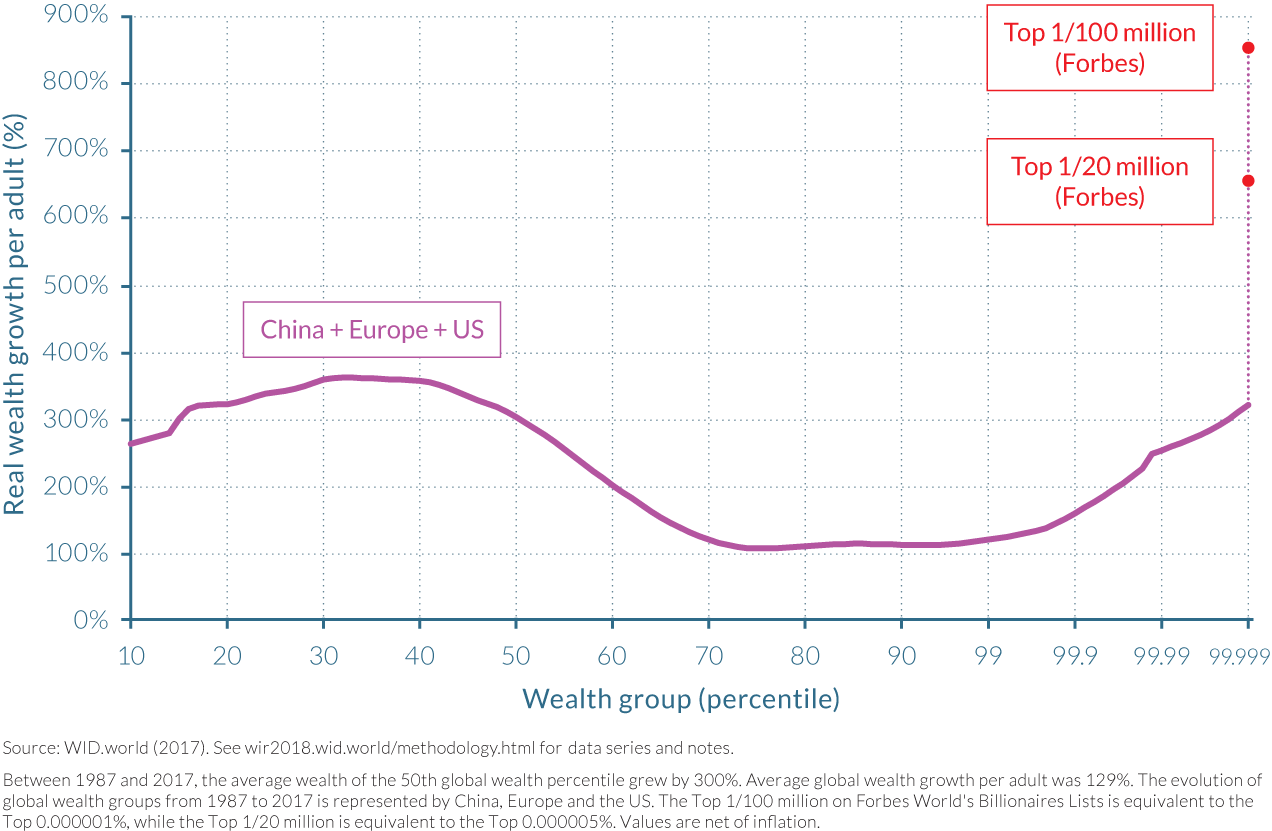
All of this implies growing inequality at the top end of the distribution. Note that the bottom of the distribution has also experienced a significant increase of its wealth, driven by rapid growth in China, as shown by Figure 4.1.2. This pattern is reminiscent of the “elephant curve” of global income growth, showing that the global wealth distribution seems to have evolved in ways qualitatively similar to income. The bottom three-quarters of the distribution saw its wealth increase by a sizeable amount, though less than the world’s billionaires according to Forbes. Between those two groups, wealth growth was at its lowest for the middle class in developed countries. The trends in the wealth growth of different groups have been fairly stable over the last three decades, with narrower wealth top groups experiencing higher growth.
Under a business-as-usual scenario, the top 1% wealth share will increase at 1 percentage point every five years
What will happen to the global distribution of wealth if these trends were to continue for the next few decades? Figure 4.1.3 seeks to answer that question. The top 0.1% wealth owners would progressively catch up with the global wealth middle class, which we define as wealth holders below the top 10% and above the median—that is, 40% of the world population. In 2050, both groups would own the same share of global wealth—that is, 25%. The global wealth middle class comprises 40% of the world population meaning that the top 0.1% wealthiest would be on average four hundred times wealthier than the global middle class. This evolution would take a couple of decades.
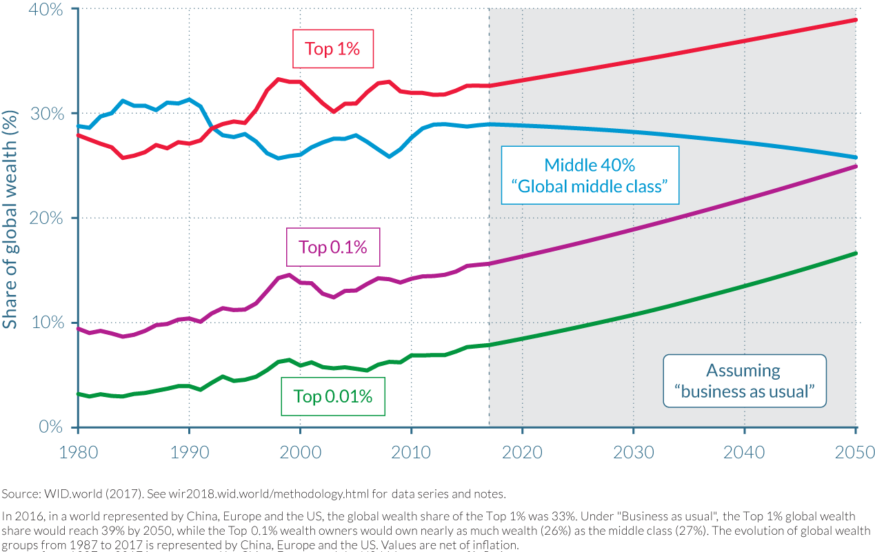
The top 1/20 million and 1/100 million of individuals, which comprise about 250 and 50 adults, could respectively own 1.5% and 0.75% of total wealth as soon as 2030, up from 0.5% and 0.25% in the early 1990s. The share of the top 1% would keep on increasing by one percentage point every five years. The shares of the top 0.1% and 0.01% would also grow by one percentage point every five years, meaning that the increase in wealth inequality is in fact driven by these small groups. These groups are much broader than billionaires, but nevertheless quite narrow. (To belong to the top 0.1% or top 0.01% of Europe, the United States, and China in 2016, one needs to own more than €5.2 million or €25.8 million, respectively.)
Global wealth inequality is driven by a large number of forces
As discussed in Part II, global income dynamics are driven by both between- and within-country forces. The rise of private wealth has been faster in large emerging economies than in rich countries, a trend driven by high economic growth and large-scale privatization in transition economies. This tends to reduce global wealth inequality. This effect was more than offset at the top, however, by the rise in wealth inequality within countries. Rising wealth inequality within countries is itself due to a number of factors, including rising income inequality amplified by inequality of savings rates and of rates of return. Other factors, such as the progressivity of taxation, can in turn mitigate or worsen these dynamics. Hence, future global wealth inequality will depend on both catchup growth in emerging economies, and within-country determinants of inequality. We study them at the country level as further described in the next chapters.
We should stress at the onset that there was nothing inevitable about the fact that the very top of the global wealth distribution would rise so much faster than average world wealth beginning in the 1980s. One of the global factors that might have played a role is the larger transfer from public to private wealth that took place in many countries. (See Part II.) To the extent that privatization disproportionately benefited small groups of the population—for example, Russian oligarchs—this can help explain why top wealth holders’ shares rose so fast. It is difficult, however, with the data at our disposal to estimate the global impact of this factor. In particular, there are also some cases where privatization has benefitted mostly the middle class (for example for housing, as we discuss below for the case of the UK, France and Spain). Whether this channel is likely to be important for the future (one might be tempted to conclude that large privatization waves are now behind us) is another important and uncertain issue.
Another potentially important global factors behind booming top wealth is the fact that financial deregulation and innovation might have increased the inequality in rates of return that are accessible to different sizes of financial portfolio. Some of the most convincing evidence for this channel comes from the observed real rates of return on university endowments, which varied from 4–5% per year for the smallest endowments to as much as 8–10% per year for largest ones (after deduction of inflation and management costs) in the United States between 1980 and 2010.2
Again one might wonder whether this corresponds to a specific financial period or whether this will continue in the future (available data suggests that large endowments were still getting very good returns in recent years). Also the governance of personal family wealth involves many other issues than that of large academic capital endowments, so one cannot directly apply these findings. Unfortunately there is too little data available to make similar computations for the highest family wealth.
As we shall see below, however, our country studies do show that differential rates of return—together with differential saving rates—can potentially be an important driving force behind rising wealth concentration. (Box 4.1.1.)
We partition the distribution of wealth into several groups:
- the bottom 99%
- the top 1%, excluding the top 0.1%
- the top 0.1%, excluding the top 0.01%
- the top 0.01%, excluding the top 1/20 million
- the top 1/20 million, excluding the top 1/100 million
- the top 1/100 million
We calculate the average growth rate of wealth of these groups since 1987 (start of the Forbes ranking), and extrapolate the average wealth of each of these groups based on these growth rates. We obtain top wealth shares based on these averages.
Because narrower top groups have experienced higher growth in the past, this method forecasts an increase of wealth inequality. Of course, this trend cannot be extended indefinitely into the future, because with the current parameters it will eventually lead to the top group’s owning nearly all of the wealth. However, this problem only arises at very long horizons, so the method is still useful for projections over a few decades.
4.2 Comparing trends in personal wealth inequality across the world
- Available data on personal wealth inequality shows that it has been on the rise in most countries since the early or late eighties. Increasing income inequality and the large transfers of public to private wealth which occurred over the past forty years drive these dynamics.
- Large rises in top wealth shares have been experienced in China and Russia following their transition from communism towards a capitalist economy, though the different inequality dynamics experienced between these two countries highlights different economic and political transition strategies.
- In the United States, wealth inequality has increased dramatically over the last 30 years and was mostly driven by the rise of the top 0.1% wealth owners. Growing inequality of income and saving rates created a snowballing effect of rising wealth concentration.
- The increase in top wealth shares in France and the UK was more moderate over the past forty years, in part due to the dampening effect of the rising housing wealth of the middle class and lower income inequality relative to the United States. As a result, while wealth concentration has been historically lower in the United States than in Europe, the situation reversed after the 1970s.
- Property prices also played an important tempering role for wealth inequality in Spain as wealth concentration remained roughly unchanged over the observed period with only short-lived fluctuations.
- In the long run, the differential between rates of return to capital and growth rates, as well as the dynamics of savings rate among wealth groups, drive wealth inequality. When rates of returns available to high-wealth portfolios are higher than average economic growth, wealth inequality increases. The same is true when savings inequality is high.
Wealth inequality within countries fell dramatically from the beginning of the twentieth century in some of the world’s largest economies, but since the 1980s there have been widespread increases in wealth concentration. The combination of economic, political and social shocks that led to the long-run decline in wealth inequality experienced throughout Europe and North America from the start of the First World War to the mid-1980s was described in the Capital in the Twenty-First Century.3 These shocks included the Great Depression, the destruction of human and physical capital led by the World Wars, restrictions on capital flows, nationalization of industries and goods provision, and greater government control over the economy. Given the close relationship between wealth and income, the story of the former is similar to that of the latter: collectively, these factors severely impacted the fortunes of the wealthiest and supported the growth of middle class wealth in Europe and the United States.
Unfortunately relatively little is been known about the recent evolution of wealth inequality at a global level. Wealth inequality data discussed in public debates up to now essentially relied on sources which do not allow for a sound analysis of wealth dynamics. It is also difficult to track how wealth inequality statistics are constructed since the methodologies are not always made transparent. This is not merely a technical question: methodological choices can indeed have a large impact on the evolution of measured wealth inequality.
The publicly available information discussed in this report and published on WID.world on the distribution of wealth and cross-border assets is still imperfect. But we see it as a fist systematic attempt at generating data on wealth inequality over the globe. It combines in a consistent manner tax data, wealth surveys and data on cross-border assets. The construction of estimates presented in this report was carried out for China, France, Russia, Spain, the United Kingdom and the United States which are presented in this chapter and the subsequent ones.
Contrasting transition strategies have generated divergent inequality dynamics in China and Russia
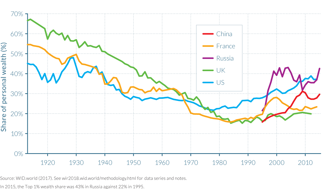
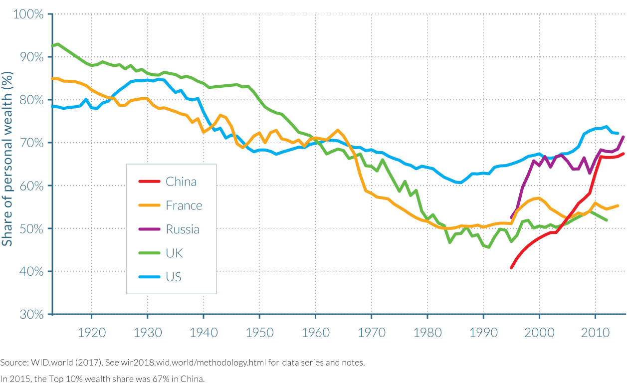
Wealth inequality data for China and Russia is only available from 1995–2015, but even in these last two decades the series confirm huge increases in wealth inequality. Wealth concentration amongst the top 1% in both countries practically doubled, as their share in China’s total wealth rose from just over 15% in 1995 to 30% in 2015, and in Russia’s from below 22% to approximately 43%. Interestingly, the share of the top 10% in total wealth in 2015 is much closer between the two countries, at 67% in China and 71% in Russia as illustrated by Figure 4.2.2, indicating that Russia’s transition strategy favored its most wealthy citizens more than China’s. As seen in Figure 4.2.1, by 2015 Russia had a higher concentration of wealth than the United States, while China’s wealth inequality was roughly in between that of France and the United States.
The variations in inequality increases between the two former communist countries were in part due to differences in their strategies for privatizing housing and state-owned enterprises. In Russia, previously state-owned businesses were transferred to the private sector through a voucher privatization process that can be compared to a fire sale of assets given the extremely fast pace at which it was executed. By contrast, the enormous transfer of public capital into private capital with the sale of state-owned enterprises in China occurred more slowly. Its scale, though, was considerable: close to 100 000 firms with ¥11.4 trillion worth of assets were privatized between 1995 and 2005.4
The method by which property wealth was privatized was different, however. Chinese citizens experienced huge reductions in welfare housing allocations and the almost complete privatization of the housing market, and by 2002, 85% of urban housing was privately-owned. This property privatization process was very unequal as access to quoted and unquoted housing assets often depended on how wealthy and politically connected the household was, with the wealthiest end of the distribution able to access privatized public wealth more easily through official markets. In contrast, Russians took a more gradual approach to property privatization. Tenants were typically given the right to purchase their housing unit at a relatively low price and did not need to exercise this right immediately, while uncertainty surrounding the macroeconomic and political environment also meant many Russian households waited until the late 1990s and even the 2000s to exercise this right. Consequently, the property privatization process had a small dampening effect on the rise of wealth inequality. The shares of the middle 40% defined as the top 50% excluding the top 10% fell in both countries across the period. Interestingly, the group’s share fell in similar proportions in China and in Russia, from 43% in 1995 to 26% in 2015 in China and from 39% to 25% over the same period in Russia. While the fall was more pronounced in China, it was initially more abrupt in Russia than in China, however, due to the aftereffects of hyperinflation that followed price liberalization in 1992 and wiped out savings.
The growing inequality of income and savings rates have caused rapid wealth concentration in the United States
The rise of wealth inequality in the United States was less abrupt, but no less spectacular in historical terms, than the increases experienced in the former communist countries. Wealth inequality in the United States fell considerably from the high levels of the Gilded Age by the 1930s and 1940s, due to drastic policy changes that were part of the New Deal. The development of very progressive income and estate taxation made it much more difficult to accumulate and pass on large fortunes. Financial regulation sharply limited the role of finance and the ability to concentrate wealth as in the Gilded age model of the financier-industrialist. But since the mid-1980s, top wealth shares have risen sharply. The key driver of this rapid increase in wealth concentration has been an upsurge of incomes at the top of the distribution and the stagnation of incomes at the bottom. These dynamics follow the reversal of the policies implemented during the previous period, with financial deregulation and lower top tax rates among others. The differentials between the saving rates of the richest and those of the middle- and lower-class also increased wealth inequality. This had a reinforcing, “snowballing” effect as the purchase of financial assets by the wealthy using the savings from their large incomes has led to a rise in capital income concentration, providing greater incomes for the purchase of more assets and hence larger top wealth shares.
In the United States, the share of wealth owned by the top 1% adults grew from a historic low of below 22% in 1978, to almost 39% in 2014, as depicted in Figure 4.2.1. This represented a trend reversal from historical patterns as the top 1% wealth share in the United States was almost double that of France and the UK in 2014. These changes enabled the wealthy to purchase more wealth assets with high returns, setting a snowballing effect in motion for those at the top of the distribution, while wealth of the middle class stagnated. Consequently, the wealth share of the middle 40% fell from a historic high of almost 37% of total wealth in 1986, to around 28% in 2014. Pensions and home ownership rates of the middle 40% increased over the preceding period, but after the mid-1980s this trend reversed due to a surge in household debt that included mortgages, student loans, credit card and other debts. These debts increased from 75% of national income in the mid-1980s to 135% in 2009 and, despite some deleveraging in the wake of the Great Recession, still amounted to close to 110% of national income in 2012; this trend can be seen in the negative share of total wealth owned by the bottom 90% between 2008 and 2013.
The rising housing wealth of the middle-class dampened wealth inequality increases in France and the UK
Between the start of the First World War and the early 1980s, France and the UK experienced dramatic falls in wealth inequality. Large wealth shocks between 1914 and 1945 included the great depression, inflation and the destruction of productive capital and housing during the World Wars, and were followed by policies designed to reduce wealth inequality such as nationalizations, rent control and tax policies. These factors collectively led to the creation of a patrimonial middle class, which did not exist in Europe before WWI, contrary to the United States where wealth inequality was relatively lower at the time. Since the mid-1980s wealth inequality has risen in both the UK and France, though to a much lesser extent than in the United States, such that the United States is now more unequal in terms of wealth than Europe. In France and in the UK, strong returns on the financial assets held in proportionately larger quantities by the wealthiest fueled wealth inequality. This factor was, however, moderated by the general rise in house prices that have largely benefited the patrimonial middle-class, which owns relatively more housing than top wealth groups.
The beginning of the twentieth century saw the start of dramatic falls in the wealth share of the top 10% and top 1% in both France and the UK, as depicted in Figure 4.2.1 and Figure 4.2.2. The share of wealth owned by the top 1% in the UK reached almost 75% in the early 1900s, and represented almost 60% of the total in France. But by the early 1980s, a combination of factors including the destruction of capital during the World Wars and greater state control of economic activity and redistribution thereafter saw the top 1% share fall to 16% in 1985 in both countries and that of the top 10% fell to 47% in the UK and 50% in France, near historic lows (they had previously been as high as 93% and 86%, respectively).
But in the midst of then French President Mitterrand’s austerity turn and Prime Minister Margaret Thatcher’s premiership, wealth inequality began to rise. Greater wealth concentration was the result of a number of factors including: greater earnings disparities between the top and bottom of the distribution, a fall in tax progressivity, higher returns on financial assets disproportionately owned by the wealthy and the privatization of large parts of formerly state-run industry.
In France, there were strong short-run fluctuations around 2000, with a substantial rise in top 10% wealth share (up to 57% in 2000) followed by a decline (53% in 2004). This was entirely due to large movements in relative asset prices. Indeed, stock prices were very high in France during the “dotcom bubble” in 2000, as compared to housing prices, which favored the upper class relative to the middle class.
However, despite these fluctuations, the longer-term trend was unchanged. In 2014, the share of total wealth held by the top 10% had increased to 55% in France and the figure was 52% in the UK in 2012, while the shares of the wealthiest 1% reached 23% and 20%, respectively. The rise in wealth inequality in the 2000s was moderate as the rise in general house prices experienced before and over this period improved the value of property wealth—assets held in greater proportion by the middle 40%—thus comforting the share of the patrimonial middle class.
We should note, however, that high housing prices have ambiguous and contradictory effects on wealth inequality. On the one hand, high housing prices can mitigate rising inequality between the middle and the top, in the sense that property owning middle classes—who typically own most of their assets in housing—benefit from an increase in the value of their wealth that is stronger than the upper groups—who mostly own financial assets. But on the other hand high housing prices make it for difficult for the poorer groups to access real estate property to begin with, and this can lead to rising inequality between the poor and the middle. High property prices also create new forms of inequality, for instance between those who bought real estate at the right time and those who did not, or between young wage-earners who can benefit from parental wealth and inter vivos gifts to become home owners and those who remain tenants forever. These are new forms of inequality which have become increasingly important for the generations born in the 1970s–1980s and after, and which were much less important for the earlier cohorts (in particular for those generations born in the 1940s–1950s, who could purchase housing assets at relatively low price with their labor income only).5
Property prices also played an important equalizing role for wealth inequality in Spain
The housing market has also played an important role among other European countries. Spain experienced fluctuations in its wealth concentration across the last decades, but inequality has remained broadly stable as a result of housing market evolutions. Asset price movements were key in determining short-run wealth inequality levels. In particular, the country’s housing boom saw property prices triple between 1984 and 1990, and triple again between 1996 and 2008, led to volatility in wealth concentration trends throughout the period between 1984 and 2013. As the wealthiest individuals in Spain bought deeper into the property market through multiple property purchases, the bursting of this bubble in 2008 thus had larger impact on top 10% and top 1%, neutralizing their previously made gains. A similar story is also evident in the midst of the dot-com boom and bust as the wealth share of the top 1% peaks at around 28% in 2000.
Policies and institutions drive long-run wealth inequality through their impact on returns on capital and savings rates.
In the long-run, it is the inequality of savings rates between individuals and the differential between rates of return and growth that determine wealth concentration.6 Earlier work has shown that wealth inequality within the top wealth groups increases in line with the difference between the rate of return and the rate of growth (r–g).7 Intuitively, the higher the gap between growth and the rate of return on capital (r > g), the more wealth inequality is amplified as capital is concentrated in the hands of the wealthy. It implies that past wealth is capitalized at a faster pace, and that it is less likely to be overtaken by the general growth of the economy. As was already mentioned above, this effect can be strongly reinforced by the fact that rates of returns tend to increase with the level of wealth: the rates of return available for large financial portfolios usually have little do with those open to small deposits.
Small changes in savings rates can also have a very large impact on wealth inequality, though it may take several decades and even generations for their impacts to play out. These forces have been evident in France, the UK, and the United States, which all exhibit large differences between the savings rates of the wealthiest individuals and the rest of the distribution. In France, the top 10% of wealth holders generally saved between 20%–30% of their annual incomes between 1970 and 2012, but this fraction was much smaller and fell notably over the period for the middle 40%, from 15% of annual income in 1970 to less than 5% by 2012, while savings rates among the bottom 50% fell from 8% to approximately 0%. In the United States, the savings rate of the bottom 90% of families fell sharply since the 1970s, while it has remained roughly stable for the top 1%. The annual saving rate of the bottom 90% fell from around 5–10% in the late 1970s and early 1980s to around -5% in the mid-2000s, before bouncing back to about 0% after the Great Recession. These falls in saving rates amongst the bottom 90% have been largely the consequence of increases in household debt, particularly from mortgages.
Assuming the same inequality of saving rates that were observed in France over the 1984–2014 period—namely 24.5% for the top 10% and 2.5% for the bottom 90%—will persist, together with the same inequality of rates of return and the same inequality of labor income, the share of total wealth owned by the top 10% in France will gradually increase to the levels that were observed in the nineteenth and early twentieth centuries, that is, approximately 85% of total wealth. If, however, the 1970–1984 trends had persisted after 1984 and continued during the upcoming decades, the top 10% would have owned only slightly more than 45% of total wealth today and this figure would further decrease throughout the twenty-first century.
4.3 Wealth inequality in the United States
Information in this chapter is based on the article “Wealth Inequality in the United States Since 1913: Evidence from Capitalized Income Tax Data,” by Emmanuel Saez and Gabriel Zucman, 2016. Quarterly Journal of Economics, 131(2), 519–578.
- Top wealth shares have been risen since the mid-1980s to 2012, with the top 0.1% driving wealth concentration at the top; their wealth share grew threefold from 7% in 1978 to 22% in 2012, a level comparable to that of the early twentieth century.
- United States wealth inequality had previously fallen considerably from the 1930s and 1940s, due to drastic policy changes that were part of the New Deal. These policies included the introduction of progressive income and estate taxation, and greater financial regulation.
- The key driver of this rapid increase in wealth concentration since the 1980s has been an upsurge of top incomes combined with an increase in saving rate inequality across wealth groups. This has had a reinforcing, “snowballing” effect as the accumulation of financial assets by the wealthy has led to a rise in capital income concentrations, allowing for more wealth accumulation at the top.
- The declining wealth share of the bottom 90% of the distribution is the result of plummeting middle-class savings, as their mortgage, consumer credit, and student debt has greatly increased.
Wealth inequality in the United States has risen rapidly and consistently since the mid-1980s
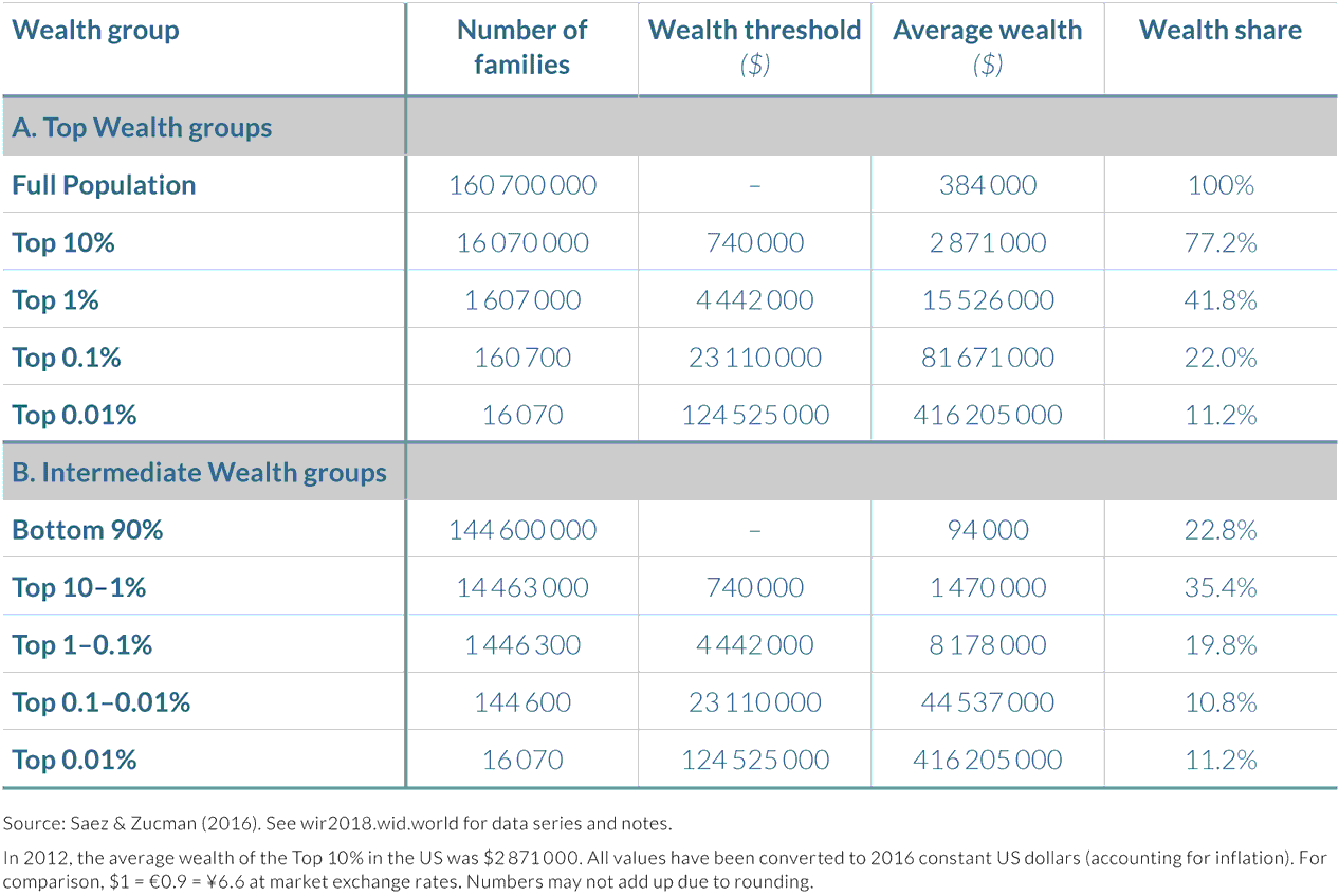
To fix notions of wealth inequality in the United States, it is perhaps best to first consider the distribution of the country’s wealth in 2012 that is outlined in Table 4.3.1. The average net wealth per family was over $384 000, but this average masks a large heterogeneity. The bottom 90%—a group of almost 145 million families who possess approximately $94 000 on average—collectively own about as much of the total household wealth (22%) as the 161 000 families who are included in the top 0.1%; their average wealth was approximately $82 million, 845 times larger than the bottom 90%. Wealth is much more concentrated than income in the United States, as the top 0.1% wealth share is about as large as the income share of the top 1%.
Rising wealth inequality since the 1980s is almost entirely due to the top 0.1%
Wealth is becoming significantly more concentrated in the United States, but this trend is not the result of tens of millions of Americans seeing a rise in their fortunes. It is rather the spectacular dynamics of a tiny group of the population owning more than $4.4 million—the entry price of the top 1%.
Top wealth shares have risen sharply since the mid-1980s. Indeed, the share of wealth held by the top 10% in 1985 was approximately 63%, the lowest value it had reached since 1917. But by 2012, the wealth share of the top 10% had reached over 77%, an additional 13 percentage points. More than three quarters of all wealth in America was owned by just ten percent of its population.
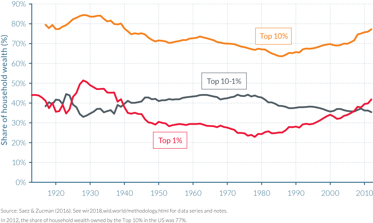
However, since the mid-1980s, the wealth share of families belonging to the top 10% but not to the top 1% has decreased. In fact, the share of total wealth owned by the top 1% increased at a faster pace (up by around 17 percentage points) than the top 10% between 1986 and 2012 (see Figure 4.3.1a). The rise in the wealth share of the top 1% itself owes almost all of its increase to the growth of the top 0.1% share which rose from 7% to 22% (15 percentage points). The wealth share of the top 0.1% was thus larger than the share of the top 1–0.1% (that is the top 1% minus the top 0.1%) in 2012, having tripled since 1978. Almost all of the top 1% and top 10% increase over the past four decades has been due to the top 0.1% alone.
The recent rises in wealth concentration contrasts with continual reductions over the previous half-century
The significant increase in the wealth shares of America’s wealthiest since the mid-1980s is in direct contrast to the trend that followed the Great Depression. The Roaring Twenties saw a huge rise in wealth concentration, as the top 1% accumulated a significantly larger share of total wealth over the decade, rising from 35% in 1923 to almost 52% by 1928, and the top 10% wealth share peaked at 84%. But the impact of the Great Depression, and the New Deal policies implemented under Franklin Roosevelt’s Presidency, quickly saw this trend reverse.
Wealth inequality fell at a tremendous pace from 1929 until around the end of the Second World War. The loss in the value of financial assets from the collapse of the stock market and the introduction of financial regulation during the New Deal reduced the role of finance and the ability to concentrate wealth relative to the Gilded Age model of the financier-industrialist, while the development of progressive income and estate taxation made it difficult to accumulate and pass on large fortunes. Correspondingly, the share of the top 1% fell from 52% of total wealth to 29% by 1949. Their falling shares were not just accumulated by the top 10–1% either, as illustrated by Figure 4.3.1b, as the share of total wealth rose from 33% to 42%, leaving the bottom 90% with a 29% share, equal to that of the top 1%.
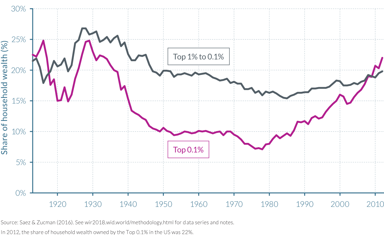
Following the Second World War, wealth inequality rose moderately, before falling again from the early 1960s onwards. The wealth share of the top 10% grew from around 70% to 74% in 1962, before falling in almost every year until the mid-1980s, by which point their share had dipped below 65% of total wealth. As previously described, the Reagan era of deregulation and reduced tax progressivity formed a turning point in wealth inequalities in America. The top personal income tax rate from 50% in 1986 to 28% in 1988, well below the corporate tax rate of 35%.
The rise and fall of middle-class wealth
The second key result of the analysis involves the dynamics of the wealth share of the bottom 90%. Since the bottom half of the distribution always owns close to zero net wealth, that is, when including negative wealth such as credit card and housing debt, the wealth share of the bottom 90% is therefore equal to the share of wealth owned by the middle 40% group, above the bottom 50% but below the top 10%. Within this “middle class”, the share of total wealth owned in 2012 was the same as it was 70 years earlier, despite a rise in the value of their pensions and an increase in their home ownership rates.
The share of wealth owned by the middle class began to increase from the early 1930s, and peaked in the mid-1980s. It has subsequently undergone a continuous decline, as illustrated by Figure 4.3.2. The large rise in the wealth share of the bottom 90%, from 16% in the early 1930s to 35% in the mid-1980s, was driven by the group’s accumulation of housing wealth, and to a greater extent by pensions. Pensions were almost nonexistent at the beginning of the twentieth century, but developed in the form of defined benefits plans, and then from the 1980s in the form of defined contribution plans such as Individual Retirement Accounts and the so called 401(k)s (the latter referring to a section of the United States tax code).
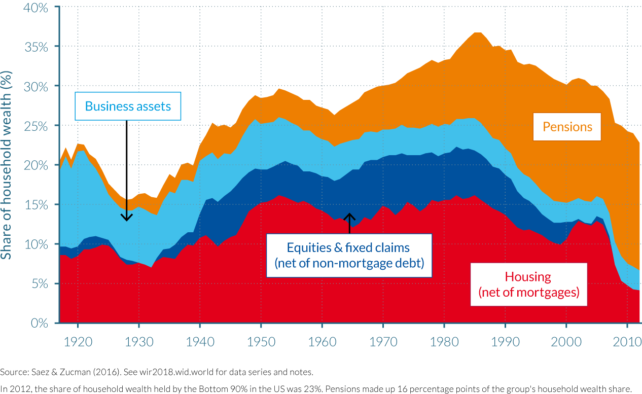
The declining share in the wealth share of the bottom 90% that occurred from the mid-1980s was due to a fall in two components of middle class wealth, namely the housing component (net of mortgage debt) and the fixed income component (net of non-mortgage debt). This fall was mostly the consequence of an upsurge in debt, as aggregate household debt, including mortgages, student loans, credit cards, and other debts, increased from 75% of national income in the mid-1980s to 135% in 2009. The financial crisis of 2007–2009 and the Great Recession then hit the middle class hard. The share of wealth owned by the bottom 90% collapsed between mid-2007 and mid-2008 because of the crash in housing prices, and the subsequent recovery was uneven: over 2009–2012, real wealth per family declined 0.6% per year for the bottom 90%, while it rose 7.9% per year for the top 0.1%.
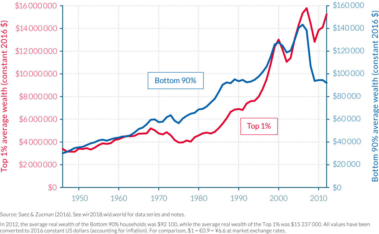
Despite a reduction in debt levels in the wake of the Great Recession as the middle class sold a proportion of their assets, their debt still amounted to close to 110% of national income in 2012. This upsurge in the debt of the middle class has had a dramatic effect on middle-class wealth as approximately 90% of (non-mortgage) debt belongs to the bottom 90% of the wealth distribution, being sufficiently large to more than offset the rise in the value of their pensions. Strikingly, the average real wealth of the bottom 90% of families was no higher in 2012 than in 1986. Real average wealth of the bottom 90% rose considerably during the late 1990s tech-boom and the mid-2000s housing bubble, peaking at $143 000 in 2006, but then collapsed to about $93 800 in 2009 (at constant 2016 $), as depicted in Figure 4.3.3.
The dynamics of savings rates explains much of the evolution of wealth inequality
Inequalities in income shares and savings rates have been shown to have an impact on wealth dynamics in the long run.8 There has been a significant difference in the savings rates of the different US wealth groups between 1917 and 2012. The bottom 90% of wealth holders saved approximately 3% of their income on average over the period, while the 10–1% grouping saved about 15% of their income and the top 1%, around 20–25%. The main exception was during the Great Depression (1929–1939), during which the savings rate of the top 1% was substantially negative, because corporations had zero or even negative profits, but still paid out dividends. This period of negative saving at the top greatly contributed to the fall in top wealth shares during the 1930s described above.
Savings rate inequality has also increased in recent decades. The saving rate of bottom 90% families has fallen sharply since the 1970s, while it has remained roughly stable for the top 1%. The annual saving rate of the bottom 90% fell from around 5–10% in the late 1970s and early 1980s to around -5% in the mid-2000s, before bouncing back to about 0% after the Great Recession (from around 2008–2011). From 1998 to 2008, the bottom 90% dis-saved (spent on credit) each year due to massive increases in debt, in particular mortgages, fueled by an unprecedented rise in housing prices.9 Concurrently, the top 1% continued to save at a high rate, and so the relative savings rate of the bottom 90% and the top 10–1% collapsed.
While the fall in the savings of the middle class explains much of the decline in the wealth share of the bottom 90%, rising income inequality has nonetheless had several noteworthy impacts on the dynamics of wealth inequality in the United States. Firstly, the fall in the savings rate of the bottom 90% saving rate might itself be a consequence of the increase in income inequality and the lackluster growth of middle-class income, further accentuating wealth inequality.10 Secondly, simulations indicate that if the bottom 90% had maintained a constant share of national income, as well as saving at 3% per year then its wealth share would have declined little since the mid-1980s and would be equal to about 33% in 2012 (rather than its actual level of 23%). And finally, rising income inequality at the top has had a significant impact on the wealth shares of the groups at the top of the wealth distribution. For example, the share of income earned by families in the top 1% of the wealth distribution doubled since the late 1970s, to about 16% in recent years. This increase is relatively larger than the increase in the wealth share of the top 1%, suggesting that the main driver of the growth in the wealth share of the top 1% is the upsurge of their income.
4.4 Wealth inequality in France
Information in this chapter is based on “Accounting for Wealth Inequality Dynamics: Methods, Estimates and Simulations for France (1800–2014),” by Bertrand Garbinti, Jonathan Goupille-Lebrets and Thomas Piketty, 2016. WID.world Working Paper Series (No. 2016/5).
- Wealth inequality rose moderately in France since the mid-1980s. In 2014, the top 10% owned 55% of total French wealth, up from 50% in 1984, its lowest level ever recorded.
- Wealth inequality has fallen dramatically between 1914 and 1984. In the early 1900s, the wealth share of the top 1% amounted to 55% of total wealth. Large shocks between 1914 and 1945 (depression, inflation, wars) followed by nationalizations, rent control and tax policies reduced the share of the wealthiest 1% to around 16% by the early 1980s.
- The 1980–1984 period saw the rising prosperity of the middle class as significant increases in the group’s absolute wealth levels were experienced. This was in part due to the rise of their saving rates during this high-growth period.
- The rise in housing prices also played a crucial role in moderating the increase in wealth inequality after 1984, as these assets form a large part of the portfolio of the middle class.
- The long-run dynamics of wealth inequality are largely governed by the inequality of savings rates, themselves driven by habit formation, income inequality and tax and regulatory policies.
- Small variations in savings rates and rates of return can have substantial, long term impacts on wealth inequality. If the recent trends are prolonged, wealth inequality could return to its 1900 level by the end of the century.
The top 10% richest French own 55% of total wealth, while the middle 40% owns 38%.
If France’s total wealth was equally shared amongst the French adult population in 2014, each adult would own approximately €201 000 in net wealth. However, as Table 4.4.1 indicates, this was far from the case. The least wealthy half of the adult population have around €25 500 in assets, equal to one-eighth of the national average and which amounted collectively to 6% of the country’s total wealth. The average wealth of the middle 40% is almost equal to that of the national average at €193 000, and hence their share of total wealth, at 38%, almost represents what it would have been if French wealth was shared equally. French adults need to own assets totaling over €402 000 to be counted in the top 10%, a group whose average wealth was close to €1.1 million, five-and-a-half times the national average and 43 times the average wealth of the bottom 50%.

Wealth in France is even more highly concentrated among the top 10%. This is immediately obvious when analyzing the wealth share of the top 1%: at 23.4% of total wealth and average net assets of over €4.7 million, their share is almost as large as the wealthiest 10% of the population excluding the top 1%, that is, the 10%–1%. To be amongst the top 0.1%, French adults must have wealth totaling nearly €7.6 million, with the average for the group closer to €16.5 million. The total wealth of this group of 52 000 adults is thus a third larger than that of the 26 million adults in the bottom 50%. At almost €184 million, the average wealth of the 520 adults in the top 0.001% is 914 times the national average and almost 180 times the average of their peers in the top 10% group.
Wealth inequality has fallen dramatically since the early twentieth Century leading to the creation of a patrimonial middle class
Current levels of wealth inequality are far from their early twentieth century levels. During the nineteenth and early twentieth century, wealth concentration remained stable at an extremely elevated rate. As noted in Capital in the Twenty-First Century,11 while the French Revolution is likely to have reduced wealth concentration in France with the end of fiscal privileges new taxes on wealth, it is interesting to note that wealth remained highly concentrated in 1800 and throughout the nineteenth Century. During the French Third Republic (1870–1940), which brought forward ideals of republican meritocracy, wealth concentration increased rather than decreased. On the eve of the First World War, the share of the top 10% was around 85% of total wealth, while the middle 40% owned a little less than 15% of French wealth, leaving the bottom 50% with almost no wealth. In a sense, there was no “middle class”: the middle 40% was almost as propertyless as the bottom 50%. As can be observed in Figure 4.4.1, the wealth held by the top 10% between 1800 and 1914 was dominated by that of the top 1%, who held almost double the wealth of the top 10–1% at the beginning of the 1900s.
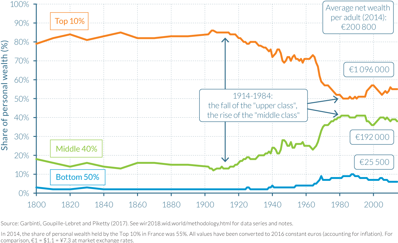
The top 10% wealth share started to fall following the 1914–1945 capital shocks. The First and Second World Wars caused huge losses in the aggregate wealth-income ratio—from around 700% to less than 200%—as significant stocks of total wealth were destroyed. This had a profound impact on wealth inequality in France. The share of total wealth held by the top 1% almost halved between the start of the First and the end of the Second World War, falling from around 55% to 30% to the benefit of the middle class.
The rise of the middle 40% during the 1914–1945 period is not due to the fact that the middle class accumulated a lot of wealth during this period: this simply corresponds to the fact they lost less wealth—in proportion to their initial wealth level-than the top 10%. In contrast, during the postwar decades, the rise of the middle class corresponds to a significant rise of their absolute wealth levels partly due to the rise of their savings rates during the high-growth period.
This fall in wealth inequality continued until the early 1980s, and fell to its lowest level recorded in 1983–1984. The share of total wealth held by the top 1% and the top 10–1% fluctuated during the mid-1940s to mid-1960s, between 30%–35% and around 35%–40%, respectively, while the middle 40% share of total wealth rose from around 20% to 25%. Top 1% shares dropped from around 33% in 1945 to just over 15% by 1984, while the middle 40%, rose from 25% to over 40%. (See Figure 4.4.1 and Figure 4.4.2.)
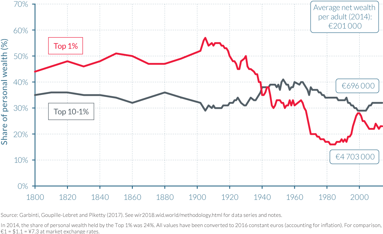
Wealth has increased moderately since 1984
Wealth inequality increased moderately since the early 1980s. In 1984, French wealth was the least concentrated it had been since data collection began at the beginning of the nineteenth century. But as the 1980s progressed, wealth inequality began to increase notably. The introduction of more laissez-faire economic policies, including the privatizations of large state-owned enterprises and the development of financial markets, that followed then President Mitterrand’s austerity turn in 1982–1983 (see Chapter 2.2 for more detail) saw the wealth share of the top 10% wealthiest French adults increase to around 53% by 1990 and 56% by 1995. This came at the expense of the wealth shares of the both the middle-class and the lower class, whose shares fell to around 49% and 6%, respectively, by the mid-1990s.
Wealth concentration then rose at a significant rate in the years of the dot-com boom. By 2000, the wealth share of the top 10% passed 60%, leaving the middle 40% with less than 35% and the bottom 50% with around 6%. The year 2000 did, however, appear to be somewhat of a turning point, illustrating the strong short-run fluctuations in wealth concentration experienced over the last three decades. The shares of the middle 40% then began to rise and those of the top 10% fall as stock prices crashed in the wake of the bursting of the dot-com bubble in 2000, and house prices increased at a solid rate. These relative movements in asset prices (discussed in more detail below) left the top 10% with approximately 56% of total wealth in 2005, the middle 40% with around 38% and the bottom 50% with the remaining 6%. The share of the bottom 50% thus remained unchanged during the first five years of the new millennium, despite the substantial changes for the other half of France’s adult population.
The following years leading up-to and following the global financial crisis of 2008–2009 had a rather muted impact on wealth inequality in France. The share of total wealth held by the top 10% increased to around 59% in 2010, while those of the middle 40% remained almost unaffected. It was the bottom 50% who suffered instead, seeing their share of total wealth fall to just 5%. The following two years show slight falls in the wealth share of the top 10% and a small increase for the bottom 50%, again changes in the shares of the middle 40% were negligible.
Differences in asset portfolios among wealth groups are key in determining wealth inequality dynamics over the recent period
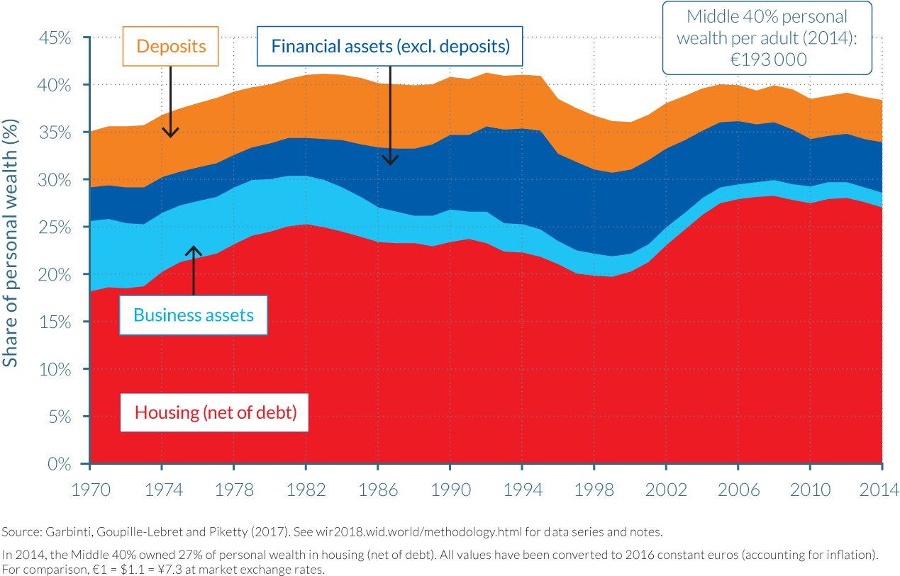
Before we move on to analyzing wealth inequality within asset categories, it is important to recall that the composition and level of aggregate wealth changed substantially in France over the 1970–2014 period, as depicted by Figure 4.4.3. Observing this figure, it is clear to see that the shares of housing assets and financial assets have increased substantially, while the share of business assets has declined markedly, the latter largely due to the fall in self-employment. Financial assets, other than deposits, increased strongly after the privatization of the late 1980s and the 1990s and reached a high point in 2000 as the stock market boomed in the run-up to the dot-com crash. In contrast, housing prices declined in the early 1990s, but then rose strongly during the 2000s, while stock prices were falling.
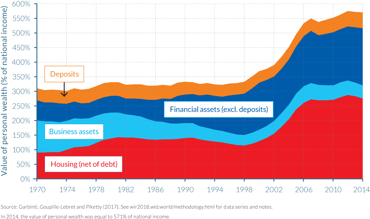
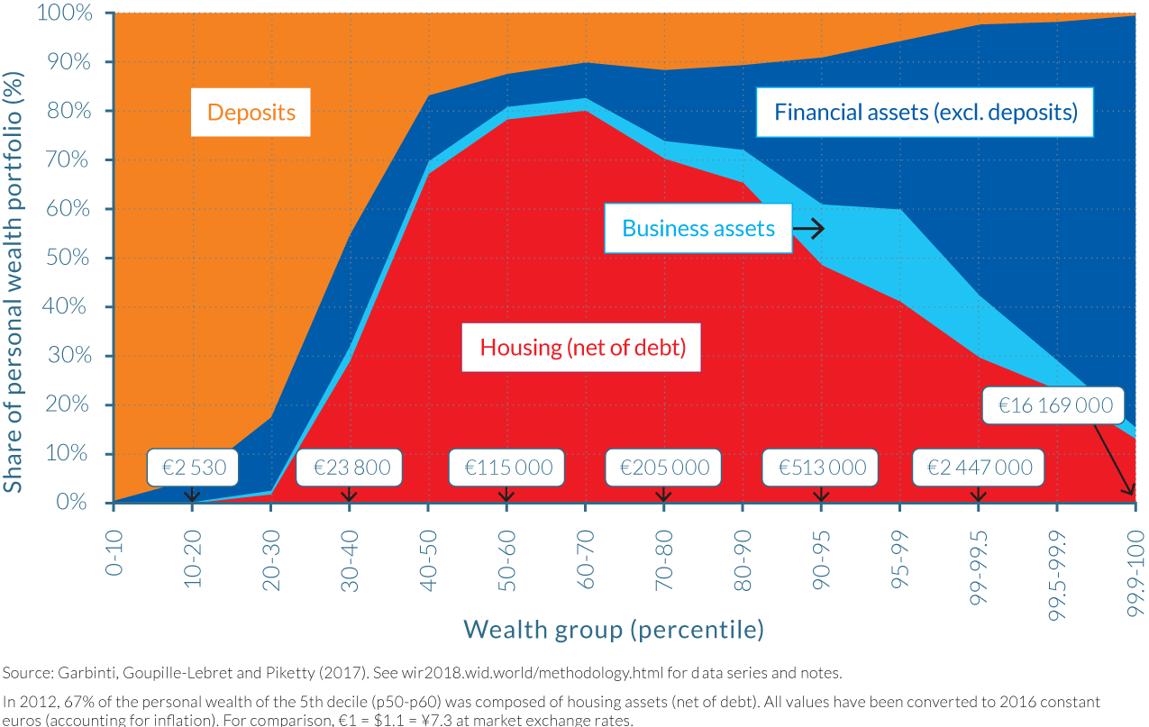
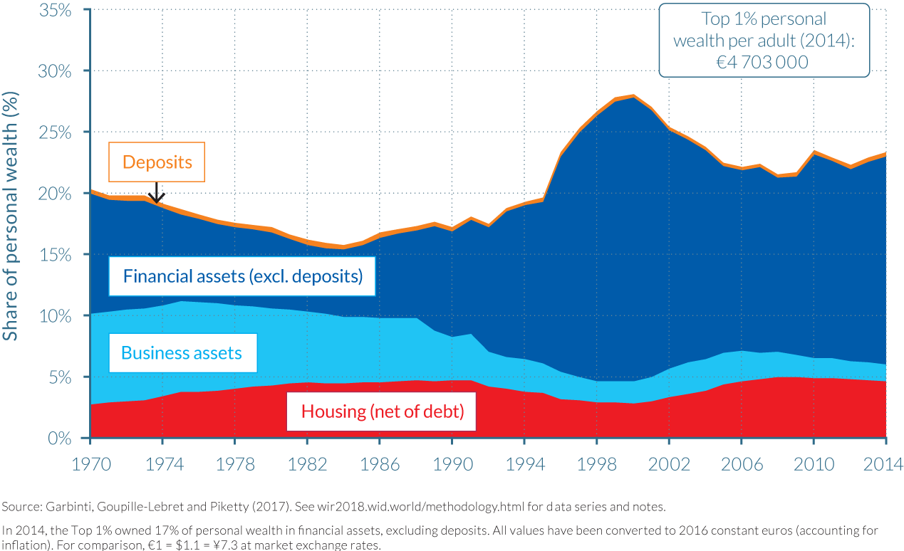
These contradictory movements in relative asset prices have an important impact on the evolution of wealth inequality in France, as different wealth groups own very different asset portfolios. As depicted by Figure 4.4.4, the bottom 30% of the distribution own mostly deposits in 2012, while housing assets are the main form of wealth for the middle of the distribution. However, as one move towards the top 10% and the top 1% of the distribution, financial assets—other than deposits—gradually become the dominant form of wealth, largely because of their large equity portfolios. These general patterns of asset portfolio construction remain relatively constant throughout the 1970–2014 period, except that business assets played a more important role during the 1970s and early 1980s, particularly among middle-high-wealth holders.
If one now decomposes the evolution of wealth shares going to the bottom 50%, middle 40%, top 10%, and top 1% by asset categories, the impact of asset price movements on inequality is significant. In particular, Figure 4.4.5, indicates the significant impact the stock market boom of the 2000s and its slide thereafter had on top wealth shares in particular. It also shows the effect of the general increase in housing prices on the wealth shares of the middle 40% during the 2000s, further discussed below.
Rising housing prices moderated wealth concentration since the 1980s
Changes to house prices played a notable role in reducing wealth inequality in France between 1970 and 2014. Similar to trends in a number of other rich nations, house prices in France increased at a faster pace than consumer price inflation (2.4% faster per year) and thus the total return to French adults owning property was significant, growing at an annual rate of over 6% during the observed period. However, this structural increase in house prices has been far from steady, rising particularly strongly between 2000 and 2008, and therefore generated large short-run, rather than long-run, fluctuations in wealth inequality.
The explanation for the short-term fluctuation in wealth concentration experienced as financial asset prices increased up to the beginning of the twenty-first century also follows the same line of reasoning. During the stock market boom, wealth inequality in France increased substantially due to the bias towards financial asset holdings amongst the wealthiest. However, the reasoning also follows that these increases in asset prices can be discounted as an explanation for the long-run increase in inequality over the period, alongside the changes in house prices.
Once variations in asset prices are corrected for, the data indicates that structural factors have caused a rise in the concentration of wealth between 1970 and 2014. The housing boom of the 2000s did, however, play an important role as a mitigating force to limit the rise of inequality, as the structural increase in the wealth shares of the top 10% and top 1% over the 1984–2014 period would have been substantially larger had housing prices not increased so fast during these years relative to other asset prices.
France is also a clear illustration of the fact that housing prices have an ambiguous and contradictory impact on inequality. They raised the market value of the wealth of the middle class—those who were able to access real estate—and thereby raised the wealth share of the middle 40% relative to the top 10%, whose asset portfolios are more diversified and contain relatively less real estate. But, rising housing prices also made it more difficult for people in the lower and working classes (the bottom 50%), and also members of the middle class with no family wealth, to access real estate.
Higher savings rates and returns on assets for the wealthy increased wealth concentration since the 1980s
In the long-run, it is the savings rates of groups and the long-run rate of return on the type of wealth (assets) that they hold that determine wealth concentration.12 In particular, if the savings rates and/or the rates of return of the top wealth groups are higher than the average, this can generate large multiplicative effects, and lead to very high wealth concentrations.
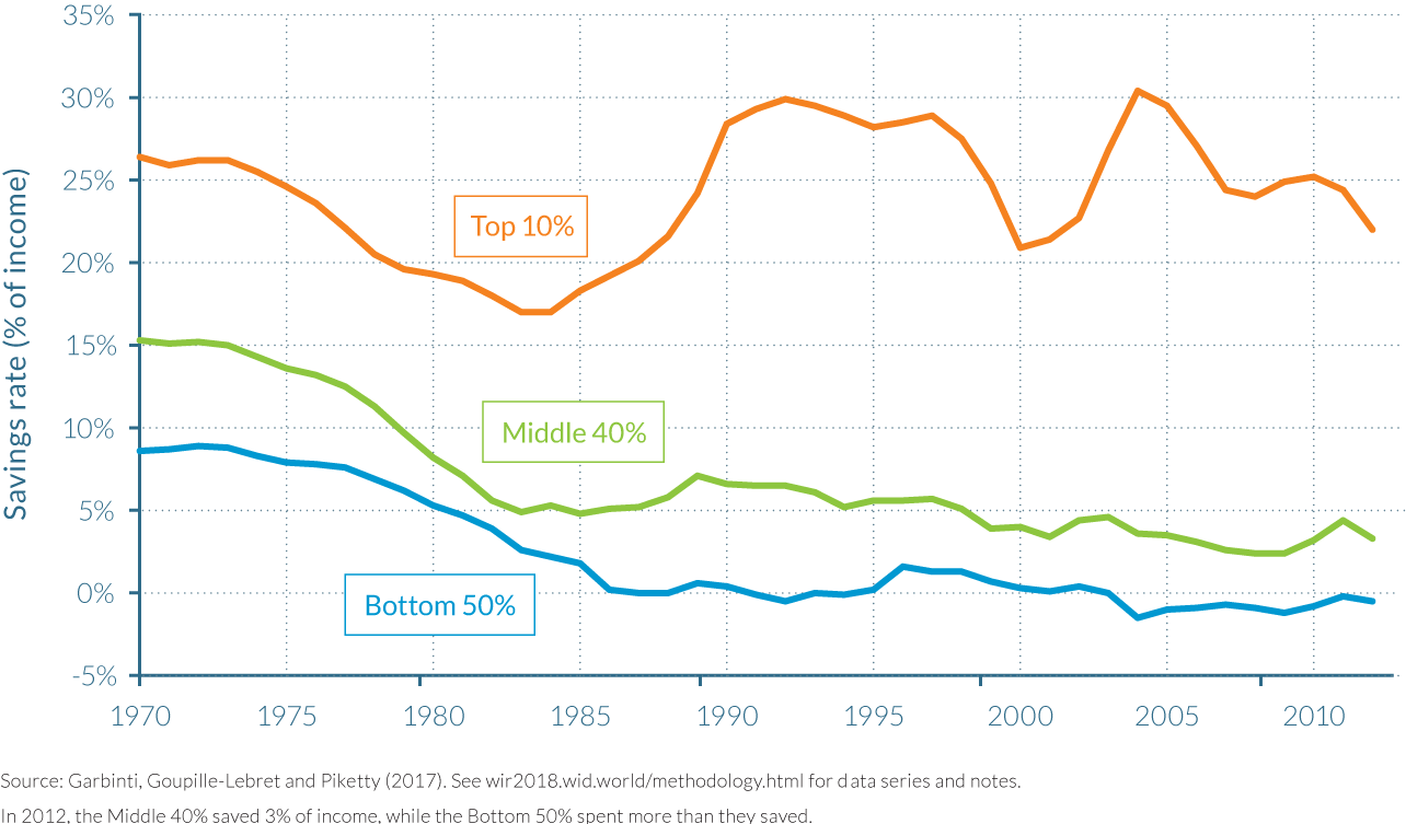
As illustrated by Figure 4.4.6, there were significant differences in savings rates between wealth groups in France between 1970 and 2012. While the top 10% of wealth holders generally saved between 20%–30% of their annual incomes over the observed period, this fraction was much smaller and fell notably over the period for the middle 40% and the bottom 50%, from 15% of annual income in 1970 to less than 5% by 2012, and from 8% to approximately 0%, respectively. Similar trends were found in the UK and the United States, reinforcing the assertion that savings rate differentials were the key structural force accounting for rising wealth concentration in many developed economies over this period.
Average rates of return on assets also vary significantly between different wealth groups over the 1970–2014 period. The notable inequalities in rates of return between higher and lower wealth groups is due to significant differences in their respective portfolio of assets, as indicated earlier in Figure 4.4.5. In particular, top wealth groups own more financial assets, particularly equities, which can have much higher rates of return than real estate assets or savings deposited in financial institutions. Indeed, the average annual return on financial assets such as equities, shares and bonds is over four-times greater than the returns on housing assets, though this difference falls to a more modest 50% when including real capital gains.13
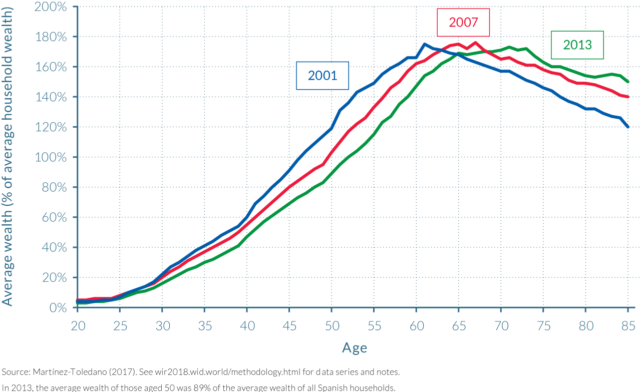
The elderly hold the keys to French wealth
How did wealth inequality evolve across age groups over the recent period? Looking first at the age-wealth profile, it is evident that the average wealth owned by those aged 20 has consistently been very limited at less than 15% of average adult wealth throughout the series history. Wealth then rises sharply with age, peaking between 55–65 years old at 150–170% of average adult wealth depending on which era is examined. Thereafter, wealth slightly declines, but remains at very high levels, around 125%–150% of from age 60 to age 80, as illustrated by Figure 4.4.7.
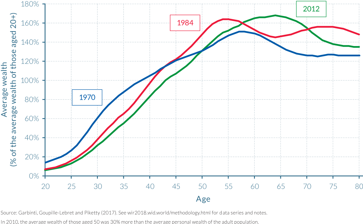
These age-wealth profile slightly evolved over the past fourty years, as wealthiest individuals grew older. In 2010, wealth is accumulated notably later in life than in 1995 and 1970, with wealth peaking at age 65, seven to ten years later than in 1970 and 1995. Note also that old-age individuals make very substantial inter vivos gifts in France, so that average wealth at high ages would be even higher without these gifts, particularly at the end of the period. Gifts are made on average about 10 years before death, and the aggregate gift flow has increased from about 20%–30% of the aggregate bequest flow in the 1970s to as much as 80% of the aggregate bequest flow in the 2000s–2010s.14
Habit formation, income inequality dynamics and tax evolutions are likely to drive the inequality of saving rates
While it is not possible to fully explain why saving rates and rates of return change in the way that they do, it is possible to identify key factors that were at play since the early twentieth century. Between 1914 and 1945, one can imagine that the saving rates of the top wealth groups were severely affected by the capital and fiscal shocks of the 1914–1945 period. In particular, there was no progressive taxation prior to 1914, and in the interwar period, effective tax rates for top income and wealth groups quickly reached very substantial levels, for example 20%–40%, and sometimes even more.15 In the likely scenario that top wealth holders reacted by reducing their consumption levels and living standards less than the increase in tax (which came in addition to a negative shock to their pre-tax capital incomes), then in effect, they had to reduce their saving rate.
After 1945, those at the bottom and in the middle of the wealth distribution saved at higher rates than before, during the high-growth postwar decades due to some form of “habit formation” effect whereby individuals were prudent with their consumption and saved earnings in case of shocks or crises.16 It is also possible that rising top income shares in recent decades, together with growth slowdown for bottom and middle groups, has contributed to rising inequality in saving rates, and this has been exacerbated by some form of relative consumption effect (see Chapter 2.5) , whereby the bottom 90% is consuming a greater proportion of their income than the top 10% leaving little savings for investment in assets. This is particularly the case for the bottom 50%.
It is clear that changes in the tax system, and in particular in tax progressivity, as seen post World War II and during the 1960s, can have very large impacts on both the inequality of saving rates between groups and on the inequality of rates of return, and therefore on wealth inequality in the long-run. The inequality of rates of return can also be influenced by many other factors, including financial regulation and deregulation seen after the great depression and the reduction in capital controls in the mid- to late-1980s, as well as the introduction and end of rent controls.
Wealth concentration could return to Gilded Age level by 2100
The savings rates and rates of return per wealth group can be used to estimate each groups’ share of total wealth in the coming decades. Assuming the same inequality of saving rates that were observed over the 1984–2014 period—namely 24.5% for the top 10% and 2.5% for the bottom 90%—will persist, together with the same inequality of rates of return and the same inequality of labor income, the share of total wealth owned by the top 10% will gradually increase to the levels that were observed in the nineteenth and early twentieth centuries, that is, approximately 85% of total wealth. If, however, the 1970–1984 trends had persisted after 1984 and continued during the upcoming decades, the top 10% would have experienced a decline in their share of total wealth. Using the same average savings rates, the same inequality of rates of return and the same inequality of labor income as during 1970–1984, the top 10% would have owned slightly more than 45% of total wealth today and this figure would further decrease throughout the 21st Century. (See Figure 4.4.8.)
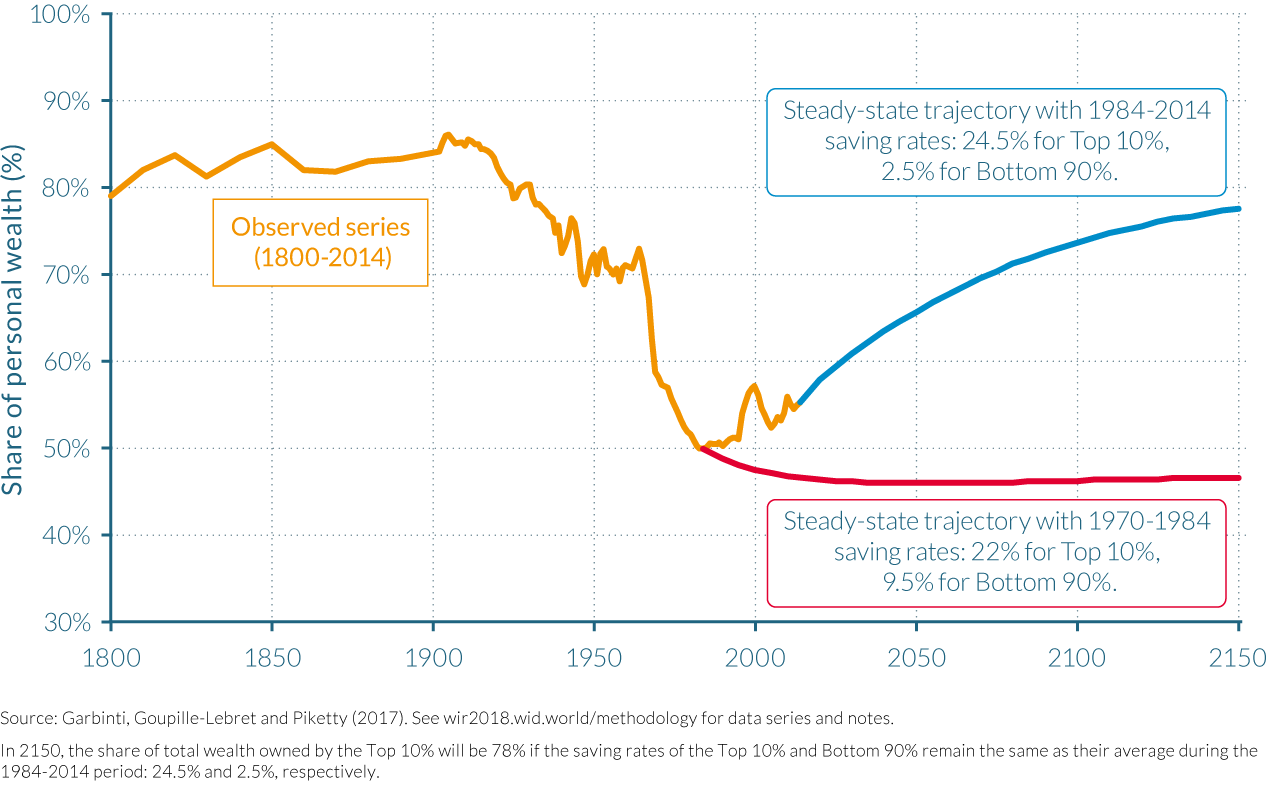
There are two main messages from these relatively simple simulations. Firstly, moderately small evolutions in the inequality of saving rates or rates of return, for example, can have enormous impacts on steady-state wealth inequality. Secondly, these effects can take decades and even generations before they fully materialize. This delayed-impact can explain why declining wealth concentration continued long after the capital shocks of the 1914–1945 period. Once some structural parameters have changed, it takes many decades to reach a new steady-state.
4.5 Wealth inequality in Spain
Information in this chapter is based on “Housing Bubbles, Offshore Assets and Wealth Inequality in Spain (1984–2013),” by Clara Martínez-Toledano, 2017. WID.world Working Paper Series (No. 2017/19).
- The Spanish housing and stock market booms of the last 30 years have seen the country’s personal wealth to national income ratio almost double from around 380% in 1984 to 730% in 2007, before falling to just under 650% by 2014.
- With an average wealth of almost €813 000 per adult, the top 10% owned almost 57% of Spain’s personal wealth in 2013. The share of the bottom 50% was 7%, with an average wealth of just over €18 900. The relative shares of personal wealth remained virtually unchanged during the last thirty years.
- The ability of the wealthy to adapt and diversify their asset portfolio depending on which assets were experiencing the most growth has enabled them to benefit from the Spanish housing boom and shelter somewhat from the impact of its crash.
- Approximately €146 billion was held by Spanish citizens in offshore wealth in 2012, increasing the concentration of wealth considerably.
Spain has experienced an unprecedented increase in aggregate wealth over the past thirty years, predominantly due to the housing the country experienced over the last 30 years. Much has been written about this economic phenomenon, when house prices tripled between 1985 and 1991 and tripled again between 1996 and 2008,17 and the value of the stock market increased sevenfold before halving, but much less so on its distributional effects. In particular, there has been little research into which groups have benefited from this increase in wealth, how much each of these groups have benefited, how differences in wealth between groups have changed over time, whether the importance of asset categories has altered, and which factors are the source of the aforementioned changes?
Using high-quality, publicly available data, Martínez-Toledano’s recent paper18 seeks to answer these questions. The author combines tax records, national accounts and wealth surveys, as well as the capitalization method19 that is used by Saez and Zucman for the United States,20 to deliver a consistent, unified wealth distribution series for Spain between 1984 and 2013, with detailed breakdowns by age over the period 1999–2013.
The rising value of housing has fueled the growth of Spanish wealth
The Spanish personal wealth to national income ratio almost doubled between 1984 and 2014. As illustrated by Figure 4.5.1 personal wealth amounted to around 380% in the late eighties and grew to around 470% in the mid-nineties. From 1995 onwards, personal wealth started to increase more rapidly, reaching its peak at 728% of national income in 2007, before the global financial crisis. After the bubble burst in 2008, personal wealth dropped notably and continued to decrease thereafter. In 2014, the Personal Wealth to National Income ratio amounted to 646%, a level similar to the Personal Wealth to National Income ratio of years 2004 and 2005, but much higher than the ratios of the eighties and nineties, as illustrated by Figure 4.5.1.
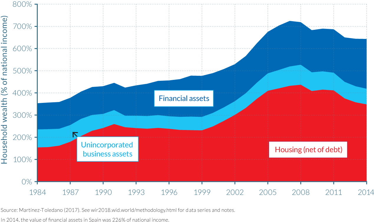
Figure 4.5.1 also shows how the components of total net Spanish wealth have evolved over the 30-year period. The late eighties saw growth in net housing that was more than double the speed of the increase in financial assets, but this trend was reversed during the nineties as financial assets started to be accumulated at a faster pace than property, due mainly to the rise in stock prices that arose from the dot-com bubble. However, after the stock market crash of 2000, housing prices increased at a pace that surpassed even the significant growth of financial assets. The value of housing then reached its peak in 2008, after which the sizeable housing bubble that had been built up burst and the fall in housing wealth was larger than that of financial assets.
This period was also characterized by the increasing importance of net housing in the asset portfolios of households. While properties are the most important asset held by the average Spanish household between 1984 and 2014, always representing more than 40% of total household net wealth, the composition of personal wealth has not evolved homogeneously. Indeed, personal wealth has lost importance in periods when financial assets significantly increase, such as the one that preceded the dot-com bubble. The increase in the fraction of property in the total portfolio of households has also been exacerbated by the steady decrease in the fraction of unincorporated business assets, which fell from 23% in 1984 to 11% in 2014, due mainly to the relative reduction in the importance of agriculture within the Spanish economy.
The top 10% has owned more than half of Spain’s personal wealth since the mid-1980s
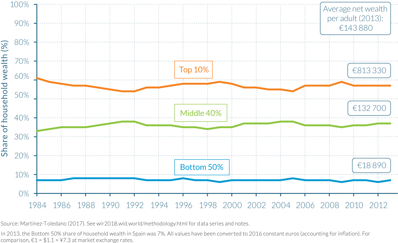
Table 4.5.1, displays the wealth level, threshold and shares of personal wealth for Spanish adults in 2013. On average, the net wealth per adult in Spain was approximately €144 000. However, the average wealth within the bottom 50% of the distribution was just 13% of the countrywide average, at €18 900. Cumulatively, the share of personal wealth held by the top 50% was less than 7%. Average wealth within the next 40% of the distribution was slightly over €133 000, giving the group a 37% share of personal wealth, not largely dissimilar to their population share. This left the top 10% holding over 56% of Spanish personal wealth, with an average wealth of approximately €813 000, over five-and-a-half times greater than the national average wealth and 43 times greater than the average wealth of 50% of the Spanish adult population.

The drastic differences in the shares of personal wealth reported in 2013, have remained largely unchanged throughout the preceding 29-year period. As Figure 4.5.2 shows below, the share of personal wealth held by each group has remained within a band of eight percentage points. The share of personal wealth attributable to the bottom 50% has always been very small, reaching a peak of 9% in 1992, but fell back to just over 6% in 2013, roughly equal to its level at the start of the period. The personal wealth share of the middle 40% has concentrated between 32% and 39% of total net wealth, remaining over 35% for the majority of the observed period, while the share of the top 10% has fluctuated between 53% and 61%. Notably, the top 10% wealth share dropped from the mid-eighties until the beginning of the 1990s, at the expense of the increased shares of both the middle 40% and the bottom 50% of the distribution, as house prices rose threefold across Spain. The top 10% wealth share then increased during the nineties, as the stock market grew strongly, before decreasing until the mid-2000s and increasing again until the start of the global financial crisis and burst of the housing bubble in 2008. Since then, the share of the top 10% decreased, before stabilizing at a similar level to that during the mid-nineties.
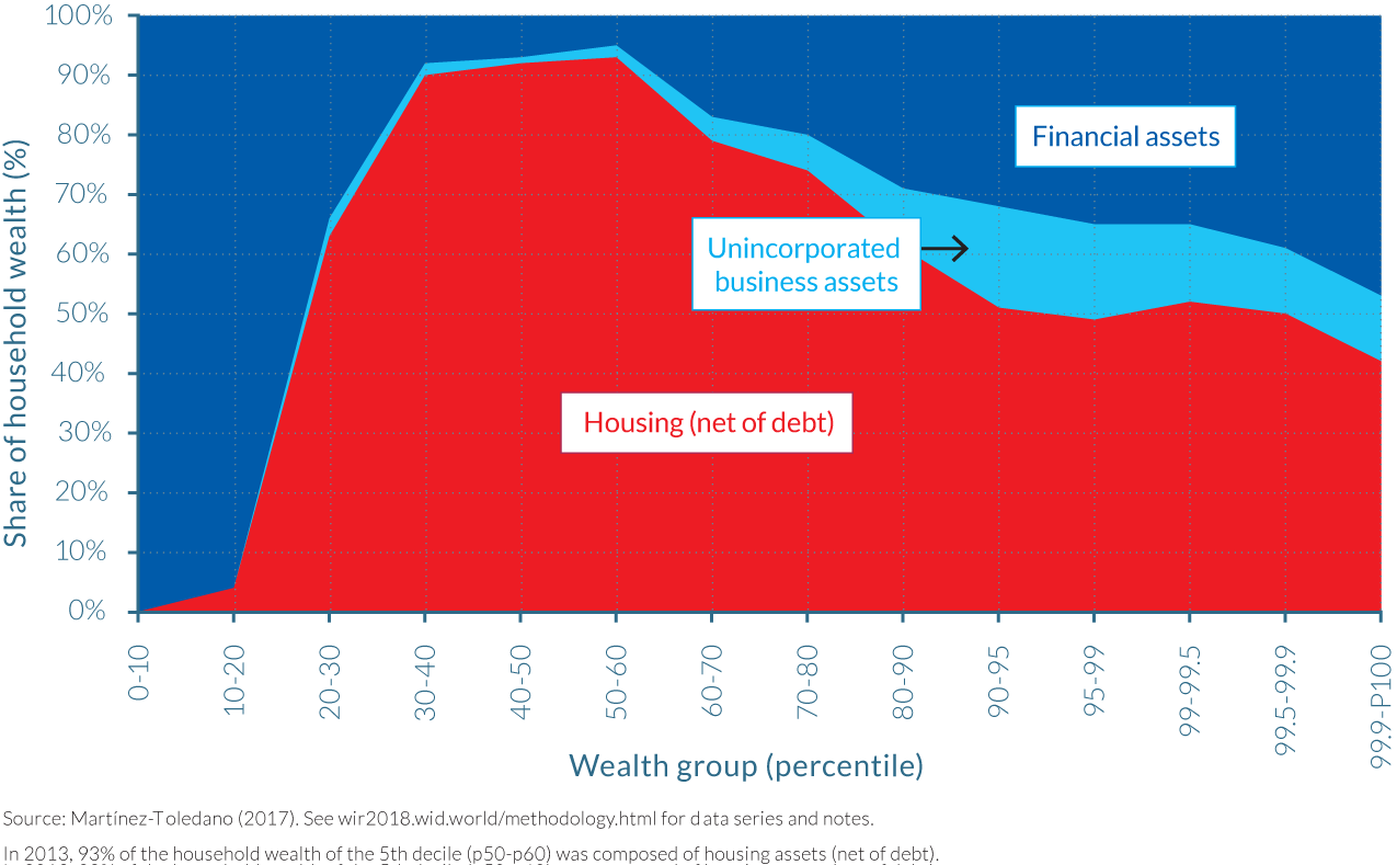
While the changes in relative assets prices have had a rather limited impact on overall wealth inequality in Spain, there are important differences in the portfolio of assets owned by different wealth groups. As shown by Figure 4.5.3, in 2013, the bottom 20% of the Spanish wealth distribution mostly owned financial assets, which largely came in the form of savings and current deposits in banks. As one move towards the center of the wealth distribution, property becomes the most dominant form of wealth (approximately 90% between the 30th and 60th percentiles). Thereafter, the dominance of financial assets within wealth portfolios grows larger as the individuals analyzed become wealthier. However, unlike the bottom 50%, bank deposits form only a minor part of financial assets for the top 10% and the top 1% of the distribution. Instead, the wealthiest Spanish adults own a combination of equities, investment funds, fixed income assets such as bonds, currency, life insurance reserves and pension funds. The same general pattern of asset composition by wealth group also applies for the period between 1984 and 2012, as can be seen in Figures 4.5.4 and 4.5.5. The only notable difference has been the falling importance of unincorporated assets over the 28-year period, which can mainly be attributed to the reduction in agricultural activity among the self-employed.
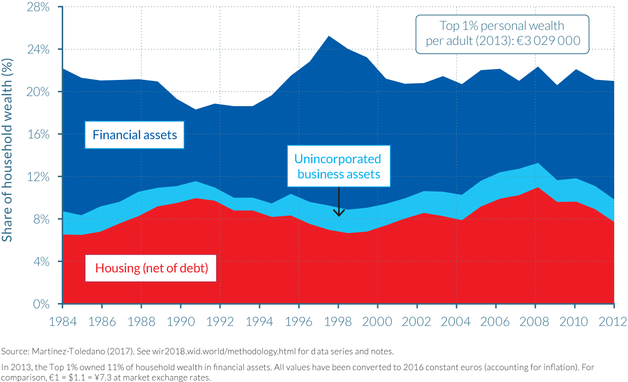
By decomposing the evolution of wealth in Spain by asset categories and by wealth group, it is possible to see how asset price movements between 1984 and 2013 affected their respective asset portfolios and shares of personal wealth. The figures within Figure 4.5.4 clearly show how the impact of the stock market boom of 2000 and the burst of the housing bubble in 2007 affected portfolios and shares of the top 1%. Reviewing the trend in the financial assets component of the wealth of the top 1%, there is an obvious spike in the value of financial assets and its dominance in their portfolio in 1999, the year preceding the dot-com crisis.
One particularity of the Spanish case relative to other rich nations is the importance of housing assets in the portfolio of households, even at the top of the distribution. This has been the case during the whole of the 29-year period analyzed, but this trend became even more striking in the years up to 2007, when the increase in the value of dwellings was largest. In Spain, the top 10% and top 1% of the wealth distribution own 26% and 8% of total net wealth in housing, respectively, whereas in France these figures are 19% and 5%, respectively.21
Increasingly greater sums of wealth are being passed on to the offspring of the wealthy
The detailed micro-files available in Spain from 1999 also allow Martínez-Toledano to analyze how wealth varies between different age groups, and how this has changed over time. As Figure 4.5.5 shows, average wealth has been consistently very small for those aged 20 during the 14-year period studied, at less than 10% of total wealth. Wealth exhibits a rising trend with age. At age 40, individuals own approximately 50% of average wealth whereas at age 60, they own more than 150% of average wealth. After 60, the average adult wealth declines moderately but never falling below 120%. As average wealth does not decline sharply after age 60 and remains at a level that is notably above average wealth, old-age individuals thus pass away with substantial wealth and transmit this to their offspring.
There are, however, important differences in relative wealth levels across age groups over the 1999–2013 period. Old individuals (+60) are better off and the young (20–39) worse off after the economic crisis, since the average wealth for the old relative to total average wealth is larger in 2013 than in 2001. This is consistent with the large increase in youth unemployment22 after the burst of the bubble and at the same time the stability in Social Security pension payments. When decomposing the wealth distribution series by age, it appears that wealth inequality is more pronounced for the young (20–39) than for the old (+60) and middle-old (40–59), for which wealth inequality is almost as large than for the population taken as a whole. A plausible explanation is the importance of bequests that transfer the wealth of the older generations to the younger generation. Higher transfer rates among wealthy families, combined with high youth unemployment rates and consequently a low wealth accumulation through labor income savings by the young (which would moderate wealth inequality), can explain higher inequality levels among the young than among the elderly.
The Spanish property bubble had a neutral effect on wealth inequality
The high level of disaggregation in Martínez-Toledano’s wealth distribution series also helps to explain why Spain’s housing bubble had a curiously neutral effect on the level of wealth inequality in the country. In Spain, as in many European countries, the increased ownership of property among the bottom 90%, and the significant share that housing represents in their asset portfolios, has contributed to reducing wealth inequality. Figure 4.5.6 illustrates that wealth concentration for the top 1% is approximately 10 percentage points lower between 1984 and 2013 when housing wealth is included. But moreover, the figure also shows that wealth inequality including and excluding housing followed a similar trend post 2000, confirming that the housing boom and bust had little impact on wealth inequality.
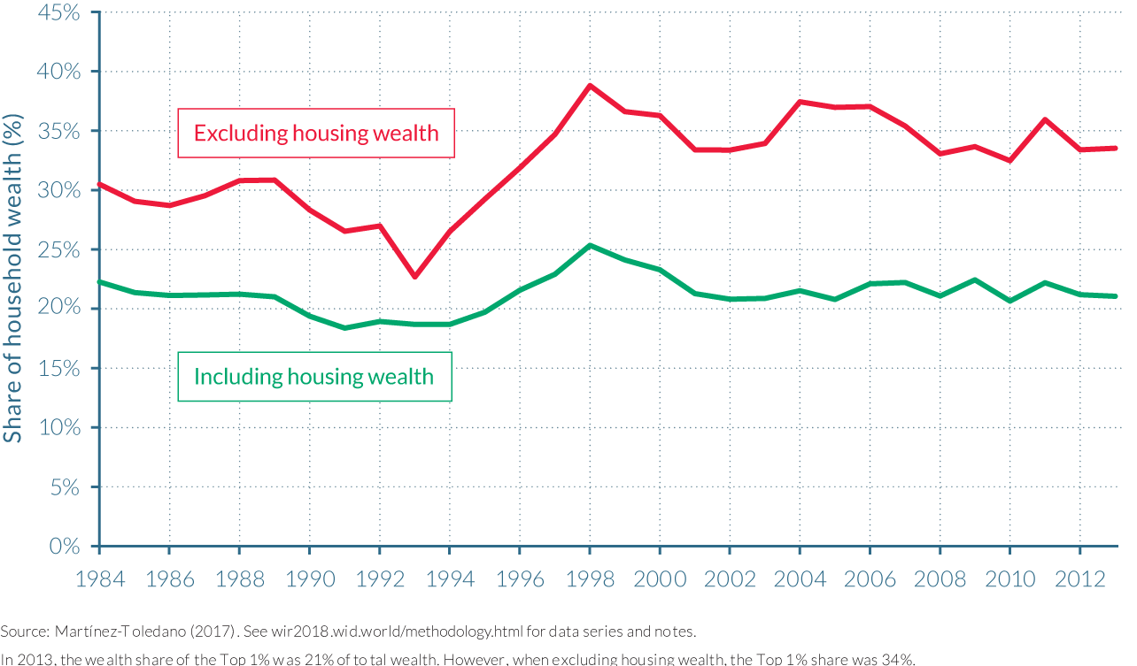
In order to understand this puzzling result, it is important to see how the composition of net housing wealth has changed over time. The fraction of total net housing owned by the top 1% increased considerably between 2005 and 2009, the years in which housing prices skyrocketed, at the expense of the proportion of homes owned by the middle 40%. This increased concentration of home ownership was principally the result of the increase in the number of secondary properties bought by the top 1%, relative to the middle 40%, and not due to relatively larger increases in the price of properties owned by the wealthiest. The ratio of the house prices of the top 10% (and top 1%) to the value of dwellings of the middle 40% remained constant between 2005 and 2009.
But if housing concentration increased at the top during the bubble and decreased thereafter, why has total wealth concentration remained virtually unchanged? One plausible explanation is that individuals within the top 1% substituted financial assets for property during the period of the housing boom, but then accumulated greater financial assets when house prices began to fall. The fraction of total financial assets held by the top 1% decreased during the boom years. This is consistent with the idea that wealthy individuals can better diversify their portfolios, and have the capabilities to invest more in risky assets, when prices are increasing—and can more easily disinvest when prices fall, to then acquire other assets.
Disparities in savings rates and returns on assets drive long-run wealth inequality
In order to understand the underlying forces driving wealth inequality dynamics in Spain, it is useful to analyse how income, savings rates and the rate of inequality have evolved between 1999 and 2012.
There are significant differences in the savings rates between wealth groups in Spain and these have changed over time, as illustrated by Figure 4.5.7a-c. These disparities reflect the high levels of wealth concentration observed in Spain, with an average savings rate of 27% of income for the top 10% over this period, compared to 10% among the middle 40% and just 1% for the bottom 50%.
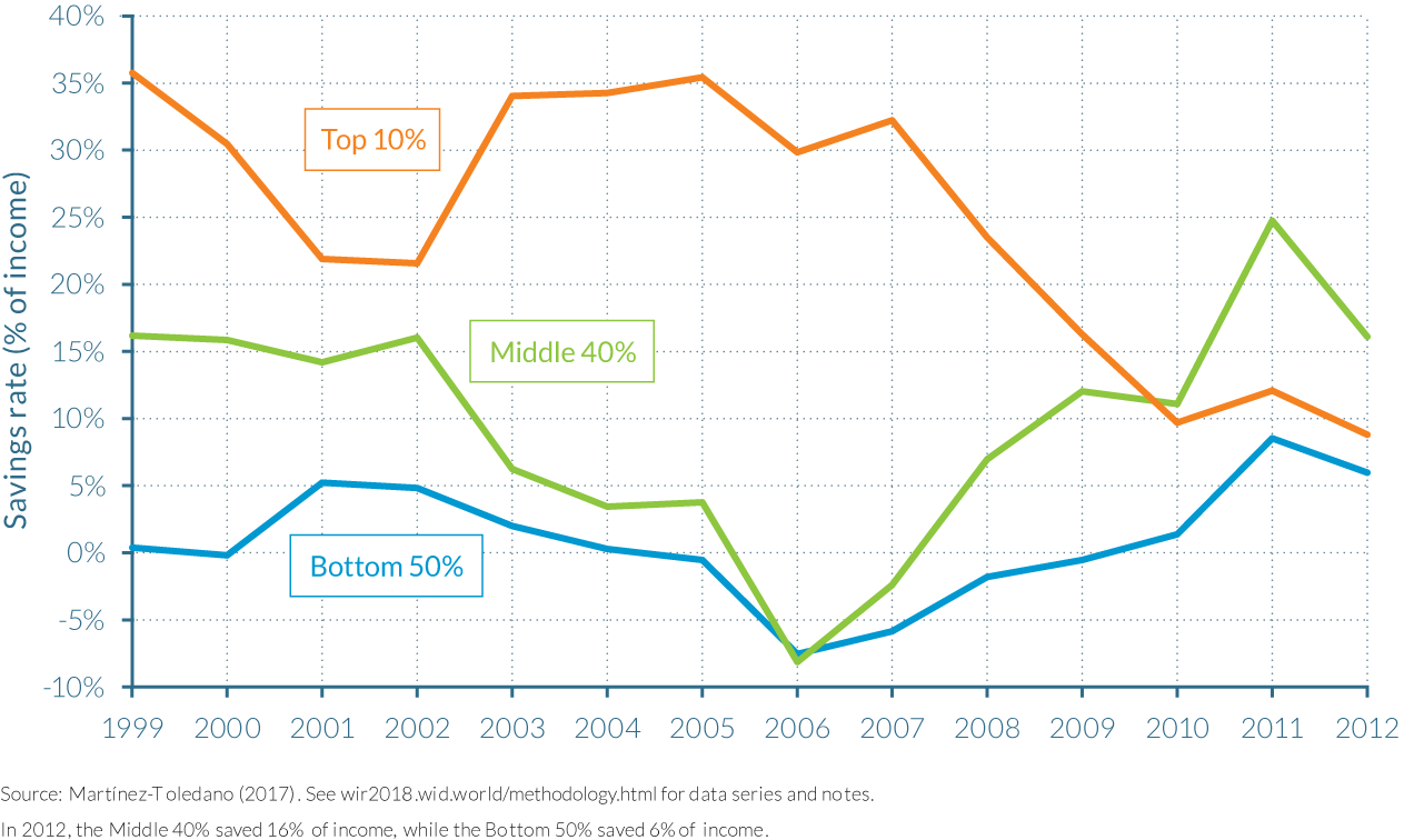
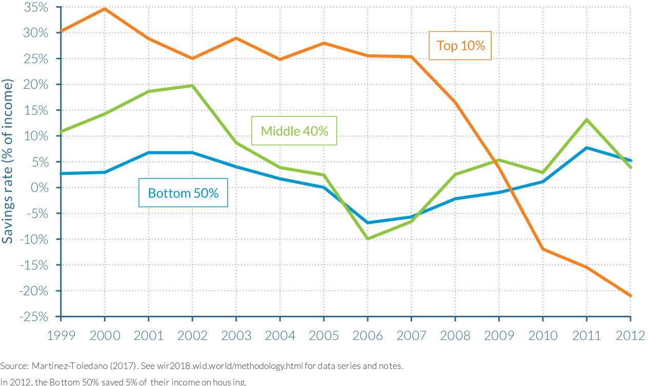
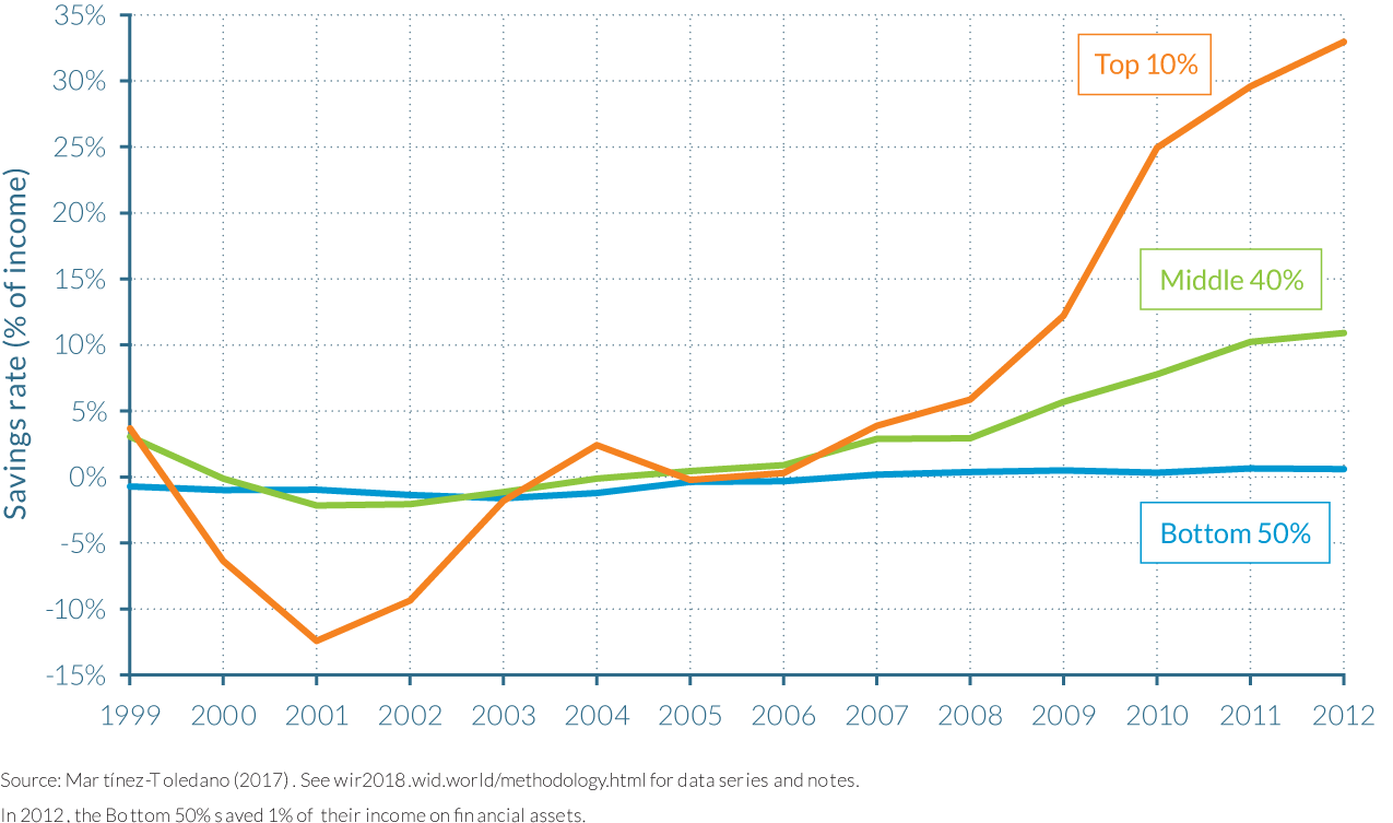
Analyzing the evolution of savings rates more closely reveals one important point. The housing bubble increased the difference in saving rates between the wealthy and the less-wealthy during the boom years and reduced their stratification during the bust period. Figure 4.5.7a shows that during the years prior to the property bubble bursting, the savings rate of the top 10% remained high as they accumulated more housing, while the savings rate for the middle 40% and the bottom 50% decreased, as their accumulation of housing assets was facilitated through borrowing. After the property bubble burst, the top 10% sold some of their housing assets and started to accumulate more financial assets to compensate for the decrease in housing prices. Nonetheless, the total savings rate for the top 10% decreased during these years, likely because they needed to consume a larger fraction of their income. The middle 40% instead started to save more in order to repay their housing mortgages, and therefore the difference in saving rates across the two wealth groups was reduced. These two trends thus contributed to neutralizing wealth concentration during Spain’s tumultuous period of housing price swings.
Wealth inequality has also been amplified by the variance in the rates of return on assets owned by different wealth groups in Spain over the 1986–2012 period.23 This finding is consistent with the large differences in the asset portfolios of Spanish wealth groups documented earlier in the chapter (Figure 4.5.1), whereby top wealth groups are more likely to own financial assets such as equity that often have higher rates of return than other assets, including deposits and housing.
Factoring in offshore wealth into the Spanish wealth distribution reveals a higher level of inequality
As is common in many other countries, official financial data in Spain fails to capture a large part of the wealth held by households abroad. Research has shown that Spanish citizens use offshore financial institutions in tax havens for their portfolios of equities, bonds, and mutual fund shares. It is estimated by Zucman24 that these assets amounted to approximately €80 billion in 2012—the equivalent of 9% of households’ net financial wealth in Spain—of which three-quarters goes unrecorded. Thus, by omitting offshore wealth from the Spanish wealth distribution series, both total assets and wealth concentration are substantially underestimated.
Using data series from the Swiss National Bank, offshore wealth taxation forms and the 2012 tax amnesty, Martínez-Toledano is able to adjust her wealth distribution series for offshore assets. As illustrated by Figure 4.5.8, the value of offshore assets increased rapidly during the eighties, nineties and at the beginning of the 2000s, before stabilizing after 2007, when Spanish tax authorities became stricter with tax avoidance and evasion schemes. Unreported offshore wealth amounted to almost €150 billion in 2012, representing 8.6% of personal financial wealth. Investment funds represented 50% of total unreported offshore assets in 2012, followed by stocks, 30%, and deposits and life insurance, which made up 18% and 2%, respectively.
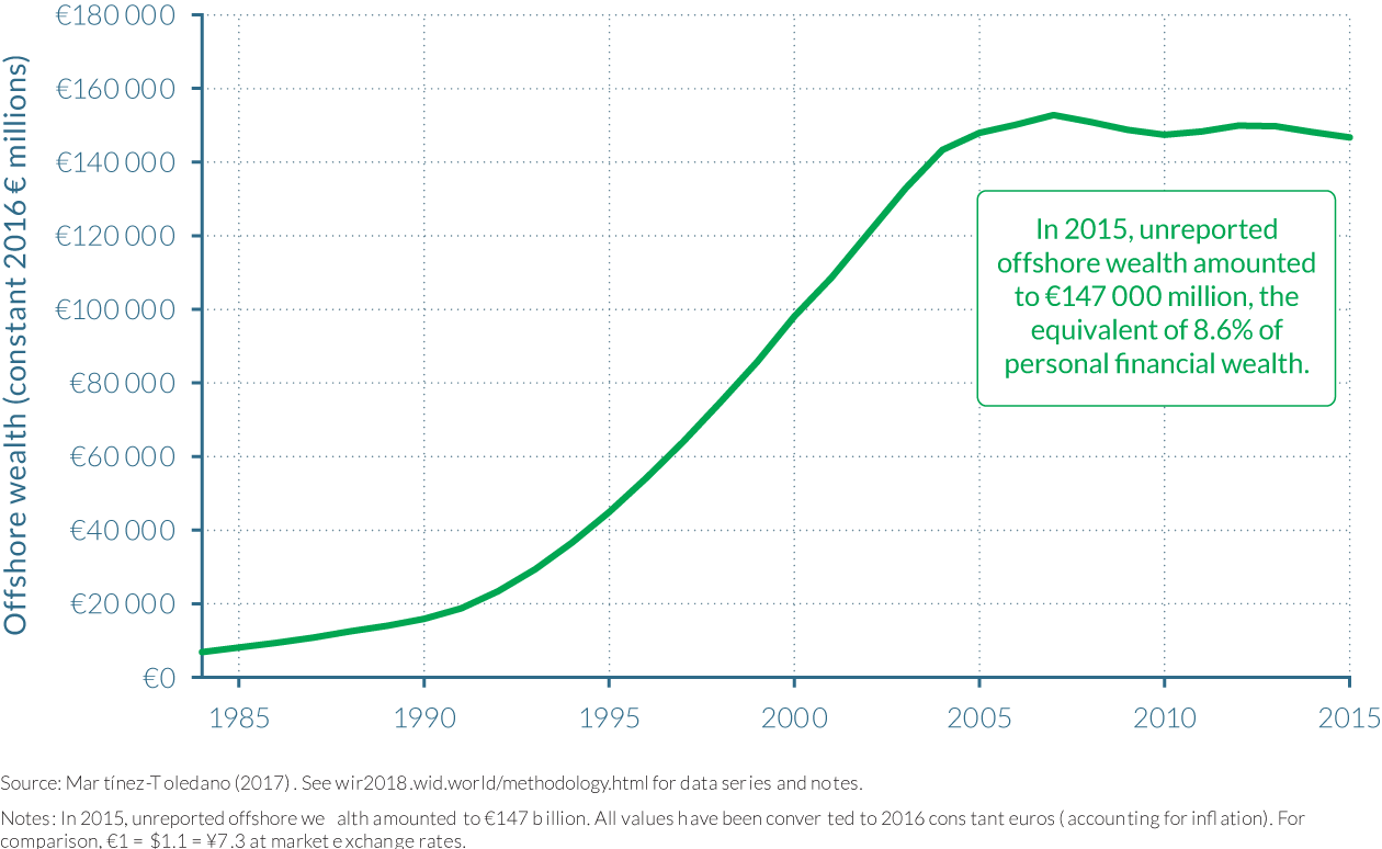
The Spanish wealth distribution series is then corrected by assigning the annual estimate of unreported offshore wealth proportionally to the wealthiest 1%. This is consistent with official documentation from the Spanish Tax Agency that states that the majority of foreign assets reported by Spanish residents are held by the top wealth holders and that these assets represented 12% and 31% of the total wealth tax base in 2007 and 2015, respectively. When offshore wealth is included in the wealth distribution, wealth concentration rises considerably, across the period between 1984 and 2013. Including offshore wealth shows that the concentration of wealth was in fact larger during the 2000s than in the eighties, contrary to what it is observed when these offshore assets are not taken into account. The wealth share of the top 1% averages approximately 24% from 2000–2013, notably larger than the 21% estimated when offshore wealth is disregarded.25 This difference is quite remarkable, particularly given that during this period of time the country experienced a housing boom and both nonfinancial and financial assets held in Spain grew considerably as discussed earlier in this chapter.
4.6 Wealth inequality in the UK
Information in this chapter is based on “Top Wealth Shares in the UK over more than a Century,” by Facundo Alvaredo, Anthony Atkinson, and Salvatore Morelli, 2017. WID.world Working Paper Series (No. 2017/2).
- UK wealth inequality has shown a moderate increase since the 1980s, with the share of total wealth owned by the top 1% (almost half million individuals) rising from 15% in 1984 to 20–22% by 2013.
- The increase in wealth concentration in the last four decades is very much a phenomenon confined to the top 0.5 per cent, and, in particular, to the top 0.1 per cent (the richest 50 000 Britons), whose share of total wealth doubled from 4.5 to 9% between 1984 and 2013.
- Today’s wealth inequality remains, however, notably lower than a century ago. In the wake of the first globalization era in 1914, the share of personal wealth going to the wealthiest 1% of UK individuals was around 70%, but their share began to fall thereafter. This encompassed two world wars, and much attention has been paid to the loss of capital during the periods 1914 to 1918 and 1939 to 1945. Top shares certainly fell in the UK during the war years, but these only accounted for a part of the large reduction that took place over the period as a whole. The large decline in top wealth shares in the UK in the twentieth century was very much a peacetime phenomenon.
- The substantial rise in owner-occupation during the twentieth century, additionally fostered by the sale of public housing, aided the reduction in wealth inequality to historically low levels in the 1980s, as the wealth share of the top 1% fell to 15%. But in the 1990s there was a change, with the return of private landlords as a result of the “buy to let.”
- The concentration of non-housing wealth (financial and business assets) increased substantially between 1995 and 2013. At the same time, the increase in total wealth inequality has been smaller. It appears that housing wealth has moderated a definite tendency for there to be a rise in recent years in top wealth shares in financial wealth. When people talk about rising wealth concentration in the UK, then it is probably the latter that they have in mind
Wealth concentration in the UK underwent enormous transformation during the twentieth century
The evidence in the UK covers an extensive period, starting in the “Gilded Age” before the First World War. The long-run series since 1895 highlight the enormous transformation that has taken place in the distribution of wealth within the UK over more than a century.26 Before the First World War, the top 5 per cent of wealth holders owned around 90 per cent of total personal wealth. There were very few owner-occupiers. A hundred years later, the share was around 40 per cent. The top 1 per cent used to own two-thirds of total wealth; their share is around one fifth today, when two thirds of households own a house.
Figure 4.6.1 shows the upper tail of the wealth distribution from 1895 to 2013. The changes in top shares can be summarized in terms of three periods. The first of these is the twenty-year period leading up to the First World War: in the wake of the first modern globalization, the share of personal wealth going to the wealthiest 1 per cent of UK individuals remained relatively stable at around 70 per cent. The second period covers more than half of the twentieth century: the share began to fall after 1914 and the decline continued until around 1980. This encompassed two world wars, and much attention has been paid to the loss of capital during the periods 1914 to 1918 and 1939 to 1945. Although UK top wealth shares certainly fell during the war years, most of the reduction was very much a peace phenomenon. By 1980, the share of the richest 1 per cent had decreased to some 17 per cent. This is still 17 times their proportionate share, but represents a dramatic reduction. The fall, however, came to an end in the mid 1980s, marking the beginning of the third period. Since the early 1980s the share of the top 1 per cent—representing approximately half a million individuals today—has moved in the opposite direction, rising from 15% in 1984 to 20–22% by 2013.
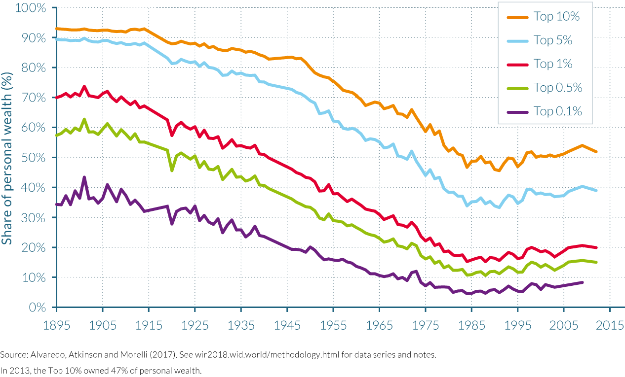
Wealth inequality has increased in the UK since the 1980s, and is by no means insignificant
With the 1980s, the downward trend in top shares came to an abrupt stop and went into reverse. The inequality of wealth has moderately increased over the past four decades. In the early 1980s, when wealth inequality was at historical lows, the top 10% richest owned 46% of total wealth, and the top 1% share was 15%. Since then, the concentration of wealth rose mainly at the very top of the distribution. The top 10% richest individuals in the UK owned more than half of total wealth in 2013. A fifth of total wealth accrued to the top 1% individuals. The lower half of the top 1% (those between the 99th and the 99.5th percentiles) saw a relative stability in their share of total wealth, whereas the upper half saw an increase between 1985 and 2013. Indeed, most of the rise in the share of the top 1% is due to the top 0.5%, and mainly to the top 0.1%—whose share of total wealth doubled from 4.5 to 9% over the period. Consequently, the increase in the concentration of wealth in the last four decades is very much a phenomenon confined to the hands of the top 0.5 per cent (the richest 250 000 Britons), and in particular, of the top 0.1 per cent (the richest 50 000).
By 2013, the average wealth of British adults was approximately €173 000 (£141 000) in constant 2016 market values, but as can be seen in Figure 4.6.2, this wealth was far from equally distributed. The average wealth of the bottom 90% of the population was approximately a third of this nationwide average at just €83 200 (£68 000), suggesting that a significant proportion of the bottom 50% of the distribution have negligible wealth. The gap with the average wealth of the top 10–5%, 5–1%, top 1–0.5% and top 0.5% is then huge: their average wealth goes from €393 000 (£321 000) to €723 000 (£591 000), respectively, and further still from €1.48 million (£1.21 million) to €4.54 million (£3.71 million), indicating the exponential trend in wealth holdings the higher up the distribution one examines.
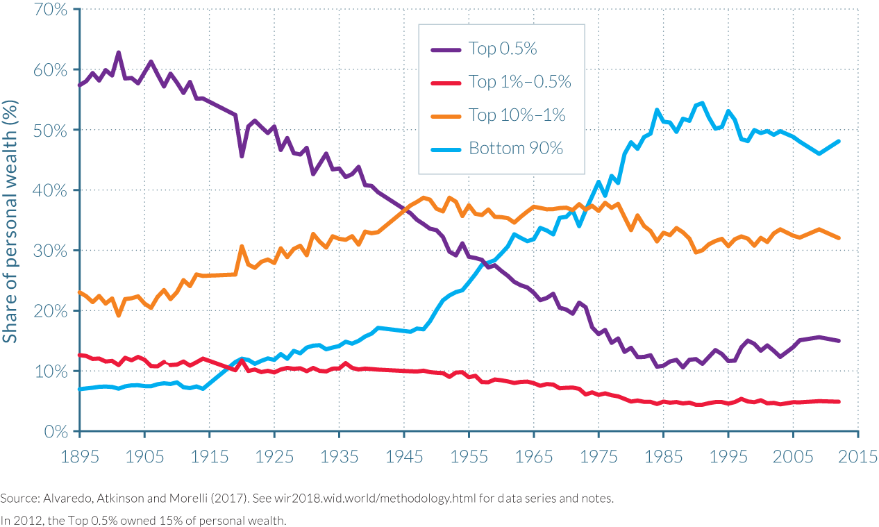
Despite recent rises, the level of wealth concentration is far from its extreme values at the beginning of the twentieth century. The first globalization era (1870–1914) brought with it extremely high shares of total wealth, with the top 10% of the wealth distribution owning almost 95% of total wealth on the eve of World War I. The 0.1% richest individuals then owned at least one third of total wealth, meaning that they had more than 333 times their proportionate share of total personal wealth. The share of the top 1% was around 70%, and that of the top 5% around 90%.
Inequality within top wealth groups substantially decreased from 1914 to 1980
The past century saw important transformations within top wealth groups, which did not all follow the same trajectory. Figure 4.6.1 demonstrates the importance of looking within the top 10 per cent, and even within the top 1 per cent: it is not just the share of the wealthy that has changed but also the shape of the distribution at the top—that is, the inequality amongst the wealthiest. The share in total wealth of those in the top 10 per cent, but not in the top 1 per cent (that is, the “next 9 per cent”) saw a rise in their share for the first half of the twentieth century at the expense of the top 1 per cent, followed by a period of stability until the end of the 1970s. The lower half of the top 1 per cent (those between the 99th and the 99.5th percentiles) saw a relative stability in their share until the 1950s, years when the share of the top 0.5 per cent was decreasing dramatically. Since 1980, the share of the lower half of the top 1 per cent has been again stable, but at a much lower level, while the upper half has been going up.
The extent of wealth concentration at the top depends on the inequality within the top wealth groups themselves (how unequal are top 1% wealth owners?) but also on the wealth required to become part of the wealthiest groups, the “entry price” (relative to mean wealth). Analyzing the “entry price”, the minimum level of wealth required to be part of the top 10% and top 5% (relative to mean wealth) increased from the start of the series up to the end of the 1970s, and then levelled off. However, at the other end of the scale, the entry price to become part of the top 0.1% fell steadily from 1911 to the 1980s, and then began to rise, as depicted by Figure 4.6.3. The entry price required to become part of the top 1% has halved since 1914. To sum up, the wealth required to enter the top 1 per cent in the UK is now some half the level required before the First World War, but it is also the case that wealth became less concentrated within the top 1 per cent.
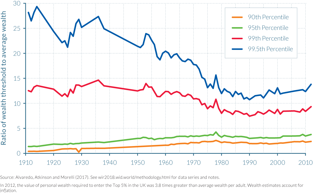
Changes in the composition of property ownership played a key role in reducing wealth inequality before 1980
The role of housing wealth in increasing average total wealth in the UK has been widely discussed. In particular, Tony Atkinson and co-authors identified back in 1989,27 that “popular wealth”, that is, the sum of owner-occupied housing and consumer durables such as automobiles and household appliances, was one of the key determinants of the dynamics of UK top wealth shares up to the end of the 1970s, and moreover, that house price rises had reduced share of the top 1%. However, since then, there have been a number of major changes in the UK housing market.
It is perhaps most illuminating to analyze how tenure changes in the UK have impacted the role of housing wealth in total wealth dynamics, especially how housing policy affected both property prices and the extent of owner occupation. With this framing, the evolution of the housing market in the UK between the end of the First World War and 2011 can be split into three main developments as described below.
Firstly, private landlords were progressively replaced with owner-occupation and social ownership of housing between 1918 and the end of the 1970s. The proportion of owner-occupied properties in England and Wales rose from 23% of households in 1918 to 50% in 1971, and then to 58% by 1981.28 This coincided with a fall in the share of housing owned by private landlords, from 76% in 1918 to 11% in 1981. Both factors led to a decline in the total wealth share of the top 1%, which contained a disproportionate number of landlords. This shift from a private-rented to owner-occupied housing market did not in itself change the ratio of housing wealth to total personal wealth (different people owned the same house at different points of time), but it was affected by the growth of social housing from 1% of the housing market in 1918 to 31% in 1981.
Secondly, council houses were widely sold off and housing rose as a percentage of total wealth in the 1980s. The decision to sell public housing by the conservative governments of the 1980s reduced the share of social housing in housing stock to 23%, with owner-occupation going up to 68% and private renting having fallen to 9%. More of the housing stock therefore entered personal wealth, and the ratio of residential housing wealth to total wealth rose by some ten percentage points in the 1980s.
Thirdly, the 1990s saw the return of private landlords. Their share in the housing market doubled from 9% in 1991 to 18% in 2011, as a result of “buy to let” schemes under successive conservative and labor governments. This increased share of private landlords came at the expense of a fall in owner-occupation (-4 percentage points) and a fall in social housing (-5 percentage points). Furthermore, whereas the selling of council properties may have meant that increases in housing wealth were equalizing in the past, the return of the private landlord is likely to imply that increases in housing wealth may now have a more moderate equalizing effect than in the past.
Housing wealth has moderated the recent tendency for rising wealth concentration
All of this suggests that it is interesting to decompose the assets within the top brackets of the wealth distribution between housing and non-housing assets. Indeed, housing only accounts for a limited fraction of total wealth at the top: since 1970, the share of housing wealth for the top 1 percent has been bounded between 10 and 25 percent of total net worth. It is instructive to look at the distribution of wealth minus residential housing, net of mortgage liabilities. Figure 4.6.4 shows the top shares of total wealth and of wealth excluding housing for the period since 1971. It appears that, as we should expect, the top shares of the distribution of non-housing wealth are higher: the share of the top 1 per cent averages 25 per cent over the period 1971 to 1997, compared with 18 per cent for the corresponding share for all wealth. Although there is more variability in the shares excluding housing wealth (shares are smoothed to some degree by the housing element), overall there is little difference in their evolution over the last quarter of the twentieth century. Up to 2000, we do not get a very different story if one just takes non-housing wealth, with a decided fall in the top shares until the end of the 1970s, and with broad stability until the mid 1990s.
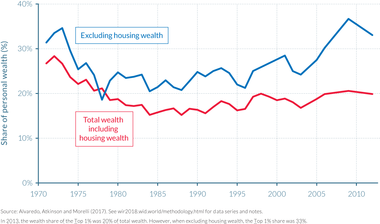
However, in the twenty-first century, there is a distinct difference: the gap between the share of the top 1 per cent in wealth excluding housing and the share for all wealth widened. The changes over time are also different, with the concentration of non-housing wealth (financial and business assets) increasing substantially between 1995 and 2013. It appears that housing wealth has moderated a definite tendency for there to be a rise in the concentration of other forms of wealth apart from housing. When people talk about rising wealth concentration in the UK, then it is probably the latter that they have in mind.
NOTES
- In comparison, the top 10% of the global income distribution typically receives between 50% and 60% of total income (depending on whether one uses purchasing power parity or market exchange rates). See Part II.
- See T. Piketty, Capital in the Twenty-First Century (Cambridge, MA: Belknap Press of Harvard University Press, 2014), ch. 12, table 12.2.
- Piketty, Capital in the Twenty-First Century
- Y. Guo, J. Gan, and C. Xu, “A Nationwide Survey of Privatized Firms in China,” Seoul Journal of Economics 21, no. 2 (2008): 311–331.
- T. Piketty, “On the Long-Run Evolution of Inheritance: France 1820–2050,” Quarterly Journal of Economics 126, no. 3 (2011): 1071–1131.
- For more detail, see B. Garbinti, J. Goupille-Lebret, and T. Piketty, “Accounting for Wealth Inequality Dynamics: Methods, Estimates, and Simulations for France (1800–2014),” WID.world Working Paper no. 2016/5, December 2016, http://wid.world/document/b-garbinti-j-goupille-and-t-piketty-wealth-concentration-in-france-1800-2014-methods-estimates-and-simulations-2016/.
- See Piketty, Capital in the Twenty-First Century; and T. Pikettyand E. Saez, “Inequality in the Long Run,” Science 344, no. 6186 (2014): 838–-843.
- Piketty, Capital in the Twenty-First Century.
- See A. Mian and A. Sufi, House of Debt: How They (and You) Caused the Great Recession and How We Can Prevent It from Happening Again (Chicago: University of Chicago Press, 2014).
- M. Bertrand and A. Morse, ‘‘Trickle-Down Consumption,’’ NBER Working Paper no. 18883, National Bureau of Economic Research, March 2013, http://www.nber.org/papers/w18883.pdf.
- Piketty, Capital in the Twenty-First Century.
- For more detail, see Garbinti, Goupille-Lebret, and Piketty, “Accounting for Wealth Inequality Dynamics.”
- Garbinti, Goupille-Lebret, and Piketty, “Accounting for Wealth Inequality Dynamics”, Table 2.
- Piketty, “On the Long-Run Evolution of Inheritance.”
- T. Piketty, Les hauts revenus en France au XXème siècle (Paris: Bernard Grasset, 2001); and Piketty, Capital in the Twenty-First Century.
- C. D. Carrol J. Overland, and D. N. Weil, “Saving andGrowth with Habit Formation,” American Economic Review 90, no. 3 (2000): 341–355.
- O. Rullan and A. A. Artigues, “Estrategias para Combatir el Encarecimiento de la Vivienda en España. ¿Construir Más o Intervenir en el Parque Existente?” Revista Electrónica de Geografía y Ciencias Sociales 11, no. 245 (28), Universidad de Barcelona, August 1, 2007, http://www.ub.edu/geocrit/sn/sn-24528.htm.
- C. Martínez-Toledano, “Housing Bubbles, Offshore Assets and Wealth Inequality in Spain (1984-2013),” WID.world Working Paper no. 2017/19
- The capitalization method entails applying a capitalization factor to the capital income distribution in order to arrive at the wealth distribution.
- E. Saez and G. Zucman, “Wealth Inequality in the United States since 1913: Evidence from Capitalized Income Tax Data,” Quarterly Journal of Economics 131, no. 2 (2016): 519–578.
- Garbinti, Goupille-Lebret, and Piketty, “Accounting for Wealth Inequality Dynamics.”
- S. Scarpetta, A. Sonnet, and T. Manfredi, “Rising Youth Unemployment during the Crisis: How to Prevent Negative Long-Term Consequences on a Generation?” OECD Social, Employment and Migration Working Papers, no. 106, OECD Publishing, Paris, April 14, 2010, http://www.oecd-ilibrary.org/docserver/download/5kmh79zb2mmv-en.pdf?expires=1510199048&id=id&accname=guest&checksum=729E512C84DEDEA22B73D109937D5AD0.
- See C. Martínez-Toledano, “Housing Bubbles, Offshore Assets and Wealth Inequality in Spain (1984–2013),” WID.world Working Paper no. 2017/19, Figure A21.
- See G. Zucman, “The Missing Wealth of Nations: Are Europe and the U.S. Net Debtors or Net Creditors?” Quarterly Journal of Economics 128, no. 3 (2013): 1321–1364; and G. Zucman, The Hidden Wealth of Nations: The Scourge of Tax Havens, trans. T. L. Fagan (Chicago: University of Chicago Press, 2015).
- Martínez-Toledano, “Housing Bubbles, Offshore Assets and Wealth Inequality in Spain (1984–2013),” Figure A26.
- The study focuses on the shares of total personal wealth, that is, the value of the assets owned by individuals, net of their debts. Assets include financial assets, such as cash, bank accounts or bonds or company shares; and real assets, such as houses and farmland;, consumer durables; and household business assets. The total wealth considered in the paper differs in important respects from total national wealth, as measured in the national accounts balance sheets. Contrary to personal wealth, total national wealth includes the wealth of nonprofit institutions serving households. Estimation methods also differ between the two concepts.
- See A. B. Atkinson, J. P. F. Gordon, and A. Harrison, “Trends in the Shares of Top Wealth-Holders in Britain, 1923–1981,” Oxford Bulletin of Economics and Statistics 51, no. 3 (1989): 315–332.
- See Office for National Statistics, “A Century of Home Ownership and Renting in England and Wales,” Release, 2011 Census Analysis, ONS, London, April 19, 2013, http://webarchive.nationalarchives.gov.uk/20160107120359/http://www.ons.gov.uk/ons/rel/census/2011-census-analysis/a-century-of-home-ownership-and-renting-in-england-and-wales/short-story-on-housing.html.