2.1 Global income inequality dynamics
The information in this chapter draws on “The Elephant Curve of Global Inequality and Growth,” by Facundo Alvaredo, Lucas Chancel, Thomas Piketty, Emmanuel Saez, and Gabriel Zucman, 2017. WID.world Working Paper Series (No. 2017/20), forthcoming in American Economic Association Papers and Proceedings.
- Data series on global inequality are scarce and caution is required in interpreting them. However, by combining consistent and comparable data, as we have done in this World Inequality Report, we can provide striking insights.
- Since 1980, income inequality has increased rapidly in North America and Asia, grown moderately in Europe, and stabilized at an extremely high level in the Middle East, sub-Saharan Africa, and Brazil.
- The poorest half of the global population has seen its income grow significantly thanks to high growth in Asia. But the top 0.1% has captured as much growth as the bottom half of the world adult population since 1980.
- Income growth has been sluggish or even nil for individuals between the global bottom 50% and top 1%. This includes North American and European lower- and middle-income groups.
- The rise of global inequality has not been steady. While the global top 1% income share increased from 16% in 1980 to 22% in 2000, it declined slightly thereafter to 20%. The trend break after 2000 is due to a reduction in between-country average income inequality, as within-country inequality has continued to increase.
- When measured using market exchange rates, the top 10% share reaches 60% today, instead of 53% when using purchasing power parity (PPP) exchange rates.
- Global income growth dynamics are driven by strong forces of convergence between countries and divergence within countries. Standard economic trade models fail to explain these dynamics properly—in particular, the rise of inequality at the very top and within emerging countries. Global dynamics are shaped by a variety of national institutional and political contexts, described and discussed in the following chapters of this report.
Managing data limitations to construct a global distribution of income
The dynamics of global inequality have attracted growing attention in recent years.1 However, we still know relatively little about how the distribution of global income and wealth is evolving. Available studies have largely relied on household surveys, a useful source of information, but one that does not accurately track the evolution of inequality at the top of the distribution. New methodological and empirical work carried out in the context of WID.world allows a better understanding of global income dynamics.
We stress at the outset that the production of global inequality dynamics is in its infancy and will still require much more work. It is critical that national statistical and tax institutions release income and wealth inequality data in many countries where data are not available currently—in particular, in developing and emerging countries. Researchers also need to thoroughly harmonize and analyze these data to produce consistent, comparable estimates. The World Inequality Lab and the WID.world research consortium intend to continue contributing to these tasks in the coming years.
Even if there are uncertainties involved, it is already possible to produce meaningful global income inequality estimates. The WID.world database contains internationally comparable income inequality estimates covering the entire population, from the lowest to the highest income earners, for many countries: the United States, China, India, Russia, Brazil, the Middle East, and the major European countries (such as France, Germany, and the United Kingdom). A great deal can already be inferred by comparing inequality trends in these regions. Using simple assumptions, we have estimated the evolution of incomes in the rest of the world so as to distribute 100% of global income every year since 1980 (Box 2.1.1). This exercise should be seen as a first step towards the construction of a fully consistent global distribution of income. We plan to present updated and extended versions of these estimates in the future editions of the World Inequality Report and on WID.world, as we gradually manage to access more data sources, particularly in Africa, Latin America, and Asia.
Global estimates in the World Inequality Report are based on a combination of sources used at the national level (including tax receipts, household surveys and national accounts as discussed in Part 1). Consistent estimates of national income inequality are now available for the USA, Western Europe (and in particular France, Germany, the United Kingdom) as well as China, India, Brazil, Russia and the Middle East. These regions represent approximately two thirds of the world adult population and three quarters of global income.
In this chapter on global income inequality, we have ultimately distributed the totality of global income, to the totality of the world population. To achieve this, we had to distribute the quarter of global income to the third of the global population for which there is currently no consistent income inequality data available. One crucial information we have, however, is total national income in each country. This information is essential, as it already determines a large part of global income inequality among individuals.
How then to distribute national income to individuals in countries without inequality data? We tested different ways and found that these had very moderate impacts on the distribution of global income, given the limited share of income and population concerned by these assumptions. In the end, we assumed that countries with missing inequality information had similar levels of inequality as other countries in their region. Take an example, we know the average income level in Malaysia, but not (yet) how national income is distributed to all individuals in this country. We then assumed that the distribution of income in Malaysia was the same, and followed the same trends, as in the region formed by China and India. This is indeed an over simplification, but to some extent this is an acceptable method as alternative assumptions have a limited impact on our general conclusions.
Sub-Saharan Africa is a particular case: we did not have any country with consistent income inequality data over the past decades (whereas in Asia we have consistent estimates for China and India, in Latin America, we have estimates for Brazil, etc.). For Sub-Saharan Africa, we thus relied on household surveys available from the World Bank (these estimates cover 70% of Sub-Saharan Africa’s population and yet a higher proportion of the region’s income). These surveys were matched with fiscal data available from WID.world so as to provide a better representation of inequality at the top of the social pyramid (see Part 1).
Doing so then allowed us to produce a global distribution of income. The methodology we followed is available on wir2018.wid.world, as well as all the computer codes we used, so as to allow anyone make alternative assumptions or contribute to extend this work. In future editions of the World Inequality Report, we will progressively expand the geographical coverage of our data.
The exploration of global inequality dynamics presented here starts in 1980, for two main reasons. First, 1980 corresponds to a turning point in inequality and redistributive policies in many countries. The early 1980s mark the start of a rising trend in inequality and major policy changes, both in the West (with the elections of Ronald Reagan and Margaret Thatcher, in particular) and in emerging economies (with deregulation policies in China and India). Second, 1980 is the date from which data become available for a large enough number of countries to allow a sound analysis of global dynamics.
We start by presenting our basic findings regarding the evolution of income inequality within the main world regions. Three main findings emerge.
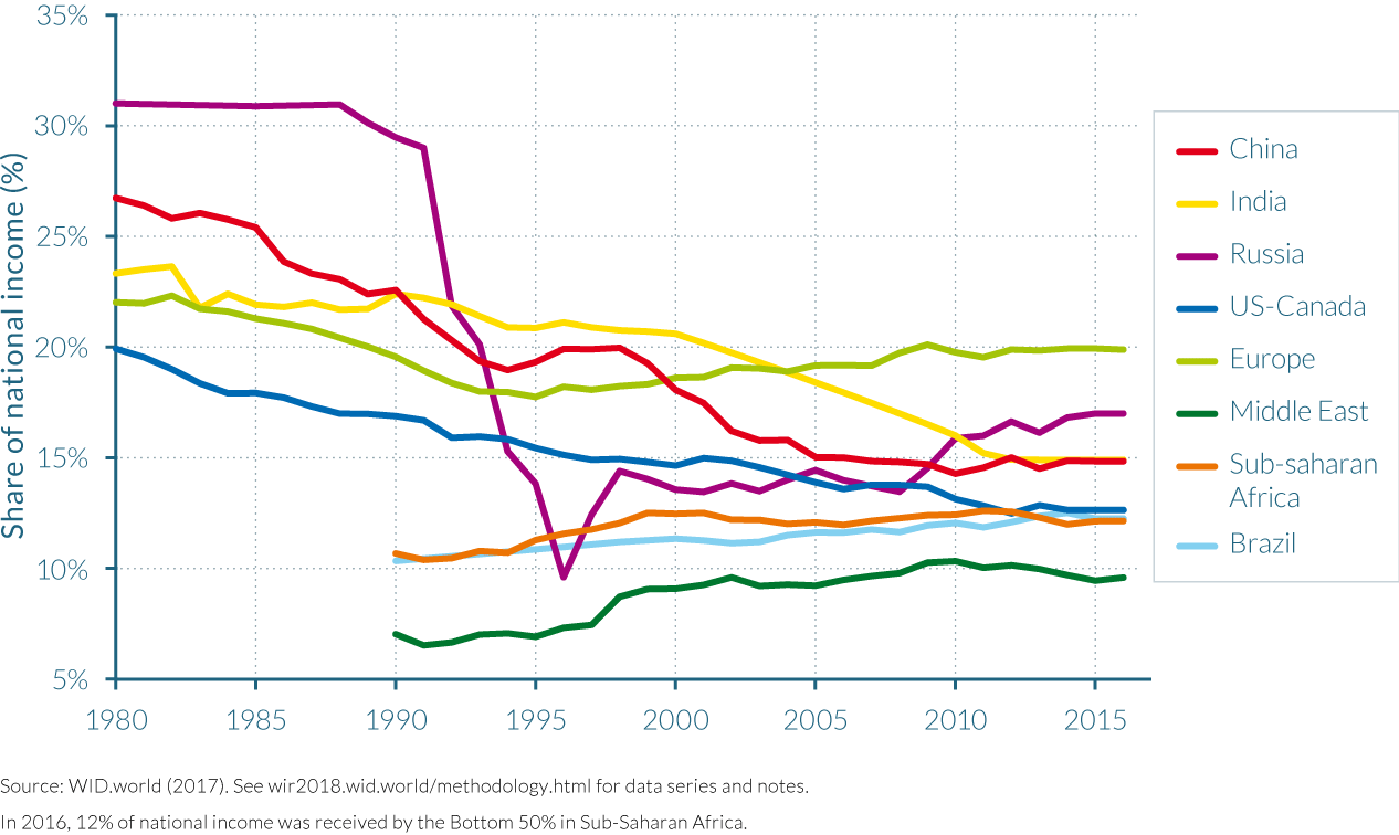
First, we observe rising inequality in most of the world’s regions, but with very different magnitudes. More specifically, we display in Figure 2.1.1a the evolution of the top 10% income share in Europe (Western and Eastern Europe combined, excluding Ukraine, Belorussia, and Russia), North America (defined as the United States and Canada), China, India, and Russia. The top 10% share has increased in all five of these large world regions since 1980. The top 10% share was around 30–35% in Europe, North America, China, and India in 1980, and only about 20–25% in Russia. If we put these 1980 inequality levels into broader and longer perspective, we find that they were in place since approximately the Second World War, and that these are relatively low inequality levels by historical standards (Piketty, 2014). In effect, despite their many differences, all these world regions went through a relatively egalitarian phase between 1950 and 1980. For simplicity, and for the time being, this relatively low inequality regime can be described as the “post-war egalitarian regime,” with obvious important variations between social-democratic, New Deal, socialist, and communist variants to which we will return.
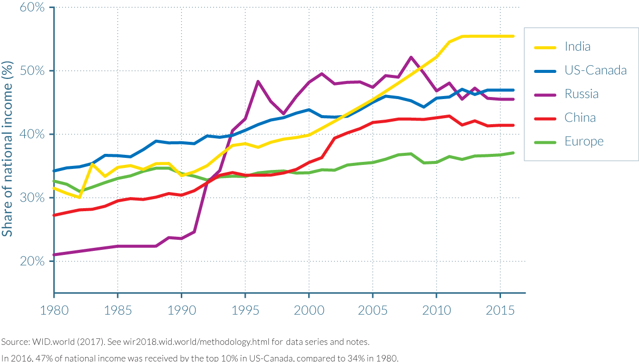
Top 10% income shares then increased in all these regions between 1980 and 2016, but with large variations in magnitude. In Europe, the rise was moderate, with the top 10% share increasing to about 35–40% by 2016. However, in North America, China, India, and even more so in Russia (where the change in policy regime was particularly dramatic), the rise was much more pronounced. In all these regions, the top 10% share rose to about 45–50% of total income in 2016. The fact that the magnitude of rising inequality differs substantially across regions suggests that policies and institutions matter: rising inequality cannot be viewed as a mechanical, deterministic consequence of globalization.
Next, there are exceptions to this general pattern. That is, there are regions—in particular, the Middle East, Brazil (and to some extent Latin America as a whole), and South Africa (and to some extent sub-Saharan Africa as a whole)—where income inequality has remained relatively stable at extremely high levels in recent decades. Unfortunately, data availability is more limited for these three regions, which explains why the series start in 1990, and why we are not able to properly cover all countries in these regions (see Figure 2.1.1b).
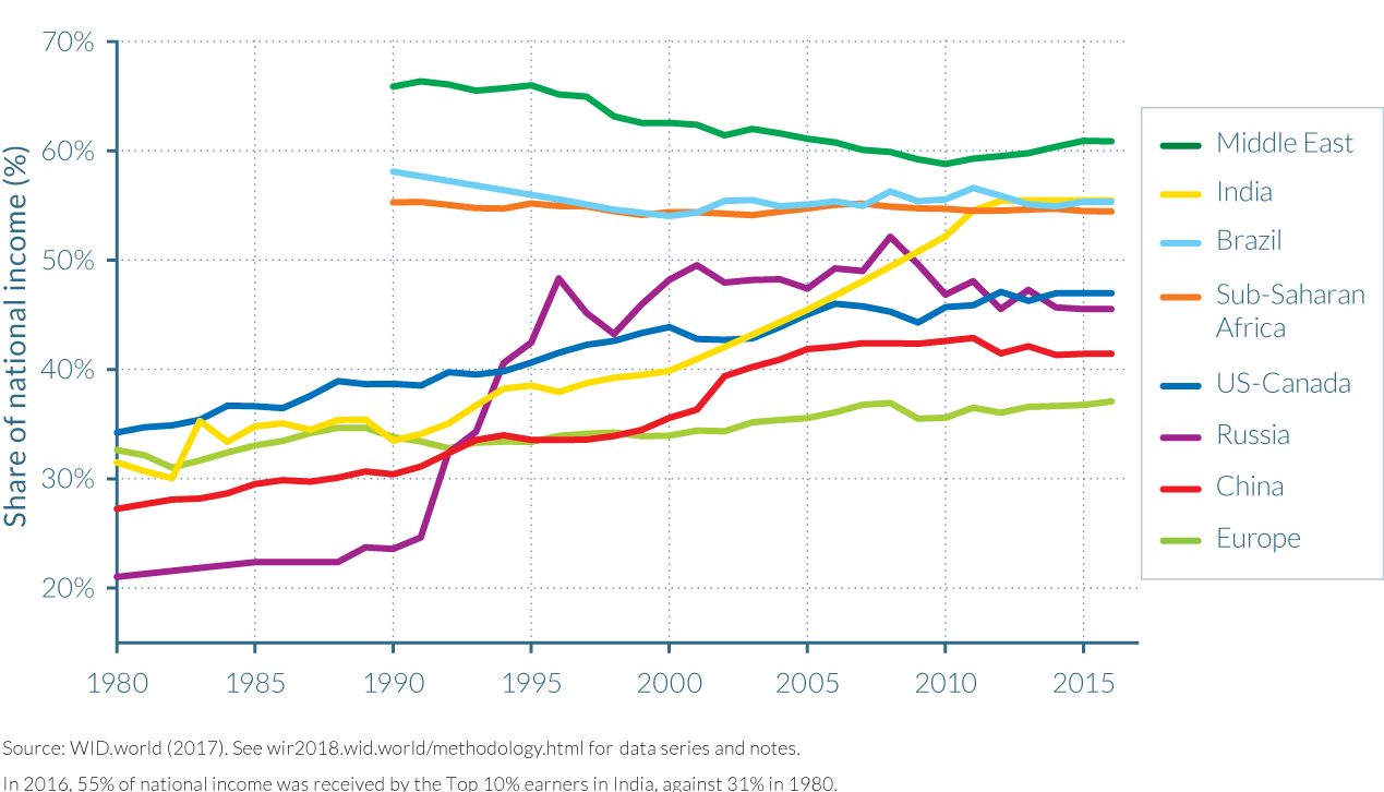
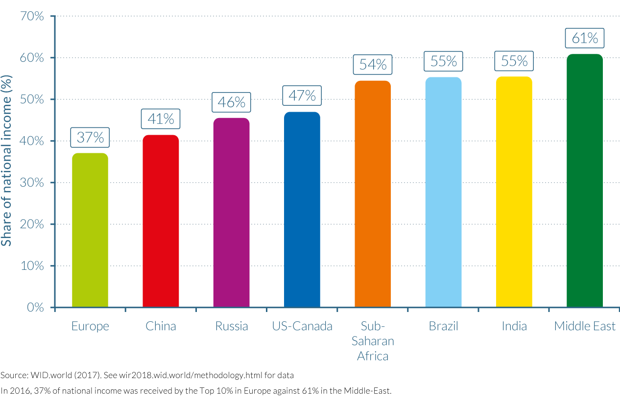
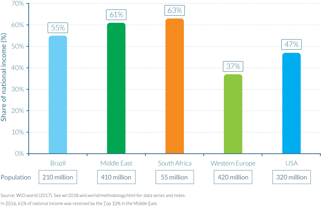
In spite of their many differences, the striking commonality in these three regions is the extreme and persistent level of inequality. The top 10% receives about 55% of total income in Brazil and sub-Saharan Africa, and in the Middle East, the top 10% income share is typically over 60% (see Figure 2.1.1c). In effect, for various historical reasons, these three regions never went through the post-war egalitarian regime and have always been at the world’s high-inequality frontier.
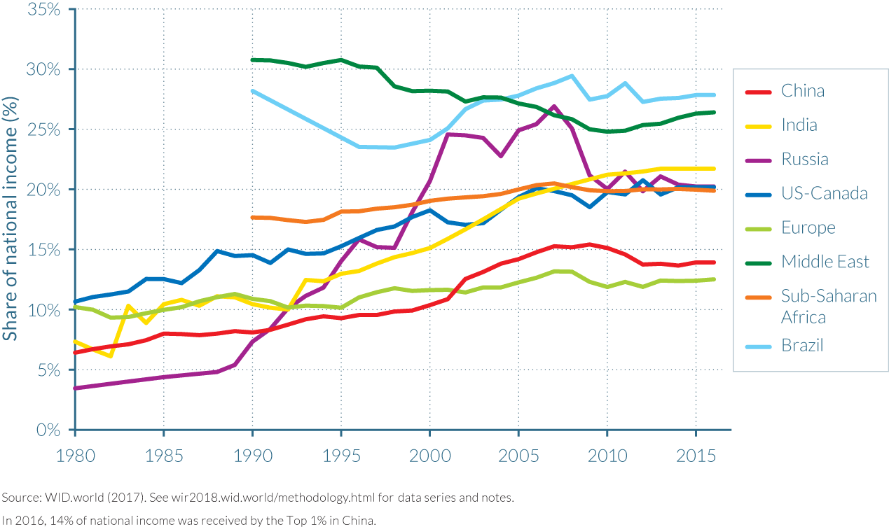
The third striking finding is that the variations in top-income shares over time and across countries are very large in magnitude, and have a major impact on the income shares and levels of the bottom 50% of the population. It is worth keeping in mind the following orders of magnitude: top 10% income shares vary from 20–25% to 60–65% of total income (see Figures 2.1.1a and 2.1.1b). If we focus upon very top incomes, we find that top 1% income shares vary from about 5% to 30% (see Figure 2.1.1d), just like the share of income going to the bottom 50% of the population (see Figure 2.1.1e).
In other words, the same aggregate income level can give rise to widely different income levels for the bottom and top groups depending on the distribution of income prevailing in the specific country and time period under consideration. In brief, the distribution matters quite a bit.
What have been the growth trajectories of different income groups in these regions since 1980? Table 2.1.1 presents income growth rates in China, Europe, India, Russia, and North America for key groups of the distribution. The full population grew at very different rates in the five regions. Real per-adult, national income growth reached an impressive 831% in China and 223% in India. In Europe, Russia, and North America, income growth was lower than 100% (40%, 34%, and 74%, respectively). Behind these heterogeneous average growth trajectories, the different regions all share a common, striking characteristic.
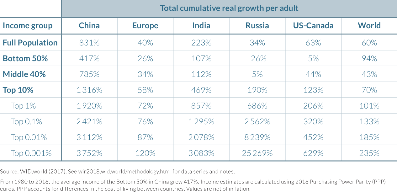
In all these countries, income growth is systematically higher for upper income groups. In China, the bottom 50% earners grew at less than 420% while the top 0.001% grew at more than 3 750%. The gap between the bottom 50% and the top 0.001% is even more important in India (less than 110% versus more than 3 000%). In Russia, the top of the distribution had extreme growth rates; this reflects the shift from a regime in which top incomes were constrained by the communist system towards a market economy with few regulations constraining top incomes. In this global picture, in line with Figure 2.1.1, Europe stands as the region with the lowest growth gap between the bottom 50% and the full population, and with the lowest growth gap between the bottom 50% and top 0.001%.
The right-hand column of table 2.1.1 presents income growth rates of different groups at the level of the entire world. These growth rates are obtained once all the individuals of the different regions are pooled together to reconstruct global income groups. Incomes across countries are compared using purchasing power parity (PPP) so that a given income can in principle buy the same bundle of goods and services in all countries. Average global growth is relatively low (60%) compared to emerging countries’ growth rates. Interestingly enough, at the world level, growth rates do not rise monotonically with income groups’ positions in the distribution. Instead, we observe high growth at the bottom 50% (94%), low growth in the middle 40% (43%), and high growth at the top 1% (more than 100%)—and especially at the top 0.001% (close to 235%).
To better understand the significance of these unequal rates of growth, it is useful to focus on the share of total growth captured by each group over the entire period. Table 2.1.2 presents the share of growth per adult captured by each group. Focusing on both metrics is important because the top 1% global income group could have enjoyed a substantial growth rate of more than 100% over the past four decades (meaningful at the individual level), but still represent only a little share of total growth. The top 1% captured 35% of total growth in the US-Canada, and an astonishing 69% in Russia.
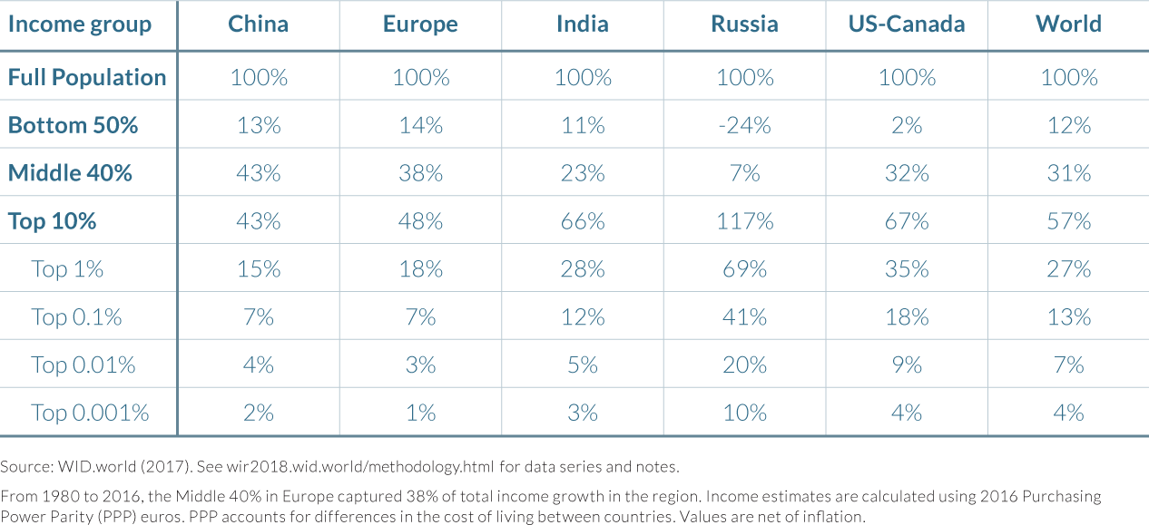
At the global level, the top 1% captured 27% of total growth—that is, twice as much as the share of growth captured by the bottom 50%. The top 0.1% captured about as much growth as the bottom half of the world population. Therefore, the income growth captured by very top global earners since 1980 was very large, even if demographically they are a very small group.
Building a global inequality distribution brick by brick
A powerful way to visualize the evolution of global income inequality dynamics is to plot the total growth rate of each income groups (see Box 2.1.2). This provides a more precise representation of growth dynamics than Table 2.1.1. To properly understand the role played by each region in global inequality dynamics, we follow a step-by-step approach to construct this global growth curve by adding one region after another and discussing each step of the exercise.
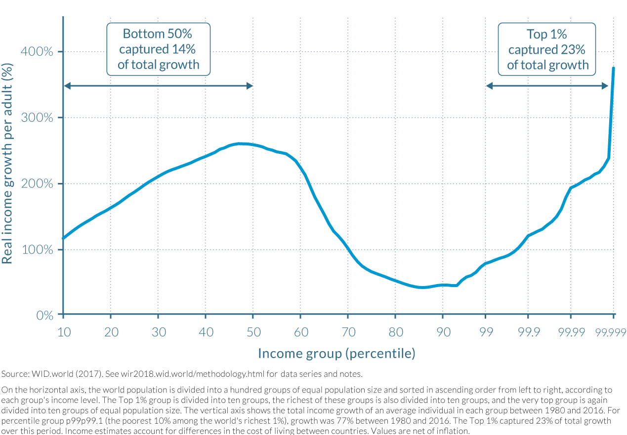
Total growth curves (or “growth incidence curves”) shed light on the income growth rate of each income group in a given country or at the world level. The popularization of such graphs is largely due to their use by Christoph Lakner and Branko Milanovic. In this report we are able to provide novel insights on global income dynamics thanks to the new inequality series constructed in WID.world (as detailed in Part 1). In particular, we are able to decompose the top 1% of the global distribution into smaller groups and observe their relative importance in total growth. If anything, our general conclusion is that the “elephant curve” is even more marked than what was initially pointed out by Lakner and Milanovic.
How to interpret these graphs? The horizontal axis sorts global income groups in ascending order from the poorest (left-hand side) to the richest (right-hand side). The first ninety-nine brackets correspond to each of the bottom ninety-nine percentiles of the global population. Each bracket represents 1% of the global population and occupies the same length on the graph. The global top 1% group is not represented on the same scale as the bottom 99%. We split it into twenty-eight smaller groups in the following way. The group is first split into ten groups of equal size (representing each 0.1% of the population). The richest of these groups is then itself split into ten groups of equal size (each representing 0.01% of the global population). The richest of these groups is again split into ten groups of equal size. The richest group represented on the horizontal axis (group 99.999) thus corresponds to the top 0.001% richest individuals in the world. This represents 49 000 individuals in 2016.
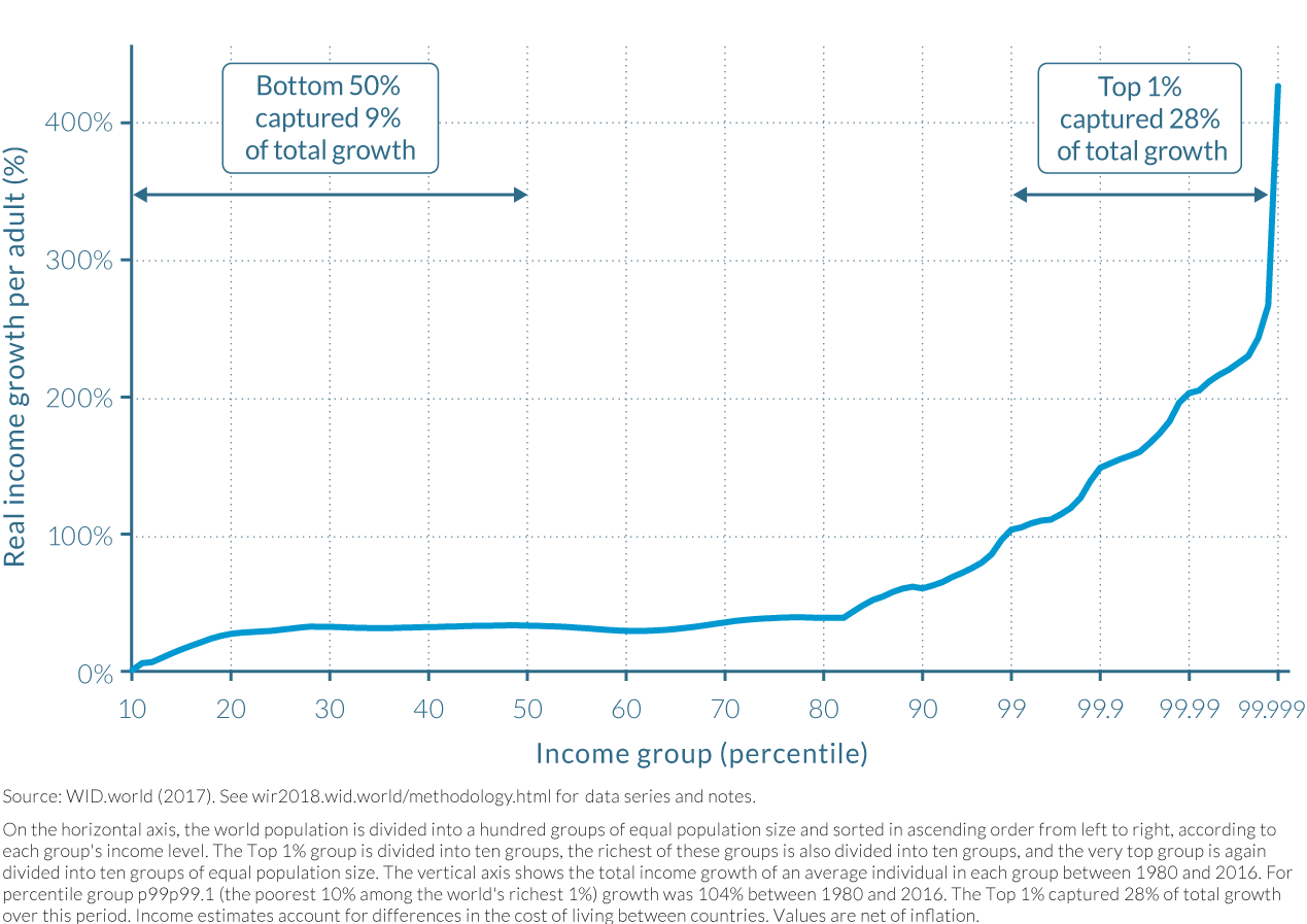
Each of these twenty-eight groups comprising the top 1% earners occupies the same space as percentiles of the bottom 99%. This is a simple way to represent clearly the importance of these groups in total income growth. The global top 1% group captured 27% of total growth from 1980 to 2016—that is, about a quarter of total growth. On the horizontal axis, this group occupies about a quarter of the scale.
There are other ways to scale percentiles on the horizontal axis. Appendices A2.1 and A2.2 show two variants. In the first, each group occupies a space that is proportional to its population size; in effect, the 28 groups decomposing the top 1% are squeezed together. In the other, each group is given a segment that is proportional to its share of total growth captured. In this case, it is the groups at the bottom of the global distribution that are squeezed. Our benchmark representation is a combination of these two variants.
The vertical axis presents the total real pre-tax income growth rate for each of the 127 groups defined above. Real income means that incomes are corrected for inflation. “Pre-tax” refers to incomes before taxes and transfers (but after the operation of the pension system). Note that the values are presented as total growth rates over the period rather than as annualized growth rates, which are perhaps somewhat more common in economic debates. Over long time spans such as the 1980–2016 period analyzed here, it is generally more meaningful to discuss total growth rates than to discuss average annual growth rates. Because of the multiplicative power of growth rates, small differences in annualized growth rates lead to large differences in total growth rates over long time spans. To illustrate this, let us take two income groups whose incomes grow at 4% and 5% over thirty-five years, respectively. The first group does not grow as fast as the second one, but the difference may seem limited. In fact, over thirty-five years, the total income growth is 295% in the first case and 452% in the second, which indeed represents a substantial difference in terms of purchasing power and standards of living.
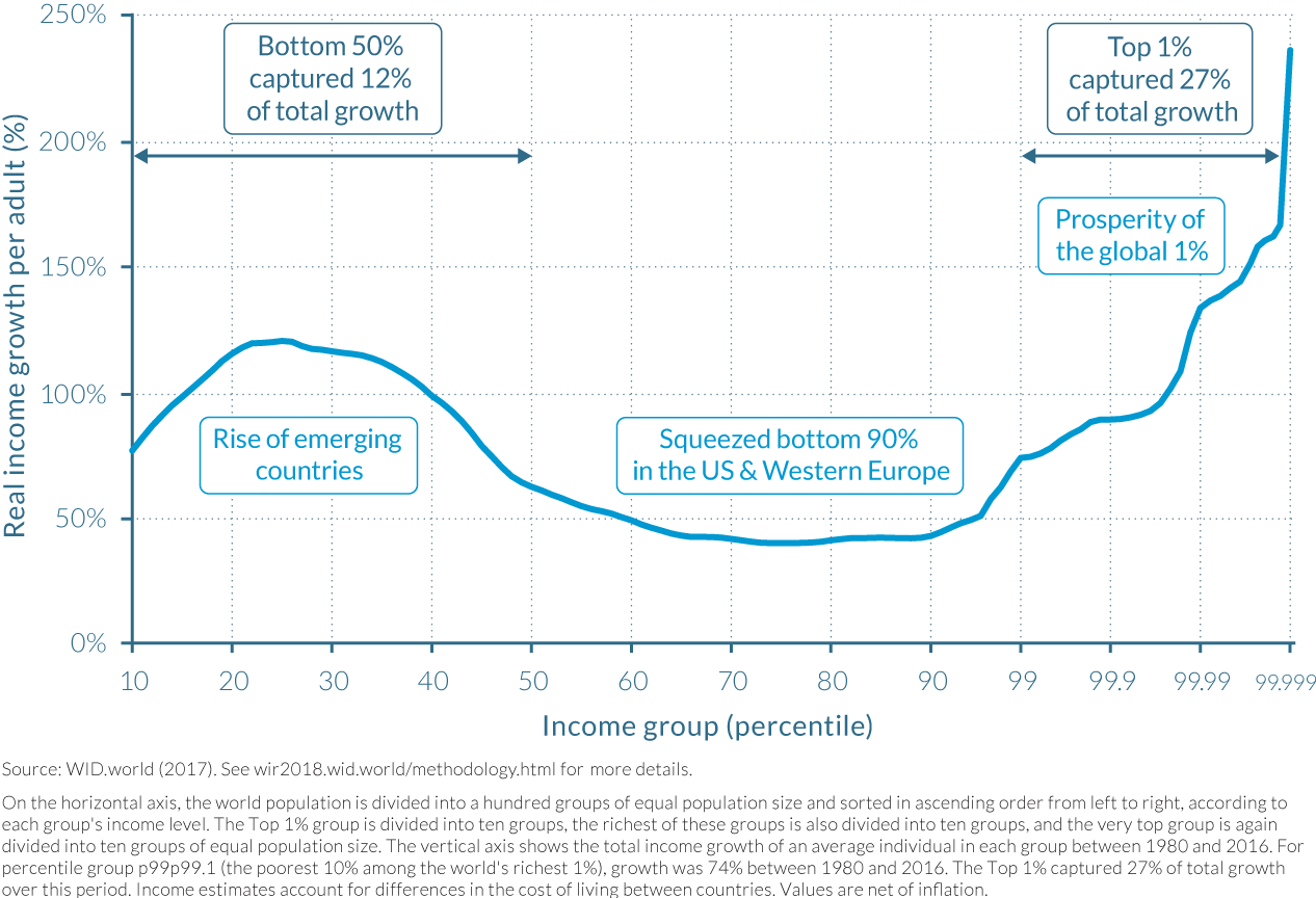
We start with the distribution of growth in a region regrouping Europe and North America (Figure 2.1.2). These two regions have a total of 880 million individuals in 2016 (520 million in Europe and 360 million in North America) and represent most of the population of high-income countries. In Euro-America, cumulative per-adult income growth over the 1980–2016 period was +28%, which is relatively low as compared to the global average (+66%). While the bottom 10% income group saw their income decrease over the period, all individuals between percentile 20 and percentile 80 had a growth rate close to the average growth rate. At the very top of the distribution, incomes grew very rapidly; individuals in the top 1% group saw their incomes rise by more than 100% over the time period and those in the top 0.01% and above grew at more than 200%.
How did this translate into shares of growth captured by different groups? The top 1% of earners captured 28% of total growth—that is, as much growth as the bottom 81% of the population. The bottom 50% earners captured 9% of growth, which is less than the top 0.1%, which captured 14% of total growth over the 1980–2016 period. These values, however, hide large differences in the inequality trajectories followed by Europe and North America. In the former, the top 1% captured as much growth as the bottom 51% of the population, whereas in the latter, the top 1% captured as much growth as the bottom 88% of the population. (See chapter 2.3 for more details.)
The next step is to add the population of India and China to the distribution of Euro-America. The global region now considered represents 3.5 billion individuals in total (including 1.4 billion individuals from China and 1.3 billion from India). Adding India and China remarkably modifies the shape of the global growth curve (Figure 2.1.3).
The first half of the distribution is now marked by a “rising tide” as total income growth rates increase substantially from the bottom of the distribution to the middle. The bottom half of the population records growth rates which go as high as 260%, largely above the global average income growth of 146%. This is due to the fact that Chinese and Indians, who make up the bulk of the bottom half of this global distribution, enjoyed much higher growth rates than their European and North American counterparts. In addition, growth was also very unequally distributed in India and China, as revealed by Table 2.1.1.
Between percentiles 70 and 99 (individuals above the poorest 70% of the population but below the richest 1%), income growth was substantially lower than the global average, reaching only 40–50%. This corresponds to the lower- and middle-income groups in rich countries which grew at a very low rates. The extreme case of these is the bottom half of the population in the United States, which grew at only 3% over the period considered. (See Chapter 2.4.)
Earlier versions of this graph have been termed “the elephant curve,” as the shape of the curve resembles the silhouette of the animal. These new findings confirm and amplify earlier results.2 In particular they make it possible to measure much more reliably the share of income growth captured at the top of the global income distribution—a figure which couldn’t be properly measured before.
At the top of the global distribution, incomes grew extremely rapidly—around 200% for the top 0.01% and above 360% for the top 0.001%. Not only were these growth rates important from the perspective of individuals, they also matter a lot in terms of global growth. The top 1% captured 23% of total growth over the period—that is, as much as the bottom 61% of the population. Such figures help make sense of the very high growth rates enjoyed by Indians and Chinese sitting at the bottom of the distribution. Whereas growth rates were substantial among the global bottom 50%, this group captured only 14% of total growth, just slightly more than the global top 0.1%—which captured 12% of total growth. Such a small share of total growth captured by the bottom half of the population is partly due to the fact that when individuals are very poor, their incomes can double or triple but still remain relatively small—so that the total increase in their incomes does not necessarily add up at the global level. But this is not the only explanation. Incomes at the very top must also be extraordinarily high to dwarf the growth captured by the bottom half of the world population.
The next step of the exercise consists of adding the populations and incomes of Russia (140 million), Brazil (210 million), and the Middle East (410 million) to the analysis. These additional groups bring the total population now considered to more than 4.3 billion individuals—that is, close to 60% of the world total population and two thirds of the world adult population. The global growth curve presented in Appendix Figure A2.3 is similar to the previous one except that the “body of the elephant” is now shorter. This can be explained by the fact that Russia, the Middle East, and Brazil are three regions which recorded low growth rates over the period considered. Adding the population of the three regions also slightly shifts the “body of the elephant” to the left, since a large share of the population of the countries incorporated in the analysis is neither very poor nor very rich from a global point of view and thus falls in the middle of the distribution. In this synthetic global region, the top 1% earners captured 26% of total growth over the 1980–2016 period—that is, as much as the bottom 65% of the population. The bottom 50% captured 15% of total growth, more than the top 0.1%, which captured 12% of growth.
The final step consists of including all remaining global regions—namely, Africa (close to 1 billion individuals), the rest of Asia (another billion individuals), and the rest of Latin America (close to half a billion). In order to reconstruct income inequality dynamics in these regions, we take into account between-country inequality, for which information is available, and assume that within countries, growth is distributed in the same way as neighboring countries for which we have specific information (see Box 2.1.1). This allows us to distribute the totality of global income growth over the period considered to the global population.
When all countries are taken into account, the shape of the curve is again transformed (Figure 2.1.4). Now, average global income growth rates are further reduced because Africa and Latin America had relatively low growth over the period considered. This contributes to increasing global inequality as compared to the two cases presented above. The findings are the same as those presented in the right-hand column of Table 2.1.2: the top 1% income earners captured 27% of total growth over the 1980–2016 period, as much as the bottom 70% of the population. The top 0.1% captured 13% of total growth, about as much as the bottom 50%.
The geography of global income inequality was transformed over the past decades
What is the share of African, Asians, Americans, and Europeans in each global income groups and how has this evolved over time? Figures 2.1.5 and 2.1.6 answer these questions by showing the geographical composition of each income group in 1990 and in 2016. Between 1980 and 1990, the geographic repartition of global incomes evolved only slightly, and our data allow for more precise geographic repartition in 1990, so it is preferable to focus on this year. In a similar way to how Figures 2.1.2 through 2.1.4 decomposed the data, Figures 2.1.5 and 2.1.6 decompose the top 1% into 28 groups (see Box 2.1.1). To be clear, all groups above percentile 99 are the decomposition of the richest 1% of the global population.
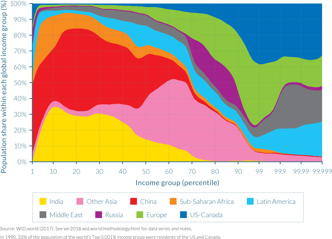
In 1990, Asians were almost not represented within top global income groups. Indeed, the bulk of the population of India and China are found in the bottom half of the income distribution. At the other end of the global income ladder, US-Canada is the largest contributor to global top-income earners. Europe is largely represented in the upper half of the global distribution, but less so among the very top groups. The Middle East and Latin American elites are disproportionately represented among the very top global groups, as they both make up about 20% each of the population of the top 0.001% earners. It should be noted that this overrepresentation only holds within the top 1% global earners: in the next richest 1% group (percentile group p98p99), their share falls to 9% and 4%, respectively. This indeed reflects the extreme level of inequality of these regions, as discussed in chapters 2.10 and 2.11. Interestingly, Russia is concentrated between percentile 70 and percentile 90, and Russians did not make it into the very top groups. In 1990, the Soviet system compressed income distribution in Russia.
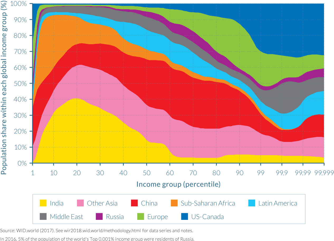
In 2016, the situation is notably different. The most striking evolution is perhaps the spread of Chinese income earners, which are now located throughout the entire global distribution. India remains largely represented at the bottom with only very few Indians among the top global earners.
The position of Russian earners was also stretched throughout from the poorest to the richest income groups. This illustrates the impact of the end of communism on the spread of Russian incomes. Africans, who were present throughout the first half of the distribution, are now even more concentrated in the bottom quarter, due to relatively low growth as compared to Asian countries. At the top of the distribution, while the shares of both North America and Europe decreased (leaving room for their Asian counterparts), the share of Europeans was reduced much more. This is because most large European countries followed a more equitable growth trajectory over the past decades than the United States and other countries, as will be discussed in chapter 2.3.
Since 2000, the picture is more nuanced but within-country inequality is on the rise
How did global inequality evolve between 1980 and 2016? Figure 2.1.7 answers this question by presenting the share of world income held by the global top 1% and the global bottom 50%, measured at purchasing power parity. The global top 1% income share rose from about 16% of global income in 1980 to more than 22% in 2007 at the eve of the global financial crisis. It was then slightly reduced to 20.4% in 2016, but this slight decrease hardly brought back the level of global inequality to its 1980 level. The income share of bottom half of the world population oscillated around 9% with a very slight increase between 1985 and 2016.
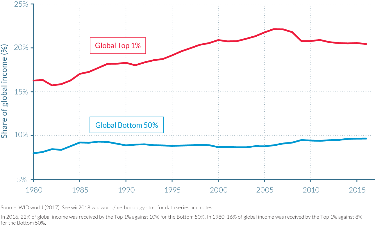
The first insight of this graph is the extreme level of global inequality sustained throughout the entire period with a top 1% income group capturing two times the total income captured by the bottom 50% of the population—implying a factor 100 difference in average per-adult income levels. Second, it is apparent that high growth in emerging countries since 2000, in particular in China, or the global financial crisis of 2008 was not sufficient to stop the rise in global income inequality.
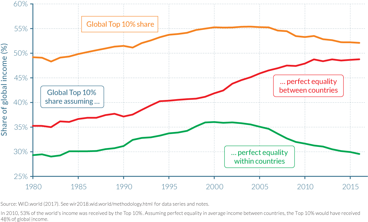
When global inequality is decomposed into a between- and within-country inequality component, it is apparent that within-country inequality continued to rise since 2000 whereas between-country inequality rose up to 2000 and decreased afterwards. Figure 2.1.8 presents the evolution of the global 10% income share, which reached close to 50% of global income in 1980, rose to 55% in 2000–2007, and decreased to slightly more than 52% in 2016. Two alternative scenarios for the evolution of the global top 10% share are presented. The first one assumes that all countries had exactly the same average income (that is, that there was no between-country inequality), but that income was as unequal within these countries as was actually observed. In this case, the top 10% share would have risen from 35% in 1980 to nearly 50% today. In the second scenario, it is assumed that between-country inequality evolved as observed but it is also assumed that everybody within countries had exactly the same income level (no within-country inequality). In this case, the global top 10% income share would have risen from nearly 30% in 1980 to more than 35% in 2000 before decreasing back to 30%.
Measured at market exchange rate, global inequality is even higher
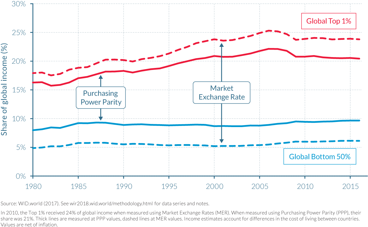
Prices can be converted from one currency to another using either market exchange rates or purchasing power parities (as we did above). Market exchanges rates are the prices at which people are willing to buy and sell currencies, so at first glance they should reflect people’s relative purchasing power. This makes them a natural conversion factor between currencies. The problem is that market exchange rates reflect only the relative purchasing power of money in terms of tradable goods. But non-tradable goods (typically services) are in fact cheaper relative to tradable ones in emerging economies (given the so-called Balassa-Samuelson effect). Therefore, market exchange rates will underestimate the standard of living in the poorer countries. In addition, market exchange rates can vary for all sorts of other reasons—sometimes purely financial and/or political—in a fairly chaotic manner. Purchasing power parity is an alternative conversion factor that addresses these problems (based on observed prices in the various countries). The level of global income inequality is therefore substantially higher when measured using market exchange rates than it is with purchasing power parity. It increases the global top 1% share in 2016 from 20% to 24% and reduces the bottom 50% share from nearly 10% to 6% (Figure 2.1.9).
Purchasing power parity definitely gives a more accurate picture of global inequality from the point of view of individuals who do not travel across the world and who essentially spend their incomes in their own countries. Market exchange rates are perhaps better to inform about inequality in a world where individuals can easily spend their incomes where they want, which is the case for top global earners and tourists, and increasingly the case for anyone connected to the internet. It is also the case for migrant workers wishing to send remittances back to their home countries. Both purchasing power parity and market exchange rates are valid measures to track global income inequality, depending on the object of study or which countries are compared to one another.
In this report, we generally use purchasing power parity for international comparisons, but at times, market exchange rates are also used to illustrate other meaningful aspects of international inequality.
Carefully looking at countries’ diverse growth trajectories and policy changes is necessary to understand drivers of national and global inequality
The past forty years were marked by a steep rise of global inequality, and growth in emerging countries was not high enough to counterbalance it. Whether future growth in emerging countries might invert the trend or not is a key question, which will be addressed in Part V of this report. Before turning to that question, one should understand better the drivers of the trends observed since 1980.
Given that this period was marked by increasing trade integration between countries, it might seem reasonable to seek explanations in economic trade models. The standard economic models of international trade, however, fail to account for dynamics of inequality observed over the past four decades. Take Heckscher-Ohlin, the most well-known of the two-skill-groups economic trade models. According to it, trade liberalization should increase inequality in rich countries, but reduce it in low-income countries.
How does the model reach this conclusion? The underlying mechanism is fairly simple. It is built around the fact that there are more high-skilled workers (such as aeronautical engineers) in the United States than in China, and more low-skilled workers (such as textile workers) in China than in the United States. Before trade liberalization started between these two countries, aeronautical engineers were relatively scarce in China and thus enjoyed relatively high pay compared to textile workers which were abundant. Conversely, in the United States, low-skilled earners were relatively scarce at the time, and the income differential between engineers and textile workers was limited.
When the United States and China started to trade, each country specialized in the domain for which they had the most workers, in relative terms. China thus specialized in textiles, so that textile workers were in higher demand and saw their wages increase, while aeronautical engineers came to be in lower demand and saw their wages decrease. Conversely, the United States specialized in aircraft building, so the aeronautical engineers saw their wages increase, while the textile workers saw their wages decrease. By virtue of the factor price equalization theorem, the wages of low-skilled workers in China and the United States started to converge, along with the wages of high-skilled workers.
While inequality did rise in the United States, as this model predicts, it also sharply rose in China, as well as in India and Russia, as seen in Figure 2.1.1a—contrary to the model’s predictions. Regardless of whether the Heckscher-Ohlin is otherwise valid or not, it cannot account for the evolution of global inequality. How can we account for these empirical findings? As Table 2.1.1 suggests, countries followed very different growth and inequality trajectories over the past decades. It seems necessary to carefully look at these trajectories as well as the institutional and policy shifts which may have occurred in various regions of the world over the past forty years.
Understanding the drivers of global income inequality requires a thorough analysis of the distribution of national income growth within countries. These dynamics are explored in the following chapters.
2.2 Trends in income inequality between countries
Information in this chapter is based on “National Accounts Series Methodology,” by Thomas Blanchet and Lucas Chancel, 2016. WID.world Working Paper Series (No. 2016/1), and on subsequent WID.world updates.
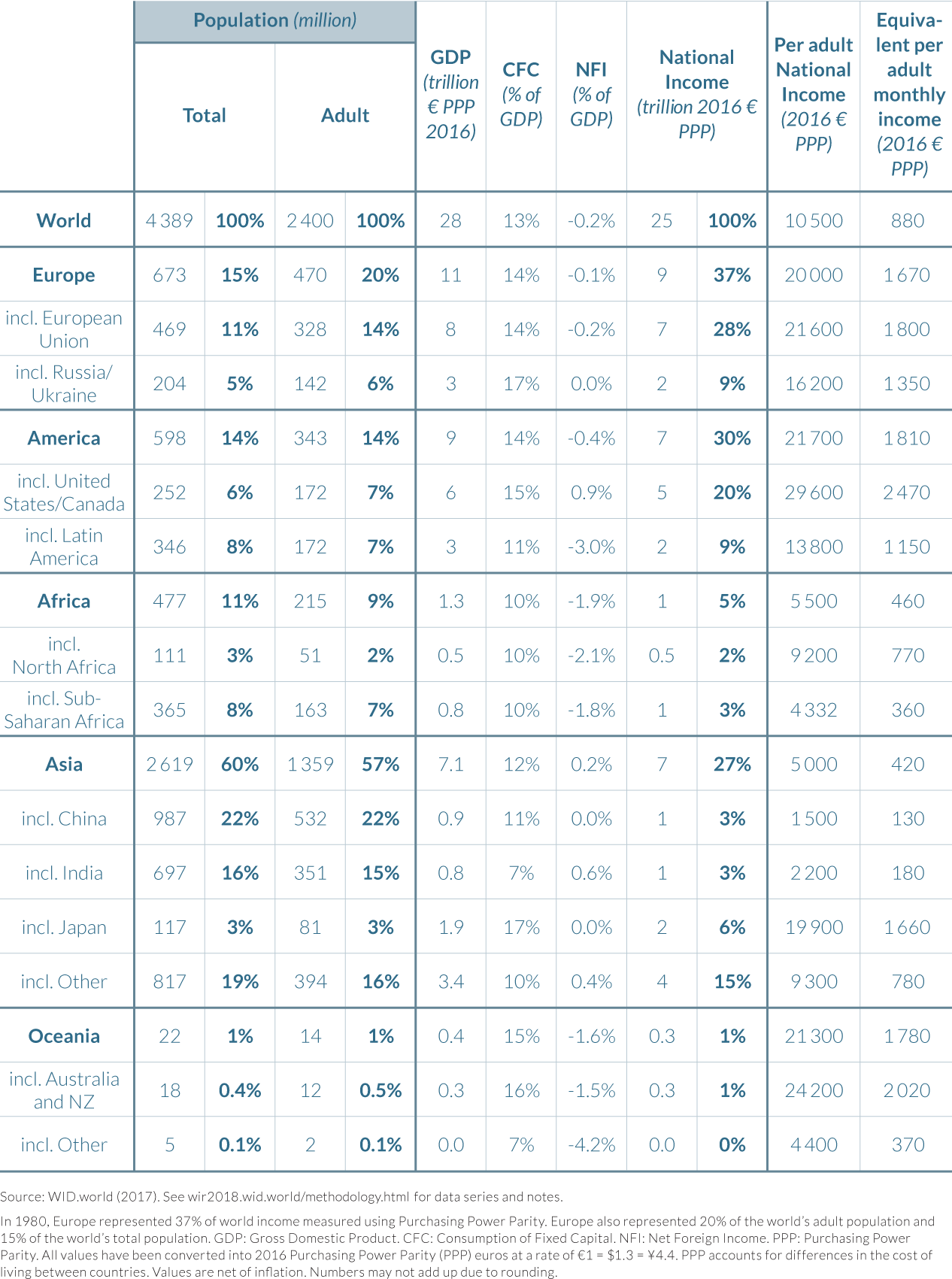
- When focusing on income inequalities between countries, it is more meaningful to compare national incomes than gross domestic product (GDP). National income takes into account depreciation of obsolete machines and other capital assets as well as flows of foreign income.
- At the global level, average per-adult national income is €1 340 per month. North Americans enjoy an income three times higher, while Europeans have an income two times higher. Average per-adult income in China is slightly lower than the global average. As a country, however, China represents a higher share of global income than North America or Europe (19%, 17%, and 17%, respectively).
- This situation sharply contrasts with that of 1980, when China represented only 3% of total global income. Over this period, strong converging forces were in play which reduced global income inequality between countries. While growth slowed in Western Europe, it skyrocketed in Asia and China in particular, following the modernization of its economy and its opening to global markets.
- However, diverging forces were also in play in other parts of the world. From 1980 to now, average incomes in sub-Saharan Africa and South America fell behind the world average.
National income is more meaningful than GDP to compare income inequalities between countries
Public debates generally focus on the growth of gross domestic product (GDP) to compare countries’ economic performance. However, this measure is of only limited use in measuring national welfare. GDP measures the value of all goods and services sold in an economy, after having subtracted the costs of materials or services incurred in production processes. As such, it does not properly account for capital depreciation, or for public “bads” such as environmental degradation, rising crime, or illnesses (because these lead to expenditures that contribute to GDP). These limitations have led many statistical agencies, and a growing number of governments, to develop and use complementary indicators of economic performance and well-being.3
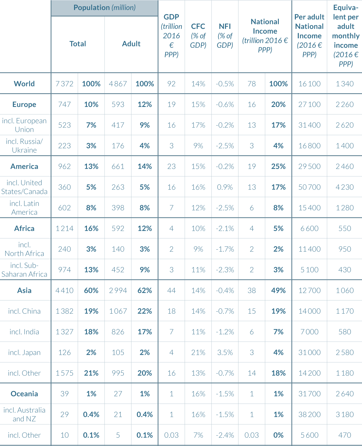
Beyond the fact that the GDP framework is not meant for the analysis of inequality within countries, it has two other important limitations when the focus is on income inequality between countries. The first one is that gross domestic product, as its name indicates, is a gross measure: it does not take into account expenses required to replace capital that has been deteriorated or that has become obsolete during the course of production of goods and services in an economy. Machines, computers, roads, and electric systems have to be repaired or replaced every year. This has been termed capital depreciation or consumption of fixed capital (CFC). Subtracting it from GDP yields the net domestic product, which is a more accurate measure of true economic output than GDP. Consumption of fixed capital actually varies over time and countries (Table 2.2.1). Countries that have an important stock of machines in their overall stock of capital tend to replace higher shares of overall capital. This is generally true for advanced and automatized economies—in particular, for Japan, where consumption of fixed capital is equal to 21% of its GDP (which reduces GDP by close to €8 000 per year and per adult). Consumption of fixed capital is also high in the European Union and the United States (16–17%). On the contrary, economies that possess relatively fewer machines and a higher share of agricultural land in their capital stock tend to have lower CFC values. CFC is equal to 11% of GDP in India, and 12% in Latin America. CFC variations thus modify the levels of global inequality between countries. Such variations tend to reduce global inequality, since the income dedicated to replacing obsolete machines tends to be higher in rich countries than in low-income countries. In the future, we plan to better account for the depreciation of natural capital in these estimates.
GDP figures have another important limitation when the need is to compare income inequality between countries and over time. At the global level, net domestic product is equal to net domestic income: by definition, the market value of global production is equal to global income. At the national level, however, incomes generated by the sale of goods and services in a given country do not necessarily remain in that country. This is the case when factories are owned by foreign individuals, for instance. Taking foreign incomes into account tends to increase global inequality between countries rather than reduce it. Rich countries generally own more assets in other parts of the world than poor countries do. Table 2.2.1 shows that net foreign income in North America amounts to 0.9% of its GDP (which corresponds to an extra €610 ($670) received by the average North American adult from the rest of the world.4 Meanwhile, Japan’s net foreign income is equal to 3.5% of its GDP (corresponding to €1 460 per year and per adult). Net foreign income within the European Union is slightly negative when measured at PPP values (Table 2.2.1) and very slightly positive when measured at market exchange rate values (Table 2.2.2). This figure in fact hides strong disparities within the European Union. France and Germany have strongly positive net foreign income (2 to 3% of their GDP), while Ireland and the United Kingdom have negative net foreign incomes (this is largely due to the financial services and foreign companies established there). On the other hand, Latin America annually pays 2.4% of its GDP to the rest of the world. Interestingly, China has a negative net foreign income. It pays close to 0.7% of its GDP to foreign countries, reflecting the fact that the return it receives on its foreign portfolio is lower than the return received by foreign investments in China.
By definition, at the global level, net foreign income should equal zero: what is paid by some countries must be received by others. However, up to now, international statistical institutions have been unable to report flows of net foreign incomes consistently. At the global level, the sum of reported net foreign incomes has not been zero. This has been termed the “missing income” problem: a share of total income vanishes from global economic statistics, implying non-zero net foreign income at the global level.
The World Inequality Report 2018 relies on a novel methodology which takes income flows from tax havens into account. Our methodology relies on estimations of offshore wealth measured by Gabriel Zucman.5 It should be noted that, when measured at market exchange rates, net foreign income flows should sum to zero (Table 2.2.2), but there is no reason for this to happen when incomes are measured at purchasing power parity (Table 2.2.1). Taking into account missing net foreign incomes does not radically change global inequality figures but can make a large difference for particular countries. This constitutes a more realistic representation of income inequality between countries than figures generally discussed.
Purchasing Power Parity
Asian growth contributed to reduce inequality between countries over the past decades
At the global level, per-adult monthly income in 2016 is €1 340 ($1 740) at purchasing power parity (PPP) and €990 ($1 090) at market exchange rate (MER). As discussed, PPP and MER are different ways to measure incomes and inequality across countries. Whereas MER reflects market prices, PPP aims to take price differences between countries into account.
National income is about three times higher in North America at PPP (€4 220 or $5 490 per adult per month) than the global average and it is two times higher in the European Union at PPP than the global average (€2 630 or $3 420 per adult per month). Using MER values, gaps between rich countries and the global average are reinforced: United States and Canada are five times richer than the world average whereas the EU is close to three times richer.6 In China, per-adult income is €1 170 or $1 520 at PPP—that is, slightly lower than world average (€1 340 or $1 740). China as a whole represents 19% of today’s global income. This figure is higher than North America (17%) and the European Union (17%). Measured at MER, the Chinese average is, however, equal to €700 or $770, notably lower than the world average (€990 or $1 090). The Chinese share of global income is reduced to 15% versus 27% for US-Canada and 23% for the EU.
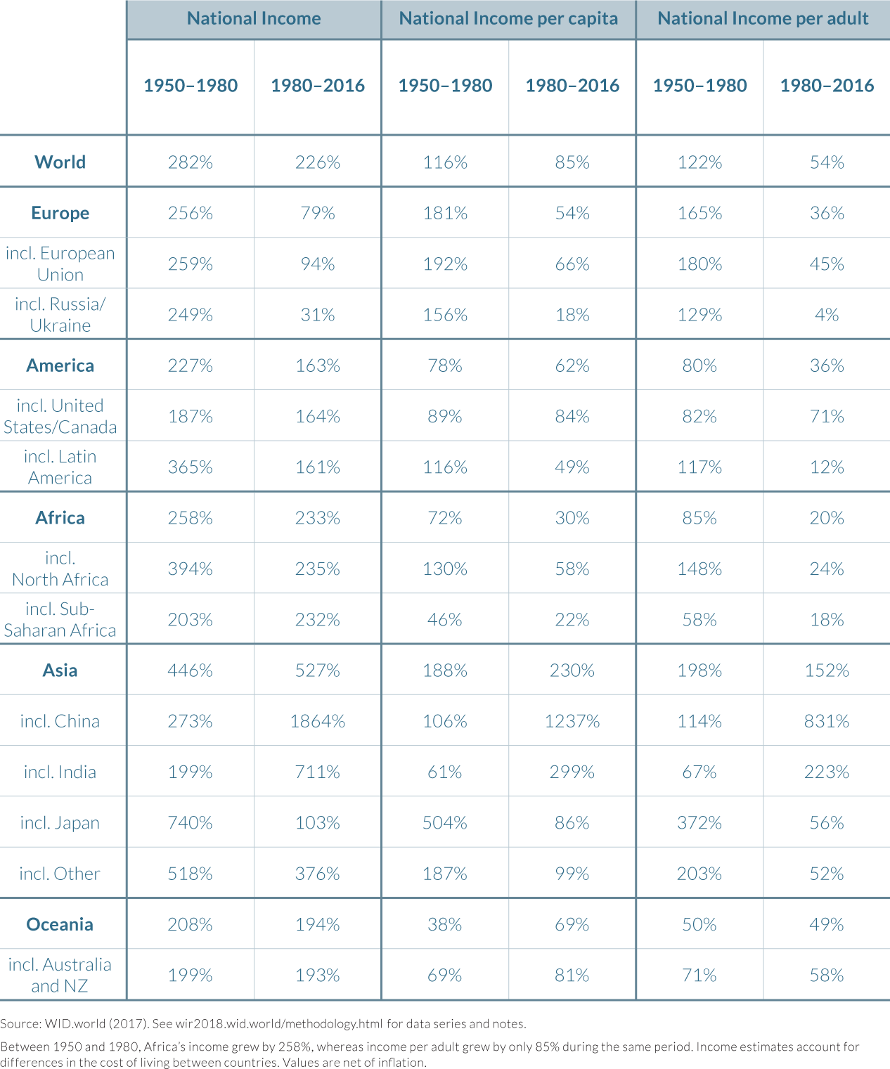
This marks a sharp contrast with the situation in 1980. Thirty-eight years ago, China represented only 3% of global income versus 20% for US-Canada and 28% for the European Union (at purchasing power parity estimates: see Table 2.2.3). Indeed, China’s impressive real per-adult national income growth rate over the period (831% from 1980 to 2016, versus 106% from 1950 to 1980: see Table 2.2.4) highly contributed to reducing between-country inequalities over the world. Another converging force lies in the reduction of income growth rates in Western Europe, as compared to the previous decades (180% per-adult growth between 1950 and 1980 versus 45% afterwards). This deceleration in growth rates was due to the end of the “golden age” of growth in Western Europe but also due to the Great Recession, which led to a decade of lost growth in Europe. Indeed, per-adult income in Western Europe was in 2016 the same as ten years before, before the onset of the financial crisis.
Despite a reduction of inequality between countries, average national income inequalities remain strong among countries. Developing and emerging countries did not all grow at the same rate as China. India’s average monthly per-adult income (€580 or $750) is still only 0.4 times the world average measured at PPP, while sub-Saharan Africa is only 0.3 times the world average (€430 or $560) today. Average North Americans earn close to ten times more than average sub-Saharan Africans.
Market Exchange Rates

Purchasing Power Parity
Diverging forces were also at play in certain parts of the world, such as sub-Saharan Africa and Latin America.
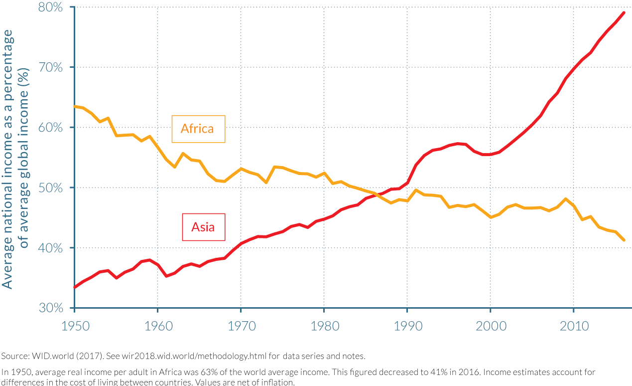
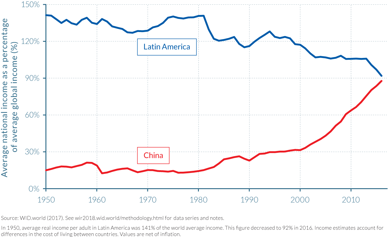
Huge inequalities persist among countries but, in some cases, they actually worsened. Certain low- to middle-income regions are relatively worse off today than four decades ago. Between 1980 and 2016, per-adult incomes in Africa grew more slowly (18%) than the world’s average per-adult incomes (54%). This growth trend, marked by a combination of political and economic crises and wars, is not limited to the poorest region of the world. In South America, as well, incomes have grown by only 12% since 1980. As a result, these regions’ average incomes fell relative to the world average, from 65% to only 40% of the world average in 1950, versus 140% to less than 100% in Latin America (Figures 2.2.1 and 2.2.2).
2.3 Trends in income inequality within countries
- After a historical decline in most parts of the world from the 1920s to the 1970s, income inequality is on the rise in nearly all countries. The past four decades, however, display a variety of national pathways, highlighting the importance of political and institutional factors in shaping income dynamics.
- In the industrialized world, Anglo-Saxon countries have experienced a sharp rise in inequality since the 1980s. In the United States, the bottom 50% income share collapsed while the top share boomed. Continental European countries were more successful at containing rising inequality, thanks to a policy and institutional context more favorable to lower- and middle-income groups.
- In China, India, and Russia, three formerly communist or highly regulated economies, inequality surged with opening and liberalization policies. The steepest rise occurred in Russia, where the transition to a market economy was particularly abrupt.
- Inequality is extreme in Brazil, the Middle East, and South Africa, the world’s most unequal regions. In these three large emerging markets, inequality currently reaches extreme levels: the top 10% earners capture 55% to 65% of national income.
- Little is known of the long-run dynamics of income inequality in many low-income countries. More information is essential for peaceful democratic debates in these countries, especially given that official estimates are very likely to understate existing levels of inequality.
After a historical decline from the 1920s to the 1970s, income inequality is on the rise in most regions of the world
Income inequality was sharply reduced in the first half of the twentieth century—more precisely, between the 1920s and the 1970s—in most countries of the world, but it has been on the rise almost everywhere since the late 1970s. In Europe and North America, the long-run decline in income inequality was due to the combination of political, social, and economic shocks already discussed. These included the destruction of human and physical capital led by the World Wars, the Great Depression, nationalization policies, and government control over the economy. After the Second World War, a new policy regime was put in place, including the development of social security systems, public education, social and labor policies, and progressive taxation. This combination of factors severely affected very high fortunes, and enabled the rise of a patrimonial middle class and a general decline in inequality in Europe—and to a lesser extent, in North America.7
In emerging economies, political and social shocks led to an even more radical reduction of income inequality. The abolition of private property in Russia, land redistribution, massive investments in public education, and strict government control over the economy via five-year plans effectively spread the benefits of growth from the early 1920s to the 1970s. In India, which did not undergo a communist revolution but implemented socialist policies after gaining its independence, income inequality was also severely reduced over the same period. For most of the global population, the first three-quarters of the twentieth century corresponded to a very strong compression in the distribution of national incomes. The economic elite captured a much smaller share of economic growth in the late 1970s than it did at the beginning of the century.
The trend was then reversed in most countries—even though there are notable exceptions deserving attention. Countries did not all follow the same path. Large emerging countries, as they underwent profound deregulations of their economies, saw inequalities surge as they opened up and liberalized but followed different transition strategies. In rich countries, inequality levels also varied largely according to changes in institutional and policy contexts, with sharp income inequality rises in the Anglo-Saxon world and more moderate increases in continental Europe and Japan. Certain Western European and Northern European countries almost contained the rise in income inequality.
Given the multitude of trends presented in this chapter, it would be imprudent to seek a single story line behind the rise of inequality across countries. Our findings show that national cultural, political, and policy contexts are key to understanding the dynamics of income inequality. In this chapter, we largely focus on the evolution of top-income shares, as they are now available for a very large set of countries. In the country-by-country chapters that come next, the focus will be more detailed and we will shift the attention to bottom-income groups.
Bottom-income groups were shut off from economic growth in the United States, while top incomes surged in the Anglo-Saxon world
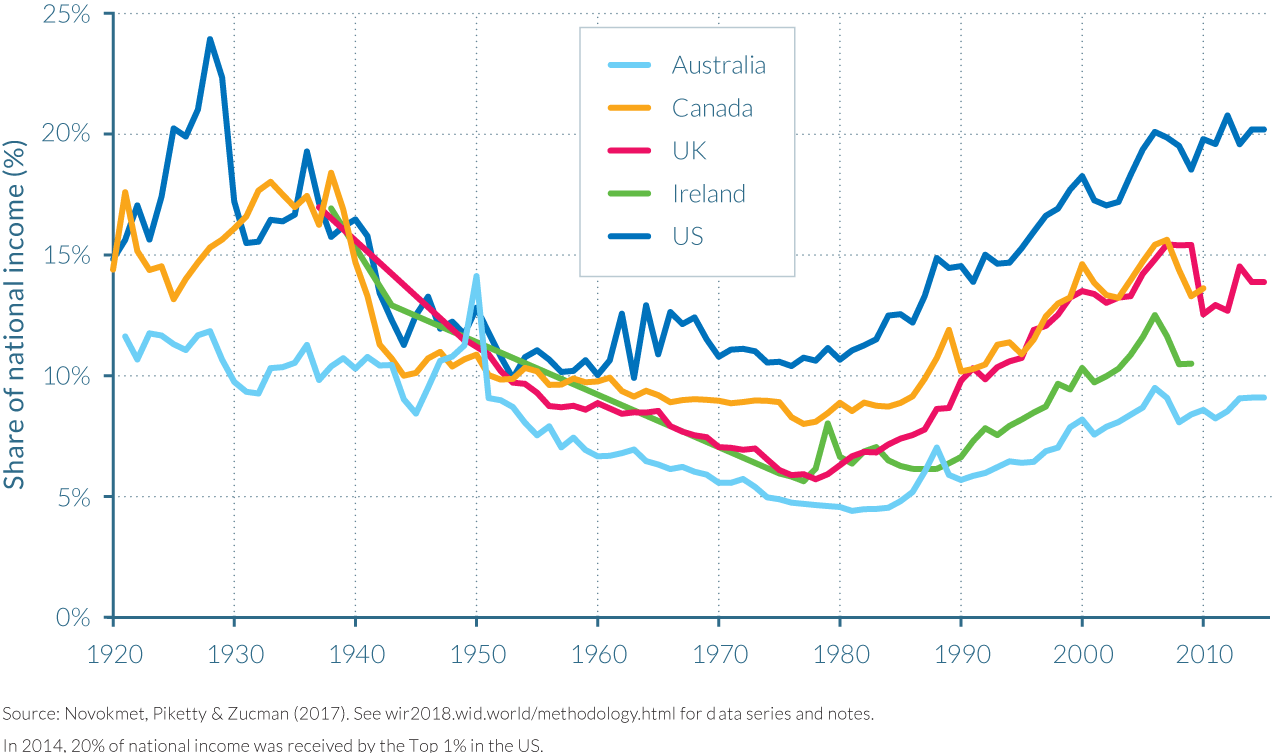
Top 1% income shares have been steadily increasing in Anglo-Saxon countries since the early 1980s, after a historical decline throughout the first part of the twentieth century (see Figure 2.3.1). Inequality exploded in the United States: the top percentile income share there was less than 11% in 1980, and it was slightly above 20% in 2014. Britain’s top percentile share rose from less than 6% in the late 1970s to nearly 14% in the mid-2010s. Britain had the same level of top 1% income share as Ireland in the late 1970s, but is now nearly on a level with Canada, where the top share increased from less than 9% in 1980 to almost 14%. Australia and New Zealand, with levels of inequality much lower throughout the entire period (around 5% in the early 1980 and rising to less than 10%) also show a broadly similar pattern.8 The impact of the financial crisis is visible on top-income shares, which exhibit a marked declined after 2007. Novel data suggest that top incomes have either recovered their shares or are progressively recovering them.
The rise in labor income inequality played an important role in the rise of inequality in Anglo-Saxon countries, and particularly in the United States before the turn of the century, as discussed in chapter 2.4. This phenomenon is owing to the “rise of super managers”—that is, the rise in super wages received by CEOs of large financial and nonfinancial firms. This evolution was also accompanied by an increased polarization of income between low-wage and high-wage firms. This contrasted with European countries, where the dynamics at the top of the distribution have been more moderate. New estimates also show that the upsurge in top incomes has mostly been a capital income phenomenon after 2000 in the United States, shedding new light on the process of unequal growth generation.
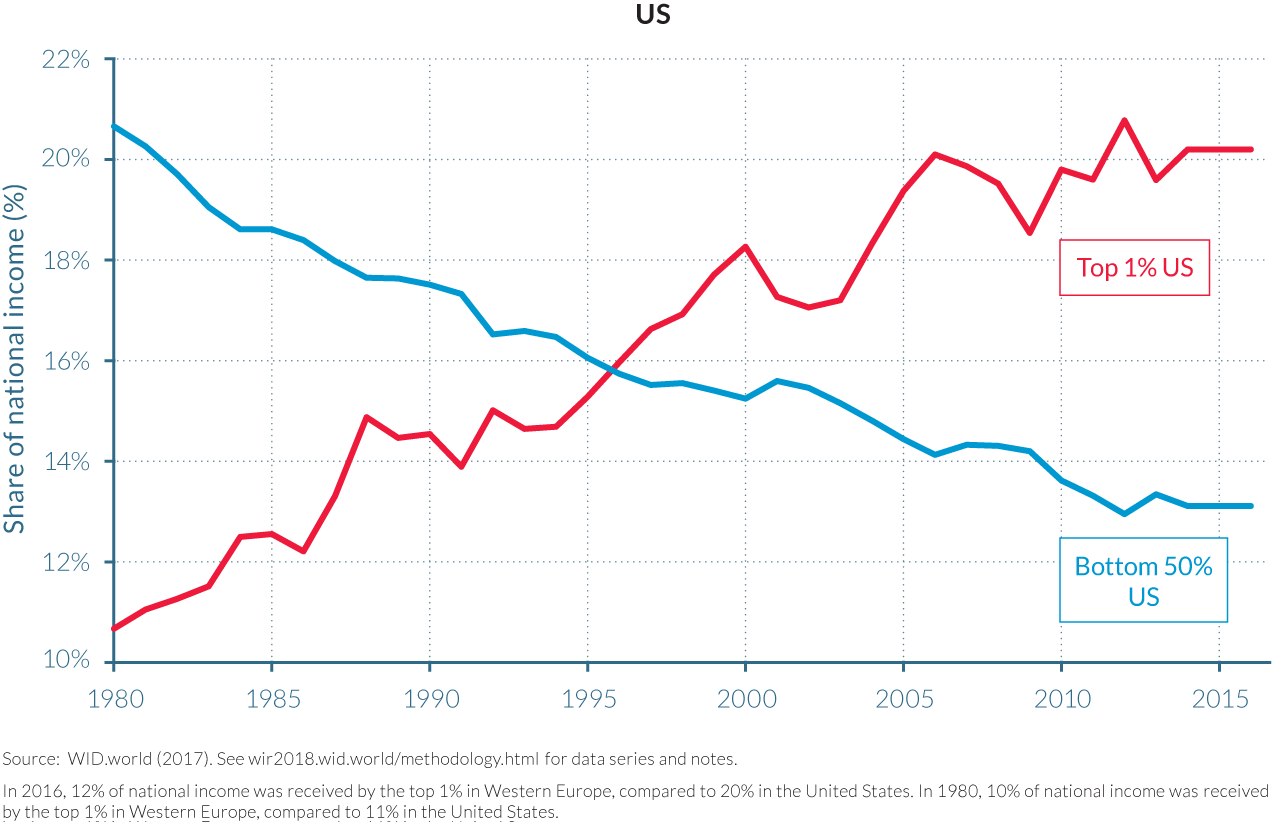
Our novel estimates also allow a better understanding of the dynamics at the bottom of the distribution—at least for certain countries. In the United States, the bottom 90% of the population benefited from a large share of growth in the three decades following the Second World War. Total per-adult pre-tax income growth for the bottom 50% and for the middle 40% was higher than 100%, while total growth for the top 10% earners was less than 80%. But since the 1980s, the bottom 50% was shut off from national income growth. While average per-adult pre-tax incomes increased by 60%, growth was close to zero for the bottom 50% of the population. The bottom 50% did benefit from a very modest post-tax income growth, thanks to redistribution, but this has been eaten up by rising health spending. Government provided little support to help low-income individuals cope with the situation.
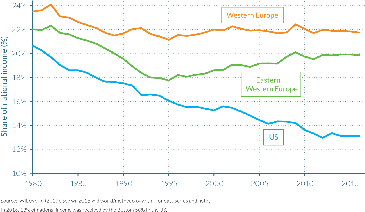
The comparison of inequality trajectories between the United States and Western Europe is particularly striking. The two regions had similar levels of inequality in 1980 (top 1% share at 10–11% and bottom 50% share at 21–23%). However, today, the situations are radically different as the relative positions of the bottom 50% and top 1% group in the United States have been inverted (see Figure 2.3.2a).
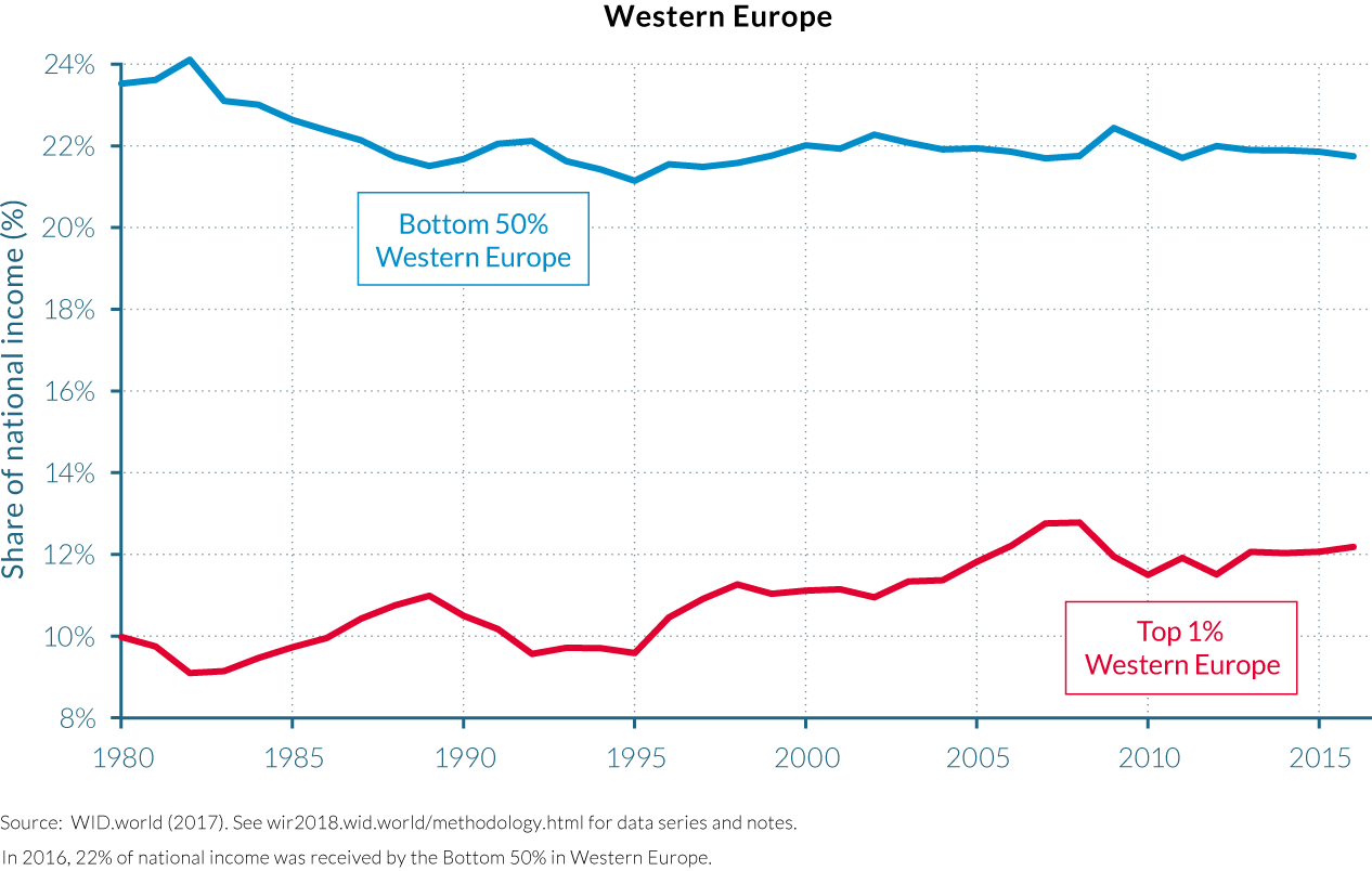
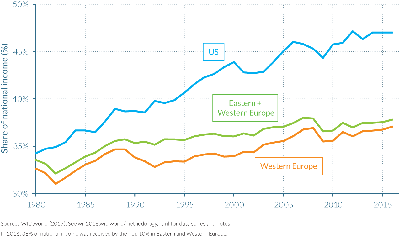
Inequality in enlarged Europe (with a population of 520 million) is now substantially smaller than in the United States (320 million)
We also compare in Figures 2.3.2b through 2.3.2c the evolution of income inequality between the United States, Western Europe, and enlarged Europe (that is, including Eastern Europe). Enlarged Europe includes ex-communist East European countries with lower average incomes than West European averages, leading to higher inequality levels. However, it is striking to see that inequality levels in enlarged Europe remain much smaller than in United States. In particular, in spite of Europe’s bigger size and potential heterogeneity (520 million for enlarged Europe, 320 million for the United States), the bottom 50% income share is substantially larger in Europe: 20–22% of total income at the end of the period versus 12% in the United States.
This conclusion would likely be exacerbated if we were to compare enlarged Europe to enlarged North America (including not only Canada but also Mexico), which we plan to do in the near future as new data become available for Mexico. Another important issue for future research is to better understand which part of Europe’s lower inequality level can be attributed to redistributive policies at the regional level (including EU regional development funds), as opposed to national factors (such as the relatively egalitarian legacy of Eastern European countries and the fact that the transition from communism was not as abrupt as in Russia).
Continental European countries were more successful in preventing the rise of incomes at the top and the stagnation of incomes at the bottom
In western continental Europe, inequality has also been on the rise since the late 1970s, though both the levels of inequality and the rise in inequality were less striking than in the United States. The German top 1% income share rose from slightly less than 11% in the early 1980s to 13% today, as described in chapter 2.6. In France, the top 1% pre-tax income share increased from approximately 7% in 1983 to nearly 11% in 2014, as discussed in more detail in chapter 2.5. Spain displays a different picture. The impact of the financial crisis and the bursting of the real estate bubble in 2007–2008, which represented a substantial share of national income, severely hampered incomes at the bottom of the distribution, but also at the top: the top 1% income share decreased from close to 13% in 2006 to less than 9% in 2012, and still shows no sign of recovery. (Figure 2.3.3)
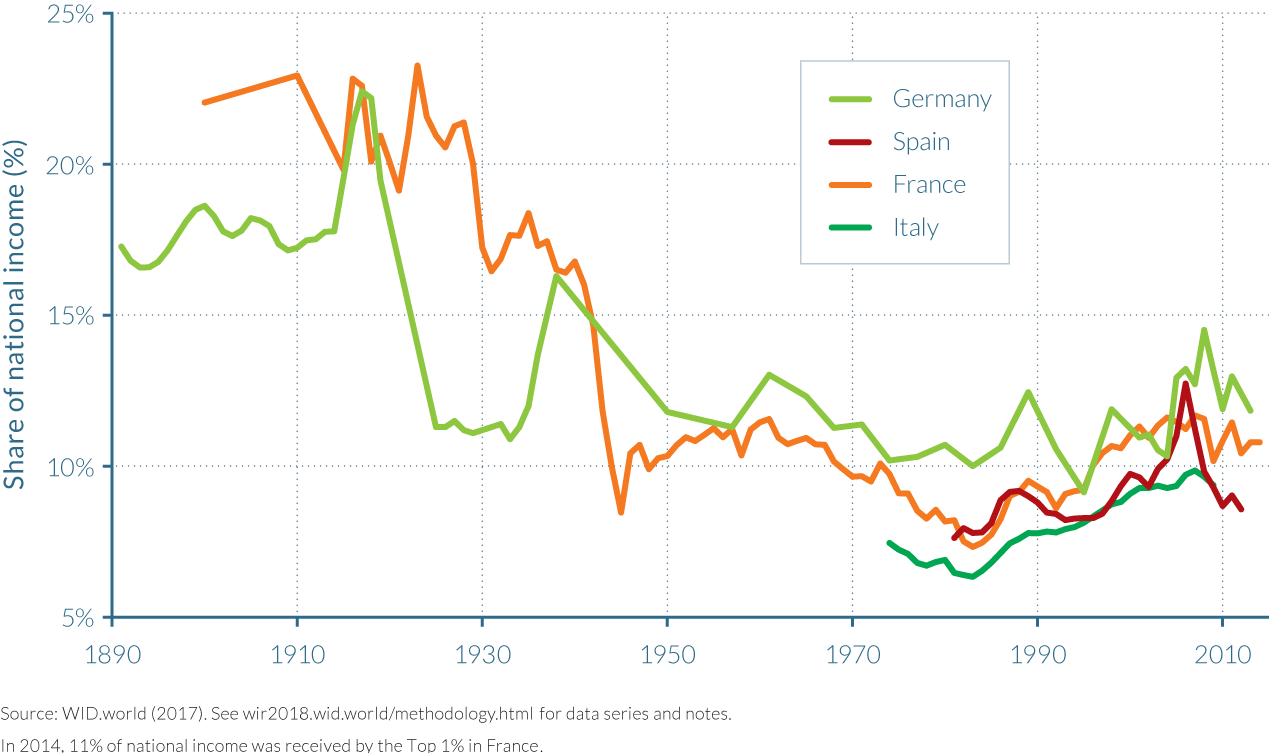
For France, new estimates also allow us to track the dynamics of growth at the bottom of the distribution. While growth was higher than average at the bottom 50% and middle 40% during the postwar period and up to the early 1980s, the situation was reversed afterwards. The “thirty glorious years”—as the high-growth 1950–1980 period is commonly referred to in France—continued after the 1980s, but only for the top income earners. This increase in inequality is characterized by rises in both labor and capital income. However, the bottom half of the population was not shut off from growth after the 1980s. This part of the population enjoyed close to average income growth rates—a strikingly different picture than in the United States.
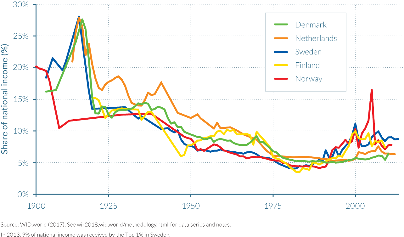
Northern European countries had among the lowest levels of income inequality in the world in the early 1980s. Growth has been more unequal in these countries after 1980 than before, yet income concentration at the top of the distribution remains limited. Top 1% income earners capture less than 10% of total income in Denmark, Finland, Norway, and Sweden. In Denmark and in the Netherlands, the rise in top percentile share has been small, from about 5% to 6% since the 1980s. As we can see, many European countries have been able to generate relatively high average income growth rates and maintain the rise in income inequality (Figure 2.3.4).
In Russia, China, and India, income inequality surged after the 1980s
Income concentration and wealth concentration were particularly high in tsarist Russia before the Soviet revolution of 1917 (see chapter 2.8 on Russia), and in colonial India (see chapter 2.9 on India). In Russia, the communist revolution led to an extreme compression of money incomes. During the entire communist period, the top 1% income share represented around 5% of national income, down to less than 4% in the seventies (see Figure 2.3.5). It is worth stressing, however, that this extremely low level of monetary inequality is partly artificial. Soviet inequality took other, non-monetary forms, such as privileged access to particular shops and vacation centers for the political elite, and brutal political repression for large segments of the population.
In India, the top percentile income share decreased from around 20% at the end of the colonial period to 6% in the early 1980s, after four decades of socialist-inspired policies aiming at reducing the economic power of the elite, including nationalizations, government control over prices, and extreme tax rates on top incomes. The implosion of the Soviet block and “shock policies” in Russia, and deregulation and opening policies in India from the 1980s onwards, contributed to strong increases in top percentile income shares. The top 1% share increased to 26% in 1996 in Russia and is now at 20%. In India, the top percentile is now around 22%.
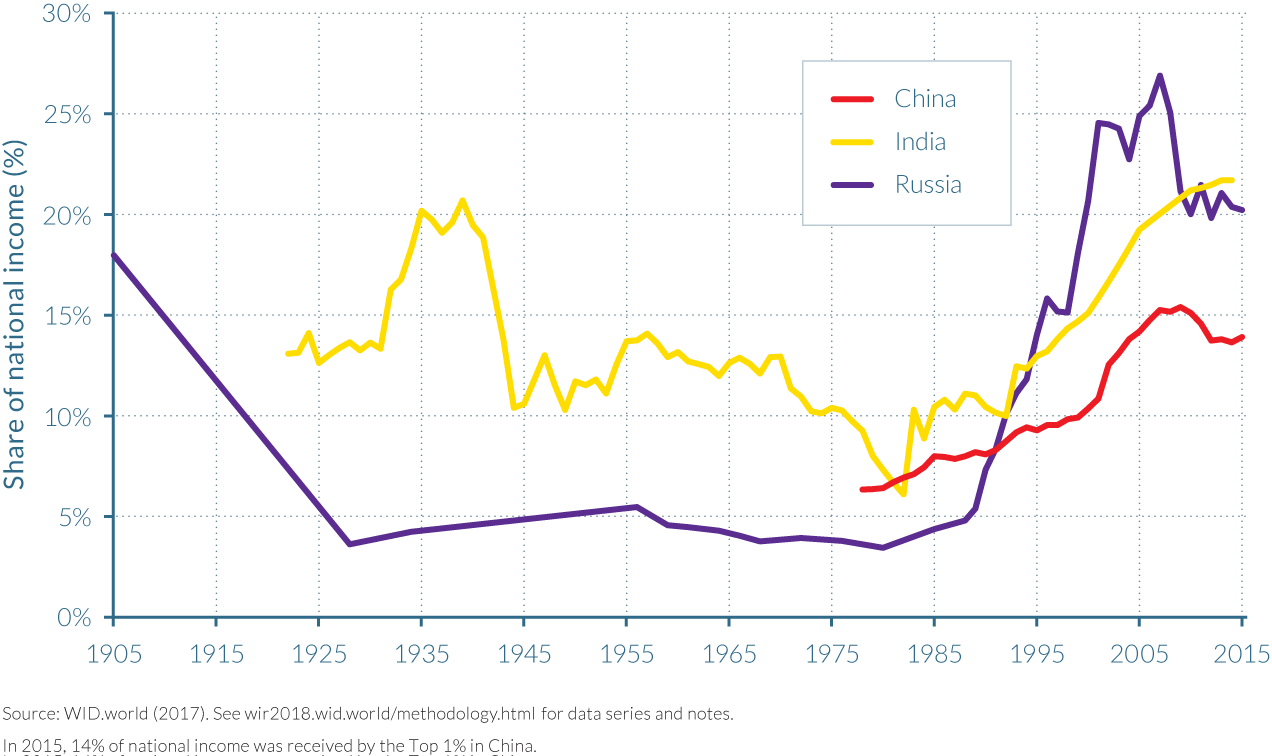
The Chinese opening-up policies established from 1978 (discussed in chapter 2.7 on China), which included important privatization plans, had a lesser effect on inequality than reforms had in Russia or India. China shows a substantial rise in inequality (the top share rose from 6.5% to 14% in twenty years). However, as compared to Russia, China’s transition to a liberalized, open economy was less abrupt and more gradual. Since 2006, inequality at the top has stagnated. In China and to a lesser extent in India, the rise in inequality occurred in the context of high average income growth, enabling important growth at the bottom of the distribution.
Brazil, South Africa, and the Middle East can be characterized as “extreme inequality” regimes: they have the highest inequality levels observed
In Brazil, South Africa, and the Middle East, income has been historically highly concentrated (see Figure 2.3.6). In Brazil, wage inequality has decreased over the past twenty years (in particular due to rising minimum wage) and there have been important and often lauded cash-transfer systems to the poor. However, due to a large concentration of business profits and capital incomes, the top 10% national income share reaches 55% in Brazil today and this value has not changed significantly for the past twenty years as is shown in chapter 2.11. Together with huge regional inequalities, the legacy of racial inequality still plays an important role; Brazil was the last major country to abolish slavery, back in 1887, at a time when slavery made up a very large fraction of the population, up to about 30% of the population in certain regions.
The extreme inequality evident in South Africa can obviously be linked to the historical legacy of the apartheid regime (only fully abolished in 1994), seen today in the country’s dualistic economy and society. As discussed in chapter 2.12, the top 10% is largely made up of whites. This group earns more than 60% of national income and enjoys income levels similar to those of Europeans, while the bottom 90% live with incomes comparable to those of low-income African countries. But in contrast to Brazil and the Middle East, inequality increased significantly over the past decades in South Africa. The trade and financial liberalization that occurred after the end of apartheid, coupled with the failure to redistribute land equally, can help to explain these dynamics - yet more research will be required to better track and understand recent South African income inequality dynamics.
Despite its much larger racial and ethno-cultural homogeneity, levels of inequality in the Middle East are similar to (or possibly even higher than) those in Brazil and South Africa, with a top 10% share above 60%. As discussed in chapter 2.10, regional income and wealth is largely concentrated in in the hands of a small group that is located in the Gulf countries and Saudi Arabia. This is yet another inequality-generating mechanism: the geography of oil property and the frontier system have led to extreme inequality in this region.
In low-income countries, inequality is likely to be higher than previously thought, but data is scarce
We still know very little about the evolution of income inequality in the rest of the developing and emerging world. The first explanation for this situation is that there is a lack of proper income-tax data, either because governments have not shared it, or because the data simply do not exist anymore, or because the data are still decentralized and not digitized.
In the absence of administrative data, most of what we know is based on survey estimates. As discussed in Part I, survey-based estimates of inequality can have a number of limitations. Surveys are often more sporadic in time, lack consistency with national accounts estimates, and miss top incomes. As demonstrated in this report, for numerous emerging countries, these weaknesses can lead to significant underestimation of inequality levels. (See chapters 2.7 and 2.12.) In Côte d’Ivoire, novel estimates show that the income share of the top 1% is approximately 17% of the country’s total income, contrary to the 12% previously estimated by surveys. WID.world work also shows that the share of income earned by the top 1% in China was at least twice as great as official estimates previously suggested. We are currently devoting great energies to accessing income tax data in other African countries, following the lead of Côte d’Ivoire, and hope to be able to report more findings in the near future. At this stage, however, we have only limited access to adequate data.
Collectively, these factors mean that we can assess the evolution of income inequality for only a few developing countries in the years before the 1980s, and over a short or interrupted time period. Given that most individuals earned below the first income-tax threshold, our analysis is also restricted to a tiny fraction of the population. Out of the nine sub-Saharan African countries for which we have historical income tax data, the income share earned by the top 1% can only be properly computed in two small countries—Mauritius and the Seychelles—and for only a few years in Zambia and Zimbabwe. For the remaining countries (Ghana, Kenya, Tanzania, Nigeria, and Uganda), the income-tax data encompass less than 1% of the estimated adult population. While this may appear surprising, it is worth remembering that in the early days of the US personal income tax (1913–1915), the proportion of taxpayers was 0.9%.
Nevertheless, some lessons can be drawn from this data. In Africa, from the mid-1940s until the early 1980s, the income share of the top 0.1% decreased in Zimbabwe, Zambia, Malawi, Kenya, Tanzania, and South Africa, following a trend similar to that of most rich countries. But compared to European levels over the same period, income inequality was much higher in these African countries, and even reached the most extreme levels. In 1950, the richest 0.1% of Zambia commanded a bit more than 10% of total national income. Income inequality was, however, seemingly lower in West African countries such as Nigeria and Ghana, where the top 0.1% averaged to 2.5% of total income between 1940 and 1960. Interestingly, this pattern of geographical differences in inequality is still evident in survey data that has been collected in recent decades.
Where it is possible to break down tax data by race or nationality, historical data in African countries demonstrate that most taxpayers were non-African—mainly Europeans, followed by Arabs, then Asians. This dominance is likely to have been mitigated in recent decades, but it is still important in former settlement colonies such as South Africa. Recent research on Côte d’Ivoire for the period 1985–2014 further illustrates how the aforementioned discrepancy between survey data and administrative data can be partly due to the undersampling of non-African individuals.9
Available data for Latin American countries show that income inequality in the region is generally higher than the levels seen in European and Asian countries. For example, recent data collected in Latin America indicate that the total income share of the top 1% in Argentina, Colombia, and Brazil is greater than 16%. Interestingly, when only survey data have been used to estimate inequality in the region, the results suggest that income inequality has decreased significantly, while WID.world estimates for Brazil and Colombia show that they have in fact remained stubbornly high.
In conclusion, the scarcity of available data makes it challenging to develop a conclusive picture of inequality levels in lower-income countries. From the data that are available, however, inequality estimations suggest that in most cases the distribution of income is more concentrated than previously thought in low-income countries. While important efforts have been made in the past years to produce and analyze consistent inequality estimates in emerging countries (which are presented for the first time together in this report) the study of the analysis of income inequality based on sound and consistent data in low-income countries is still only in its infancy.
2.4 Income inequality in the United States
Information in this chapter is based on the article “Distributional National Accounts: Methods and Estimates for the United States,” by Thomas Piketty, Emmanuel Saez, and Gabriel Zucman, forthcoming in the Quarterly Journal of Economics (2018).
- Income inequality in the United States is among the highest of all rich countries. The share of national income earned by the top 1% of adults in 2014 (20.2%) is much larger than the share earned by the bottom 50% of the adult population (12.5%).
- Average pre-tax real national income per adult has increased 60% since 1980, but it has stagnated for the bottom 50% at around $16 500. While post-tax cash incomes of the bottom 50% have also stagnated, a large part of the modest post-tax income growth of this group has been eaten up by increased health spending.
- Income has boomed at the top. While the upsurge of top incomes was first a labor-income phenomenon in 1980s and 1990s, it has mostly been a capital-income phenomenon since 2000.
- The combination of an increasingly less progressive tax regime and a transfer system that favors the middle class implies that, even after taxes and all transfers, bottom 50% income growth has lagged behind average income growth since 1980.
- Increased female participation in the labor market has been a counterforce to rising inequality, but the glass ceiling remains firmly in place. Men make up 85% of the top 1% of the labor income distribution.
Income inequality in the United States is among the highest of rich countries
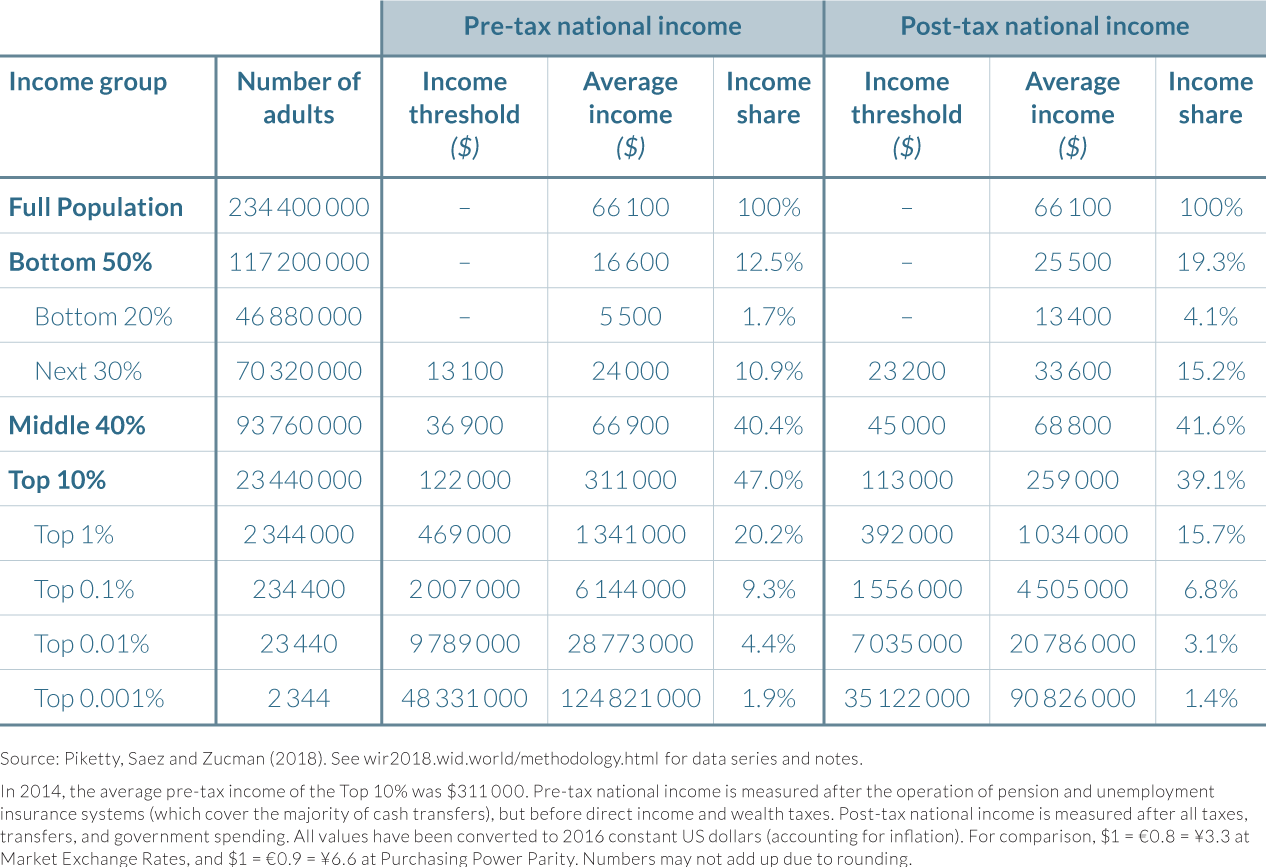
In 2014, the distribution of US national income exhibited extremely high inequalities. The average income of an adult in the United States before accounting for taxes and transfers was $66 100, but this figure masks huge differences in the distribution of incomes. The approximately 117 million adults that make up the bottom 50% in the United States earned $16 600 on average per year, representing just one-fourth of the average US income. As illustrated by table 2.4.1, their collective incomes amounted to a 13% share of pre-tax national income. The average pre-tax income of the middle 40%—the group of adults with incomes above the median and below the richest 10%, which can be loosely described as the “middle class”—was roughly similar to the national average, at $66 900, so that their income share (41%) broadly reflected their relative size in the population. The remaining income share for the top 10% was therefore 47%, with average pre-tax earnings of $311 000. This average annual income of the top 10% is almost five times the national average, and nineteen times larger than the average for the bottom 50%. Furthermore, the 1:19 ratio between the incomes of the bottom 50% and the top 10% indicates that pre-tax income inequality between the “lower class” and the “upper class” is more than twice the (1:8 ratio) difference between the average national incomes in the United States and China, using market exchange rates.
Income is very concentrated, even among the top 10%. For example, the share of national income going to the top 1%, a group of approximately 2.3 million adults who earn $1.3 million on average per annum, is over 20%—that is, 1.6 times larger than the share of the entire bottom 50%, a group fifty times more populous. The incomes of those in the top 0.1%, top 0.01%, and top 0.001% average $6 million, $29 million, and $125 million per year, respectively, before personal taxes and transfers.
As shown by Table 2.4.1, the distribution of national income in the United States in 2014 was generally made slightly more equitable by the country’s taxes and transfer system. Taxes and transfers reduce the share of national income for the top 10% from 47% to 39%, which is split between a one percentage point rise in the post-tax income share of the middle 40% (from 40.5% to 41.6%) and a seven percentage point increase in the post-tax income share of the bottom 50% (from 12.5% to 19.4%). The trend is also of relatively large proportionate losses in income shares as one looks further up the income distribution, indicating that government taxes are slightly progressive for the United States’ richest adults.
National income grew by 61% from 1980 to 2014 but the bottom 50% was shut off from it
Income inequality in the United States in 2014 was vastly different from the levels seen at the end of the Second World War. Indeed, changes in inequality since the end of that war can be split into two phases, as illustrated by Table 2.4.2. From 1946 to 1980, real national income growth per adult was strong—with average income per adult almost doubling—and moreover, was more than equally distributed as the incomes of the bottom 90% grew faster (102%) than those of the top 10% (79%).10 However, in the following thirty-four-year period, from 1980 to 2014, total growth slowed from 95% to 61% and became much more skewed.
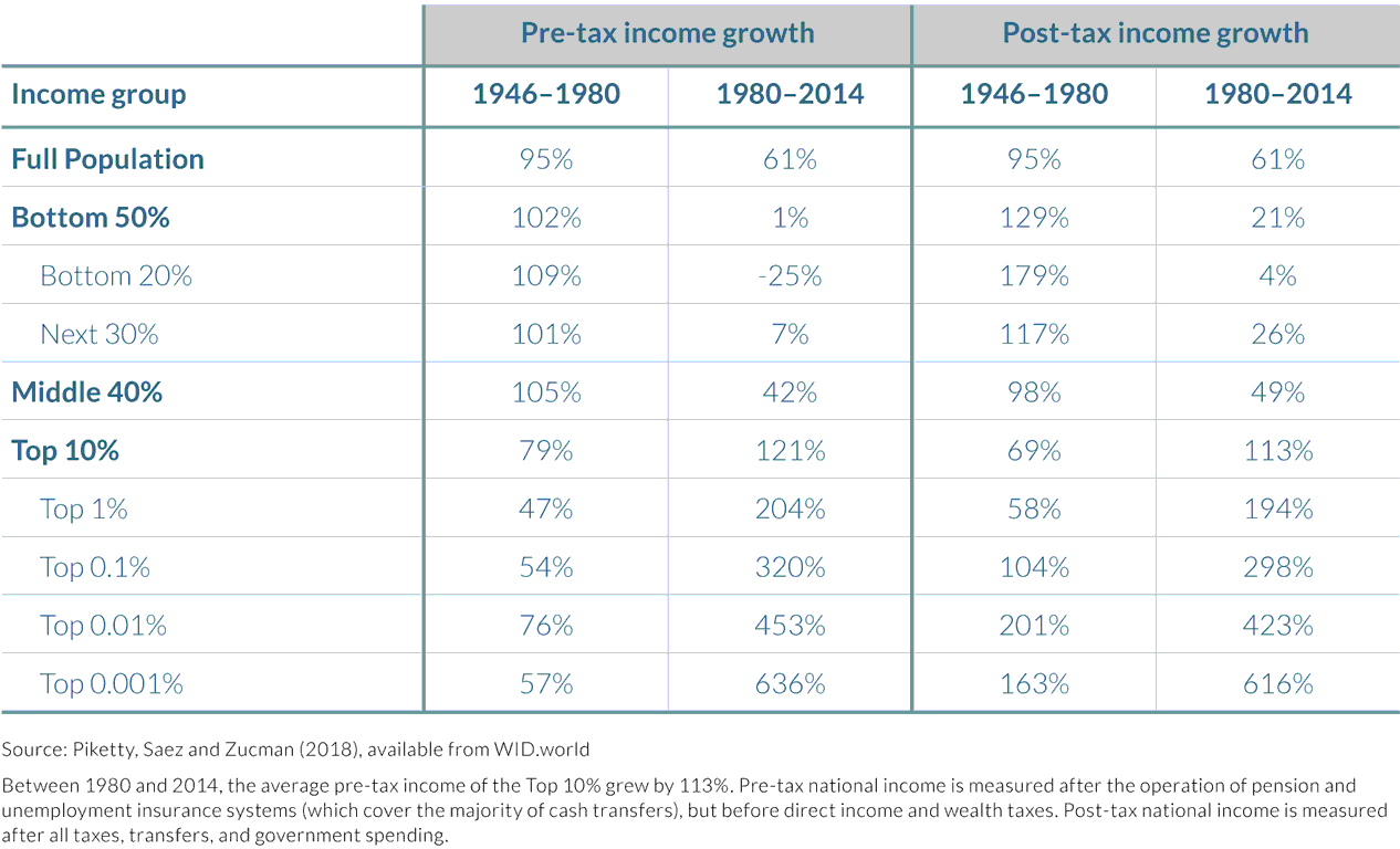
The pre-tax incomes of the bottom 50% stagnated, increasing by only $200 from $16 400 in 1980 to $16 600 in 2014, a minuscule growth of just 1% over a thirty-four-year period. The total growth of post-tax income for the bottom 50% was substantially larger, at 21% over the full period 1980–2014 (averaging 0.6% a year), but this was still only one-third of the national average. Growth for the middle 40% was weak, with a pre-tax increase in income of 42% since 1980 and a post-tax rise of 49% (an average of 1.4% a year). By contrast, the average income of the top 10% doubled over this period, and for the top 1% it tripled, even on a post-tax basis. The rates of growth further increase as one moves up the income ladder, culminating in an increase of 636% for the top 0.001% between 1980 and 2014, ten times the national income growth rate for the full population.
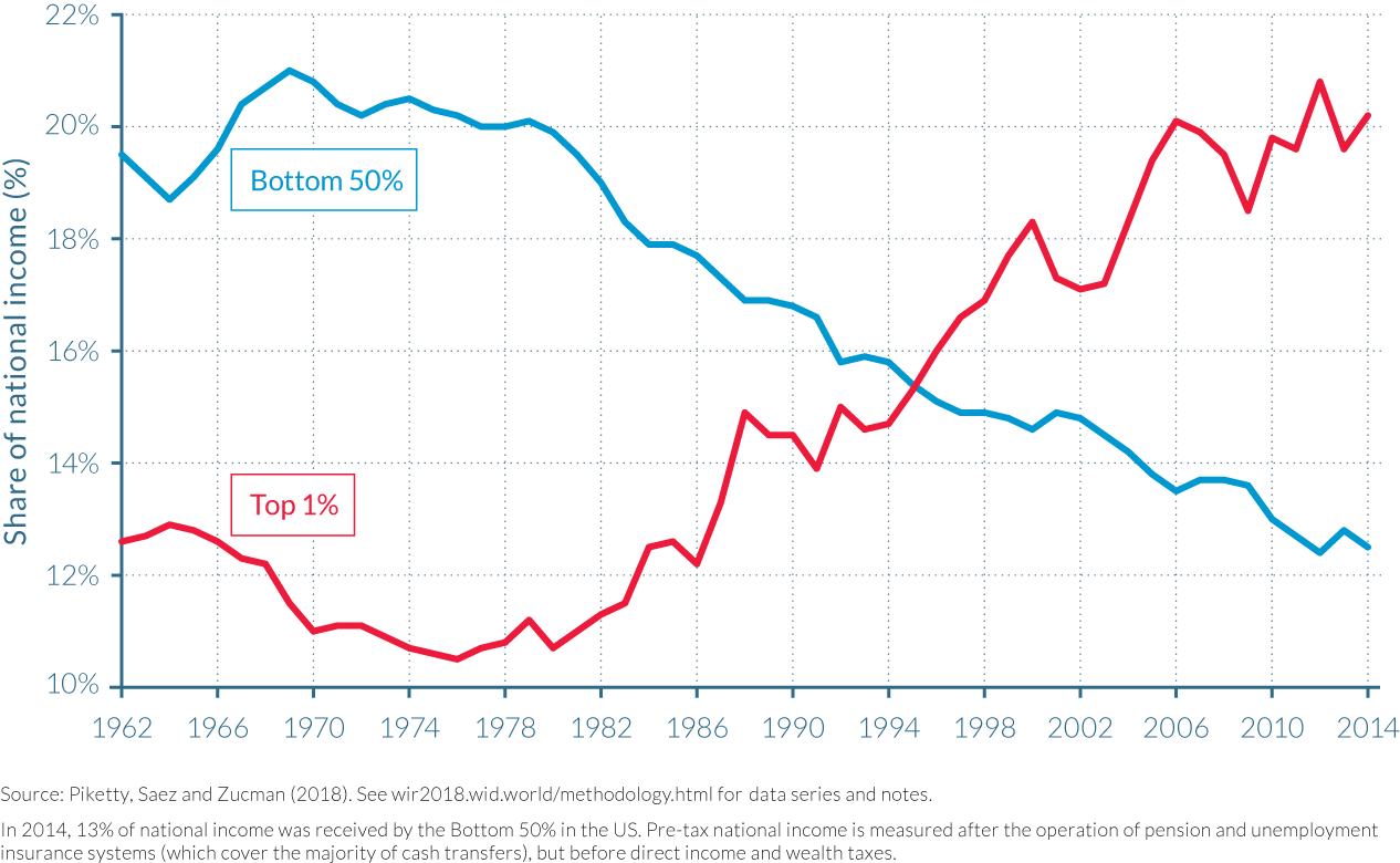
The rise of the top 1% mirrors the fall of the bottom 50%
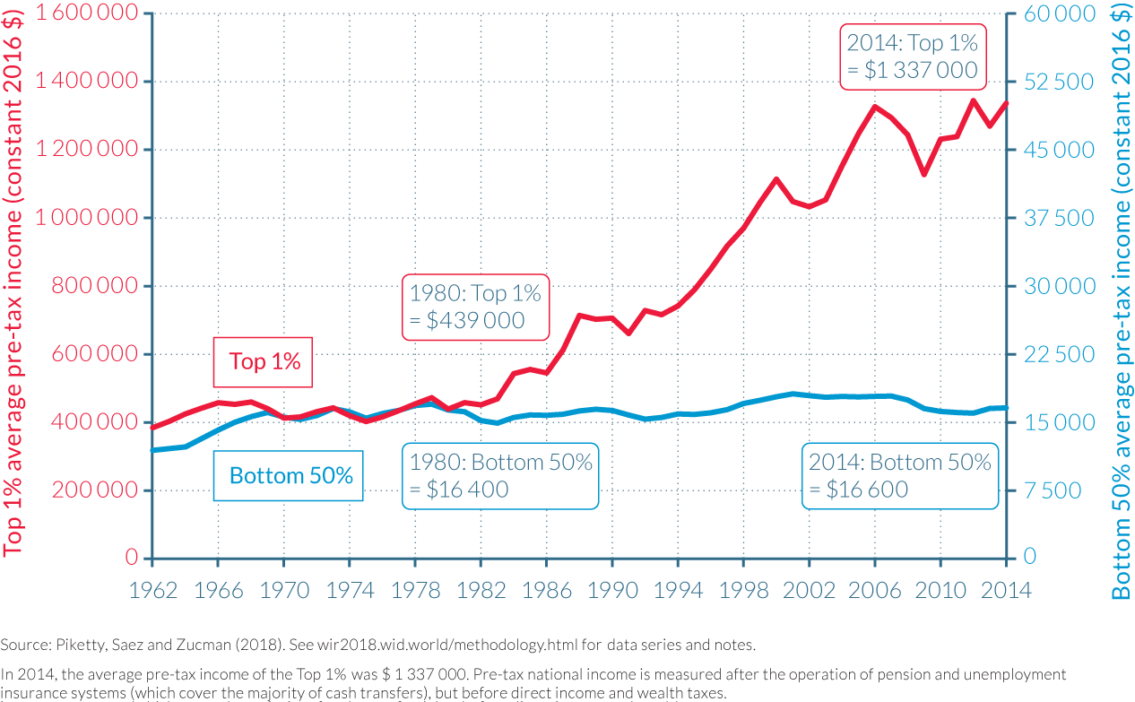
This stagnation of incomes of the bottom 50%, relative to the upsurge in incomes experienced by the top 1% has been perhaps the most striking development in the United States economy over the last four decades. As shown by Figure 2.4.1a, the groups have seen their shares of total US income reverse between 1980 and 2014. The incomes of the top 1% collectively made up 11% of national income in 1980, but now constitute above 20% of national income, while the 20% of US national income that was attributable to the bottom 50% in 1980 has fallen to just 12% today. Effectively, eight points of national income have been transferred from the bottom 50% to the top 1%. Therefore, the gains in national income share made by the top 1% have been more than large enough to compensate for the fall in income share of the bottom 50%, a group demographically fifty times larger. Figure 2.4.1b shows that while average pre-tax income for the bottom 50% has stagnated at around $16 500 since 1980, the top 1% has experienced 300% growth in their incomes to approximately $1 340 000 in 2014. This has increased the average earnings differential between the top 1% and the bottom 50% from twenty-seven times in 1980 to eighty-one times today.
Excluding health transfers, average post-tax income of the bottom 50% stagnated at $20 500
The stagnation of incomes among the bottom 50% was not the case throughout the postwar period, however. The pre-tax share of income owned by this chapter of the population increased in the 1960s as the wage distribution became more equal, in part as a consequence of the significant rise in the real federal minimum wage in the 1960s, and reached its historical peak in 1969. These improvements were supported by President Johnson’s “war on poverty,” whose social policy provided the Food Stamp Act of 1964 and the creation of the Medicaid healthcare program in 1965.
However, the share of both pre-tax and post-tax US income accruing to the bottom 50% began to fall notably from the beginning of the 1980s, and the gap between pre-tax and post-tax incomes also diverged significantly from this point onwards. Indeed, the data indicate that virtually all of the meager growth in the real post-tax income of the bottom 50% since the 1970s has come from Medicare and Medicaid. Excluding these two health care transfers, the average post-tax income of the bottom 50% would have stagnated since the late 1970s at just below $20 500 (see Figure 2.4.2). The bottom half of the US adult population has therefore been effectively shut off from pre-tax economic growth for over forty years, and the increase in their post-tax income of approximately $5 000 has been almost entirely absorbed by greater healthcare spending, in part as a result of increases in the cost of healthcare provision.11 Furthermore, it is solely through the in-kind health transfers and collective expenditures that the bottom half of the distribution sees its income rise above its pre-tax level and becomes a net beneficiary of redistribution; up until the government ran large deficits during the 2008 Great Recession, the bottom 50% paid more in taxes than it received in individualized cash transfers.
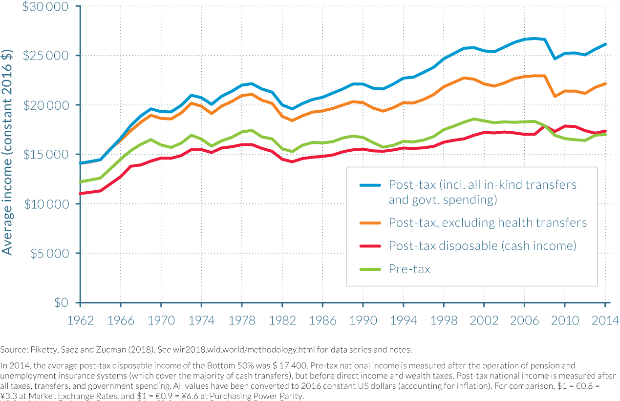
Among the bottom 50%, the pre-tax income of working-age adults is falling
The stagnation in the incomes of the bottom 50% could in principle reflect demographic changes rather than deeper evolutions in the distribution of lifetime incomes. People’s incomes tend to first rise with age—as workers build human capital and acquire experience—and then fall during retirement. Population aging might therefore have pushed the bottom 50% income share down. However, this is not the case for the United States. This can be shown by examining the bottom 50% of income earners within specific age categories such as 20–45 year olds, 45–65 year olds, and 65+ year olds, as in Figure 2.4.3.
Figure 2.4.3a shows that the average pre-tax income of working-age adults in the bottom 50% has collapsed since 1980, falling by 20% for adults aged 20–45 and by 8% for those between aged 45–65. It is only for the elderly (aged 65+) that pre-tax income has been rising, due to increases in social security benefits and private pension distributions. Figure 2.4.3b shows that these trends are even more pronounced on a post-tax basis. The average income of bottom 50% income earners among those aged 65+ has grown by 70% since 1980s and now exceeds the average income of bottom 50% income earners among all adults. Indeed, all the growth in the post-tax incomes of the bottom 50% is attributable to this increase in income for the elderly.12 For the working-age population in the bottom 50%, the increase in post-tax income since 1980 has been essentially nil.
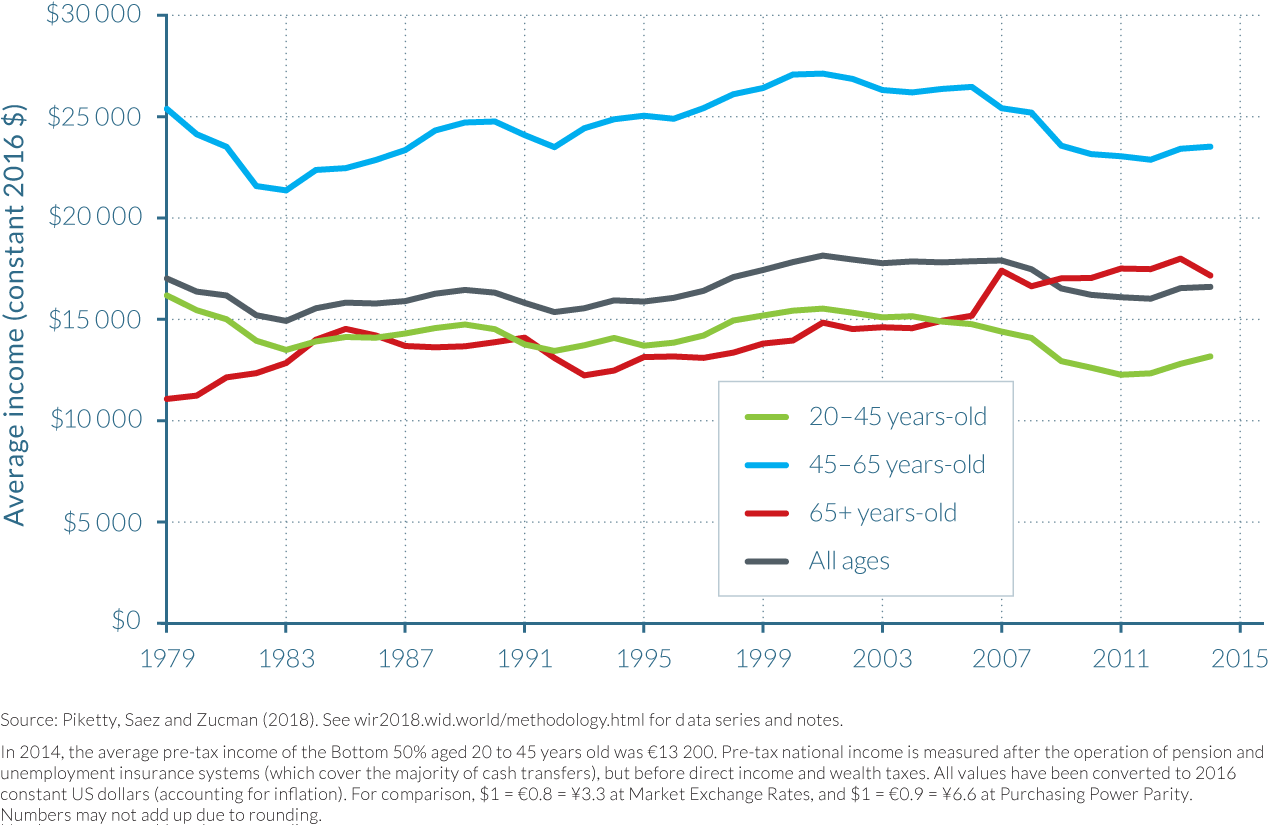
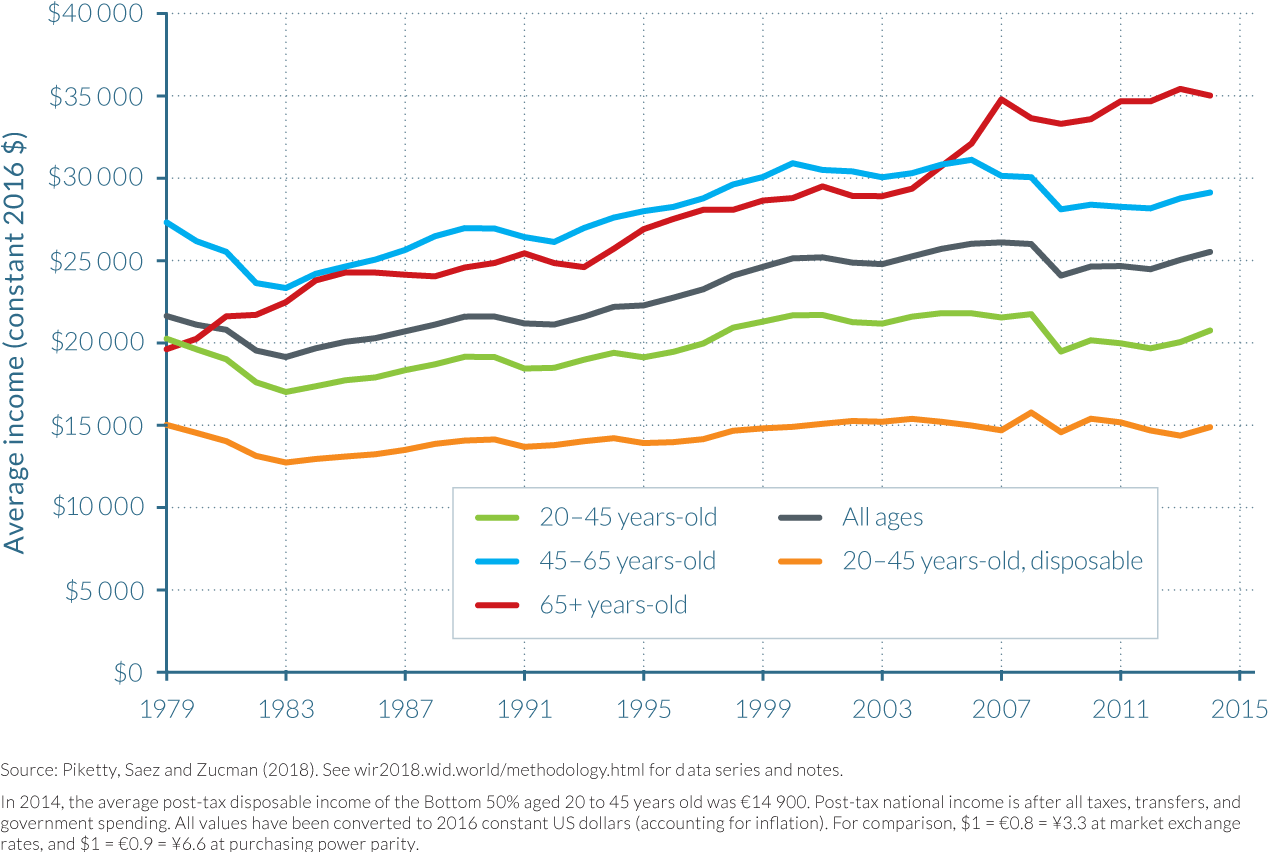
Three key insights can be drawn from the evolution of bottom 50% incomes in the United States. First, as the income of all working-age groups within the bottom 50% has collapsed—including experienced workers above 45 years old—it is unlikely that the cumulative income that someone from the bottom 50% group has earned across their lifetime has grown much since the 1980s. Secondly, the stagnation in the incomes of the bottom 50% is not due to population aging. To the contrary, at the bottom half of the income spectrum, the elderly’s incomes are the only ones rising. Thirdly, despite the rise in means-tested benefits, government redistribution has not enhanced income growth for low- and moderate-income, working-age Americans over the last three decades. This, along with the real level of pre-tax inequality, indicates that there are clear limits to what taxes and transfers can achieve in the face of such massive changes in the pre-tax distribution of income as have occurred in the United States since 1980. This combination of factors supports the view that policy discussions should focus on how to equalize the distribution of primary assets, including human capital, financial capital, and bargaining power, rather than merely focus on ex-post redistribution.
Pre-tax income inequality has risen notably since the 1980s, slightly more than post-tax income inequality
The trends described above should also be put into their longer historical context. An analysis of data going as far back as 1917 indicates that there have been considerable changes in income inequality in the United States over the last century. As shown in Figure 2.4.4, the share of national income going to the top 10% has followed a U-shaped curve over the last century. On a pre-tax basis, the top 10% income share today is almost as high as it was at its peak in the late 1920s.
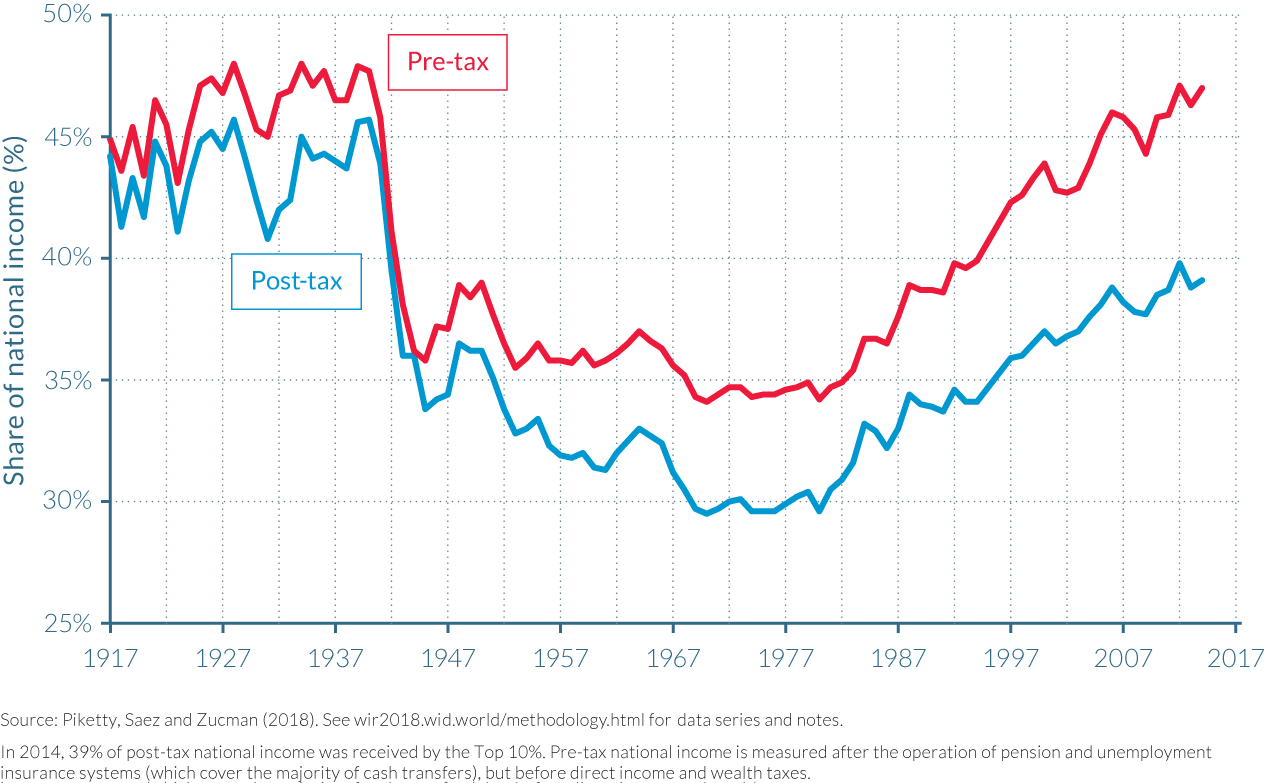
The shares of income attributed to top earners, after accounting for taxes and transfers, have also followed a U-shaped evolution over time, though they exhibit a less marked upward swing in recent decades than do the pre-tax figures. This difference is mainly due to the smaller size of government a century ago, and lower tax rates relative to the present day, which meant the difference between pre- and post-tax incomes was less pronounced in the early 1900s. Pre-tax and post-tax shares of income started diverging after 1933 as President Roosevelt’s New Deal impacted the top 1% and policies to raise money for Second World War–related spending led to significant increases in federal income taxation of the top 10%.
Although post-tax inequality has increased significantly since 1980, it has risen at a slower rate than pre-tax inequality. As can be seen in Figure 2.4.4, the share of total income attributable to the top 10% rose from 30% to 40% post-tax, and from 35% to 47% pre-tax between 1980 and 2014. Significant tax increases implemented in 2013 for those with the largest incomes may have played a role in the slower growth of post-tax top-income shares relative to pre-tax income shares over the last few years. Overall, redistributive policies have prevented post-tax inequality from returning all the way to pre–New Deal levels (as discussed in more detail below). Further reducing taxes on top earners, as envisioned by the current administration and congress, could sharply increase post-tax income inequality in coming years. (Box 2.4.1)
Despite fluctuations, the share of aggregate capital in total pre-tax income has remained relatively stable over the last century. Significantly larger concentrations of earnings continue to be derived from capital, rather than labor, as one moves up the income distribution. The vast majority of Americans have earned little capital income over the last century, with the bottom 90%—which includes both the middle and lower-income classes—rarely receiving more than 10% of their income from capital before the 1970s (see Figure 2.4.5). The rise of pension funds (which now account for 36% of all household wealth) has helped to increase the share of capital in the pre-tax income of the bottom 90%, rising to approximately 16% in 2014. While lower than their highs of over 50% in the mid-60s, the top 10% income earners still derive over 40% of their incomes from capital in 2014; this figure was almost 60% for the top 1%, and 70% for the top 0.1% in 2014.
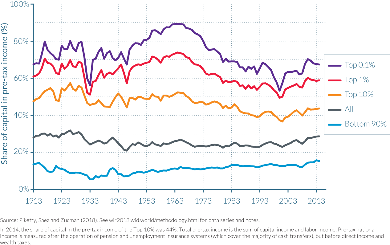
Fluctuations in the share of income coming from capital have been remarkable for those with the highest incomes. Early in the twentieth century, the top 0.1% derived 70%–80% of its income from capital, but this share collapsed to just over 50% during the Great Depression when corporate profits slumped, before rebounding in the 1950s and 1960s to around 90%. As described in Piketty’s Capital in the Twenty-First Century, top executive compensation and labor incomes hit an historical low during the postwar decades.13 They then rose very rapidly from the 1970s through the late 1990s, culminating in 2000 when the capital share of the top 0.1% reached a low point of 49%. Since the turn of the twenty-first century, however, capital has bounced back, with a surge in profits from corporate equities. The share of capital income in national income grew from 22% to 29% between 2000 and 2014, and indeed almost all of the 0.6% average yearly growth of income per adult in the United States over this period was a result of the rise in capital income; labor income per adult grew by 0.1% per year while capital income per adult grew by 2.2% per year. This rise in wealth inequality led to an increase in capital income concentration, which then reinforced wealth inequality itself as top capital incomes were saved at a high rate. Consequently, as the twenty-first century progresses, the working rich of the late twentieth century may increasingly live off their capital income, or could be in the process of being replaced by their offspring who can live off their accumulated inheritance.
Taxes have become less progressive over the last decades
The progressivity of the US tax system has declined significantly over the last few decades, as illustrated in Figure 2.4.6. The country’s macroeconomic tax rate (that is, the share of total taxes in national income including federal, state, and local taxes) increased from 8% in 1913 to 30% in the late 1960s, and has remained at the latter level since. Effective tax rates have become more compressed, however, across the income distribution. In the 1950s, the top 1% of income earners paid 40%–45% of their pre-tax income in taxes, while the bottom 50% earners paid 15–20%. The gap in 2014 was much smaller. In 2014, top earners paid approximately 30%–35% of their income in taxes, while the bottom 50% of earners paid around 25%. The main factor explaining why the effective tax rates paid by the top 1% have declined over time is the fall in corporate and estate taxes; in the 1960s, the top 1% paid close to 20% of its pre-tax income in corporate and estate taxes, while by 2014, this had fallen to approximately 10%.
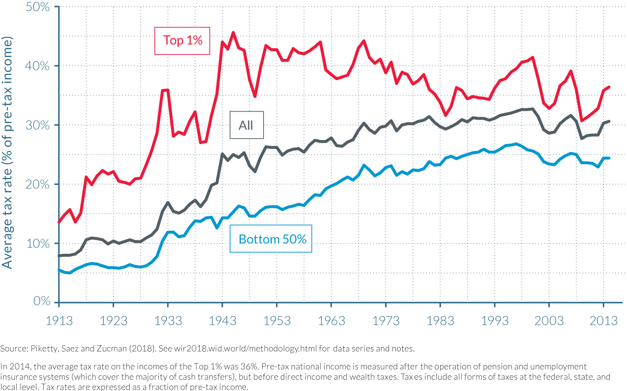
The 2013 tax reforms partly reversed the long-run decline in top tax rates. The surtaxes introduced by the Affordable Care Act, and the expiration of the 2001 Bush tax cuts for top earners, together increased marginal tax rates for the richest on their capital income (+9.5 percentage points) and labor income (+6.5 percentage points).14 These increases were the largest hikes in top tax rates since the 1950s, exceeding those implemented by the Clinton administration in 1993. The effective tax rate paid by top 1% earners has risen by approximately four percentage points between 2011 (32%) and 2013 (36%), and is now back to its level of the early 1980s.15 Still, it is worth noting that inequality was much lower in the 1980s and that the long-run declines in corporate-tax and estate-tax revenues continue to exert downward pressure on effective tax rates at the top. Compared to the period between 1940 and 1960, when the level of taxation of the top 1% was consistently above 40%, the average tax rate as a percentage of pre-tax income was more than five percentage points lower in 2014, and ten percentage points lower than before the financial crisis.
In contrast to the overall fall in tax rates for top earners since the 1940s, taxes on the bottom 50% have risen from 15% to 25% between 1940 and 2014. This has been largely due to the rise of payroll taxes paid by the bottom 50%, which have risen from below 5% in the 1960s to more than 10% in 2014. Indeed, payroll taxes are now much more important than any other taxes—federal or state—borne by the bottom 50%. In 2014, payroll taxes amounted to 11% of pre-tax income, significantly above the next largest items: federal and state income taxes, which made up 7% of pre-tax income, and sales taxes, at 5%.16 Although payroll taxes finance transfers including Social Security and Medicare, which in part go to the bottom 50%, their increase also contributes to the stagnation of the post-tax income of working-age Americans who make up a notable proportion of the bottom 50% of the income distribution.
In this chapter, we present estimates of pre- and post-tax income inequality for the USA, which are two complementary concepts for the analysis of inequality. Comparing pre- and post-tax income inequality allows to better assessing the impact of personal taxes and in-kind transfers on the dynamics of income inequality.
In the WID.world database, pre-tax income refers to incomes measured before personal income and wealth taxes and in-kind transfers (typically health transfers) but after the operation of the pension and employment insurance systems (as well as after Social security and disability transfers in the case of the United States).
In contrast, post-tax income refers to incomes measured after all taxes (in particular, after direct personal and wealth taxes) and after all government transfers (cash and in-kind).
It is important to note that pensions and unemployment insurance represent the vast majority of cash transfers in the United States and more generally in rich countries. Therefore our notion of pre-tax income inequality (which we used in previous chapters to make international comparisons) already includes most cash redistribution.
In practice, other cash transfers tend to be relatively small. For instance, in the case of the United States, pre-tax income is virtually equal to post-tax cash income for the bottom 50%, at around $16 500 in 2014—and this figure has remained more or less the same since 1980. This means that the poor contribute about as much to taxes than they benefit from them in cash transfers (other than pensions and unemployment insurance) and this has not changed in fourty years.
That being said, it is critical to study post-tax inequality and not only pre-tax inequality, first because in-kind transfers (in particular access to free education and health services) play a very important role for bottom groups, and next because post-tax incomes can be substantially smaller than pre-tax incomes at the top of the distribution (at least in countries with highly progressive tax systems).
Unfortunately, the United States is the only country for which complete pre- and post-tax income inequality estimates are available in this Report. Would focusing on post-tax income inequality in other countries modify the general conclusions of the Report?
Based on the findings of this chapter and on preliminary results for other countries, it seems likely that focusing on post-tax incomes would tend to comfort our main conclusions.
For instance, the magnitude of in-kind education and health transfers tends to be higher in Europe than in the United States, particularly for the bottom 50%, so our conclusion about higher inequality in the US is likely to be magnified when we move from pre-tax to post-tax inequality.
Next, we know that tax progressivity was reduced, rather than increased, in most countries since the 1980s (see chapter 5.2). Taking into account post-tax estimates therefore tends to reinforce the rise in inequality observed in pre-tax series. In France, for instance, effective tax rates are lower for the very rich than for the middle class, and new tax legislations will further decrease these rates for the richest (see chapter 2.5).
In emerging countries, the tax and transfer systems are generally less developed and less progressive than in the United States and Europe (as discussed in chapter 5.2, there are no estate taxes in emerging countries, while the poor pay high taxes on some basic consumption goods such as energy), so the gap between extreme inequality countries and other regions discussed in chapter 2.1 may in fact be reinforced with post-tax estimates.
The exact magnitude of these variations remains unknown at this stage. The WID.world consortium is currently producing novel post-tax income inequality estimates for various parts of the world (in particular for Europe and Latin America), but taking into account consistently all forms of incomes, taxes and transfers of all individuals in a given country over long time periods requires tremendous efforts. This is an exciting agenda for economic research and future editions of this Report will present new results and progresses made along these lines.
Transfers essentially target the middle class, leaving the bottom 50% with little support in managing the collapse in their pre-tax incomes
While taxes have steadily become less progressive since the 1960s, one major evolution in the US economy over the last fifty years has been the rise of individualized transfers, both monetary and in-kind. Public-goods spending has remained constant, at around 18% of national income, but transfers—other than Social Security, disability, and unemployment insurance, which are already included in calculations of pre-tax income—increased from around 2% of national income in 1960 to 11% in 2014. The two largest transfers were Medicaid and Medicare, representing 4% and 3%, respectively, of national income in 2014. Other important transfers include refundable tax credits (0.8% of national income), veterans’ benefits (0.6%), and food stamps (0.5%).
Perhaps surprisingly, individualized transfers tend to target the middle class. Despite Medicaid and other means-tested programs which go entirely to the bottom 50%, the middle 40% received larger transfers in 2014 (totaling 16% of per-adult national income) than the bottom 50% of Americans (10% of per-adult national income). With the top 10% of income earners receiving approximately 8% of per-adult national income in transfers, there is an inverted U-shaped relationship between post-tax income and transfers received (when Social Security benefits are included in transfers). These transfers have been key to enabling middle-class incomes to grow, as without them, average income for the middle 40% would not have grown at all between 1999 in 2014. (See Figure 2.4.7) By contrast, transfers have not been sufficient to enable the incomes of the bottom 50% to grow significantly and counterbalance the collapse in their pre-tax income.
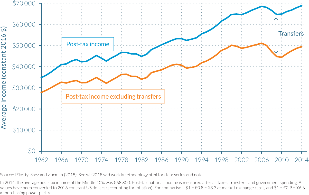
The reduction in the gender wage gap has been an important counterforce to rising US inequality
The reduction in the gender gap has been an important force in mitigating the rise in inequality that has largely taken place after 1980. To examine this process, the data must be analyzed on an individual rather than on a tax-unit basis (such as a couple or a family). The overall gender gap has been almost halved over the last half-century, but it has far from disappeared. The more comprehensive way to measure the gender gap is to compute the ratio of average labor income of working-age men (aged 20–65) to average labor income of working age women (aged 20–65), regardless of whether and how much they work. As illustrated in Figure 2.4.8, this income ratio has fallen from highs of 3.7:1 in the 1960s to approximately 1.75:1 in 2014.
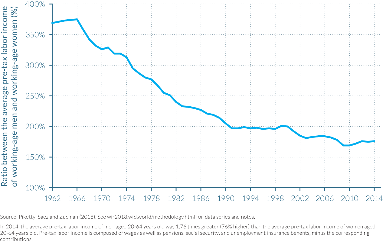
Still, considerable gender inequalities persist, particularly at the top of the labor income distribution, as illustrated by Figure 2.4.9. In 2014, women accounted for close to 27% of the individuals in the top 10% of the income distribution, up 22 percentage points from 1960. Their representation, however, grows smaller at each higher step along the distribution of income. Women make up only 16% of the top 1% of labor income earners (a 13 percentage point rise from the 1960s), and only 11% of the top 0.1% (an increase of 9 percentage points). There has been only a modest increase in the share of women in top labor income groups since 1999. The glass ceiling is still far from being shattered.
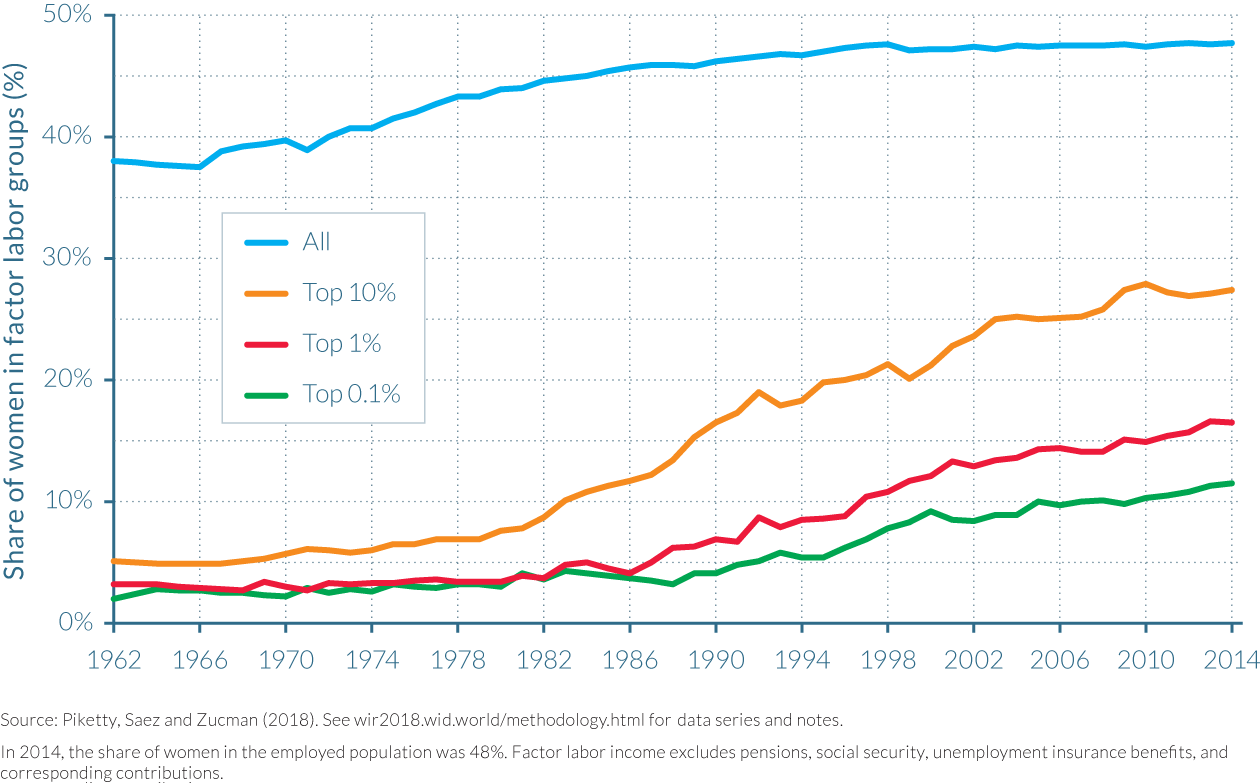
2.5 Income inequality in France
Information in this chapter is based on “Income Inequality in France, 1900–2014: Evidence from Distributional National Accounts (DINA),” by Bertrand Garbinti, Jonathan Goupille-Lebret and Thomas Piketty, 2017. WID.world Working Paper Series (No. 2017/4).
- In 2014, the share of total pre-tax income received by the bottom 50% earners was 23%, while the share of the top 10% was 33%. Although income inequality in France was by no means insignificant in 2014, it sharply contrasts with the situation a century ago. In 1900, the top 10% of the income distribution received half of total French national income.
- Income inequality decreased significantly between the start of the First World War and the end of the Second World War due to the fall of top capital incomes resulting from the destruction of physical capital, the damaging impact of inflation, and the effects of nationalizations and rent-control policies.
- The struggle between labor and capital to share the fruits of growth between 1945 and 1983 characterized a turbulent period for income inequality, rising until 1968, when civil unrest pressured the government into reducing wage differentials.
- Austerity measures introduced in 1983, including the end of indexing wages to inflation, started a trend of rising inequality. Wage differentials and returns to capital increased thereafter.
- While gender pay gaps have consistently fallen since the 1970s, women made up just 30% of the top 10% of French earners in 2012, and if current trends continue, women cannot expect to make up a proportion of the top 10% equal to men until 2102.
In 2014, the top 10% French earners captured 33% of national income
In 2014, the average national income per adult in France was €33 400. This average, however, disguises significant variations among groups within the distribution. The bottom 50% earned around €15 000 on average in 2014, notably less than half the national average, and thus their share of total French income was less than a quarter (22.5%). The middle 40% had an annual average income of almost €37 500, and accordingly held a 45% share of national income, while the top 10% received approximately €109 000, more than three times the national average. These relative differences grow ever larger for the richest, with the top 1% having an 11% share in national income, and the top 0.1% and 0.01% having incomes 37 and 129 times the national average, as shown in Table 2.5.1.
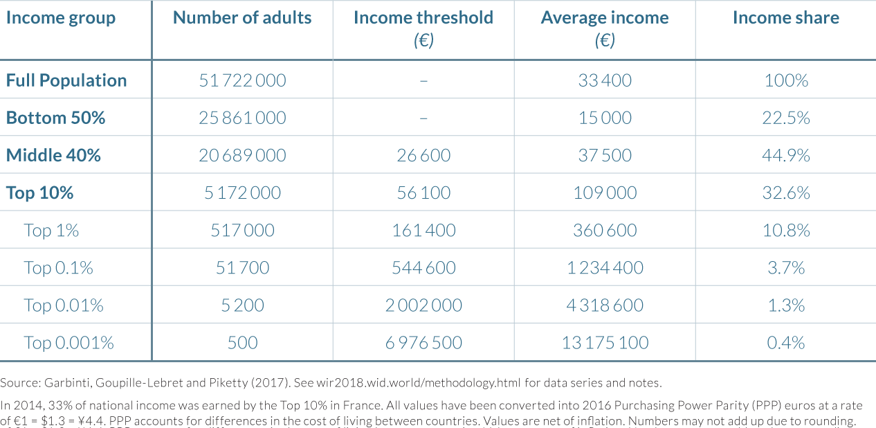
Income inequality in France has varied significantly since the start of the twentieth century
While income inequality in France is by no means insignificant today, it has fallen notably since 1900. At the beginning of the twentieth century, the top 10% of the income distribution (which can be thought of as the “upper class”) received 50% of total national income, while the middle 40% (the so-called “middle class”) had around 35%. Meanwhile, the bottom 50% (the “lower class”) had less than 15% of national income. The increased shares for the middle (+10 percentage points) and lower class (+8 percentage points) between 1900 and 2014 have thus come at the expense of the richest in roughly equal amounts. This reduction in inequality has taken place, however, in a haphazard and disorderly manner, undergoing numerous evolutions over the last century that are the result of a complex mix of historical events and political decisions.
To better comprehend recent developments in income inequality in France, it is first important to analyze how average income evolved from 1900 to 2014. Per-adult national income has risen approximately sevenfold over the last century in France, from around €5 500 in the year 1900. However, this growth in national income per adult was far from steady. Between 1900 and 1945, per-adult national income declined on average by -0.1% per year, but then increased at an average of 3.7% during the postwar period until 1980; dubbed les trente glorieuses. These “thirty glorious years” were followed by a period in which per-adult national incomes grew four times slower than previously, averaging 0.9% per annum from 1980 to 2014. This pattern was not unique to France, however. Similar trends were experienced in most European countries and Japan, and to a lesser extent in the United States and in the UK, where the shocks created by the First and Second World Wars were less damaging than in Continental Europe.
The evolution of income inequality over the last century can be broken down into three broad periods. The first of these periods was from the start of the First World War to the end of the Second World War. As visualized in Figure 2.5.1, the share of income of the top 10% of earners fell abruptly during the 1914–1945 period, from more than 50% of total income on the eve of the First World War to slightly above 30% of total income in 1945. This decline was mainly due to the collapse of capital income, which was hit by a number of negative shocks. Capital income generally makes up a significantly higher proportion of income for the richest 10% of the population, and particularly the top 1%, than it does for other groups. Both wars involved the destruction of capital stocks, and bankruptcies were not infrequent. They led to a collapse in gross domestic product (GDP), which lost 50% of its value between 1929 and 1945. Inflation reached record levels (the price index was multiplied by more than a hundred between 1914 and 1950), severely penalizing individuals with bond holdings and, more broadly, with fixed income assets. The control of rents during the period of inflationism led to a tenfold fall in their real value, and additionally, nationalization and the high level of taxation of certain assets in 1945 contributed to a sharp fall in capital income. The result for the top 1%—that is, those earning the most income from capital—was to see their share of national income halved in around thirty years.
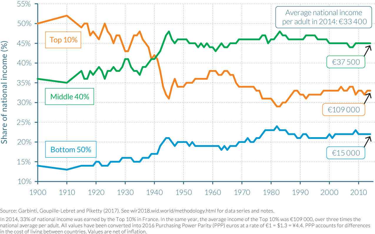
The second period, between 1945 and 1983, was characterized by a struggle between labor and capital to share the fruits of growth, which reached very high levels (+3.3% per year on average). From 1945 to 1968, the inequality in wages that had existed before the world wars was rebuilt and the share of capital in the French economy also rose, leading to a period of rising income inequality. As illustrated by Figure 2.5.1, the income share of the top 10% had risen from around 30% to 38% during this twenty-three-year period, while the share of the bottom 50% fell from approximately 23% to 17%. Following the events of May 1968, however, this trajectory of rising inequality abruptly stopped.
May 1968 was a volatile period of civil unrest in France, punctuated by demonstrations, general strikes, and protester occupations of universities and factories across the country. The French government, under Charles De Gaulle’s presidency, introduced a number of conciliatory policies in the following month in an attempt at appeasement, including a boost in the real minimum wage of approximately 20%. This marked the beginning of a period of steady increases in the minimum wage and of the purchasing power of the poor between 1968 and 1983. The purchasing power of those with lower wages rose substantially more than did GDP, which itself grew by a noteworthy 30%. These factors led to a compression in the distribution of wages and reduced income inequality more generally. In the early 1980s, the top 10% had their lowest share of pre-tax national income recorded, at 30%, while the middle 40% had an historic high of approximately 48%, and the bottom 50% accounted for 23%. However, the rise in unemployment that started during the mid-1970s also marked the beginning of a new period.
The third period, marked by a substantial reduction in income growth rates (1% per year on average), began in 1982–1983 when successive governments decided to end the policy of indexing wages to prices and therefore reduced the rate of wage increases for the low-paid.17 This was initially part of an austerity program known as the tournant de la rigueur (austerity turn), introduced by President Mitterrand’s then newly elected left-wing government. The program was an attempt to combat high inflation rates and rapid deteriorations in the budget and trade deficits between 1981 and 1983 that could have seen France leave the European Monetary System. Taxes were also increased, subsidies to state-owned enterprises were reduced, and social security and unemployment insurance payments were restrained.18 The overall effect of these policy choices was an increase in the pay gaps between those who earned the lowest wages and others. During this period, inequality was relatively stable except at the top of the distribution. Very top incomes increased substantially.
The end of the “thirty glorious years” for the bottom 95%, but not for those at the top
One way to better understand the magnitude of the turning point that occurred in the 1980s is to look at the total growth curve by income group. That is, we can ask: What was the change in the average income of each group over the different time periods? Between 1983 and 2014, average national income per adult rose by 35% (1% per annum) in real terms in France. However, actual total growth was not the same for all income groups, as illustrated by the impressive upward slope on the right hand of the 1983–2014 growth curve in Figure 2.5.2. Total growth between 1983 and 2014 was 31% on average (0.9% per annum) for the bottom 50% of the distribution, 27% for next 40% (0.8% per annum), and 49% for the top 10% (1.3% per annum). Moreover, total growth remained below the economy-wide average until the ninety-ninth percentile, and then rose steeply, up to as much as 98% growth over the thirty-one-year period (2.2% per annum) for the top 0.1% and 144% for the top 0.001% (2.9% per annum).
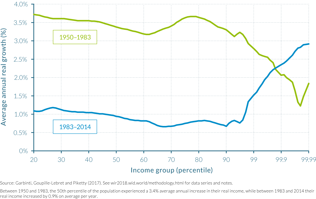
The contrast between 1950–1983 and 1983–2014 in terms of the total growth rates of income groups is particularly stark. As Table 2.5.2 and Figure 2.5.2 show, growth rates were very high for the bottom 99% of the population during the “thirty glorious years” between 1950 and 1983, at around 200%, while growth for the top 1% was markedly lower at 109% (2.3% per annum). Growth rates were even lower at the very top, at around 80% (1.8% per annum) for the top 0.1 and 0.01%.
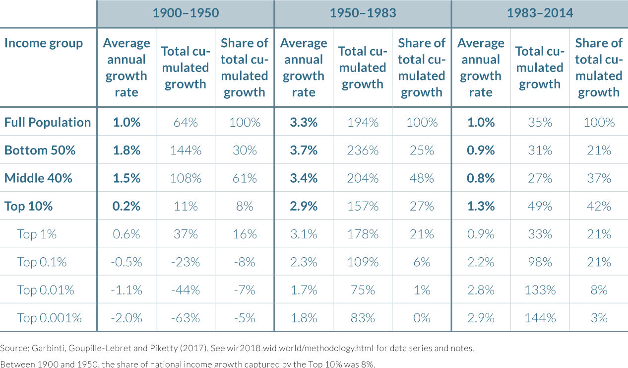
Another way to measure these diverging evolutions is to compare the shares of total economic growth going to the different income groups. Between 1950 and 1983, 25% of total growth went to the bottom 50% of the population, versus only 6% to the top 1%. Between 1983 and 2014, 21% of total growth went to the bottom 50%, as much as the share of growth which went to the top 1%.
Summing up, although the rise of inequality was less pronounced in France (and to a large extent in Europe) than in the United States, the break between the 1950–1983 period, when bottom groups enjoyed larger growth than the top, and the 1983–2014 period, when the exact opposite pattern prevailed, is very visible.
Recent growth at the top is due to higher salaries and returns on capital assets
As a result of the unequal distribution of growth, the share of income attributed to the top 1% has seen a notable increase between 1983 and 2007, rising from less than 8% of total income to over 12% over this period—that is, rising by over 50%. Between 2008 and 2013, the income share of the top 1% fluctuated between 10% and 12%, remaining significantly larger than when income inequality was at its lowest point in the early eighties (see Figure 2.5.1). As stated above, this trend of rising inequality among the highest earners is even more pronounced for the top 0.1% and the top 0.01% (see Figure 2.5.3). The difference between the average national income before tax and those of top earners has almost doubled over the preceding thirty years. The top 0.1% average income increased from 21 times above average in 1983 to 37 times in 2014, while the figure increased from 71 times average to 129 times for the top 0.01%.
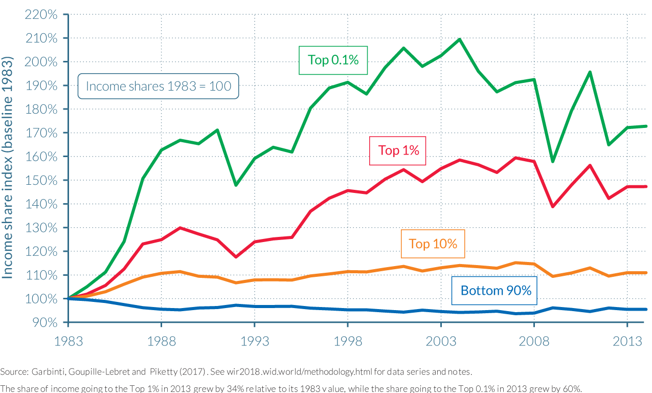
Why has there been a rise in top incomes over the recent period? In the case of France, top earners have experienced significant increases in their incomes from both labor and capital. Between 1983 and 2013, the labor income of the top 0.01% rose 53%, while their capital income increased by 48%. It is difficult for standard explanations based on technical change and the changing supply and demand of skills to explain rising income concentration at the very top, whether around the world or in France specifically.19 The rise of labor incomes at the top is more likely to be the result of evolutions in institutional factors governing pay-setting processes for top managerial compensation, including changes in corporate governance and the decline of unions and collective bargaining processes. Evolutions in top marginal tax rates have also likely had an impact on labor income inequality. Reduced top income tax rates can affect wage-setting at the top; as top earners expect less taxes, they may be more inclined to ask for increases in wages.20 Top income tax rates were above 60% during the trente glorieuses and rose to 70% in the early 1980s. They fell to about 50% in the late 2000s. Effective tax rates (total taxes paid on total income) are actually inferior for very top income groups than for the middle class.21 Recent tax legislation supported by the current government are about to further reduce tax rates at the top, in particular due to reduction in tax rates on capital.
Increases in top labor income inequality have in certain cases been correlated with increases in top capital income inequality. Top managers, for example, have benefitted first from very high labor incomes through large bonuses or stock options (some of which have been largely mediatized) and then from very high capital incomes derived from improvements in the price of the stocks that they have come to own. Top capital incomes have also been rising due to the rising share of macroeconomic capital in a context of declining labor bargaining power and privatization policies.
Gender pay gaps may be falling, but men are still paid approximately 50% more than women
While income inequality has increased since the 1980s, gender gaps have been declining since the 1970s. Still, gender gaps remain very high in France today. In the 1970s (the “age of patriarchy”) men earned 3.5 to 5 times the labor income of women, and women’s labor force participation rate was around 45%. The share of working women rose dramatically to 80% in 2012 and the women-to-men pay ratio decreased to 1:1.5 on average. There are, however, strong variations in gender income gaps over age groups. As can be seen in Figure 2.5.4a, in 2012, men earned 1.25 times more on average than women at the age of 25, and 1.64 times more at age 65.
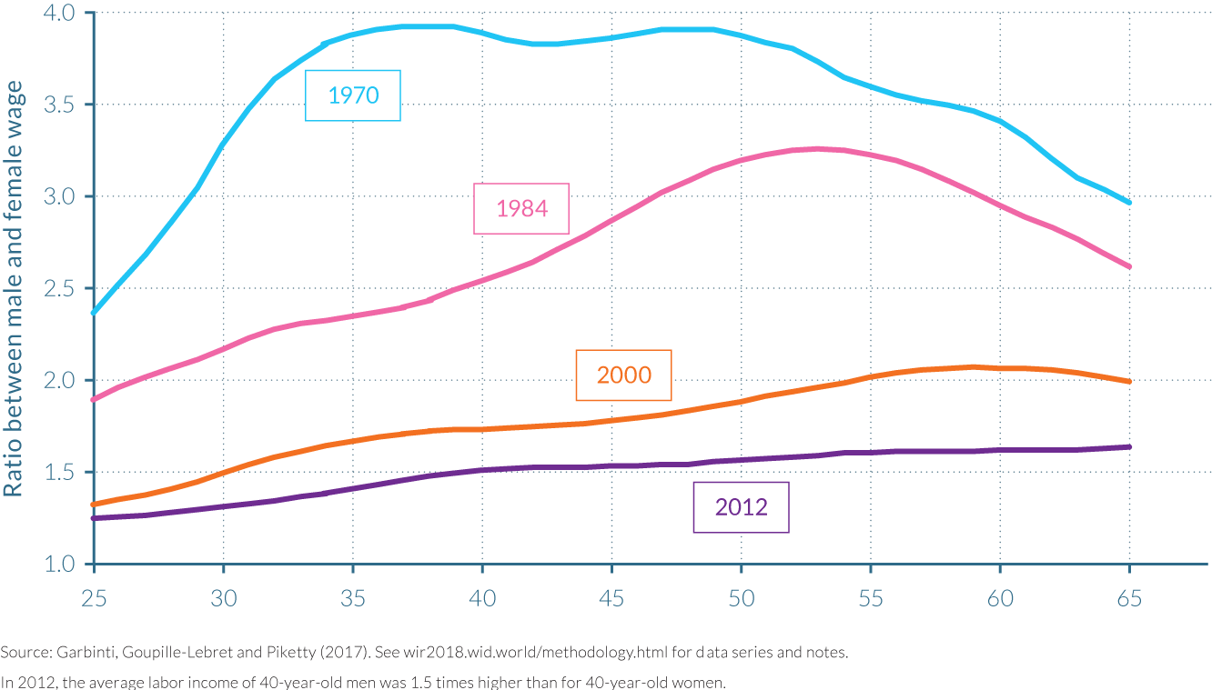
Gender inequalities are also particularly high among higher paying jobs. Despite moderate improvements since 1994, women still do not have equal access to them. In 2012, the female share of the top 50% of earners was 42%, while women made up just 30% and 12% of the top 10% and top 0.1% earners, respectively. If current trends continue, women can expect to make up the same proportion as men of the top 10% and top 0.1% shares by 2102 and 2144, respectively. (See Figure 2.5.4b)
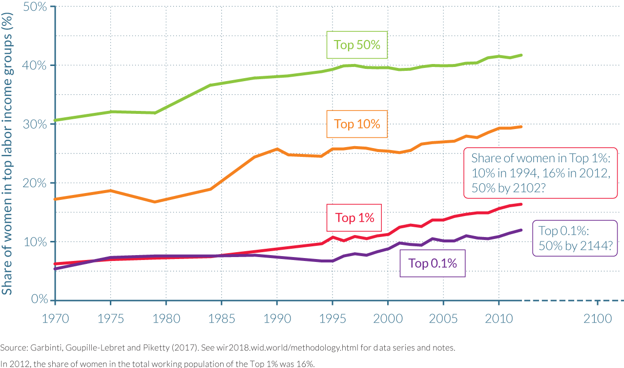
2.6 Income inequality in Germany
Information in this chapter is based on “Top incomes in Germany, 1871–2013,” by Charlotte Bartels, 2017. WID.world Working Paper Series (No. 2017/18).
- In 2013, the share of total income received by the bottom half of the population was 17%, while the share of the top decile was 40%. In 1913, the share of the top 10% was also 40%.The top 1% is, however, lower today than in 1913 (18% versus 13%).
- The top 1% increased sharply between the creation of the Reich in 1871 and the establishment of the Weimar Republic in 1918. It then decreased dramatically when social policies were implemented by the Weimar Republic. The Nazi prewar period is associated with economic recovery and favorable policies for large businesses, and saw temporary surges in top incomes. The top 1% share was then reduced to 10–12% during the 1950–1990 period and has been on the rise since reunification.
- Top income earners in Germany have been business owners throughout the twentieth century and up to the present. As most German firms are family owned, with some family members more involved than others, it is difficult to judge how much of top incomes are labor incomes and which part is “pure” capital income (with limited labor input). Starting in the 1980s, however, highly qualified employees have increasingly entered top-income groups.
- In Germany, high income concentration of the industrialization period dropped as soon as the 1920s and fluctuated around this level throughout the postwar period. This contrasts with other rich countries like United States, the United Kingdom, and France, where the Second World War brought strong and lasting reductions in income concentrations at the top.
Investigating the evolution of inequality using German income tax data has a long tradition, as particularly Prussian and Saxon tax data are internationally praised for their accuracy. Simon Kuznets partly drew his famous hypothesis of rising inequality in the early phase of industrialization from Prussian income tax data. The early introduction of modern income taxation in German states at the end of the nineteenth century offers a special opportunity to compute inequality series from the industrialization phase until today.
The series presented in this chapter are based on pre-tax income data from historical German income-tax statistics collected by Charlotte Bartels. One should note, however, that the impressive length of the period covered in Germany comes with a price, in that changing territories are covered by the series. The two world wars of the twentieth century, the division of Germany after the Second World War, and its reunification in 1990 leave the researcher with income tax systems applying across time to quite differently sized territories and populations.
Long-run German income inequality dynamics can be split into five periods
The evolution of income inequality from 1871 to 2013 can be split into five periods. Figure 2.6.1 shows the evolution of the top 1% income share from 1871 to 2013. The first period starts with the foundation of German Reich in 1871, which unified German states, and ends with the First World War. The top percentile was the greatest beneficiary of this industrialization period. Its income share moderately increased from 16% in 1871 to 18% in 1913 and then rose to 23% during the First World War. The sharp increase observed during that war might have been the result of extraordinarily high profits from military spending. By 1918, authorities managed to restrict those profits, which contributed to bringing the top 1% share back down to 20% of national income.
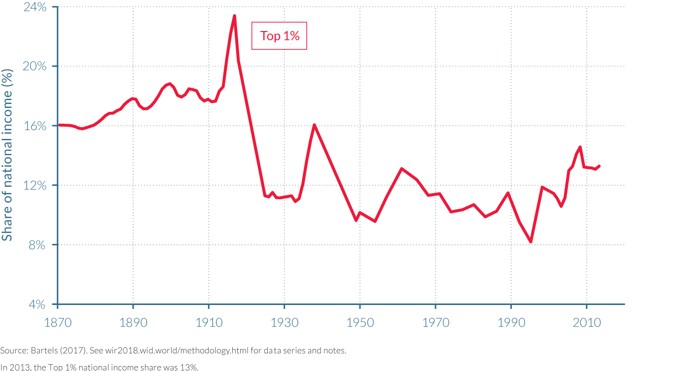
The second period includes the years of the Weimar Republic (1918–1933), which brought a variety of inequality-reducing policies, including an increase in the top marginal tax rate from 5% to 60% in Prussia, the introduction of unemployment insurance, and employment law including employment protections. Strong unions and the rise of collective bargaining contributed to an increase in wages which resulted in lower labor income inequality. Hyperinflation eroded financial assets and greatly reduced capital incomes during this period. Additionally, industrial firms generated very low profits throughout the 1920s, if any at all, and mostly did not pay out dividends. As a consequence, the top percentile’s income share decreased significantly from 20% in 1918 to 11% in 1925 and remained at the latter level until 1933.
The third period starts with the Nazi’s seizure of control in 1933 and ends at the eve of the Second World War in 1938. After 1938, the Statistical Office stopped publishing income tax statistics so it is impossible to know how income distribution changed during the Second World War. This prewar Nazi period is marked by an extraordinary increase in the top percentile’s income share from 11% in 1934 to 17% in 1938, contrasting with the initial anti-big-business rhetoric of the Nazi party. In contrast, to the top percentile, the P95–P99 group (the top 5% richest, minus the very top 1%) gained only moderately during this period. As in most rich countries, economic recovery after the Great Depression started in 1932 in Germany. Industrial firms saw their profits rise sharply between 1933 and 1939. Ferguson and Voth find evidence that firms with strong ties to the Nazi party disproportionately benefited from the recovery, which probably contributed to further concentration of incomes at the top.22 The larger firms across all sectors were more likely to form connections with the Nazi government, but this was particularly the case for the rearmament industry.
The post-war period is marked by a relatively stable but high top percentile income share
The German postwar period is characterized by a comparably high income concentration at the top, paralleled by a rather compressed wage distribution. From the mid-1950s until the 1980s, the top percentile’s share oscillates between 11% and 13%. This is higher than the top percentile’s share in postwar United States, United Kingdom, or France in the same period. This finding is particularly striking as the policies (especially nationalizations and rent control) after the Second World War and destructions during the Second World War are generally seen as long-lasting equalizing forces both in Germany and in other war-participating countries. The currency reform in 1948 eradicated capital incomes from financial assets for the second time in the twentieth century, while leaving business assets and real estate untouched. Savings accounts were reduced to about a tenth of their former value. As rents were heavily regulated, top incomes stemmed from business profits. On the other hand, strong labor demand and the high national income growth rates of the German Wirtschaftswunder coincided with powerful unions, low unemployment, and a rather compressed wage distribution. The bottom 50% then received a third of total income, as Figure 2.6.2 shows. It was not until the 1980s that top wage earners increasingly entered top-income groups and the wage distribution became increasingly unequal. With the oil crises and the onset of mass unemployment, the share of the bottom 50% decreased to less than a fifth of national income. The fall of the bottom half was mirrored by an increase of the middle 40%, who received slightly more than 40% of national income beginning in the 1970s.
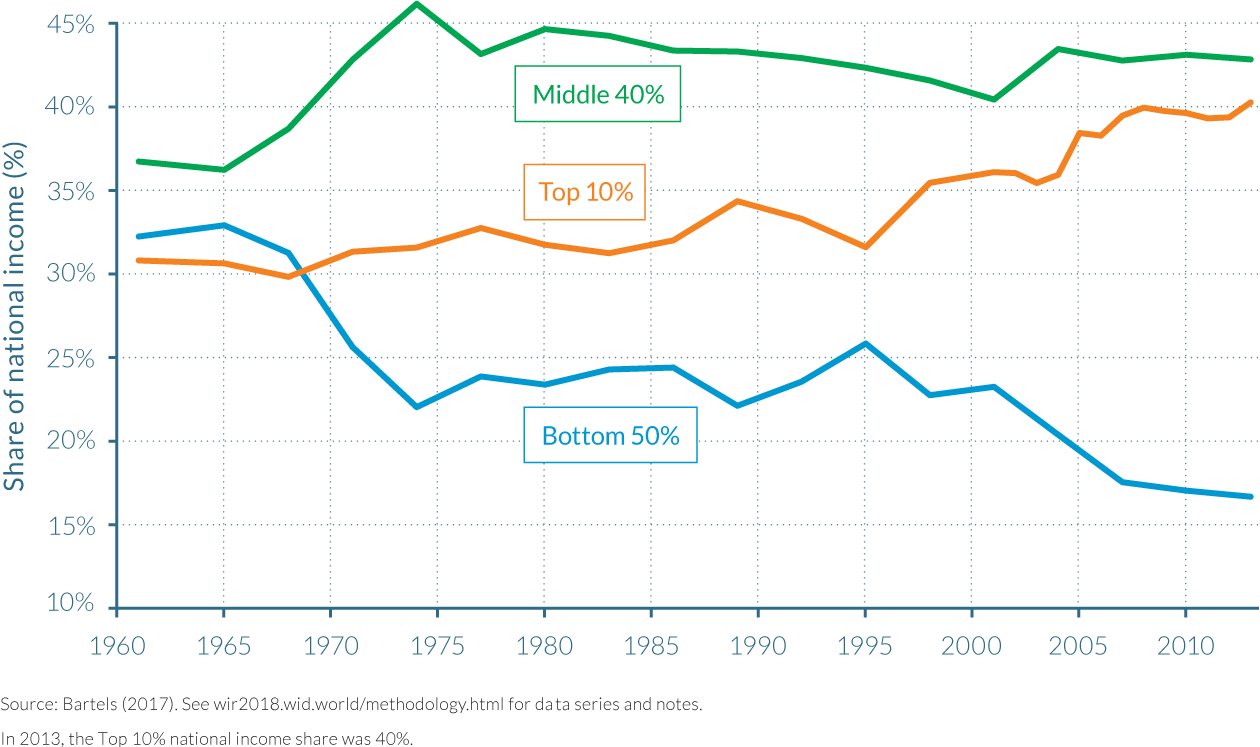
Income inequality is rising at the top since reunification
The fifth and last period corresponds to reunified Germany. Political unification on October 3, 1990, brought the eastern states of Berlin, Brandenburg, Mecklenburg–Western Pomerania, Saxony, Saxony-Anhalt, and Thuringia into the Federal Republic of Germany. The first years after reunification were marked by exceptionally high national income growth rates for the reunified German economy. Industrial production quickly collapsed in the East and unemployment rose accordingly. Those keeping their jobs benefitted from an unprecedented jump in real wages, thanks to bargaining by the Eastern German labor unions that aimed to reach parity with West German wage levels in 1994. Taking these effects together, the top percentile’s income share fell sharply, whereas the bottom 50% gained in the first years following reunification. The start of the new millennium marked another turning point; the share of the bottom half declined significantly from 22% in 2001 to 17% in 2013, a trend that went hand in hand with the growth of the low-income sector.
The top 10% income group quite steadily increased its income share over the entire postwar period. Highly qualified employees like engineers, lawyers, and doctors have benefitted from high wage growth and have been increasingly present in top-income groups. However, very top incomes are still exclusive to business owners, and profits fluctuate with business cycles. The top percentile’s share is volatile, as shown in Figure 2.6.3. It suffered large shocks in the German unification crisis in the mid-1990s, the burst of the new economy bubble in the early 2000s, and the Great Recession in 2009. But despite the large drop after the Great Recession, the top percentile’s income share still grew by almost 40% between 1983 and 2013, while the bottom 90% share fell by 10%. In 2013, while the average income in Germany was €36 200, the top 10% earned €146 000, the middle 40% earned €39 000, and the bottom 50% earned €12 000.
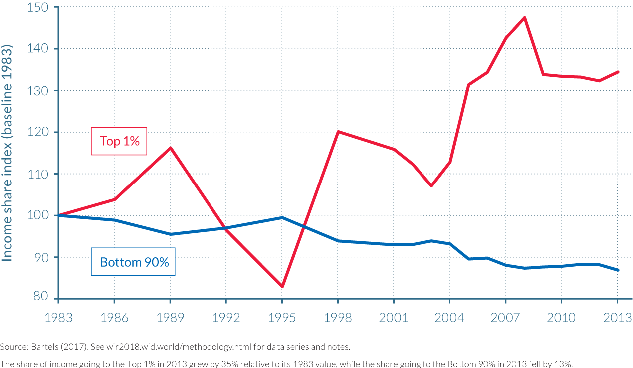
2.7 Income inequality in China
Information in this chapter is based on “Capital Accumulation, Private Property and Rising Inequality in China, 1978–2015,” by Thomas Piketty, Li Yang, and Gabriel Zucman, 2017.
WID.world Working Paper Series (No. 2017/6).
- China’s opening-up policies established from the late 1970s onwards were followed by unprecedented rises in national income, but also significant changes to the country’s distribution of income.
- While the top 10% and bottom 50% both shared 27% of national income in 1978, they diverged dramatically thereafter, with the former experiencing a substantial increase to 42% by 2015 and the latter a substantial decrease to 15%.
- The top 10% of the income distribution enjoyed total growth rates higher than the national average (approximately 1 200% versus 800%), while the bottom 50% and middle 40% experienced slower growth (400% and 700%, respectively).
- The urban-rural gap in national income has grown considerably between 1978 and 2015 due to a rise in urban incomes and population. Despite this rising gap, it is mainly inequality within regions that has spurred the growth
of inequality at the national level.
Chinese average incomes grew ninefold since 1978
The Communist Party of China, then led by Deng Xiaoping, implemented a series of policies in the People’s Republic of China starting in December 1978 to reform and open up the Chinese economy, as the Party sought a new economic model based on the principle of “socialism with Chinese characteristics.” The transition away from the communist model of the previous decades ushered in gradual but nevertheless wide-reaching reforms, expanding geographically from special economic zones in coastal cities towards inland provincial regions, and in sectoral waves. During the first stage of reform, market principles were introduced into the agricultural sector through the de-collectivization of production. While foreign investment and entrepreneurship were permitted under state guidance, the vast majority of industry remained state-owned until the mid-1980s. The following decades saw a second stage of deeper reforms implemented. Soviet-style central planning in industry was dismantled through the privatization and contracting out of state-owned enterprises, though the state maintained its control of monopolies in some sectors, including banking and petroleum. Furthermore, liberalization of markets over this period saw the lifting of price controls and the reduction of protectionist policies and regulations, aiding the dramatic growth of the private sector. These changes were particularly evident in the country’s housing market. The private housing stock rose from roughly 50% in 1978 to over 95% in 2015. For other forms of domestic capital, the public share declined, though it is still around 50%.
The subsequent impacts of these privatization and opening reforms have been of great interest worldwide, particularly given the significant growth the country has experienced over the last forty years and its accompanying improvements in poverty rates. Indeed, between 1978 and 2015, China moved from a poor, low-income country to the world’s leading emerging economy. Despite the decline in its share of world population, China’s share of world national income increased from less than 3% in 1978 to 19% in 2015, and real per-adult national income multiplied more than ninefold. Indeed, average national income adult was about €1 400 per year in 1978 (less than 15% of global average), but exceeded €13 100 in 2015 (close to 90% of the global average).
In a recent paper, Thomas Piketty, Li Yang, and Gabriel Zucman analyze how this exceptional growth was distributed across the Chinese population (reported below), and the impact that privatization policies had on the country’s capital-income ratios (see chapter 3.3 of the report).23 To form distributional national accounts, the authors combine survey data, national accounts, and recently released income tax data on high-income taxpayers. They find a significant increase in per-adult pre-tax income inequality from 1978 to 2015.24 These results largely increase existing official inequality statistics and probably represent a lower bound to inequality, as they remain imperfect.
The shares of the top 10% and bottom 50% diverged after the opening-up reforms
As China began its privatization process (as also discussed in chapter 3.4 on Chinese public and private wealth dynamics), the share of national income going to the top 10% of the population was 27%, equal to the share going to the bottom 50%. Put in another way, these groups captured the same amount of total income, but the former had a population five times smaller than the latter. The average income of the bottom 50% was thus one-fifth of the top 10%. In 1978, the income share of the middle 40% represented just over 46% of national income; their average income was only slightly higher than the national average. The past four decades show a large divergence in the shares of the bottom 50% and the top 10% income earners (see Figure 2.7.1).
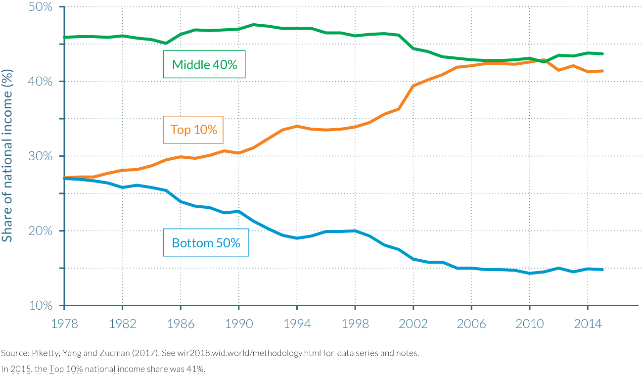
The income share of the bottom 50% in 2015 was just below 15%, a twelve-percentage-point fall since 1978. The share of the top 10% had increased to 41%. In 2015, the average income of the bottom 50% (€3 900 or ¥17 000) was approximately 13.5 times smaller than that of the richest 10% in 2015 (€54 500 or ¥238 000). The bottom 50% consequently earned roughly 3.4 times less than the average national income per adult in China of €13 100 or ¥57 000 in 2015, while the top 10% earned around four times more than the average income. The share of national income going to the middle 40% is only marginally different than in 1978 at almost 44%. The average income of this middle class (€14 400 or ¥63 000) was slightly higher than the average Chinese adult’s income in 2015. (Table 2.7.1)
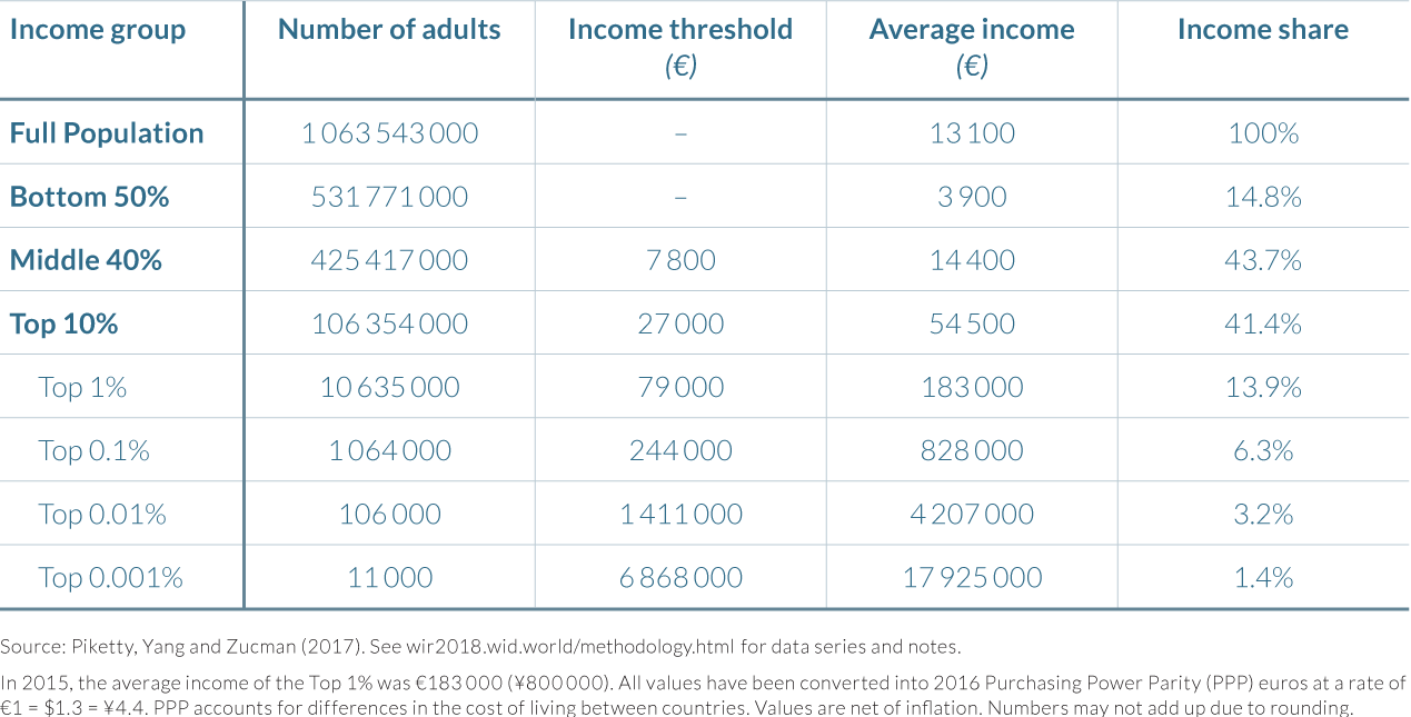
Income inequality stabilized after 2006
While the incomes of the top 10% and the bottom 50% in China began to diverge in 1978, the greatest divergence took place from 1998 to 2006. This coincided with the eight-year period that saw the Chinese government introduce a new set of policies for the privatization of state-owned enterprises, mainly in the tertiary sector. Part of the resulting effect was a reduction in the bottom 50% share of national income from 20% to 15%, and an increase in the share of the top 10% from around 34% to 43%. Income inequality apparently stabilized thereafter, with the shares of all three of the main income groups in 2015 remaining pretty much similar to their levels in 2006. This stabilization of inequality since 2006 should be regarded with caution as it could partly reflect data limitations, due in particular to the lack of national data made available on high-income taxpayers since 2011.25 Still, this trend is considered valid by a number of researchers who speculate that a turnaround took place around 2006 as a result of two factors: new policies that reflected changing priorities towards more equitable growth; and the slowdown of structural transformations, such as a shrinking rural labor force, which caused wages to grow more rapidly than output.26
Comparing Piketty, Yang, and Zucman’s inequality series to the survey-based estimates used by the Chinese government, two remarks are in order. First, the official survey data also show a strong rise in the national income share of the top 10% and a strong decline in the top 50% income share from 1978 to 2015. Second, both the level and the rise of inequality are larger in the aforementioned corrected series than in the official series. The top 10% income share rises 14 percentage points over the observed period (from 27% to 41% of national income)—which is 6 percentage points more than that seen in the official statistics—while the upward correction for the top 1% sees their share of total income for 2015 rise to 14%, versus 6.5% in the raw surveys. Most of the difference between these estimates and the raw surveys comes from the finer level of precision among top income earners enabled by income tax data. In 2015, for example, the raw surveys identify the income share of the top 1% to be 6.5%, but this reaches 11.5% after factoring in data from high-income taxpayers, and 14% following the inclusion of undistributed profits and other tax-exempt income.
Since 1980, Chinese top-income groups benefitted from quadruple-digit growth rates
The new data series constructed by Piketty, Yang, and Zucman on the distribution of national income also allow a decomposition of national income growth by income group. This in turn enables a quantitative assessment of the extent to which various groups of the population have benefitted from the enormous growth China has experienced since 1980. (See Table 2.7.2 and Figure 2.7.2)
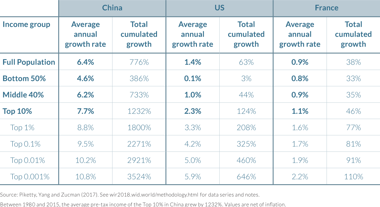
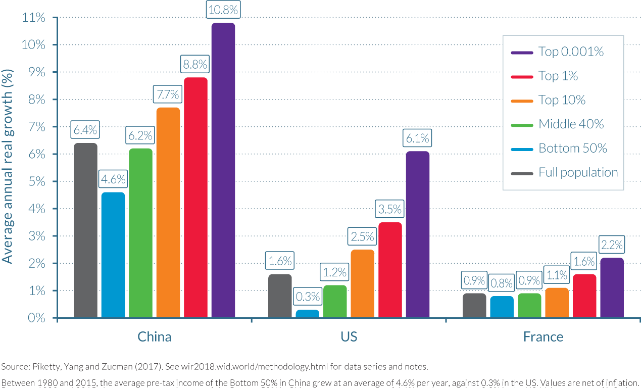
Average national income per adult has grown close to ninefold between 1980 and 2015, corresponding to an average annual increase of 6.4% and a total growth rate of 780%. This growth has not been equally shared; the higher the income level, the higher the rate of growth over the time period considered. Growth for the bottom 50% over the period was 390%, while it was 730% for the middle 40%, and 1 230% for the top 10%. Within the top 10%, growth was also unequally shared. The top 1% experienced total income growth of 1 800%—a huge figure, but notably less than the increases of over 2 270%, 2 920%, and 3 520% for the top 0.1%, top 0.01%, and top 0.001%, respectively.
By contrast, average national income per adult rose by just 63% and 38% in the United States and France over the same period, respectively—approximately fourteen and twenty-one times less than in China. The difference in income growth across the distribution was also markedly different at the bottom of the distribution; the cumulative national income growth of the bottom 50% was 3% for Americans, while for French citizens, it rose at 33%, i. e. less than the average. However, the same pattern, by which income growth rates rise more quickly the higher up the distribution one goes, was evident for all countries.
The urban-rural gap continues to grow, but it is within-region inequality that spurs overall growth in inequality
What role has the urban-rural gap played in the evolution of Chinese inequality? This question is important as inequality could be driven mainly by growing differences between cities and rural areas and not by inequality among individuals within areas. Policy implications are indeed dependent on which force dominates in the mix. To answer this question, it is first important to identify how the populations of urban and rural areas has changed post 1978, as this will in part determine the urban and rural shares in national income. In the urban areas of China, the adult population rose from 100 million in 1978 to almost 600 million in 2015. During this same period, the adult rural population remained roughly stable, rising from 400 million in 1978 to almost 600 million by the mid-1990s, before declining to less than 500 million in 2015. Secondly, the income gap between urban and rural China has always been large and it has grown over time. Urban households earned twice as much income on average as rural households in 1978, but in 2015 they earned 3.5 times as much. Thus, while the urban share in the adult population has grown from 20% in 1978 to 55% in 2015, the urban share in national income has increased from 30% to 80%.
Despite the increase of inequality both in urban and rural China, the level of income inequality in China as a whole is markedly higher at the national level (where the bottom 50% captures only 15% of total income) than it is within rural China (where the figure is 20%) or urban China (25%) considered alone.27 As evidenced in the previous sections, the trend for the top 10% largely mirrored that of the bottom 50%, but in the opposite direction, with rising income shares for the top 10%. Combining this data also demonstrates that there has always been more inequality within rural areas than within urban China, and this will remain the case if current trends continue. (Figure 2.7.3)
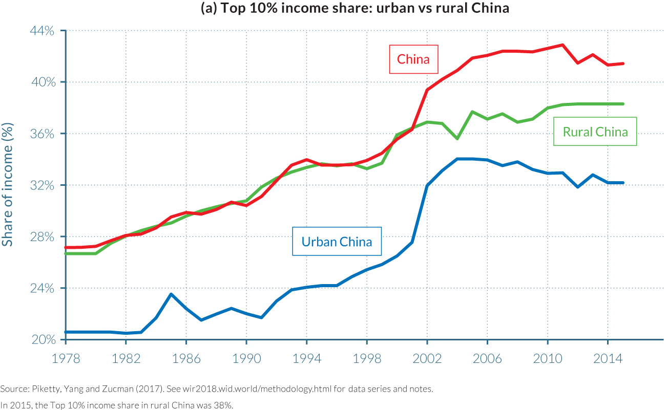
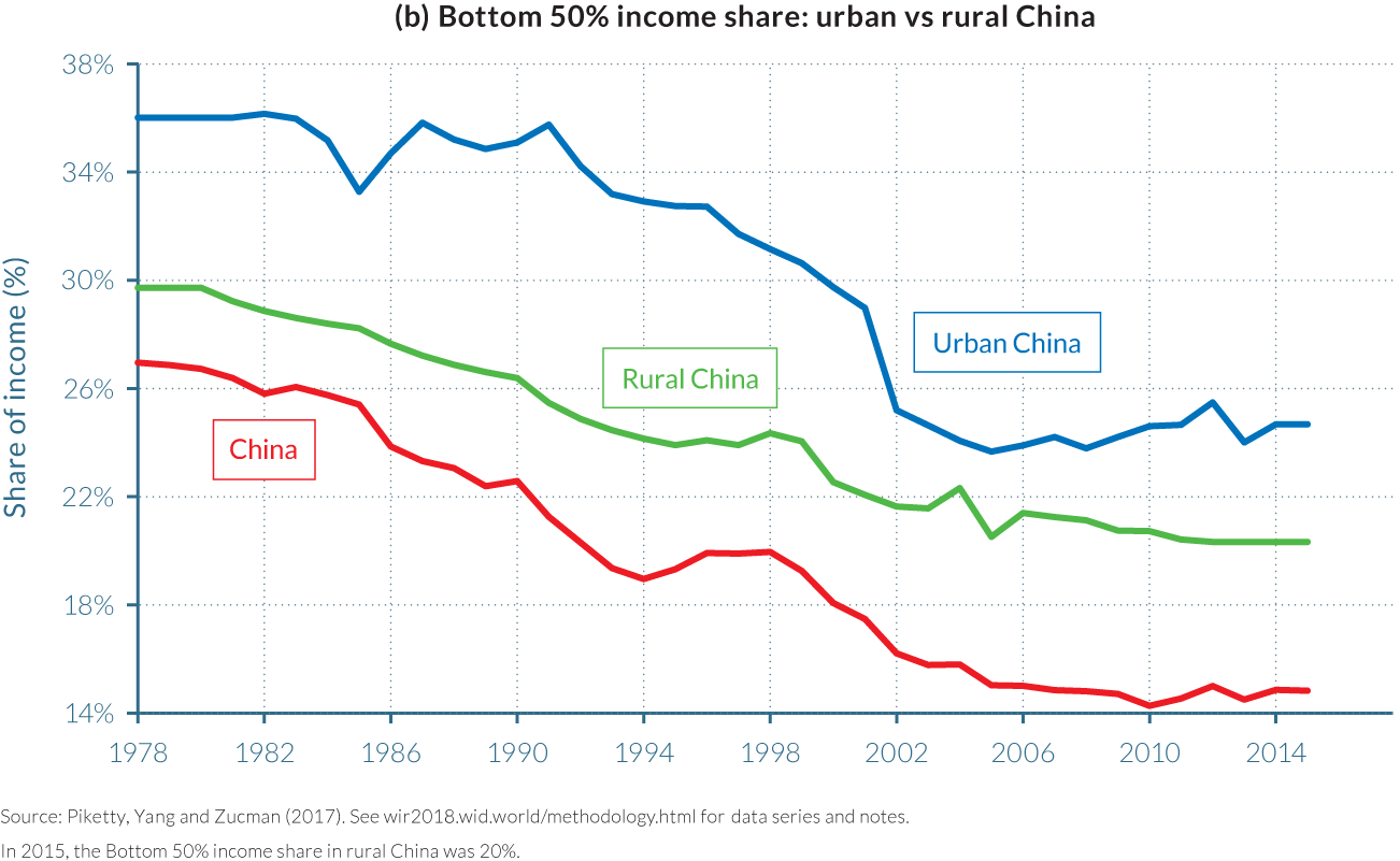
2.8 Income inequality in Russia
Information in this chapter is based on “From Soviets to Oligarchs: Inequality and Property in Russia 1905–2016,” by Filip Novokmet, Thomas Piketty, and Gabriel Zucman, 2017. WID.world Working Paper Series (No. 2017/9).
- Russia’s transition from a communist to a capitalist economic model after 1989 brought about a large divergence in the income shares and growth rates of different income groups.
- The share of national income attributable to the bottom 50% has fallen from 30% in 1989 to less than 20% today, while the share of the top 1% has rocketed upwards from around 25% to over 45% of national income.
- Russia’s rapid and chaotic “shock therapy” of privatization, capital flight, and the rise of offshore wealth, along with high inflation and a new market environment, have contributed to the rise of top Russian incomes since 1989.
- Today’s inequality levels are comparable, and somewhat higher, than those observed during the tsarist period. The Russian Revolution led to a significant redistribution of income, with the top 1% share of national income falling from 18% in 1905 to less than 4% in 1928.
- The most equitable distribution of income in Russia’s recent history followed the introduction of comparatively liberal de-Stalinization policies from 1958 onwards, with large investments in education and infrastructure.
Since the 1990s, Russia’s convergence towards Western European levels of GDP has been far from smooth
Since the fall of the Soviet Union in 1990–1991, Russia has experienced dramatic economic and political transformations. National income and gross domestic product fell abruptly from 1992 to 1995, when inflation skyrocketed, but then started to recover during 1998 and 1999, ushering in a decade of robust growth. The world financial crisis and the fall in oil prices interrupted this process in 2008–2009 and, since then, growth has been sluggish. However, there is little doubt that average incomes are significantly higher in Russia today than they were in 1989–1990. Indeed, the gap between Russia’s per-adult national income and the West European average narrowed from approximately 60–65% of the West European average in 1989–1990, to around 70–75% in mid-2010.28 This can be seen in Figure 2.8.1.
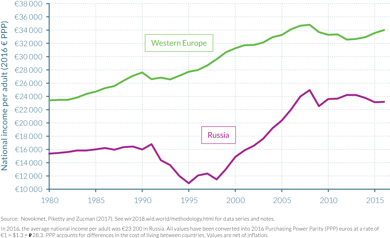
While average national income per adult in Russia reached almost €23 200 in 2016, this figure hides considerable variations in its distribution. The lowest-earning 50% of the adult population—a group of almost 115 million people—earned just under €7 800 on average in 2016, close to three times less than the national average. The middle 40% also received less income than the national average, earning approximately €21 700. The richest 10% of the population earned considerably more, however, receiving over €105 500 on average in 2016. These differences in income left Russia with a very high concentration of income among the country’s richest individuals. The share of national income attributable to the top 10% was 45.5% in 2016, making it considerably larger than that of the bottom 50% (17%) and the middle 40% (37.5%). The top 1% earners capture more than 20% of national income. The average income of the 1.15 million adults in the top 1% was approximately €470 000 in 2016 whereas the top 0.01% and top 0.001% had average incomes of €12.1 million and €58.6 million, respectively—over 523 times and 2527 times greater than the Russian national average. (See Table 2.8.1.)
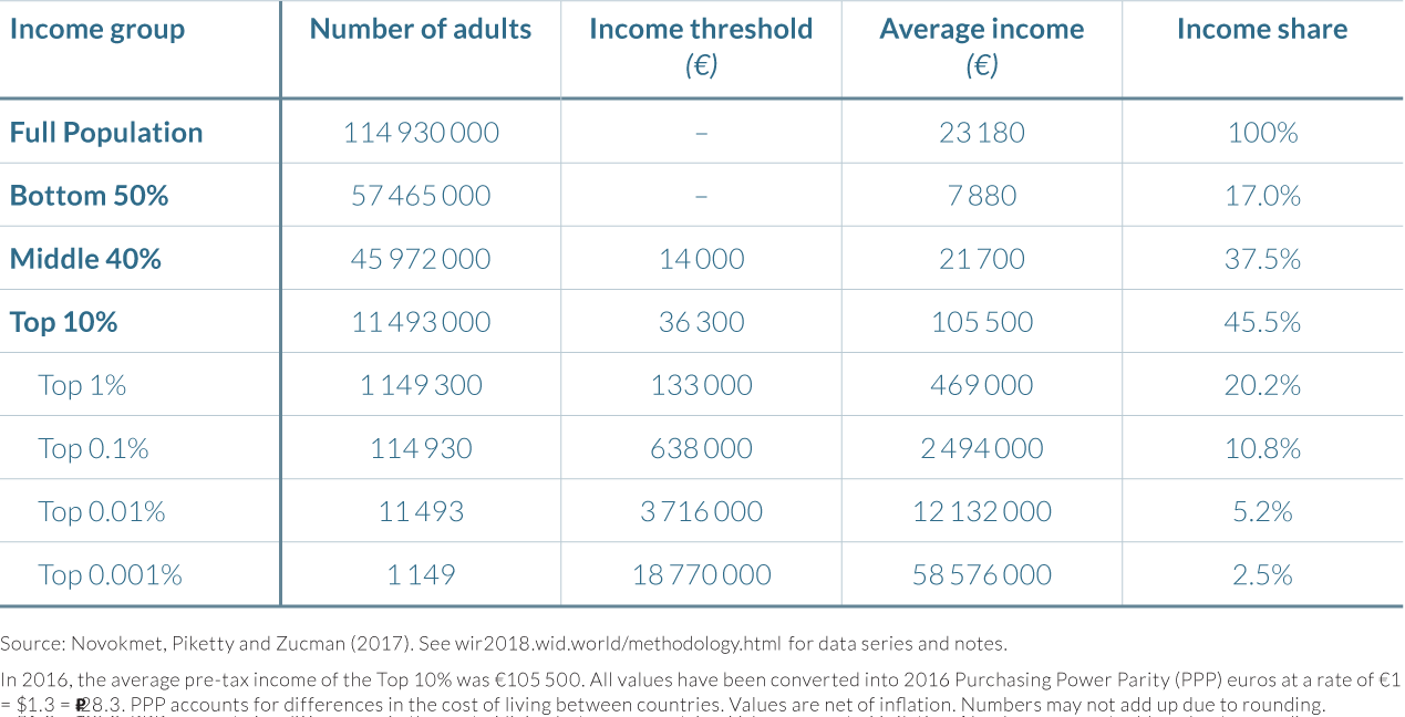
The best available estimates indicate that Russia’s per-adult national income stagnated at around 35–40% of West European levels between 1870 and the First World War, but this ratio rose spectacularly to a high of 65% in the aftermath of Second World War as the Soviet state implemented its modernization strategy of rapid industrialization and mass investment in basic education. As depicted by Figure 2.8.2, Russia’s relative position plateaued at around 55–65% of West European levels between 1950 and 1990—and while Russian living standards stagnated between the 1950s and 1980s, substantial improvements were experienced in Western Europe and the United States. Together with rising shortages and general frustration among the comparatively highly educated population, the relative sluggishness of living standard improvements arguably contributed to the complex social and political processes that eventually led to the fall of the Soviet Union.29
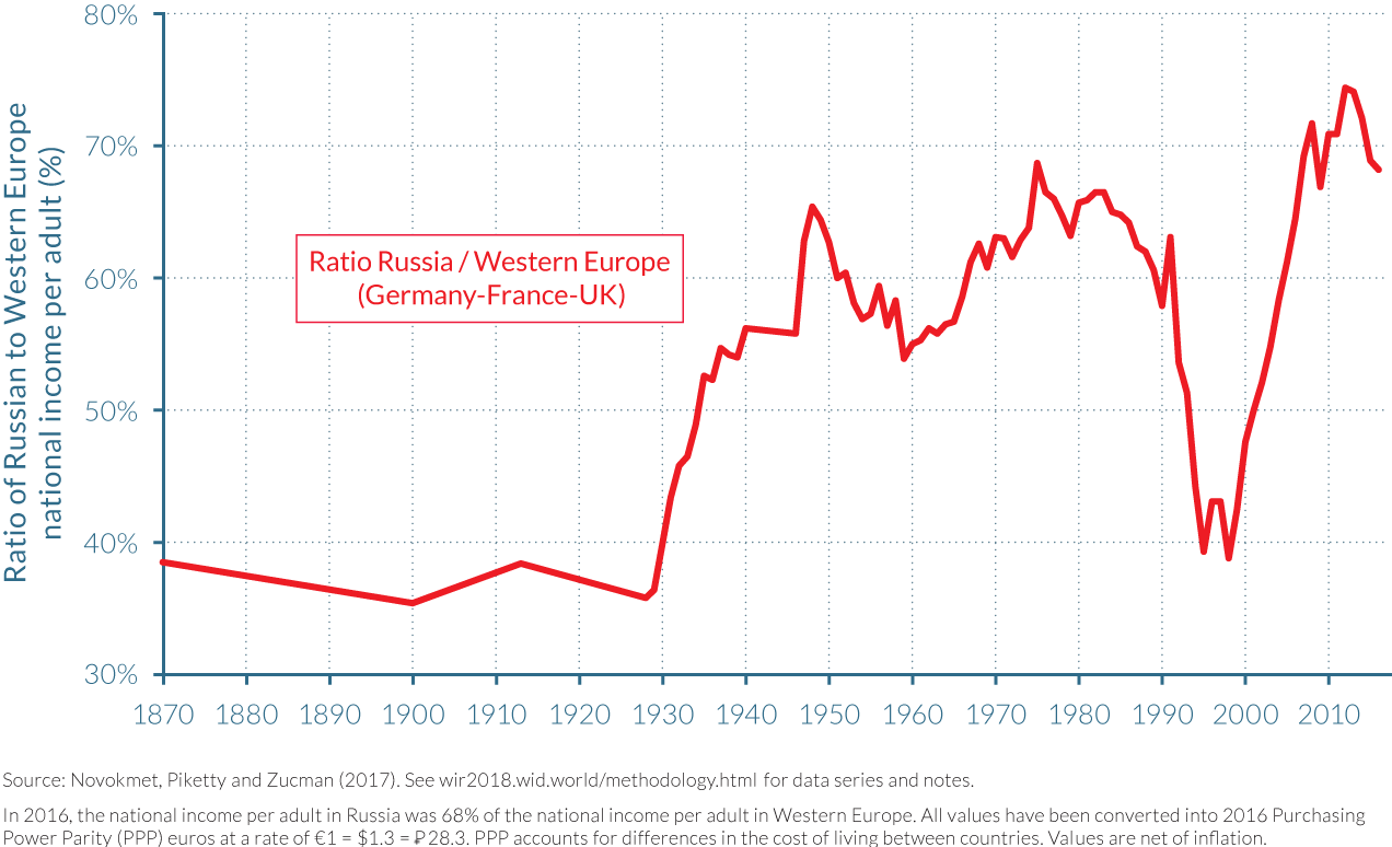
Yet the consequences of these dramatic transformations of the distribution of income and wealth are not well documented or well understood, particularly following the fall of the Soviet Union. There is no doubt that income inequality has increased substantially since 1989–1990—at least in part because monetary inequality was unusually, and to some extent artificially, low under Communism—but there has been little empirical work to measure the exact magnitude of the increase and how this compares to change in other countries. It is to these points and many others that Novokmet, Piketty, and Zucman’s recent paper seeks to respond, by creating distributional national accounts for Russia that combine national accounts, survey, and wealth and fiscal data, including recently released tax data on high-income taxpayers, in essentially the way described earlier in this report.
“Shock therapy” transition policies drastically increased the top 10% share of national income
The striking rise in income inequality after the fall of the Soviet Union was dramatic in terms of both speed and quantitative change. This period was shaped by a “shock therapy” and “big-bang” model of transition from the previously planned, state-led economy to one that was to be led by free-market principles.30 With this came the privatization of the significant wealth of Russia’s state-owned enterprises and the liberalization of prices and capital and labor markets, among many other political and economic changes. According to benchmark estimates provided by Novokmet, Piketty, and Zucman, the income share of the top 10% rose from less than 25% in 1990–1991 to more than 45% in 1996 (see Figure 2.8.3), while the income share of the top 10% rose moderately from 39% to 41% in the United States, and remained at around 30%–31% in France.
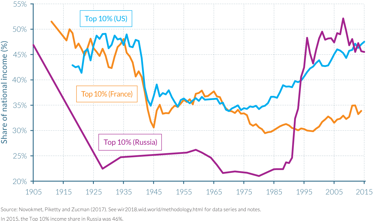
Privatizations were partly done through a voucher privatization strategy, whereby citizens were given books of free vouchers that represented potential shares in any state-owned company. However, voucher privatization of state-owned enterprises took place very quickly, with the ownership of over fifteen thousand firms transferred from state control between 1992 and 1994.31 This happened, moreover, within such a chaotic monetary and political context that small groups of individuals were able to buy back large quantities of vouchers at relatively low prices, and also in some cases were able to obtain highly profitable deals with public authorities—for example, via the infamous loans-for-shares agreements.32 Together with capital flight and the rise of offshore wealth, this process arguably led to much higher level of wealth and income concentration in Russia than in other ex-communist countries.
The transformation of the labor market from state-led to market-led also led to an increase in income inequality through higher inequality of labor income.33 In communist Russia, unemployment was virtually nonexistent with only small wage differentials used to reward differential inputs and to motivate effort. This ensured generally egalitarian inequality outcomes as compared to market economies. When the transition toward free markets began, however, a significant amount of unemployment was created as workers moved from the state to the private sector. Both state and private employment fell with the closure of state and private enterprises, while the imposition of hard budgets created intensely unfavorable conditions for investment and hiring, and left very little support for those seeking unemployment benefits—all of which hit the lowest earners the hardest. Given the abundance of excess labor and greater concentration of wealth, the labor market transition and the privatization process favored owners of capital to the detriment of labor.34
Price liberalization also saw the consumer price index multiply by nearly five thousand between 1990 and 1996. Inflation was particularly high in 1992 and 1993 (when it hit 1 500% and 900%, respectively) after official price liberalization occurred on January 1, 1992. While these episodes of hyperinflation affected the whole of the Russian economy—national income per adult fell from approximately €17 000 in 1991 to €11 000 in 1995—it was the poorest who were hit the hardest. A large part of the bottom 50% of the income distribution was made up of pensioners and low-wage workers whose nominal incomes were not fully indexed to price inflation, and this resulted in massive redistribution and impoverishment for millions of Russian households, particularly among the retired population. The share of national income accruing to the bottom 50% collapsed, dropping from about 30% of total income in 1990–1991 to less than 10% in 1996.
Concurrent with the rapid collapse in the share of incomes for the poorest 50% of the population, a more gradual and continuous process of rising top 1% income shares can be observed. The income share of the top 1% grew from less than 6% in 1989 to approximately 26% in 1996. This was a huge turnaround in just over seven years; note that the income share of the bottom 50% was five times greater than that of the top 1% in 1989, but by 1996, it was almost two times smaller. Meanwhile, the middle 40% appear to have been relatively unaffected by the initial transition reforms; their share of national income saw only a muted fall over the same period, from approximately 46% to 43%.
Following the 1996 reelection of President Boris Yeltsin, income shares began to stabilize for Russia’s poorest 50% of the population. The income share of the bottom 50% rose over five percentage points between 1996 and 1998 as low-end pensions and wages benefited from a gradual recovery process between 1996 and 2015. They never fully returned, however, to their 1990–1991 relative income share. The top 10% share fell from around 48% to 43% between 1996 and 1998, before averaging around 47% until 2015. This latter period saw consistent rises in the income share of the top 10% in the United States, and by 2015, income concentration was higher than in Russia. The top 10% income share also rose in France, but very steadily to a more modest 34% by 2015.
This twelve-year period also saw strong macroeconomic growth, with Russia’s per-adult national income more than doubling from around €12 000 in 1996 to approximately €25 000 in 2008.35 However, it was the top 10% who were to be the main beneficiaries of this growth, as their share of national income rose from 43% to 53% across the ten years leading up to 2008. This upward trend for the top 10% was the opposite of that experienced by the middle 40%, whose share of national income fell from almost 40% in 1998 to 35% in 2008. The world financial crisis and precipitous drop in oil prices interrupted Russian national income growth in 2008–2009, and economic activity remained sluggish after that—only to fall again in 2014–2015, partly due to the international sanctions that followed the Russian military intervention in Ukraine. Average per-adult national income fell by over €2 000 in 2008–2009 before recovering rather lethargically to just over €24 000 in 2013, and then falling back down to €23 000 in 2015–2016. The richest part of the population experienced the largest fall in their share of national income as a result of the crisis, as the top 10% income share lost six percentage points in the two years leading up to 2010. It later settled to just over 45% in 2014–2015. The bottom 50% and middle 40% experienced four-percentage-point rises in their respective shares of national income, to approximately 18% and 39%, respectively.
Considering the period 1989–2016 together, average per-adult national income in Russia increased by 41%—that is, by approximately 1.3% per year. However, as a result of the dynamics described above, the different income groups have enjoyed widely different growth experiences. On average, the bottom earners benefited from very small or negative growth over the twenty-seven-year period (-0.8% per year and -20% over the entire period for the bottom 50%), due principally to the inflation-induced loss of incomes before 1996. The middle 40% had positive but very modest average growth of just 0.5% per year, and thus their incomes grew by 15% over the period. The experience of the top 10%, meanwhile, has been vastly different. Indeed, as Table 2.8.2 shows, the growth in income these groups saw only increases as one looks further up the income distribution. The average per-adult incomes of the top 10% grew by 3.8% per year between 1989 and 2016, providing the 11.5 million top earners with a cumulative income growth of 171%. Moreover, it is almost solely this top 10% that has benefited from Russia’s macroeconomic growth over the period. Their share in the country’s growth has been 99%, as opposed to only 1% for the bottom 90%, made up of almost 103.5 million adults.
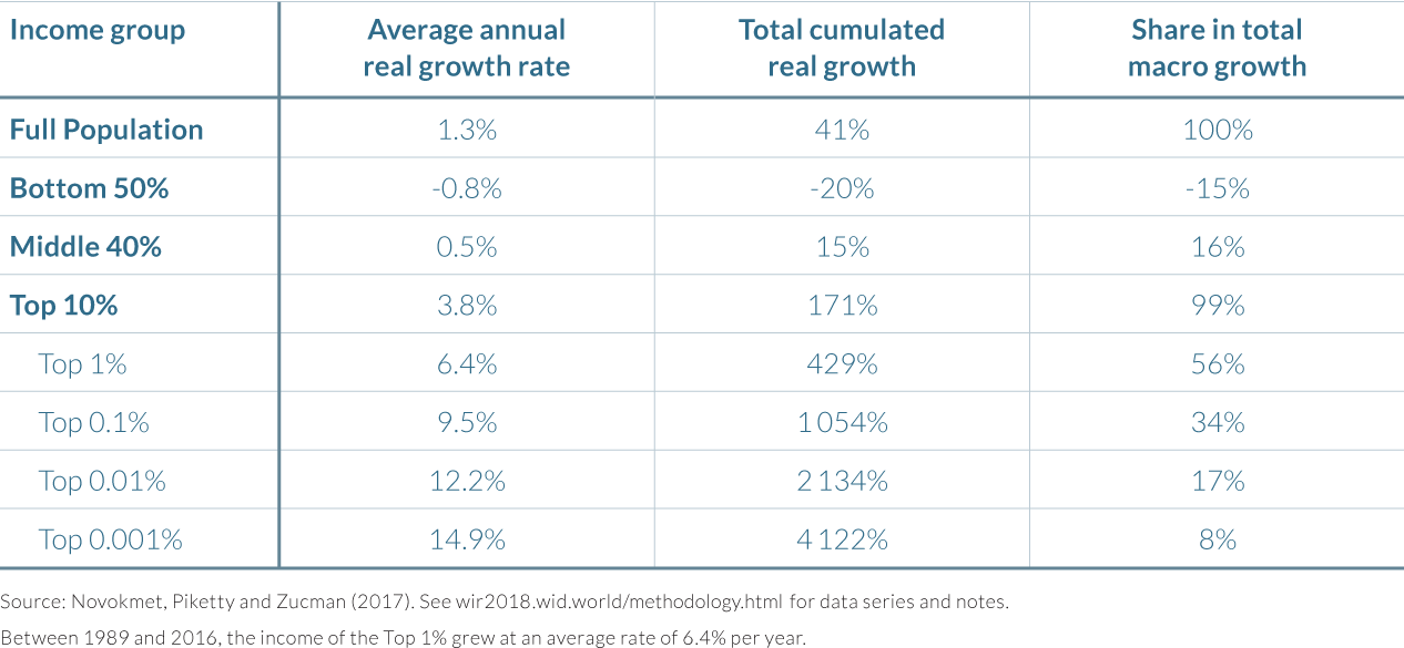
Figure 2.8.4 shows the annual and total growth rates over the period for different groups of the population. Interestingly, these figures show the same upward-sloping pattern as those constructed by The European Bank for Reconstruction and Development (EBRD).36 They do, however, differ on two points. First, they show an even stronger tilt toward the top incomes due to a more precise estimation of top Russian incomes.37 Second, there are meaningful differences in the income concepts employed.38 The latter difference has a notable impact on the rate of total real growth over the 1989–2016 period; the EBRD find this to be 70% rather than the 41% presented above. Such a difference is far from marginal. Consistent with the concepts used in this report and throughout WID.world, Novokmet et al. use national income rather than solely self-reported survey data. In doing so, they recognize the significant challenges of comparing real incomes for the Soviet and post-Soviet periods in a satisfactory manner. For example, if the researchers were to evaluate the welfare costs of shortages and queuing in 1989–1990, then it is possible that their aggregate growth figure might increase from 41% to 70%, or perhaps even more.
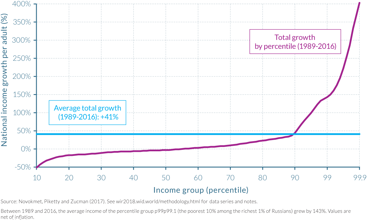
Long-run Russian inequality follows a U-shaped pattern
The changes in the distribution of income that took place in the post-communism period of 1989–2016 look very different from those that took place after 1905. In the tsarist Russia of 1905, the share of national income attributable to the top 10% was approximately 47%, while the bottom 50% share was about 17%, and the middle 40% share was 36%. Following the Russian Revolution of 1917, which dismantled the tsarist autocracy and paved the way for the creation of the Union of Soviet Socialist Republics (USSR) in 1922, these shares changed dramatically. By 1929, the top 10% earned just 22% of national income, twenty-five percentage points down from twenty-four years earlier. The loss in the share of national income of the top 10% was subsumed by an approximate thirteen-percentage-point rise in the share of the bottom 50% and middle 40% to almost 30% and 48% of national income, respectively, as seen in Figure 2.8.5. The top 1% income share, meanwhile, was somewhat below 20% in 1905 and dropped to as little as 4–5% during the Soviet period. The vast majority of growth up until 1956 (the start of the so-called de-Stalinization policies) was therefore shared by the bottom 90%, with mass investment in publication and the introduction of the five-year plans—plans that brought about the accumulation of capital resources through the buildup of heavy industry, the collectivization of agriculture, and the restricted manufacturing of consumer goods, all under state control.39
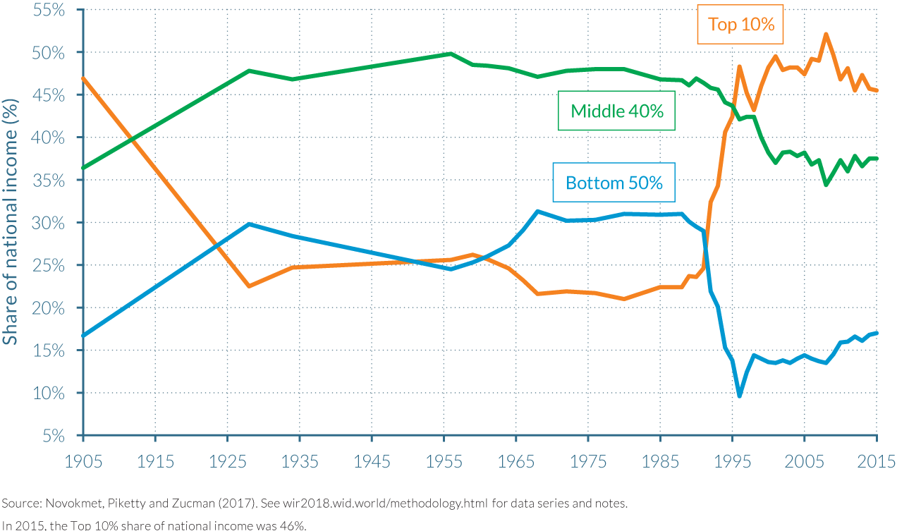
The death of Joseph Stalin in 1953 and the introduction thereafter of comparatively liberal policies known as de-Stalinization policies, which included the end of mass forced labor in Gulags, saw further changes to income shares that favored those earning lower incomes. The bottom 50% experienced gains in their share of national income from 24% in 1956 to 32% in 1968, while the share of the top 10% fell from 26% to 22% over the same period. Shares of national income then remained fairly constant for these groupings and for the middle 40% until 1989, and growth was thus relatively balanced between them, as illustrated by Figure 2.8.6 and Table 2.8.3.
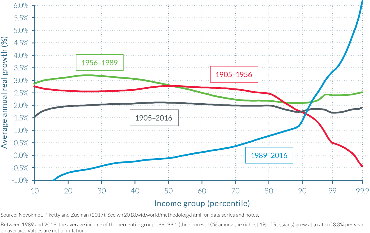
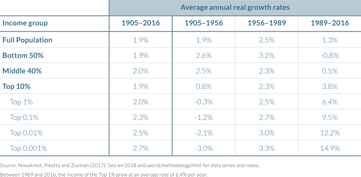
These figures reiterate the stark difference between living under the communist system and living after its end, in terms of the variance in average annual real growth rates experienced by income groups. Throughout 1905–1956 and 1956–1989, the bottom 50% and middle 40% saw their average annual real incomes increase by at least as much as those of the top 10%, and at considerably higher rates from 1905 to 1956. In this earlier period, growth notably favored both the bottom 50% and middle 40% (with 2.6% and 2.5% annual growth rates, respectively) over the top 10% (0.8%). From 1956 to 1989, the bottom 50% experienced an annual growth rate that was higher than in the preceding periods, but the difference with top groups was remarkably reduced. The top 1% grew at 2.3%—as much as the middle 40%. Interestingly, annual growth rates were increasingly negative within the top 1% income brackets between 1905 and 1956, but were then increasingly positive within these groups from 1956 to 1989. The real contrast, however, is in the post-1989 period, when the divergence in annual growth rates rose to 15.7 percentage points between the top 0.001% (14.9%) and the bottom 50% earners (-0.8%). Such a divergence in growth rates at different ends of the distribution has not been witnessed throughout the twentieth century, even during the socialization of the Russian economy.
More detailed data is required for more precise conclusions to be drawn
As already mentioned, there are a number of limitations in the data sources employed by Novokmet, Piketty, and Zucman, which suggests that while broad orders of magnitude can be considered reliable, small variations in inequality should not be viewed as precisely true. Indeed, their estimates suggest that inequality levels in tsarist and post-Soviet Russia are roughly comparable. But the lack of detailed income tax data—and the general lack of financial transparency—make their estimates for the recent period relatively imprecise, perhaps most importantly because their estimate for 1905 is at least as imprecise.40 Thus, it seems safer to conclude only that inequality levels in tsarist Russia were very high and are comparable with the possibly even greater levels seen in post-Soviet Russia.
It is also worth stressing that the measures of monetary inequality depicted in Figure 2.8.1 and Figure 2.8.5 neglect non-monetary dimensions of inequality, which may bias comparisons of inequality over time and across societies. For example, inequalities in personal status and basic rights, including mobility rights, were pervasive in tsarist Russia, and persisted long after the official abolition of serfdom in 1861. Summarizing such inequalities with a single monetary indicator is clearly an oversimplification of a complex set of power relations and social domination. The same general remark applies to the Soviet period, when monetary inequality was reduced to very low levels under communism. However, the then relatively small difference between the incomes of the top 10% and bottom 50% did not prevent the Soviet elite from having access to superior goods, services, and opportunities. This could take different forms, including access to special shops and vacation facilities, which allowed the Soviet top 1% to enjoy living standards that in some cases might have been substantially higher than their annual incomes of four to five times the national average would have suggested. These factors should be kept in mind when making historical and international comparisons—in Russia or elsewhere.
2.9 Income Inequality in India
Information in this chapter is based on the working paper “Indian Income Inequality, 1922–2014: From British Raj to Billionaire Raj?,” by Lucas Chancel and Thomas Piketty, 2017. WID.world Working Paper Series (No. 2017/11).
- Income inequality in India has reached historically high levels. In 2014, the share of national income accruing to India’s top 1% of earners was 22%, while the share of the top 10% was around 56%.
- Inequality has risen substantially from the 1980s onwards, following profound transformations in the economy that centered on the implementation of deregulation and opening-up reforms.
- Since the beginning of deregulation policies in the 1980s, the top 0.1% earners have captured more growth than all of those in the bottom 50% combined. The middle 40% have also seen relatively little growth in their incomes.
- This rising inequality trend is in contrast to the thirty years that followed the country’s independence in 1947, when income inequality was widely reduced and the incomes of the bottom 50% grew at a faster rate than the national average.
- The temporary end to the publication of tax statistics between 2000–2010 highlights the need for more transparency on income and wealth statistics that track the long-run evolution of inequality. This would allow for a more informed democratic debate on inequality and inclusive growth in India.
India entered the digital age without inequality data
India introduced an individual income tax with the Income Tax Act of 1922, under the British colonial administration. From that date up to the turn of the twentieth century, the Indian Income Tax Department produced income tax tabulations, making it possible to track the long-run evolution of top incomes in a systematic manner. Given the profound evolutions in India’s economy since the country’s independence, this provides a rich data resource for researchers to access.41 Research has shown that the incomes of the richest—the “top incomes”—declined significantly from the mid-1950s to the mid-1980, but this trend was reversed thereafter, when pro-business, market deregulation policies were implemented.
Little has been known, however, about the distributional impacts of economic policies in India after 2000, when real income growth was substantially higher than in previous decades. This is largely because the Indian Income Tax Department stopped publishing income tax statistics in 2000, but also because self-reported survey data often do not provide adequate information concerning the top of the distribution. In 2016, the Income Tax Department released tax tabulations for recent years, making it possible to track the evolution of income inequality during the high average income growth years post-2000.
Inequality rose from the mid-1980s after profound transformations of the economy
Over the past four decades, the Indian economy has undergone profound evolutions. In the late seventies, India was recognized as a highly regulated, centralized economy with socialist planning. But from the 1980s onwards, a large set of liberalization and deregulation reforms were implemented. Liberalization and trade openness became recurrent themes among Indian policymakers, epitomized by the Seventh Plan (1985–1990) led by Prime Minister Rajiv Gandhi (1984–1989). That plan promoted the relaxation of market regulation, with increased external borrowing and increased imports. These free-market policy themes were then further embedded in the conditions attached to the International Monetary Fund’s assistance to India in its balance of payment crisis in the early 1990s, which pushed further structural reforms for deregulation and liberalization. This period also saw the tax system undergo gradual transformation, with top marginal income tax rates falling from as high as 97.5% in the 1970s to 50% in the mid-1980s.
The structural changes to the economy along with changes in tax regulation, appear to have had significant impact on income inequality in India since the 1980s. In 1983, the share of national income accruing to top earners was the lowest since tax records started in 1922: the top 1% captured approximately 6% of national income, the top 10% earned 30% of national income, the bottom 50% earned approximately 24% of national income and the middle 40% just over 46% (see Figure 2.9.1a and b). But by 1990, these shares had changed notably with the share of the top 10% growing approximately 4 percentage points to 34% from 1983, while the shares of the middle 40% and bottom 50% both fell by 2 percentage points to around 44% and 22%, respectively.
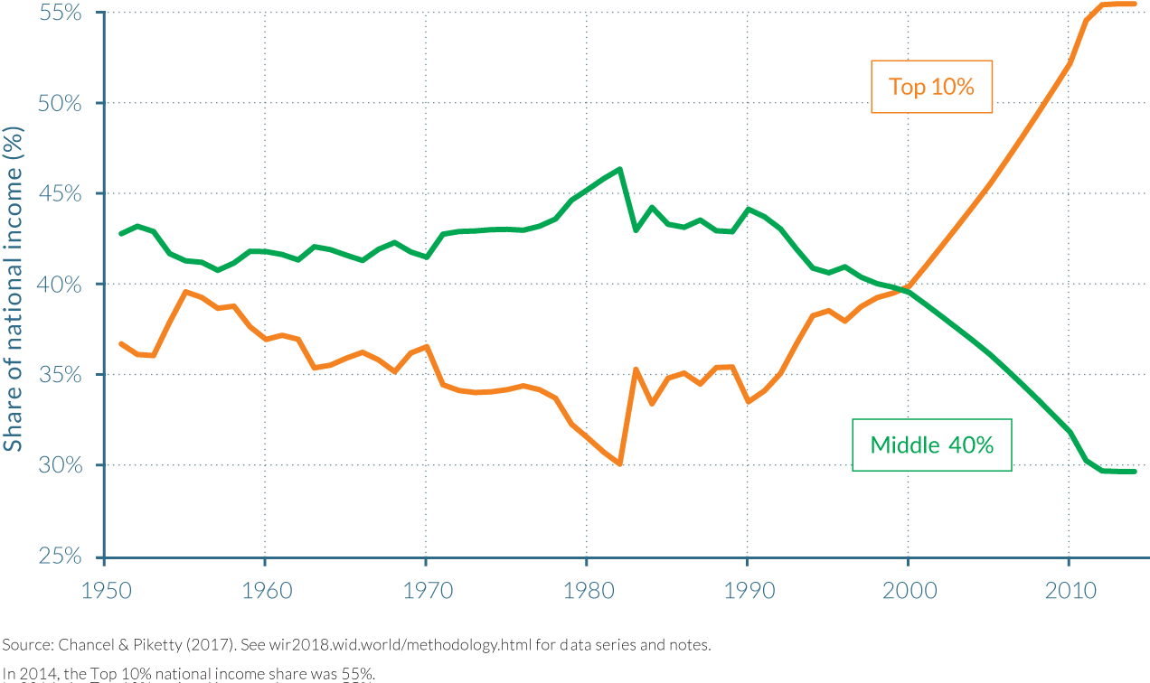
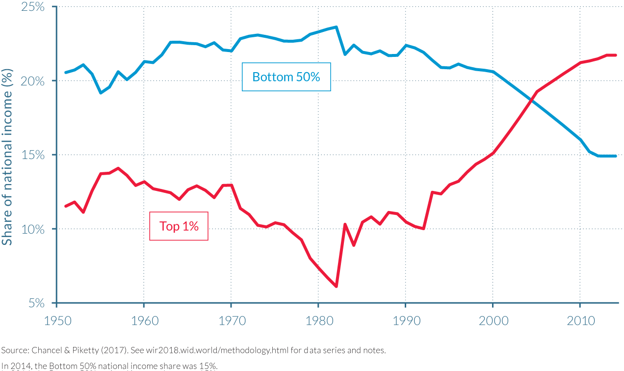
What came to be known as the first set of economic reforms were implemented from 1991 to 2000 and in practice were the continuation of the mid 1980s policy shift. These reforms placed the promotion of the private sector at the heart of economic policies, via denationalizations, disinvestment of the public sector and deregulation (de-reservation and de-licensing of public companies and industries)42, weighing the economy substantially in favor of capital above labor. These reforms were implemented both by the Congress government and its Conservative successors. As illustrated by Figure 2.9.1, these reforms were concomitant with a dramatic rise in Indian income inequality by 2000. The top 10% had increased its share of national income to 40%, roughly the same as that attributable to the middle 40%, while the share of the bottom 50% had fallen to around 20%.
Indian income inequality by 2000. The top 10% had increased its share of national income to 40%, roughly the same as that attributable to the middle 40%, while the share of the bottom 50% had fallen to around 20%.
These pro-market reforms were prolonged after 2000, under the 10th and subsequent five-year plans. The plans ended government fixation of petrol, sugar and fertilizer prices and led to further privatizations, in the agricultural sector in particular. Inequality trends continued on an upward trajectory throughout the 2000s and by 2014 the richest 10% of the adult population shared around 56% of the national income. This left the middle 40% with 32% of total income and the bottom 50%, with around half of that, at just over 16%.
Indian inequality was driven by the rise in very top incomes
Inequality within the top 10% group was also high. The higher up the Indian income distribution one looks, the faster the rise in their share of the national income has been since the early 1980s. As depicted by Figure 2.9.2, the income share of India’s top 1% rose from approximately 6% in 1982–1983 to above 10% a decade after, then to 15% by 2000, and further still to around 23% by 2014. The latest data thus shows that during the first decade after the millennium, the share of national income attributable to the top 1% grew to be larger than that pertaining to the bottom 50%. By 2014, the national income share of the bottom 50%—a group of approximately 390 million adults—was just two-thirds of the share of the top 1%, who totaled 7.8 million. An even stronger increase in the share of national income was experienced by the top 0.1% and top 0.01%, whose shares grew fivefold and tenfold, respectively, from 2% and 0.5% to almost 10% and 5%, between 1983 and 2014. Income growth rates at the very top were extreme, as shown by Table 2.9.1.
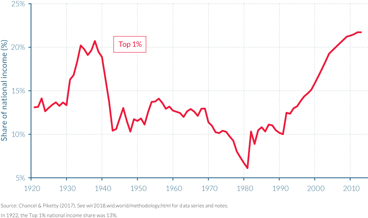
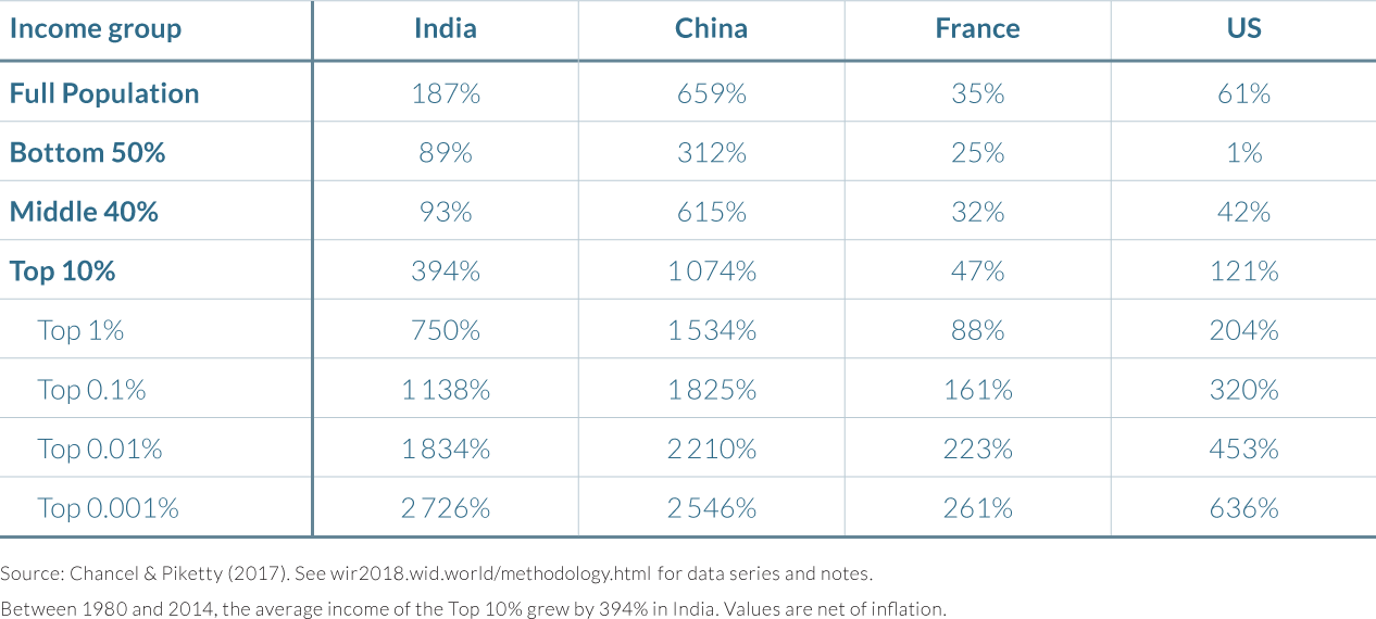
These evolutions are consistent with the dynamics of Indian wealth inequality, which exhibit a strong increase in the top 10% wealth share in the recent period, in particular after 2002.43 Highly unequal income growth at the top mechanically drives wealth inequality across the population, which in returns fuels income concentration.
The recent surge in inequality mirrors inequality declines from the 1940s to the 1980s
After independence, Jawaharlal Nehru implemented a set of socialist policies, with strict government control over the economy, with an explicit goal to limit the power of the elite. The policies implemented by himself and his followers, including his daughter Indira Gandhi, up to the late 1970s, included nationalizations, strong market regulation and high tax progressivity. Nationalizations involved the railways and air transport in the early-1950s, oil in the mid-1970s and banking throughout the entire period, to cite but a few. Along with the transfer of private to public wealth and their implicit reduction in capital incomes, nationalizations brought government pay-scale setting with them that compressed wage distributions. In the private sector, incomes were constrained by extremely high tax rates: between 1965 and 1973, top marginal income tax rates rose from 27% to almost 98%. These changes may have discouraged rent-seeking behavior at the top of the distribution, which can be seen as an efficient strategy in the presence of excessive bargaining power and rent-seeking activity. The impact on income inequality was substantial, as the top 1% income share decreased from 21% before the second World War to approximately 10–12% in the 1950s and 1960s and fell further to 6% in the early 1980s.
Revisiting “Shining India’s” income growth rates
How do these vast institutional and policy changes translate in terms of income growth rates for different groups of the population? As Figure 2.9.3 illustrates, the average growth of real incomes has varied notably between the different groups in the income distribution since the 1950s. The annual real incomes of the bottom 50% grew at a faster rate than the countrywide average during the 1960s and 1970s when socialist central planning dominated the Indian economy, and at a notably higher pace than the growth experienced by those in the top 10% and top 1% of earners. However, this dynamic changed dramatically during the 1980s and has remained as such ever since. The 1980s saw a much higher average income growth rates than in the previous decades, but growth was only marginally higher for the bottom 90% of the population. High growth was in fact concentrated among the top 10%. This situation was prolonged throughout the 1980–2000s. During the 2000s, the annual real income growth of the top 1% was close to 8.5%, followed by the top 10% at around 7 % and the bottom 50% at less than 2.5 %. India’s countrywide average was 4.5 % over the decade.
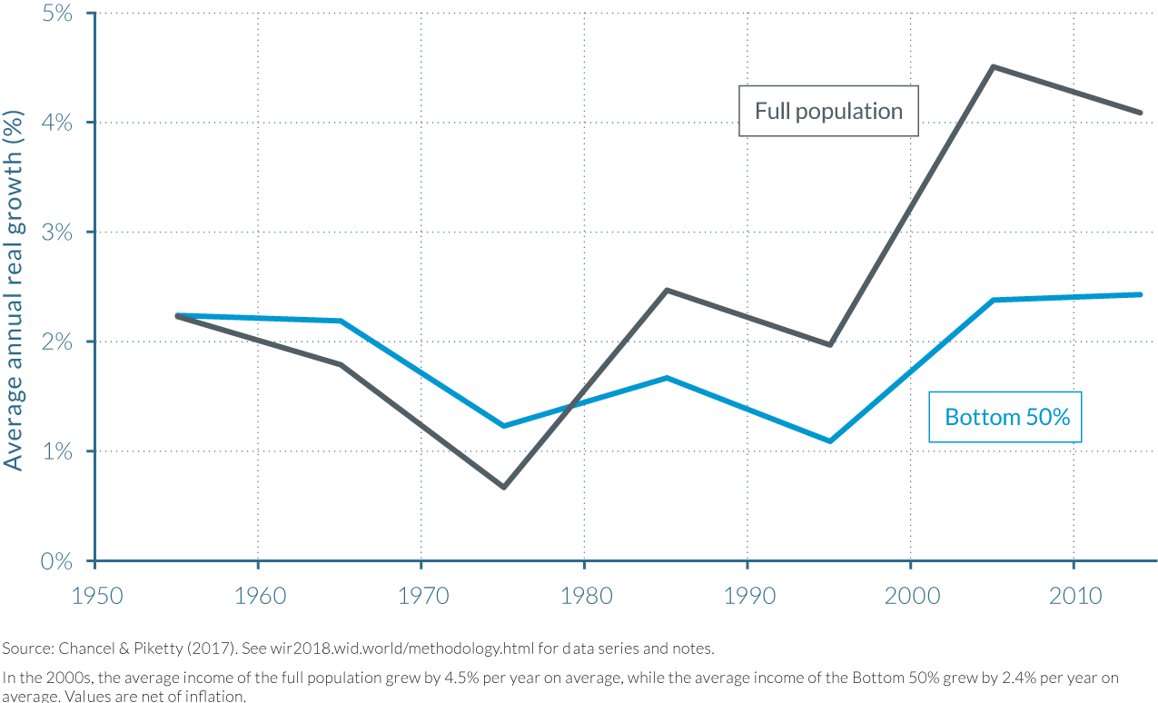
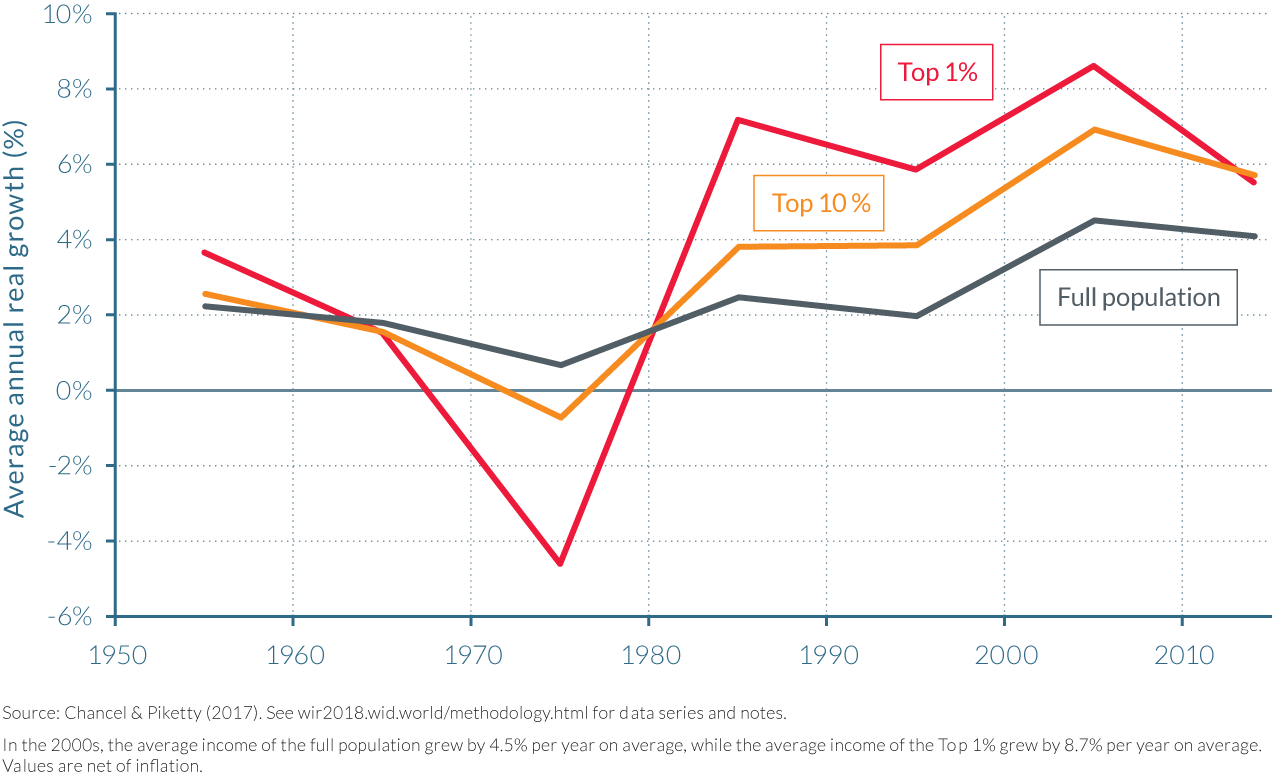
Table 2.9.2 shows the growth rate and the percentage of growth captured by different income groups in India between 1951–1980. During this period, the higher the group in the distribution of income, the lower the growth rate they experienced. Real per-adult incomes of the bottom 50% and middle 40% groups grew substantially faster than average income, increasing by 87% and 74% respectively, compared to the 65% growth of average income per adult. Furthermore, the top 0.1%, top 0.01% and top 0.001% income groups experienced a significant reduction in their real incomes, falling -26%, -42% and -45% respectively over the 30-year period. The bottom 50% group captured 28% of total growth between 1951 and 1980, while the middle 40% captured almost half of total growth.
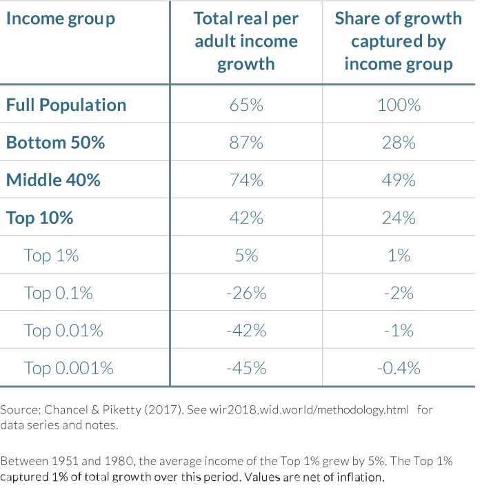
It is particularly interesting to compare the pre-1980 with the post-1980 growth rates. From 1980 to 2014, the bottom 50% and middle 40% grew at 89% and 93%, respectively. Whereas average income growth is substantially higher after 1980, there is very little difference in growth rates for the bottom 50% and middle 40%. Since 1980, it is also striking that the top 0.1% earners captured more of the total growth than the bottom 50% (12% versus 11% of total growth). The top 0.1% of earners represented less than 800 000 individuals in 2014, this is equivalent to a population smaller to Delhi’s IT suburb, Gurgaon. It is a sharp contrast with the 389 million individuals that made up the bottom half of the adult population in 2014. At the opposite end of the distribution, the top 1% of Indian earners captured as much growth as the bottom 84%.
Table 2.9.3 illustrates the income levels and income thresholds for different groups and their corresponding adult population in 2014. The bottom 50% earned significantly less than the average income per adult, receiving less than one-third of the nationwide mean income before tax, while the average income of the middle 40% was around four-fifths the national average. Those in the top 10% earned five times the national average, and when one examines further up the income distribution, the same exponential trend as seen in the growth statistics is evident. The top 1% of earners, for example, received around €134 600 (₹ 3.12 million) per year on average, while the top 0.1% receive approximately €533 700 (₹ 12.4 million), 22 and 86 times the average income for Indian adults, respectively. For the top 0.001%, this ratio is 1871. (Figure 2.9.4)
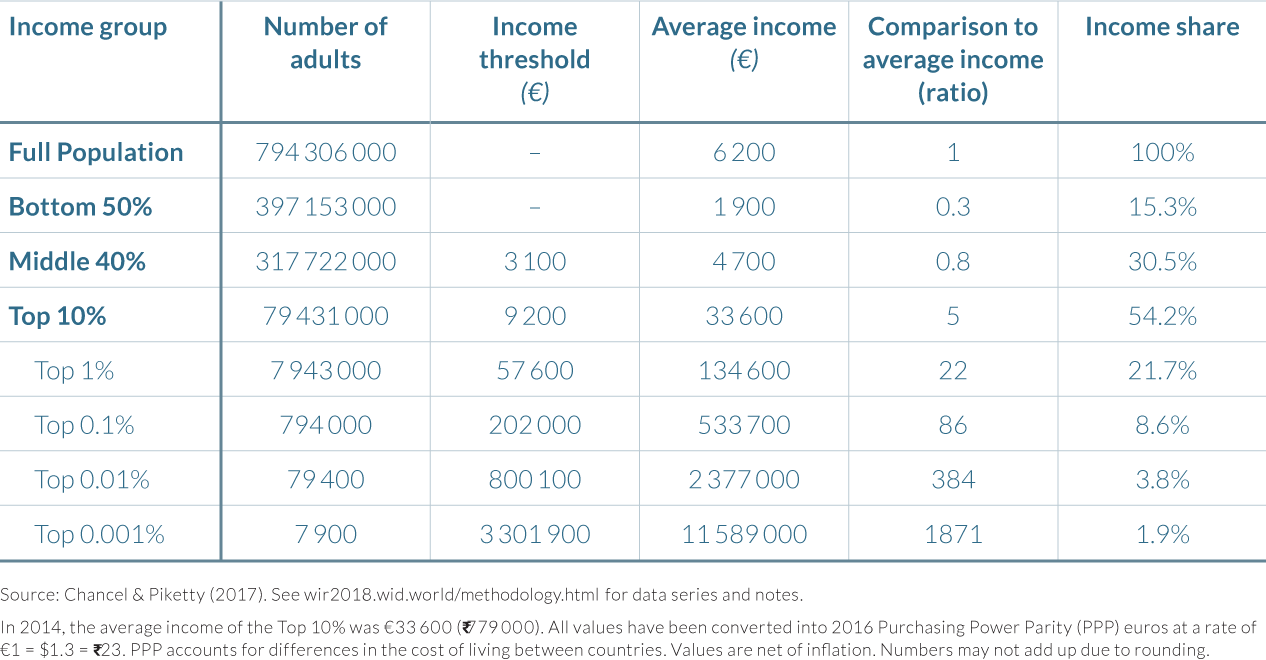
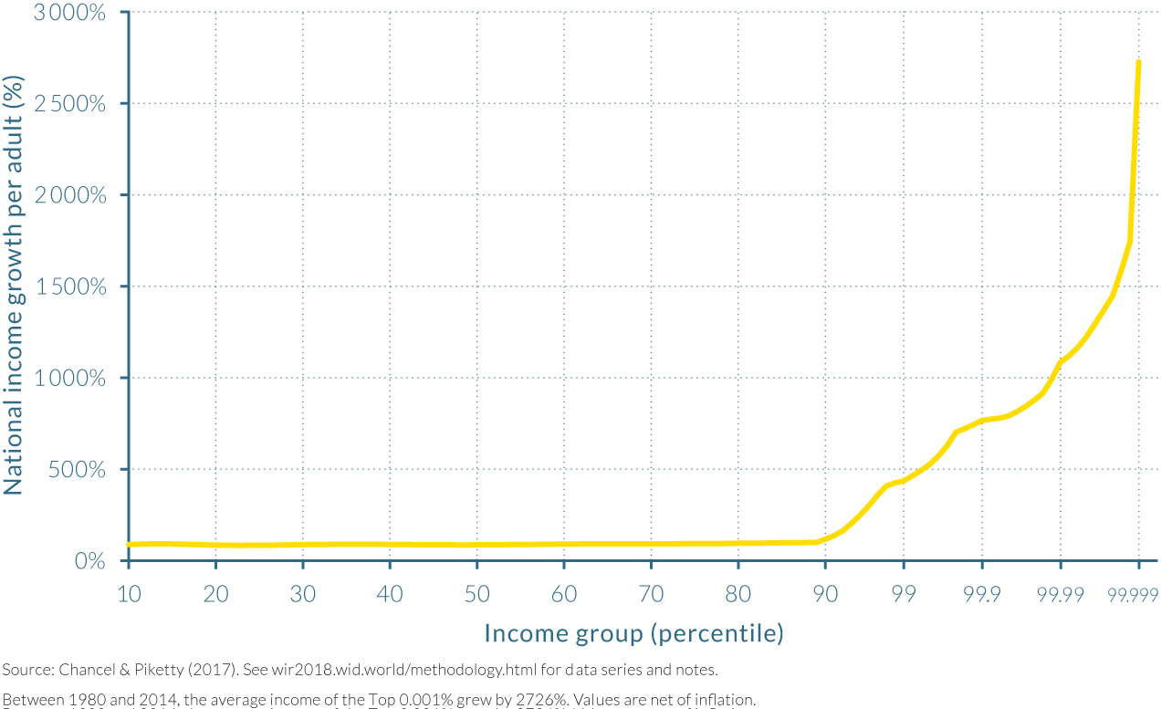
2.10 Income Inequality in the Middle East
Information in this chapter is based on “Measuring Inequality in the Middle East, 1990–2016: The World’s Most Unequal Region?” by Facundo Alvaredo, Lydia Assouad, and Thomas Piketty, 2017. WID.world Working Paper Series (No. 2017/16).
- The Middle East appears to be the most unequal region in the world, with the share of income accruing to the top 10 and 1% exceeding 60% and 25% of total regional income 2016. The levels of inequality remained extreme over the 1990–2016 period, with the top 10% income share varying between 60%–66% and a bottom 50% share consistently below 10%. These inequality levels are comparable to or higher than those observed in Brazil and South Africa.
- This high level of income concentration is due to both enormous inequality between countries, particularly between oil-rich and population-rich countries, and is also the result of very large inequality within countries.
- Inequality between countries is largely due to the geography of oil ownership and the transformation of oil revenues into permanent financial endowments. As a result, the income of the oil-rich Gulf countries made up 42% of the total regional income in 2016 despite only representing a small share of the total population (15% in 2016). The gap in per-adult national income between Gulf countries and the other countries is therefore extremely large.
- These new results also show that inequalities within countries are much larger than previously estimated. However, given the lack of data available, these estimations are likely to be substantially underestimated. The problem is particularly acute in the Gulf countries, for which the low official inequality statistics contradict important aspects of their political economy, namely the growing population share of low-paid foreign workers.
The Arab Spring’s demands for greater social justice has led researchers to reexamine inequality in the Middle East
Following the Arab Spring movement, there has been renewed interest in inequality measurement in Middle East countries, as calls for greater social justice were amongst the leading demands of these popular movements. However, existing studies have argued that income inequalities within these countries do not seem to be particularly high by international standards, suggesting that the source of dissatisfaction might lie elsewhere. This somewhat surprising fact, coined “the Enigma of Inequality”44 or the “Arab Inequality Puzzle”45, has led to a growth in the literature on inequality in the region.
Among the literature seeking to address this surprising finding is a recent paper by Facundo Alvaredo, Lydia Assouad and Thomas Piketty. They argue that previous results, based on household survey data only, highly underestimate inequality and they offer novel estimates using the only fiscal data available in the region that has been recently released.
Inequality in the Middle East is among the highest of any region worldwide
Income inequality in the Middle East remains extremely high over the 1990–2016 period: the top 10% income share fluctuated at around 60%–66% of total income, while the share of the bottom 50% and middle 40% varied between 8%–10% and 27%–30% of total income, respectively. Regional income has largely been concentrated among the top 1% of the adult population, which receives 27% of total income, that is three times more than the bottom 50%, and approximately the same as the middle 40% of the population. Inequality in the Middle East is therefore among the highest of any region worldwide. (Figure 2.10.1)
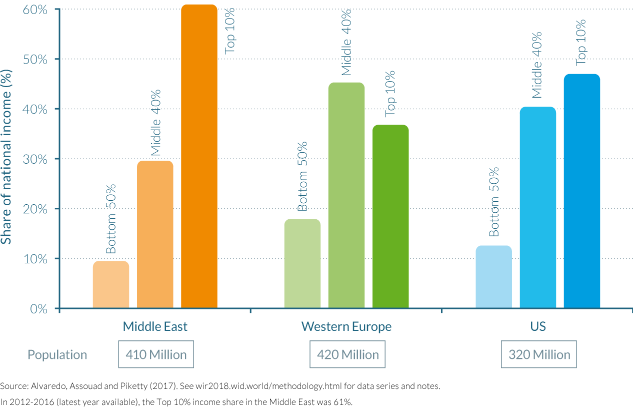
Comparing the Middle East performance in terms of inequality with other countries in the World is legitimate and informative—at least as much as the usual inequality comparisons between nation-states. The total population of the region (about 410 million in 2016) is comparable to Western Europe (420 million) and the United States (320 million), and is characterized by a relatively large degree of cultural, linguistic and religious homogeneity. The authors find that the share of total income going to the top 10% income earners in the Middle East, is significantly greater than in the largest rich countries in Western Europe (36%) and the United States (47%) but also than in Brazil (55%), a country that is often described as one of the most unequal in the world. The only country for which higher inequality estimates can be currently found is South Africa, whose top 10% received approximately 65% of national income in 2012. (Figure 2.10.2)
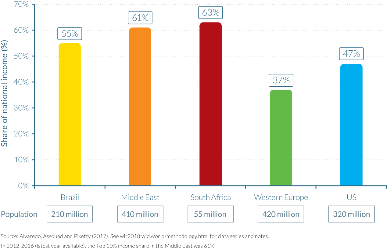
While these results contradict the aforementioned studies, they are robust to different estimation techniques. When the income distribution is computed using purchasing power parity figures, which reflect the difference in the living standards of each country, inequality levels decline but not by a significant amount. Changing the geographical definition of the Middle East also has a relatively limited impact on inequality: by excluding Turkey from the analysis, a country whose average income is between those of the poorest countries—Egypt, Iraq, Syria, Yemen, etc.—and the oil-rich Gulf countries, inequalities unsurprisingly increase, but only by a small margin.
The origins of inequality are, however, distinctive amongst these different groups of countries. In the case of the Middle East, they are largely due to the geography of oil ownership and the transformation of oil revenues into permanent financial endowments, as we shall see below. In contrast, In Brazil, the legacy of racial inequality continues to play an important role together with huge regional inequalities (see chapter 2.11). Extreme inequality in South Africa is intimately related to the legacy of the Apartheid system (see chapter 2.12). It is striking to see that the Middle East, in spite of its much larger racial and ethno-cultural homogeneity, has reached inequality levels that are comparable to, and even higher than, those observed in South Africa or Brazil.
Extreme inequality in the Middle East is driven by enormous and persistent between-country inequality
The 1990–2016 period has been a period of rapid population growth in the Middle East: total population rose by about 70%, from less than 240 million in 1990 to almost 410 million in 2016. The rise in average income has been much more modest, however. Using purchasing power parity estimates (expressed in 2016 euros), per-adult national income rose from about €20 000 in 1990 to €23 000 in 2016, that is, by about 15%. Using market exchange rates, per-adult national income rose from less than €9 000 in 1990 to about €10 000 in 2016 (see Figure 2.10.3). In Western Europe—a relatively low growth region by world standards—per-adult growth was 22%.
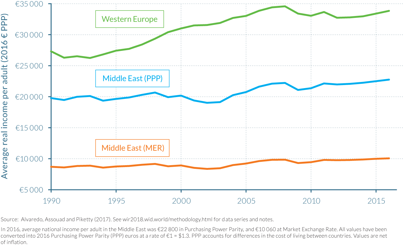
Should Middle East inequality be measured at purchasing power parity (PPP) or at market exchange rates (MER)? Both the PPP and the MER viewpoints express valuable and complementary aspects of international inequality patterns. The PPP viewpoint should of course be preferred if we are interested in the living standards of the inhabitants living, working and spending their incomes in the various countries (which is the case of most inhabitants). However the MER viewpoint is more relevant and meaningful if we are interested in external economic relations: e.g. the ability of tourists and visitors from Europe or from Gulf countries to purchase goods and services when they travel to other countries; or the ability of migrants or prospective migrants from Egypt or Syria to send part of their euro wages back home. Here market exchange rates matter a lot, and may also have an important impact on perceptions of inequality. This is why MER are used as benchmark measures of inequality in the Middle East.
It is critical to stress that enormous and persistent between-country inequality exists behind the Middle East average. In order analyze to summarize the changing population and income structure of the Middle East, it is useful to decompose the region into five blocs: Turkey; Iran; Egypt; Iraq-Syria (including other Arab, non–Gulf countries: Jordan, Lebanon, Palestine, Yemen); and Gulf countries (including Saudi Arabia, Oman, Barhain, UAE, Qatar and Kuwait) (see Table 2.10.1).
The first four blocs all represent approximately 20–25% of total population of the Middle East, whereas Gulf countries represent 15% of the population. In contrast, Gulf countries represent almost half of the total income of the region in market exchange rates. This reveals the large gap in per-adult national income between Gulf countries and other countries in the region. These marked difference help us understand why albeit novel, regional Middle East inequality estimates are not entirely unexpected.
The evolution of income inequality in the Middle East has been driven by the dynamics of between-country inequality. In 1990, Gulf countries’ share in Middle East population was 10%, and their income share was between 44% (PPP) and 48% (MER). The narrowing of per-adult income inequality between Gulf countries and the other four country blocs identified above reduced regional inequality over the 1990–2016 period. However, the income gap between these two groupings remains enormous.
The fall in the income gap between Gulf countries and the rest of the Middle East reflects a number of complex and contradictory forces. It was partly due to the evolution of oil prices and output levels in Gulf countries, as well as to the relative fast output growth in non–Gulf countries including Turkey, but the very large rise of migrant workers also played a significant role, leading to an artificial reduction of national income per adult in Gulf countries. The massive inflow of foreign workers, especially in the construction sector and domestic services sector, quite simply led to a stronger increase in the population denominator than in the income numerator of Gulf countries. This massive rise of migrant workers saw the shares of foreigners in Gulf countries increase from less than 50% in 1990 to almost 60% in 2016.
From this viewpoint, it is also useful to distinguish between two groups of Gulf countries. The first of these groups is made up of Saudi Arabia, Oman and Bahrain, where nationals still make a small majority of the population, with the foreign population share remaining relatively stable at around 40–45% of total adult population between 1990 and 2016. The second group is that of the United Arab Emirates (UAE), Kuwait and Qatar, where the nationals have made up a smaller and smaller minority of the resident population, given that the foreign share rose from 80% to 90% of the total population. This second group made about one quarter of total population of Gulf countries in 1990, but this rose to about one third by 2016.
Within-country inequality is likely to be high in Middle East countries
Income tax data is unfortunately extremely limited in the Middle East and therefore prevents a detailed and precise analysis of within-country inequality. It is unfortunate that the only country for which data is currently available is Lebanon, as household surveys in the Middle East appear to underestimate top incomes at least as much as in the rest of the world (and possibly more). The Lebanese data confirms the general finding that top income levels reported in tax data are much higher than in household surveys: top 1% incomes are typically two to three times higher, with large variations across income levels and over years.
The lack of good data is particularly acute in the case of the Gulf countries, where the low official Gini coefficient might indeed hide important aspects of their political economy, namely the growing share of the non-national population, a large majority of which is composed of low-paid workers, living in difficult conditions. The substantial growth of migrant workers in Gulf countries give incentives to nationals within Gulf countries to defend their numerous privileges, beginning by restraining naturalization given that national citizens typically do not pay income tax, benefit from significant social spending, including free healthcare and education, receive subsidies for electricity and fuel, and often receive other benefits such as land grants. Furthermore, some citizens also have expectations that the state provides them with a job and housing, an idea enshrined in some Gulf country constitutions.46 (Figure 2.10.4)
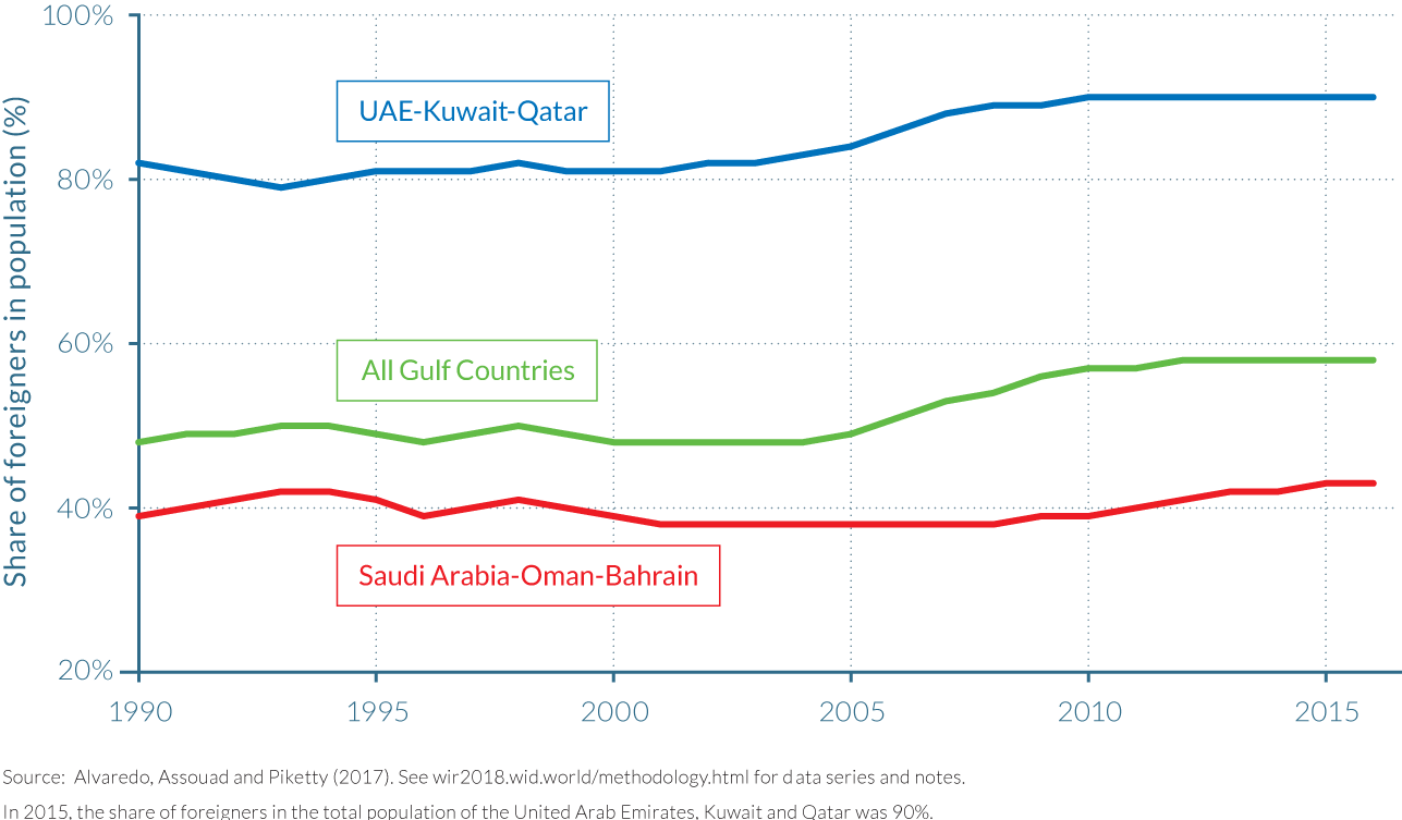
But perhaps the most striking manifestation of the difference between the local and foreign populations is the restrictions imposed on the migrant population through the “sponsorship system,” or the “kafala system” as it is known in Arabic.47 This system requires all unskilled laborers to have an in-country sponsor, usually their employer, who is responsible for their visa and legal status.48 As a report by the Chatham House think tank describes, this system can lead to the creation of an extremely polarized social structure with two groups which are not legally, socially and economically equals.49 As far as is known, little research has been conducted to study the two populations to measure income inequality within Gulf societies given the aforementioned data limitations, and therefore our quantitative understanding of these issues is still somewhat limited. Alvaredo, Assouad and Piketty are the first researchers to distinguish systematically between the two populations (and lead to a large upward revisions of inequality estimate in the survey distribution). Unfortunately, there are still important limitations to the empirical understanding of these issues.
Better data on income inequality is crucially needed in the Middle East
Accessing better quality and larger volumes of country-level inequality data for the whole of the 1990–2016 period in Middle East countries might lead to different conclusions than those presented in this paper. In particular, a rise of within-country inequality could possibly counterbalance the reduction of between-country inequality between Gulf countries. Rising within-country inequality trends are found in a large number of very different countries across the world, e.g. in the United States, Europe, India, China, South Africa, Russia, with varying magnitudes as described in other chapters of this report. It is also possible that Middle East countries—along with Brazil—belong to a different category, that is, countries where inequality has always been very large historically and thus has not risen in recent decades. However, given the data sources currently available, it is not possible to draw precise conclusions on this phenomenon with a satisfactory degree of precision.
All in all, it is very difficult to have an informed public debate about inequality trends—and also about a large number of substantial policy issues such as taxation and public spending—without proper access to such data. While the lack of transparency on income and wealth is an important issue in many, if not most, areas of the world, it appears to be particularly extreme in the Middle East, and arguably raises a problem of democratic accountability in itself, independent from the levels of inequality observed.
2.11 Income inequality in Brazil
Information in this chapter is based on “Extreme and Persistent Inequality: New Evidence for Brazil Combining National Accounts, Survey and Fiscal Data,” by Marc Morgan, 2017. WID.world Working Paper Series (No. 2017/12).
- Novel and more precise inequality data show that the level of inequality is much higher in Brazil than previously estimated.
- Previous inequality estimates suggested that policies targeting inequality over the past decades had been successful in significantly reducing it, but recent evidence suggests that national income inequality has remained relatively persistent at high levels over the past 15 years. At the time, the fall in labor income inequality, even if more moderate than previously thought, is confirmed by the new estimates.
- The distribution of income in Brazil has remained stable and extremely unequal over the last 15 years, with the top 10% receiving over 55% of total income in 2015, while the share of the bottom 50% was just above 12% and the middle 40%, approximately 32%. While inequality within the bottom 90% fell, driven by compression of labor incomes, concentration at the top of the distribution grew over the period, reflecting the increasing concentration of capital income.
- Since the global financial crisis in 2008, the share of total growth in income captured by the top 10% of earners has been the same than in the years of strong growth leading up to the crisis.
- The bottom 50% captured a very limited share of total growth between 2001–2015. So far, cash transfers had only a limited impact on the reduction of national income inequality.
Brazil’s inequality is higher than previously estimated and relatively stable over the past two decades
Brazil has consistently been ranked among the most unequal countries in the world since data became widely available in the 1980s. However, from the mid-1990s, household surveys began to show that inequality was falling, due to a combination of strong labor market performance, declines in the skill wage premium due to educational expansion, systematic increases in the minimum wage (indexed to social benefits), and the growing coverage of social assistance programs.50 This household data provided evidence that government policies had been effective in reducing inequality. Indeed, this apparent decline in Brazilian income inequality drew significant attention worldwide, as examples of large economies that could reduce inequality while growing solidly are relatively rare.51
However, as described earlier in this report, household surveys only tell part of the story. Recent releases of income tax data by the Federal tax office have painted a different picture, showing that inequality in Brazil was higher than previously thought.52 Marc Morgan has generated a series of distributional national accounts for Brazil, which combine annual and household survey data with detailed information on income tax declarations and national accounts. By ensuring the consistency of the surveys and tax declarations with macroeconomic totals, he is able to provide the most representative income inequality statistics to date that show a sharp upward revision of the official estimates of inequality in Brazil. The novel data also suggests that, if contrary to other emerging countries such as Russia, India or China, pre-tax inequality has remained relatively stable in Brazil since the turn of the new century, it has not declined as much as many commentators have argued.
Total income inequality has remained at very high levels in Brazil despite the fall in labor income inequality
The findings highlight the large extent of income concentration in Brazil. The richest 10% of Brazilian adults—around 14 million people—received over half (55%) of all national income in 2015, while the bottom half of the population, a group five times larger, earned between four and five times less, at just 12%. The middle 40% of the distribution receives just less than one third of total income (32%), a figure which is low by international standards. This clearly reveals that inequality in Brazil is principally affected by the extreme concentration at the top of the distribution. This concentration becomes less extreme when we look at the labour income distribution. The top 10% highest earners received 44% of all national labour income in 2015, with the middle 40% taking home almost 40% and the bottom 50% in this distribution receiving about 15%. (Figure 2.11.1)
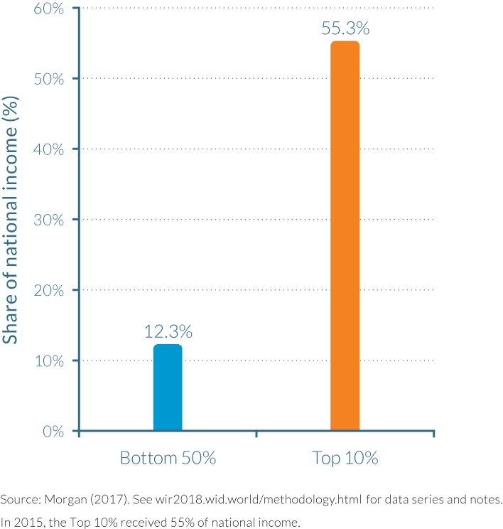
Since 2000, total income inequality has remained relatively stable. Small gains were made by the bottom 50%, who increased their share of national income from 11% to 12% from 2001 to 2015, while the top 10% income share evolved from 54% to just over 55% over the period. Both of these gains were at the expense of a continuous squeeze on the middle 40%, whose share of national income fell from 34% to just above 32%. The stability in the total income inequality should not mask the registered decline in the inequality of labour incomes. The bottom 50% of earners made greater gains in this distribution, increasing their share from 12% to 15% from 2001 to 2015, while the top 10% labor income share fell from 47% to 44%. The middle 40% share increased from 37% to almost 40%, which confirms the overall compression in the labour income distribution and conveys the importance of capital income in the total income distribution. This is even more apparent the higher up in the hierarchy the comparison is made. For instance, while the top 1% of labour earners received 14% of national labour income in 2015, the same group in the national total income distribution received double this share (28%).
These extreme levels of inequality manifested themselves in large differences between the average incomes of the aforementioned groups, as represented by Table 2.11.1. In 2015, the average income of an adult living in Brazil was around €13 900 (R$37 100), but for those amongst the bottom 50% of earners, the average income was less than €3 400 (R$9 200, around a quarter of the national average). Moving up the income distribution, the average annual income of adults in the middle 40% was approximately €11 300 (R$30 500), meaning that a significant percentage of 90% of Brazil’s adult population earned less than the national average, which highlights the extent of income skewness in Brazil and the lack of a broad “middle class.” Consequently, the average income of the top 10% was over five times greater than the national average at €76 900 (R$207 600). The magnitudes increase substantially as one moves towards the upper echelons of the income distribution, with the average income of the richest 1% being around €387 000 (R$10 449 000).
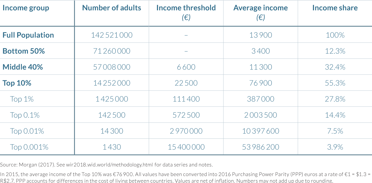
Table 2.11.2 presents refined shares at the top of the income distribution for 2015, to show more precisely how national income is shared across the adult population and also compares how inequality estimates differ between the DINA series and survey data. Using only the survey data, the top 1% (about 1.4 million adults) received 12% of national income in 2015. However, when income from fiscal data and undistributed income from national accounts are included, the share of this top 1% increases dramatically, to 28%. The large share of national income captured by the top 1% therefore seems to be gradually reducing the share of the middle 40% over time.
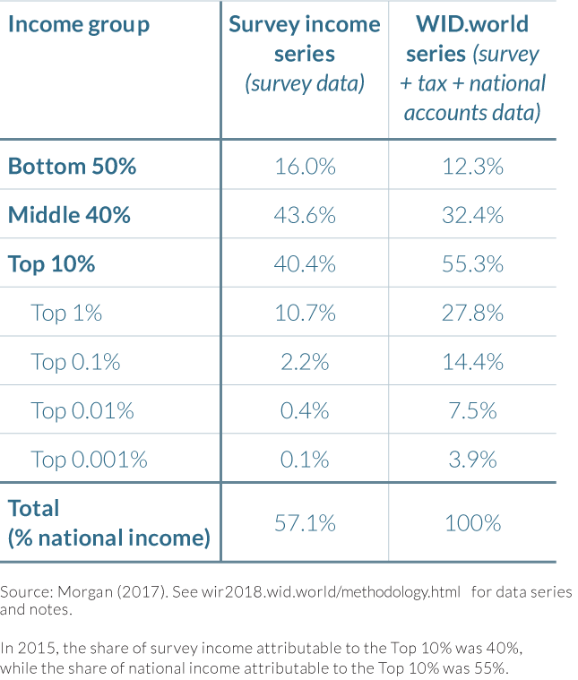
Higher up the distribution, the trend is similar, with the elites capturing a disproportionate share of Brazilian income. Figure 2.11.2 compares the income share of the bottom 50% (70 million adults), with that of the top 0.1% (140 000 adults) over the fifteen-year time period. Having started at similar levels of national income in 2001—around 11% each—the two groups quickly experienced diverging fortunes, with the top 0.1% share growing to just under 15% of national income by 2004 and the share of the bottom 50% remaining virtually unchanged. By 2015 the gap between the groups’ respective shares had grown to 4 percentage points, such that the collective incomes of the top 0.1% were significantly larger than those of the bottom 50% despite the top 0.1% being 500 times smaller in population size.
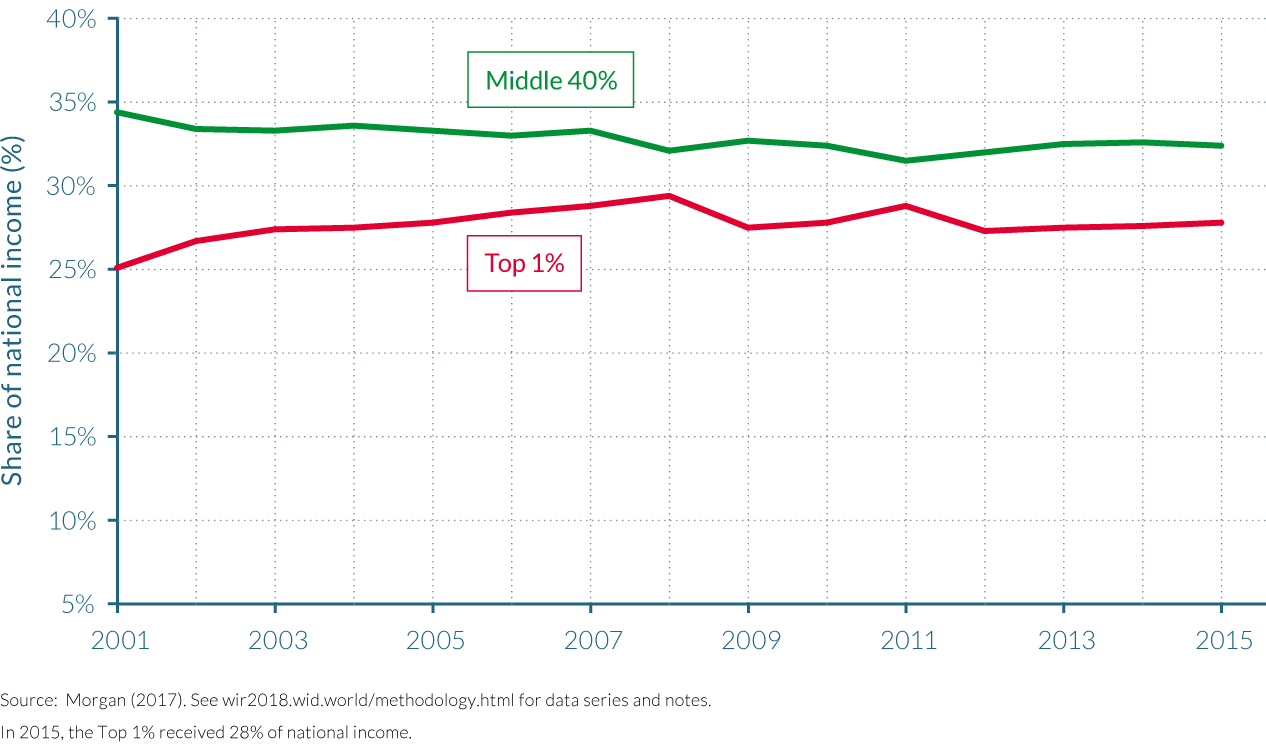
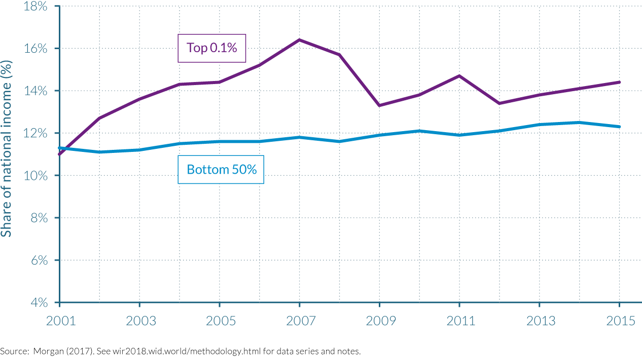
Morgan in the same work also compares the raw estimates from the surveys with his benchmark national income series (combining national accounts, surveys and fiscal data). There are clear, large discrepancies in the level and change in inequality that grow increasing larger the higher up the distribution one looks. These discrepancies thus highlight why relying exclusively on surveys and ignoring undistributed income in national accounts flowing to corporations can distort understanding of how income inequality has developed in Brazil. For example, household surveys indicate that income inequality fell between 2001 and 2015, with the top 10% share of national income falling from 47% to just above 40% and the bottom 50% share rising from just over 12% to 16%. These are in stark contrast with the trends and levels presented above, with a top 10% share oscillating around 55% (Figure 2.11.3). The general trend is therefore one of an increase in the concentration of national income shares at the top of the income distribution, small increases at the bottom and an ever-smaller share for the middle.
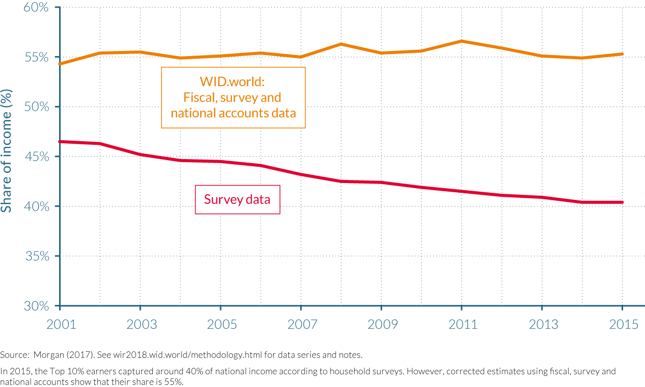
Brazilian income inequality rises as the richest experience higher growth in incomes
Distributional National Accounts also enable us to examine how growth at the macroeconomic level in Brazil has affected the income shares of the country’s population. Between 2001 and 2015, cumulative real growth of national income in Brazil totaled 56%. (See Table 2.11.3.) The question that arises from this evolution is how the income growth of different groups of the income distribution compares to this number. The real growth of incomes in the bottom 50% was strong, increasing approximately by 72% over the fifteen-year period. This was comparatively higher than the growth in incomes of the middle 40% (44%) and the top 10% (60%). Among the top percentiles, growth was equally strong. The income of the top 1% grew by 69%, while the incomes of the top 0.1% grew at almost 65%, both higher than the cumulative growth of total national income.
Despite the growth of incomes in the bottom half of the income distribution, the top of the distribution captured a disproportionately large part of the total income growth between 2001 and 2015. For example, the top 10% captured 58% of total growth, while the top 1% captured 32%. Even with the strongest growth performance over the period of three major income groupings, the low incomes of the bottom 50% meant that the fraction of total growth they were able to capture was relatively small, at 16%. Subsequently, the change in the bottom 50% share of total national income was also small. The figures relating to the middle 40% help to reinforce the importance of the size of incomes in analyzing how group shares in national income have changed: despite their total cumulative growth rate being smaller than the bottom 50%, the fraction of total growth captured by the middle 40% was higher than that of the poorest half of the population, at 26%.
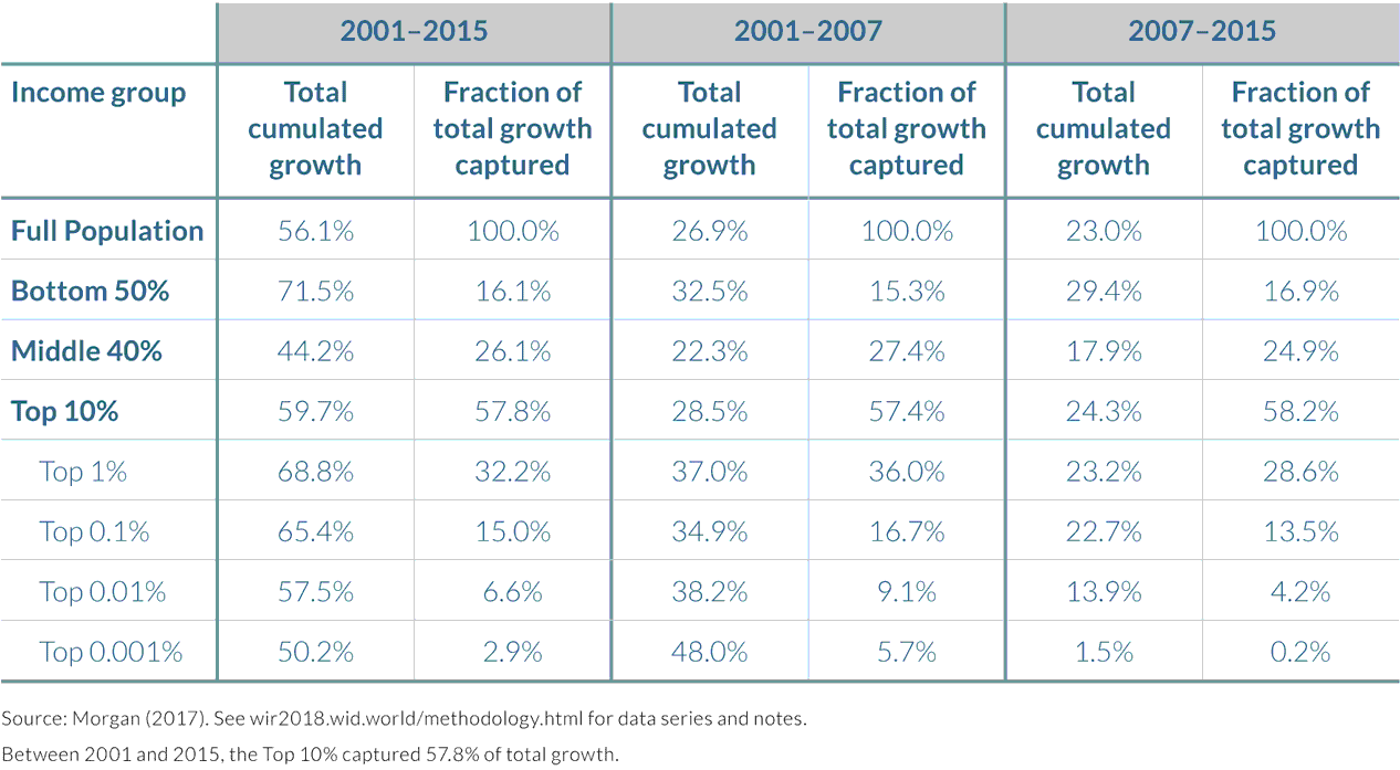
Table 2.11.3 also subdivides the incidence of growth by two roughly equal time periods, relating to that before the global financial crisis, and that during and after it. During the first period (2001–2007), all groups experienced strong increases in their incomes as the economy grew solidly, with only the middle 40% growing at a slower pace than the national income. Nevertheless, the overwhelming gains went to the top decile, with the top 10% capturing over half of total growth. Growth in the years between 2007 and 2015 was slightly weaker, with incomes expanding by 23% as compared to 27% in the previous period, but growth was equally concentrated in the top decile after the financial crisis and the beginning of the domestic recession.
Note to readers: "Values presented in Table 2.11.3, have been updated since the online release of the World Inequality Report in December 2017. In the French and English print edition of the World Inequality Report (respectively, Le Seuil and Harvard University Press), due to a technical issue, the text associated to the table still refers to the values present in the initial online edition of the Report. This webpage shows the fully updated version of this section."
2.12 Income inequality in South Africa
Information in this chapter is based on “Colonial rule, apartheid and natural resources: Top incomes in South Africa, 1903–2007,” by Facundo Alvaredo and Anthony B. Atkinson (Centre for Economic Policy Research Discussion Paper, 2010, No. 8155), as well as on WID.world updates.
- South Africa stands out as one of the most unequal countries in the world. In 2014, the top 10% received 2/3 of national income, while the top 1% received 20% of national income.
- During the twentieth century, the top 1% income share was halved between 1914 and 1993, falling from 20% to 10%. Even if these numbers must be qualified, as they are surrounded by a number of uncertainties, the trajectory is similar to that of other former dominions of the British Empire, and is partly explained by the country’s economic and political instability during the 1970s and 1980s.
- During the early 1970s the previously constant racial shares of income started to change in favor of the blacks, at the expense of the whites, in a context of declining per capita incomes. But while interracial inequality fell throughout the eighties and nineties, inequality within race groups increased.
- Rising black per capita incomes over the past three decades have narrowed the interracial income gap, although increasing inequality within the black and Asian/Indian population seems to have prevented any decline in total inequality.
- Since the end of the Apartheid in 1994, top-income shares have increased considerably. In spite of several reforms targeting the poorest and fighting the segregationist heritage, race is still a key determinant of differences in income levels, educational attainment, job opportunities and wealth.
South Africa’s dual economy is among the most unequal in the world
South Africa is one of the most unequal countries in the world. In 2014, the top 10% of earners captured two thirds of total income. This contrasts with other high-income inequality countries such as Brazil, the United States and India where the top 10% is closer to 50–55% of national income. However, unlike other highly unequal countries, the divide between the top 1% and the following 9% in South Africa is much less pronounced than the gap between the top 10% and the bottom 90%. Otherwise said, in terms of top income shares, South Africa ranks with the most unequal Anglo-Saxon countries, but, at the same time, there is less concentration within the upper income groups, mostly composed by the white population. The average income among the top 1% was about four times greater than that of the following 9% in 2014 (for comparative purposes, the top 1% in the United States earn seven times more than the following 9%), while average income among the top 10% was more than seventeen times greater than the average income of the bottom 90% (it is eight times more in the United States). It is then only logical that the income share of the top 1% is high, capturing 20% of national income, though this is not the largest share in the world.
The South African “dual economy” can be further illustrated by comparing South African income levels to that of European countries. In 2014, the average national income per adult among the richest 10% was €94 600, at purchasing power parity, that is, comparable to the average for the same group in France, Spain or Italy. But average national income of the bottom 90% in South Africa is close to the average national income of the bottom 16% in France. In light of these statistics, the recently debated emergence of a so-called middle class is still very elusive. Rather, two societies seem to coexist in South Africa, one enjoying living standards close to the rich or upper middle class in advanced economies, the other left behind. (Figure 2.12.1)
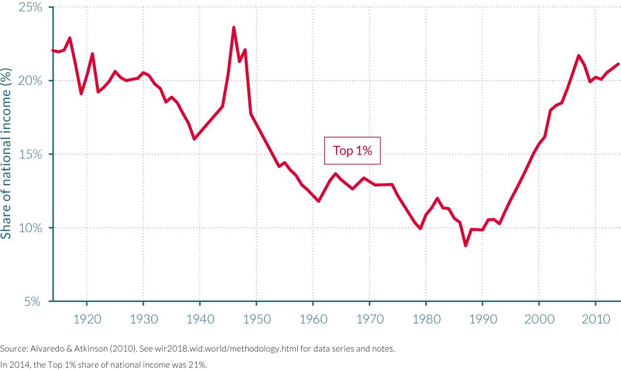
Inequality has decreased from the unification of South Africa to the end of apartheid
South Africa is an exception in terms of data availability in comparison with other African countries. The period for which fiscal data are available starts in 1903 for the Cape Colony, seven years before the Union of South Africa was established as a dominion of the British Empire, and ends in 2014, with some years sporadically missing, and noticeably an eight-year interruption following the end of apartheid in 1994. As is often the case with historical tax data series, only a very small share of the total adult population was eligible to pay tax in the first half of the twentieth century. Therefore, the fiscal data from which we can estimate top-income shares allows us to track the top 1% income share since 1913, but only cover the top 10% of the population from 1963 (with a long interruption between 1971 and 2008).
With important short run variations, the evolution of income concentration over the 1913–1993 period seems to follow a very clear long-term trend. The income share of the richest 1% was more than halved between 1913 and 1993, falling from 22% to approximately 10%. Not only did the income share attributable to the top 1% decrease, but inequality within this upper group was also reduced. Indeed, the share of the top 0.5% fell more quickly than the share of the next 0.5% (from percentile 99 to percentile 99.5). Consequently, while the top 0.5% represented about 75% of the top 1% in 1914, by the end of the 1980s, their representative proportion fell to 60%.
Despite the extreme social implications of the first segregationist measures that were implemented in the early 1910s, these policies did not lead to large increases in income concentration among the top 1%. This was also a time in which South Africa progressively developed its industrial and manufacturing sector, enjoying notable accelerations in the 1930s that were to the benefit of the large majority of the population. Aside from a brief fall during the Great Depression, average real income per adult then increased steadily. Following a trend similar to other former Dominions of the British Empire (Australia, Canada and New Zealand) inequality decreased significantly in South Africa from 1914 to the beginning of the the Second World War, despite some short-run variations in the late 1910s: the income share of the top 1% fell from 22% to 16%.
During the Second World War, national average continued to follow its previous trend, but the average real income of the richest 1% took off. As a consequence of the demand shock during the war, the agricultural export prices boomed, the manufacturing sector more than doubled its output between 1939 and 1945, and profits for the foundry and engineering industries increased by more than 400%.53 However, the wage differential between skilled/white and unskilled/black workers remained extremely large. As C.H. Feinstein described, “black workers [were] denied any share of the growing income in the new economy they were creating.”54 The fact that the peak in the income share of the top 1%—as high as 23% in 1946—was concomitant with the war effort thus seems essentially due to a brief enrichment of the upper class.
In contrast, income growth in the 1950s was more inclusive, as average real income per adult increased by 29% between 1949 and 1961, while the average real income of the top 1% slightly decreased. By 1961 the income share of the top 1% had fallen to around 14%. In the 1960s, both averages grew approximately at the same rate such that inequality remained relatively constant. Following 60 years of successive increases, national average income was almost four times greater by the early 1970s than in 1913. Inequality resumed its downward sloping trend from 1973, but this also marked a period of overall income growth stagnation in South Africa until 1990 that culminated in a three-year recession.
For the first time in the previous 90 years, gold output started falling. Richer seams were exhausted and extraction costs increased rapidly. The industry that was once the engine of the economy started to weaken. Increases in oil prices and other commodities accelerated inflation dramatically, averaging about 14% per year between 1975 and 1992. In the 1980s, international sanctions and boycotts were placed on South African trade as a response to the apartheid regime, adding further pressure to that created by domestic protests and revolts, and contributed to the destabilization of the regime in place. White dominance was challenged on both economic and political grounds, to which the ruling government progressively made concessions, recognizing trade unions and the right to bargain for wages and conditions; this could partly explain why the average real income per adult of the top 1% decreased faster than the national average. (Figure 2.12.2)
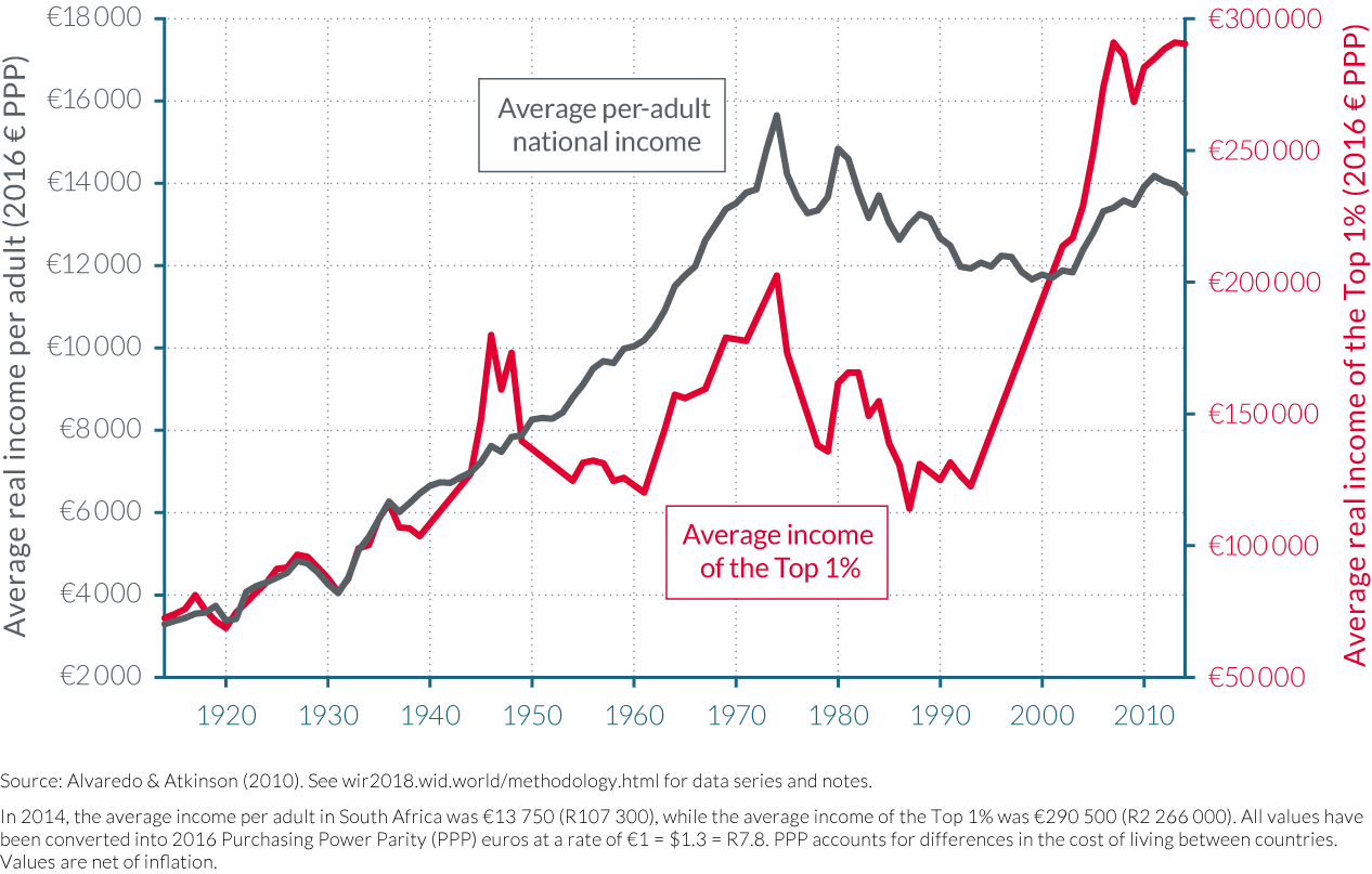
The progressive policies implemented after the apartheid were not sufficient to counter a profoundly unequal socio-economic structure
There are no fiscal data to estimate top-income shares for the eight years that followed 1993. However, joining up the data points to the next available figure in 2002 suggests that income inequality has increased sharply between the end of apartheid and the present, even if the magnitude of the increase must be taken with caution, as the estimates in these two periods may not be totally comparable. The income share of the top 1% increased by 11 percentage points from 1993 to 2014. Part of the increase from 1993 to 2002 should come from changes in the tax code. In particular, before 2002, capital gains were totally excluded, which is very likely to downward bias the share of top-income groups. Also, the tax collection capabilities seem to have increased substantially in the last years. That being said, using household survey data for the years 1993, 2000 and 2008 research has demonstrated that inequality increased significantly during the period for which we have no fiscal data.55
At first, it might seem puzzling that the abolishment of a segregationist regime was followed by an aggravation of economic inequality. The establishment of a multi-racial democracy, with a new constitution and a president of the same ethnic origin as the majority of the population, did not automatically transform the inherited socio-economic structure of a profoundly unequal country. Interracial inequality did fall throughout the eighties and nineties, but inequality within race groups increased: rising black per capita incomes over the past three decades have narrowed the black-white income gap, although increasing inequality within the black and Asian/Indian population seems to have prevented any decline in aggregate inequality. In explaining these changes scholars agree in that the labor market played a dominant role, where a rise in the number of blacks employed in skilled jobs (including civil service and other high-paying government positions) coupled with increasing mean wages for this group of workers.
Since 1994, several redistributive social policies have been implemented and/or extended, among which important unconditional cash transfers targeting the most exposed groups (children, disabled and the elderly). At the same time, top marginal tax rates on personal income were kept relatively high and recently increased to 45%. However, in spite of these redistributive policy efforts, surveys consistently show that top-income groups are still overwhelmingly white. Other studies further demonstrate that such dualism is itself salient along other key dimensions such as unemployment and education. Furthermore wealth, and in particular land, is still very unequally distributed. In 1913, the South African parliament passed the Natives Land Act which restricted land ownership for Africans to specified area, amounting to only 8% of the country’s total land area, and by the early 1990s, less than 70 000 white farmers owned about 85% of agriculture land.56 Some land reforms have been implemented, but with seemingly poor results,57 and it is likely that the situation has not improved much since, although precise data about the recent distribution of land still needs to be collected.
Given this socio-economic structure, the interruption of the international boycotts in 1993 might have more directly favored a minority of high skilled and/or richer individuals who were able to benefit from the international markets, which therefore contributed to increase inequality. This hypothesis would also explain the fact that income inequality in South Africa did not increase in the 1980s, while boycotts were put in place, contrary to other former Dominions (New Zealand, Canada and Australia) despite the country having so far followed a similar trend. Furthermore, the implementation of the Growth, Employment and Redistribution (GEAR) program in 1996, which consisted of removing trade barriers, liberalizing capital flows and reducing fiscal deficit might also have contributed, at least in the short run, to enrich the most well off while exposing the most vulnerable, in part by increasing returns to capital over labor and to skilled workers over unskilled workers.
The rapid growth experienced from the early 2000s until the mid-2010s was essentially driven by the rise in commodity prices and was not accompanied with significant job creation as the government hoped it would. The income share of the top 1% grew from just less than 18% in 2002 to over 21% in 2007, then decreased by about 1.5 percentage points and increased again in 2012–2013 as prices reached a second peak. The fact that these variations closely mirror the fluctuation in commodity prices suggest that a minority benefiting from resource rents could have granted themselves a more than proportional share of growth.
Lastly, it should be stressed that the top 1% only represents a small part of the broader top 10% elite which is mostly white. While the share of income held by the top 1% is relatively low as compared to other high inequality regions such as Brazil or the Middle East, the income share of the top 10% group is extreme in South Africa (Figure 2.12.3). The historical trajectory of the top 10% group may be different to that of the top 1%—potentially with less ups and downs throughout the 20th century. Unfortunately at this stage, historical data on the top 10% group does not go as far back in time as for the top 1% group."
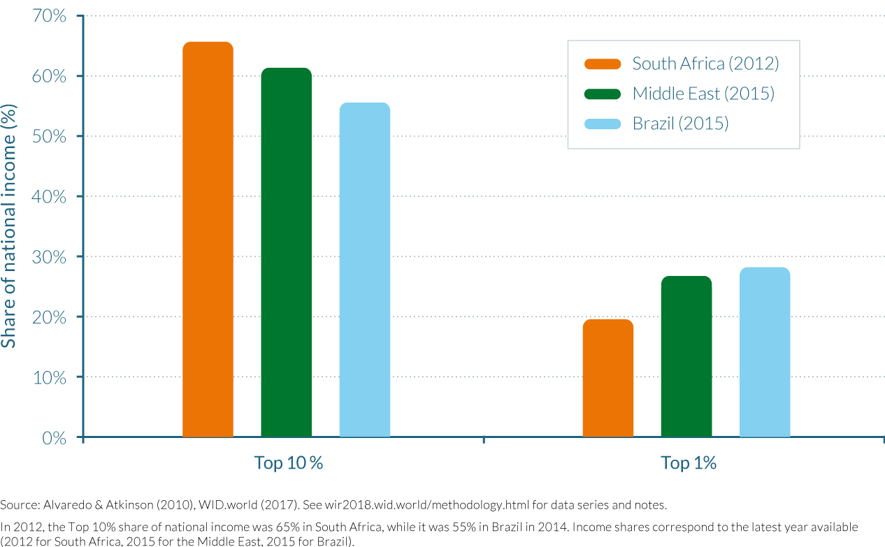
Notes
- See, for instance, C. Lakner and B. Milanovic, “Global Income Distribution: From the Fall of the Berlin Wall to the Great Recession,” World Bank Economic Review 30, no. 2 (2016): 203–232; as well as P. Liberati, “The World Distribution of Income and Its Inequality, 1970–2009,” Review of Income and Wealth 61, no. 2 (2015): 248–273;; and I. Ortiz and M. Cummins, “Global Inequality: Beyond the Bottom Billion: A Rapid Review of Income Distribution in 141 Countries,” UNICEF Social and Economic Policy Working Paper, UNICEF, April 2011, https://www.unicef.org/socialpolicy/files/Global_Inequality.pdf. For existing global wealth reports, see the “Global Wealth Report 2016,” Credit Suisse Research Institute, Credit Suisse AG, Zurich, November 2016, http://publications.credit-suisse.com/tasks/render/file/index.cfm?fileid=AD783798-ED07-E8C2-4405996B5B02A32E.
- Lakner and Milanovic, “Global Income Distribution: From the Fall of the Berlin Wall to the Great Recession.”
- J. E. Stiglitz, A. Sen, and J. P. Fitoussi, “Report by the Commission on the Measurement of Economic Performance and Social Progress,” Paris, http://ec.europa.eu/eurostat/documents/118025/118123/Fitoussi+Commission+report.
- Measured at market exchange rate. At purchasing power parity, the corresponding value is $790.
- G. Zucman, “The Missing Wealth of Nations: Are Europe and the U.S. Net Debtors or Net Creditors?” Quarterly Journal of Economics 128, no. 3 (2013): 1321–1364.
- Our figures for the European Union include all countries on the European continent, apart from Russia and Ukraine.
- T. Piketty, Capital in the Twenty-First Century (Cambridge MA: Belknap Press of Harvard University Press, 2014).
- Not represented on the graph for the sake of clarity. Readers should refer to WID.world/world to view all graphs.
- L. Czajka, “Income Inequality in Côte d’Ivoire: 1985–2014,” WID.world Working Paper no. 2017/8, July 2017, http://wid.world/document/income-inequality-cote-divoire-1985–2014-wid-world-working-paper-201708/.
- Very top incomes, however, grew more in post-tax terms than in pre-tax terms between 1946 and 1980 (194%), because the tax system was more progressive at the very top in 1946.
- The growth in Medicare and Medicaid transfers reflects an increase in the generosity of the benefits, but also the rise in the price of health services provided by Medicare and Medicaid—possibly above what people would be willing to pay on a private market. See, for example, A. Finkelstein, N. Hendren, and E. F. P. Luttmer, “The Value of Medicaid: Interpreting Results from the Oregon Health Care Experiment,” NBER Working Paper no. 21308, National Bureau of Economic Research, June 2015, http://www.nber.org/papers/w21308.pdf—and perhaps an increase in the economic surplus of health providers in the medical and pharmaceutical sector.
- In turn, most of the growth of the post-tax income of the elderly Americans in the bottom 50% has been due to the rise of health benefits. Without Medicare and Medicaid (which cover nursing home costs for poor elderly Americans) average post-tax income for the bottom 50% seniors would have stagnated at $21 000 since the early 2000s, and would have increased only modestly since the early 1980s when it was around $15 500.
- Piketty, Capital in the Twenty-First Century.
- See E. Saez, “Taxing the Rich More: Preliminary Evidence from the 2013 Tax Increase,” Tax Policy and the Economy 31, no. 1 (2017): 71–120.
- The US Congressional Budget Office also finds an increase by about 4–5 points in the federal tax rate of the top 1% from 2011 to 2013. US Congressional Budget Office, “The Distribution of Household Income and Federal Taxes, 2013,” US CBO Report, June 2016, Congress of the United States, Washington DC, https://www.cbo.gov/sites/default/files/114th-congress-2015–2016/reports/51361-householdincomefedtaxes.pdf.
- In keeping with the national accounts conventions, the nonrefundable portion of tax credits and tax deductions are treated as negative taxes, while the refundable portion of tax credits are seen as transfers. Subsequently, nobody can have negative income taxes.
- This general periodization is relatively well known and has been studied elsewhere (see in particular. See T. Piketty, “Income Inequality in France, 1901–1998,” Journal of Political Economy 111, no. 5 (2003): 1004–1042; and Piketty, Capital in the Twenty-First Century.
- See Piketty, “Income Inequality in France, 1901–1998,” and Piketty, Capital in the Twenty-First Century.
- See Piketty, Capital in the Twenty-First Century, ch. 9 in particular.
- T. Piketty, E. Saez, and S. Stantcheva, “Optimal Taxation of Top Labor Incomes: A Tale of Three Elasticities,” American Economic Journal: Economic Policy 6, no. 1 (2014): 230–271.
- A. Bozio, R. Dauvergne, B. Fabre, J. Goupille, and O. Meslin. “Fiscalité et redistribution en France, 1997–2012”, Rapport IPP, 2012. See in particular p.28 for tax rates on primary incomes (before pensions and unemployment insurance) and p.30 for tax rates on secondary incomes (including pensions and unemployment insurance). In the former case, tax rates at the top are lower than for any other income group. In the latter case, tax rates are lower for the bottom 50% than for the richest, but the middle class has a higher total tax rate than the top 0.1%.
- T. Ferguson and H.-J. Voth, “Betting on Hitler: The Value of Political Connections in Nazi Germany,” Quarterly Journal of Economics 123, no. 1 (2008): 101–137.
- T. Piketty, L. Yang, and G. Zucman, “Capital Accumulation, Private Property and Rising Inequality in China, 1978–2015,” NBER Working Paper no. 23368, National Bureau of Economic Research, June 2017, http://www.nber.org/papers/w23368.pdf.
- Comparing the paper’s inequality series to the official survey-based estimates highlights that although the trends are similar in both calculation methods, the data used in Piketty, Yang, and Zucman, “Capital Accumulation,” shows both a much larger level and rise in inequality over the period. Most of the difference between these estimates comes from the use of high-income tax data.
- In particular, the lack of national data on high-income taxpayers since 2011 forces the authors to apply the 2006–2010 average correction factors to years 2011–2015 (in effect making it impossible to detect a possible rebound of inequality since 2011).
- See R. Kanbur, Y. Wang, and X. Zhang, “The Great Chinese Inequality Turnaround,” ECINEQ WP 2017-433, Society for the Study of Economic Inequality (ECINEQ), April 2017, http://www.ecineq.org/milano/WP/ECINEQ2017-433.pdf; and R. Garnaut, L. Song, C. Fang, and L. Johnston, “Domestic Transformation in the Global Context,” in China’s Domestic Transformation in a Global Context, ed. L. Song, R. Garnaut, C. Fang, and L. Johnston, 1–16 (Acton, Australia: Australian National University Press, 2015).
- As a result, the middle 40% income share is now similar in China to urban China: the top 10% income share is higher in China than in urban China, while the bottom 50% income share is lower, leaving the share of the middle 40% at about 43%–44% in both cases in recent years.
- The Western European average referred to is the simple arithmetic average of per-adult income in Germany, France, and Britain. Note that using the Western European average income as a reference point is clearly an oversimplification and does not do justice to the complexity of country-specific trajectories. For example, Germany, France, and Britain have quasi-identical average incomes in 2016, but Britain lagged behind Germany and France in 1980 (only slightly above Russian level), and was well ahead in 1870–1914.
- The best indicator of the mediocre Soviet economic and social performance in the postwar decades is perhaps the stagnation of life expectancy. See, for example, E. Todd, The Final Fall: An Essay on the Decomposition of the Soviet Sphere, trans. J. Waggoner (New York: Karz, 1979).
- See, for example, B. Milanovic, Income, Inequality, and Poverty during the Transition from Planned to Market Economy (Washington, DC: World Bank, 1998).
- See J. Nellis, “Time to Rethink Privatization in Transition Economies?” Finance and Development 36, no. 2 (1999): 16–19.
- In 1995, the government of Boris Yeltsin adopted a “loans-for-shares” scheme, whereby some of the largest state industrial assets were leased through auctions for money lent by commercial banks to the government. The auctions were thought by many to have been rigged and lacked competition, being largely controlled by favored insiders with political connections or used for the benefit of the commercial banks themselves. Since neither the loans nor the leased enterprises were returned in time, this effectively became a form of selling, or privatizing, state assets at very low prices. See I. W. Lieberman and D. J. Kopf, eds., Privatization in Transition Economies: The Ongoing Story (Amsterdam: Elsevier JAI, 2008).
- See J. Flemming and J. Micklewright, “Income Distribution, Economic Systems and Transition,” in Handbook of Income Distribution, ed. A. B. Atkinson and F. Bourguignon,843–918 (Amsterdam: Elsevier, 2000).
- See also B. Milanovic and L. Ersado, “Reform and Inequality during the Transition: An Analysis using Panel Household Survey Data, 1990–2005,” UNU-WIDER Working Paper no. 2010/62, United Nations University World Institute for Development Economics Research, Helsinki, May 2010, https://www.wider.unu.edu/sites/default/files/wp2010-62.pdf.
- All figures are presented in 2016 Euros using purchasing power parity (PPP) conversions. In 2016, €1 = ₽ 74.5 (rubles) at the market exchange rate or ₽ 28.3 using PPP conversions.
- European Bank for Reconstruction and Development (EBRD), Transition for All: Equal Opportunities in an Unequal World, Transition Report 2016–2017, October 2016, available for download at http://www.ebrd.com/transition-report.
- The corrected inequality series combines survey data with income tax data and wealth data, while the EBRD growth incidence curve relies solely on self-reported survey data. For a more detailed discussion, see F. Novokmet, T. Piketty, and G. Zucman, “From Soviets to Oligarchs: Inequality and Property in Russia 1905–2016,” WID.world Working Paper no. 2017/09, July 2017, http://wid.world/wp-content/uploads/2017/08/NPZ2017WIDworld.pdf.
- See Part I.
- S. L. Richman, “War Communism to NEP: The Road to Serfdom,” Journal of Libertarian Studies 5, no. 1 (1981): 89–97.
- This figure from 1905 relies not on actual income tax data, since the tax was never implemented in tsarist Russia, but on income tax projections that were made by the imperial tax administration at the time the regime was considering implementing such a tax. Similar estimates were made during the same period in France, but their implementation revealed that the tax administration was significantly underestimating top income levels. See T. Piketty, Les hauts revenus en France au XXème siècle (Paris: Bernard Grasset, 2001).
- See A. Banerjee and T. Piketty, “Top Indian Incomes, 1922–2000,” World Bank Economic Review 19, no. 1 (2005): 1–20.
- Economic policies also sought to rationalize the public sector; its branches now had to pursue the objectives of profitability and efficiency. Trade was opened, an exchange rate floating regime was implemented and banking as well as capital market were also liberalized.
- I. Anand and A. Thampi, “Recent Trends in Wealth Inequality in India,” Economic and Political Weekly 51, no. 50 (December 2016).
- United Nations Development Programme (UNDP), “Towards the Developmental State in the Arab Region,” Arab Development Challenges Report 2011, UNDP Regional Centre for Arab States, Cairo, 2011, available for download at http://www.undp.org/content/undp/en/home/librarypage/hdr/arab-development-challenges-report-2011.html
- E. Ianchovina, L. Mottaghi, and S. Devarajan,“Inequality, Uprisings, and Conflict in the Arab World,” World Bank Middle East and North Africa (MENA) Region Economic Monitor, World Bank, Washington, DC, October 2015, http://documents.worldbank.org/curated/en/303441467992017147/pdf/99989-REVISED-Box393220B-OUO-9-MEM-Fall-2015-FINAL-Oct-13-2015.pdf.
- J. Kinninmont, “Future Trends in the Gulf,” Chatham House Report, The Royal Institute for International Affairs, London, February 2015, https://www.chathamhouse.org/sites/files/chathamhouse/field/field_document/20150218FutureTrendsGCCKinninmont.pdf.
- Human Rights Watch, “South Asia: Protect Migrant Workers to Gulf Countries,”Human Rights Watch news, December 18, 2013
- Ibid.; and A. Kapiszewski,“Arab versus Asian Migrant Workers in the GCC Countries,” United Nations Expert Group Meeting on International Migration and Development in the Arab Region, United Nations Secretariat, Beirut, May 15–17, 2006, http://citeseerx.ist.psu.edu/viewdoc/download?doi=10.1.1.403.7975&rep=rep1&type=pdf
- Kinninmont, “Future Trends in the Gulf.”
- R. Barros, R., M. De Carvalho, S. Franco, and R. Mendonça, “Markets, the State and the Dynamics of Inequality in Brazil,” in Declining Inequality in Latin America: A Decade of Progress? ed. L. F. López-Calva and N. Lustig (New York: UNDP, and Washington, DC: Brookings Institution Press, 2010).
- See B. Keeley, Income Inequality: The Gap between Rich and Poor, OECD Insights (Paris: OECD Publishing, 2015).
- M. Medeiros, P. H. G. F. Souza, and F. A. de Castro, “The Stability of Income Inequality in Brazil, 2006–2012: An Estimate Using Income Tax Data and Household Surveys,” Ciência y Saúde Coletiva 20, no. 4 (2015): 971–986.
- J. Lewis, Industrialisation and Trade Union Organization in South Africa, 1924–55: The Rise and Fall of the South African Trades and Labour Council (Cambridge: Cambridge University Press, 1984).
- C. H. Feinstein, An Economic History of South Africa: Conquest, Discrimination, and Development (Cambridge: Cambridge University Press, 2005).
- M. Leibbrandt, I. Woolard, A. Finn, and J. Argen, “Trends in South African Income Distribution and Poverty since the Fall of Apartheid,” OECD Social, Employment and Migration Working Papers, no. 101, OECD Publishing, Paris, May 28, 2010
- World Bank, Southern Africa Department, “South African Agriculture: Structure, Performance and Options for the Future,” Informal Discussion Papers on Aspects of the Economy of South Africa, no. 6, World Bank, Washington, DC, February 1994, http://documents.worldbank.org/curated/en/309521468777031091/pdf/multi-page.pdf.
- M. Aliber and R. Mokoena, “The Land Question in Contemporary South Africa,” in State of the Nation: South Africa 2003–2004, ed. J. Daniel, R. Southall, and A. Habib, 330–346 (Cape Town, HSRC Press, 2003).